
Wall Art Guide, Wall Art Tutoriels
Namaste Wall Art: Yoga Meditation Spiritual Greeting
Jul
So I’ve been deep in this namaste wall art rabbit hole lately because three different clients asked me about it in the same week, which felt like the universe telling me to figure this stuff out properly. And honestly? There’s way more to think about than just slapping up something with a lotus flower and calling it zen.
The Actual Styles That Don’t Look Cheesy
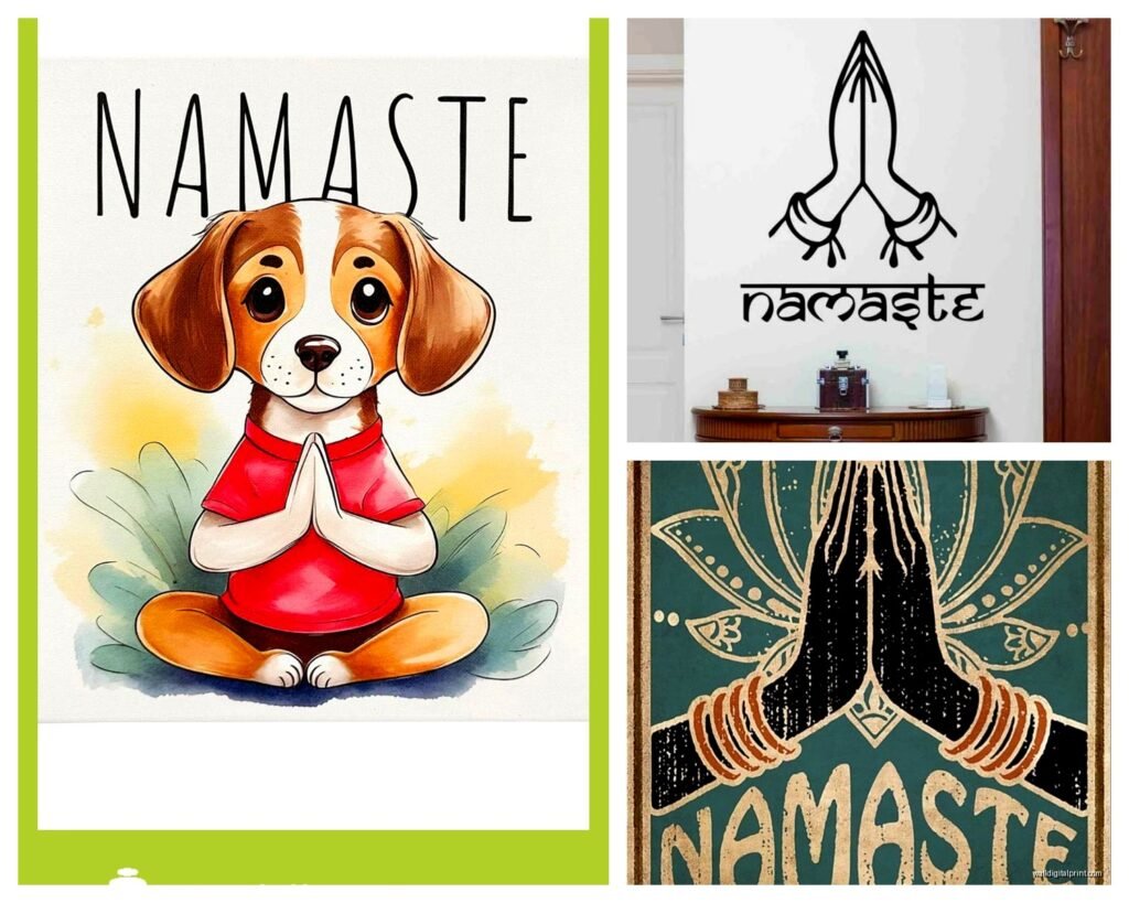
Okay so first thing – not all namaste art is created equal. You’ve got your super literal versions with the hands pressed together and ornate lettering that can read very “I bought this at a strip mall yoga studio gift shop.” Nothing wrong with that if it’s your vibe, but if you’re trying to create something that feels authentic and not like performative spirituality, you gotta be more selective.
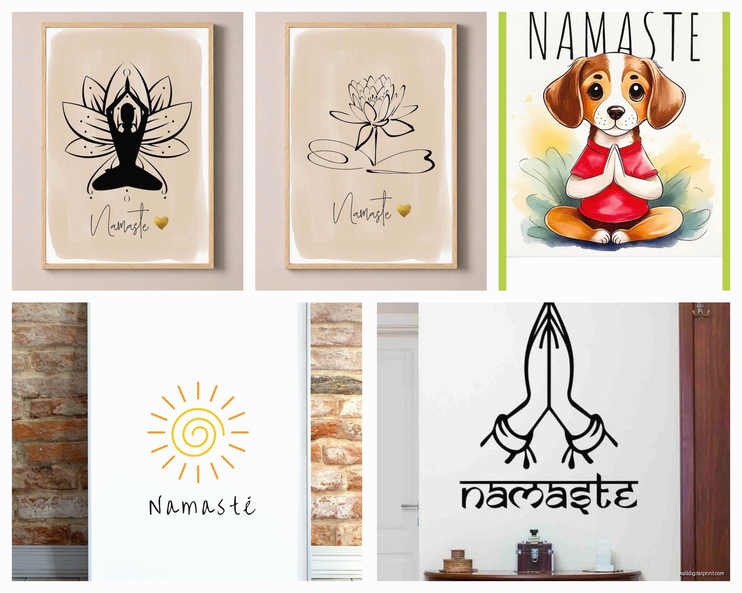
The minimalist calligraphy versions are huge right now. Just the word “namaste” in simple brush strokes, usually black on white or vice versa. I installed one in a client’s meditation corner last month and it literally disappears into the space in the best way – it’s there when you need the reminder but doesn’t scream at you. These work especially well in small spaces because they don’t compete for attention.
Then there’s the botanical route, which honestly is my favorite lately. Namaste incorporated into mandala designs or surrounded by lotus flowers, eucalyptus, monstera leaves… my cat knocked over a plant while I was researching this and I swear the irony wasn’t lost on me. But yeah, the botanical ones bridge that gap between spiritual and just generally pretty, so even guests who aren’t into yoga won’t find it preachy.
What Actually Works on Different Wall Colors
This is gonna sound obvious but I’ve seen people mess it up constantly – your wall color matters SO much. White or cream walls are forgiving, you can basically do whatever. But if you’ve got that trendy sage green or dusty blue situation happening, you need to think about contrast.
Gold foil namaste prints look absolutely stunning on deep colors like navy, charcoal, or even that moody terracotta everyone’s obsessed with. The metallic catches light and creates this whole moment. I found this out by accident when a piece I ordered for a white wall ended up in a room my client had repainted without telling me, and it looked better in the darker space anyway.
For gray walls – and I mean true gray, not greige – stick with black and white designs or something with pops of actual color like teal or coral. The namaste pieces with chakra colors incorporated can work here, though fair warning, those can tip into the “too much” territory fast if you’re not careful.
Size and Placement Because Everyone Gets This Wrong
The number one mistake I see is people buying art that’s way too small for the space. Like, you’ve got this big blank wall behind your meditation cushion and you put up an 8×10 print and it just looks… sad and lonely floating there.
Here’s my rough guide that I literally keep in my phone notes:
- Small meditation corner or above a yoga mat storage area: 11×14 to 16×20 inches
- Above an altar or small console table: 16×20 to 24×36 inches
- Main wall in a dedicated yoga room: 24×36 inches or larger, or do a gallery wall
- Behind a seating area in a multipurpose room: 18×24 to 30×40 inches depending on furniture size
The height thing matters too – center your art at eye level when you’re in the position you’ll usually be in that space. So if it’s above where you meditate on the floor, that’s different than if it’s in an area where you’ll mostly be standing. I usually aim for 57-60 inches from the floor to the center of the artwork for standing spaces, but drop that to like 48-52 inches for meditation spaces.
Framing Options That Don’t Cost a Fortune
Okay so funny story, I used to think you had to spend a ton on custom framing for spiritual art to make it look legit. Then I discovered that standard size prints in ready-made frames from places like Michaels or even Target can look just as good if you choose wisely.
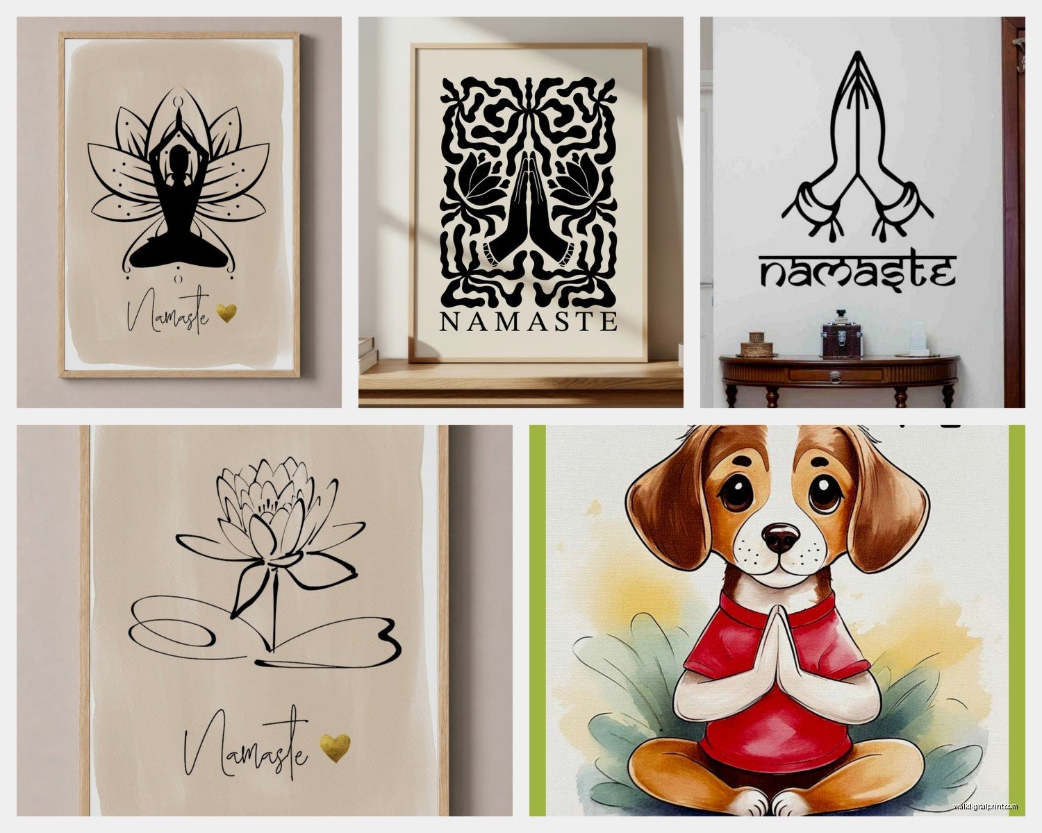
Natural wood frames in light oak or walnut are your friends here. They complement the earthy spiritual vibe without being too rustic. Black frames work great for modern minimalist spaces. White frames can work but they sometimes feel too crisp and formal for meditation spaces – though I’ve seen them look amazing in bright, airy yoga studios.
Floating frames are having a moment for namaste art, especially the ones with a small gap between the glass and the print. It creates this shadow box effect that makes even a simple print feel more intentional and collected.
And wait I forgot to mention – if you’re printing your own from digital downloads (which honestly is the most affordable route), get it printed at a proper print shop, not your home printer. The quality difference is massive. I use a local place but FedEx Office does decent work too if you don’t have better options.
Mixing Namaste Art With Other Decor Styles
This is where it gets interesting because you probably don’t want your whole house looking like an ashram unless you actually live in an ashram, in which case you’re not reading this anyway.
In modern spaces, pair minimalist namaste art with clean-lined furniture and keep the color palette tight. Black and white namaste calligraphy works beautifully with mid-century modern pieces, concrete planters, that whole aesthetic.
For boho spaces – which honestly is where most people default with spiritual decor – you can go more ornate with your namaste pieces. Mandala designs, multiple colors, metallic accents, all fair game. Just watch that you’re not creating visual chaos. I tell clients to pick one busy piece and keep everything else around it simpler.
Scandinavian minimalist rooms need the most restraint. Simple line art versions of namaste or super minimal typography. Nothing with too much embellishment or it’ll clash with that pared-down aesthetic.
The Multi-Piece Gallery Wall Approach
If you really wanna make a statement, do a gallery wall that incorporates namaste art with complementary pieces. This is actually easier than it sounds once you have a system.
I usually start with the namaste piece as the anchor – typically the largest or most visually important piece in the arrangement. Then build around it with:
- Abstract art in coordinating colors
- Botanical prints or pressed flowers
- Inspirational quotes that aren’t specifically spiritual
- Black and white photography, especially nature shots
- Small woven pieces or macrame for texture
Layout tip that saved me so much wall damage – arrange everything on the floor first, take a photo, then use that as your guide when hanging. Or trace each piece on kraft paper, tape the paper to the wall, and hang through the paper so you can see the full layout before committing.
Materials and Textures Beyond Basic Prints
Okay so this is where you can get creative and honestly make your space feel way more custom. Canvas prints are the obvious choice and they’re great – no glass to worry about, they feel substantial, easy to hang. But there are other options worth considering.
Metal prints of namaste art are surprisingly gorgeous, especially for modern spaces. The slight sheen adds dimension and they’re incredibly durable. I put one in a client’s bathroom (which doubled as their meditation spot, small apartment life) and it’s held up perfectly in the humidity.
Wood prints or wood-burned namaste designs bring that natural element in directly. These work especially well in spaces with lots of plants or natural materials already present. The grain of the wood shows through and makes each piece unique.
Tapestries are having a comeback moment and a namaste tapestry can double as art and a subtle sound dampener, which actually matters more in meditation spaces than people realize. The fabric adds warmth that prints sometimes lack.
Oh and another thing – acrylic prints look super high-end and modern. The depth and vibrancy are incredible, though they’re pricier. But if you’re doing one statement piece, might be worth the investment.
DIY Options If You’re Even Slightly Crafty
Listen, I’m not particularly crafty myself – I can barely keep my succulents alive – but even I’ve successfully created custom namaste art, so you can too.
The easiest route is buying a printable digital file from Etsy, getting it printed at your desired size, and framing it yourself. You can customize the colors before printing to match your exact space. I’ve done this probably fifteen times now and the cost difference versus buying pre-made is significant.
If you want something more hands-on, gold leaf on canvas is shockingly doable. Get a blank canvas, paint it your base color, use a stencil for “namaste” or a lotus design, apply adhesive, press on gold leaf, seal it. There are YouTube tutorials that make it look way more complicated than it is. My client canceled last Tuesday so I spent an hour comparing different gold leaf brands and the cheap stuff from Amazon works fine for this purpose.
Another option is printing namaste designs on fabric using iron-on transfer paper, then stretching the fabric over a canvas frame. This lets you use interesting textured fabrics and creates a more tactile piece.
What to Avoid Because I’ve Seen It Go Wrong
Oversized spiritual imagery in small spaces feels oppressive rather than calming. If your meditation area is basically a corner of your bedroom, don’t put up a massive mandala that dominates the room. Scale down.
Too many words on one piece. Those namaste prints that include the full translation, multiple mantras, and decorative elements all crammed together? They’re busy and your eye doesn’t know where to focus. Pick pieces with either the word namaste OR a longer quote, not both.
Mixing too many metallics looks chaotic. If you have a gold namaste print, don’t add silver mandala art and copper om symbols all in the same space. Pick one metallic and stick with it, or use them in completely separate areas of your home.
Super saturated rainbow chakra colors everywhere can feel overwhelming. I get the appeal of representing all the chakras, but in practice, having every color of the rainbow on your walls makes it hard to relax. If you want chakra colors, incorporate them subtly or in small doses.
Lighting Considerations Nobody Talks About
The lighting in your meditation or yoga space completely changes how namaste art looks, and this is something people discover after they’ve already hung everything.
Natural light is obviously ideal but watch for direct sun that’ll fade your prints over time. UV-protective glass or acrylic helps if you can’t avoid sunny spots. Or just accept that you might need to replace prints every few years – honestly not the worst thing if your style evolves anyway.
Warm artificial lighting (2700-3000K bulbs) makes most namaste art feel cozier and more inviting. Cool white light can make the same piece feel sterile. I always test art in the actual lighting conditions before finalizing placement.
Picture lights or small spotlights can elevate namaste art from decoration to focal point, especially in dimmer spaces or for evening meditation. The shadow play can actually enhance mandala designs specifically.
Maintaining and Updating Your Spiritual Art
Dust accumulates faster than you’d think, especially on canvas and textured pieces. Quick pass with a microfiber cloth every couple weeks keeps things looking fresh. For glass-covered prints, regular glass cleaner works fine.
Don’t feel locked into keeping the same namaste art forever just because it’s “spiritual.” Your practice evolves, your style changes, your space needs shift. I rotate my own meditation space art seasonally sometimes – lighter, brighter pieces in summer, deeper colors and metallics in winter. There’s no rule saying spiritual decor has to be permanent.
If a piece stops resonating with you, that’s okay. Donate it, gift it to a friend starting their yoga journey, sell it online. The whole point of having namaste in your space is to support your practice and create calm, not to rigidly maintain some Instagram-perfect setup that doesn’t actually serve you anymore.
Oh and real quick – if you have kids or pets, hang things higher than you think you need to or use those earthquake-proof hanging strips. My friend’s dog knocked down three pieces during an enthusiastic greeting situation and it was a whole thing. Just learn from other people’s mistakes, you know?
