Wall Art Guide, Wall Art Tutoriels
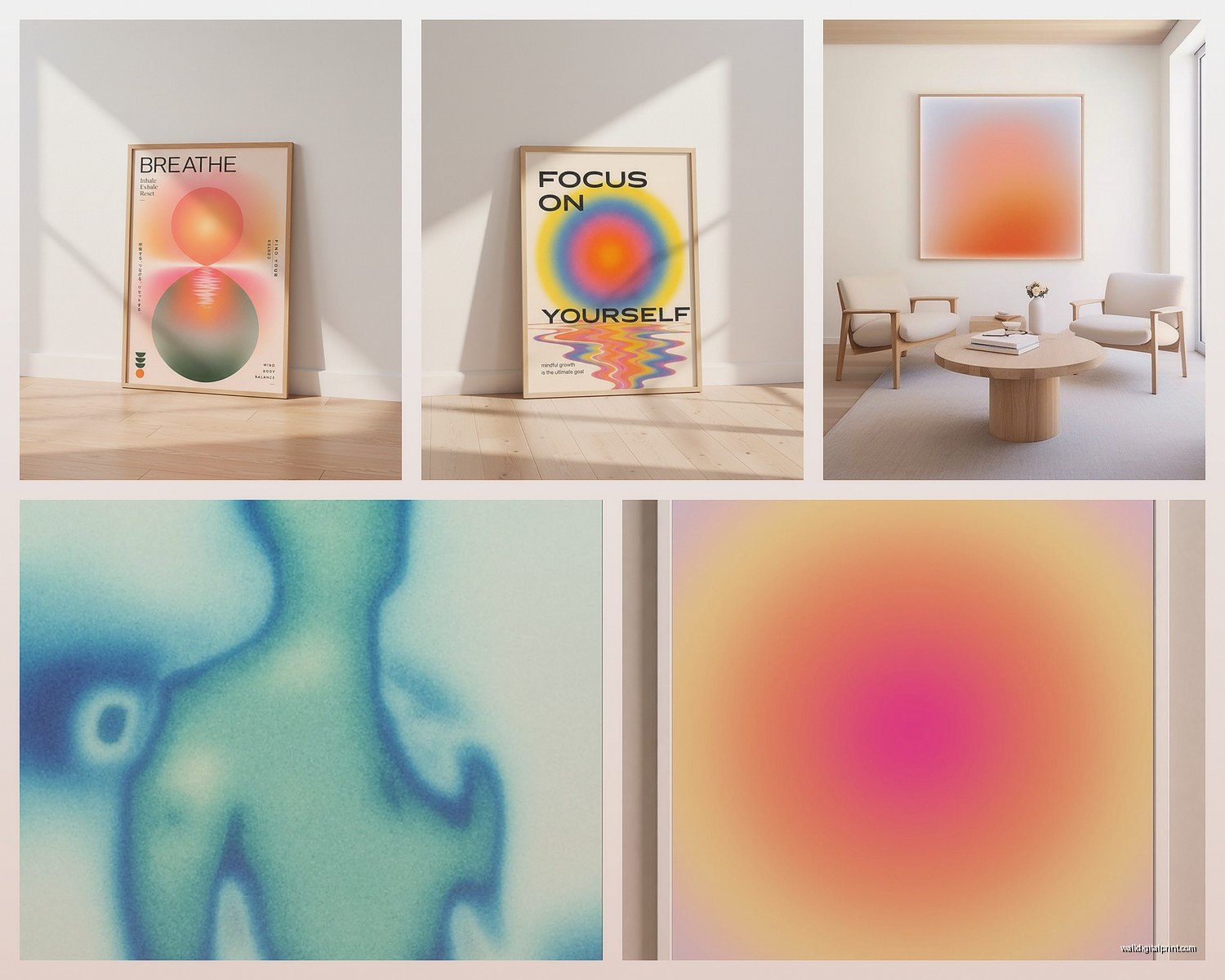
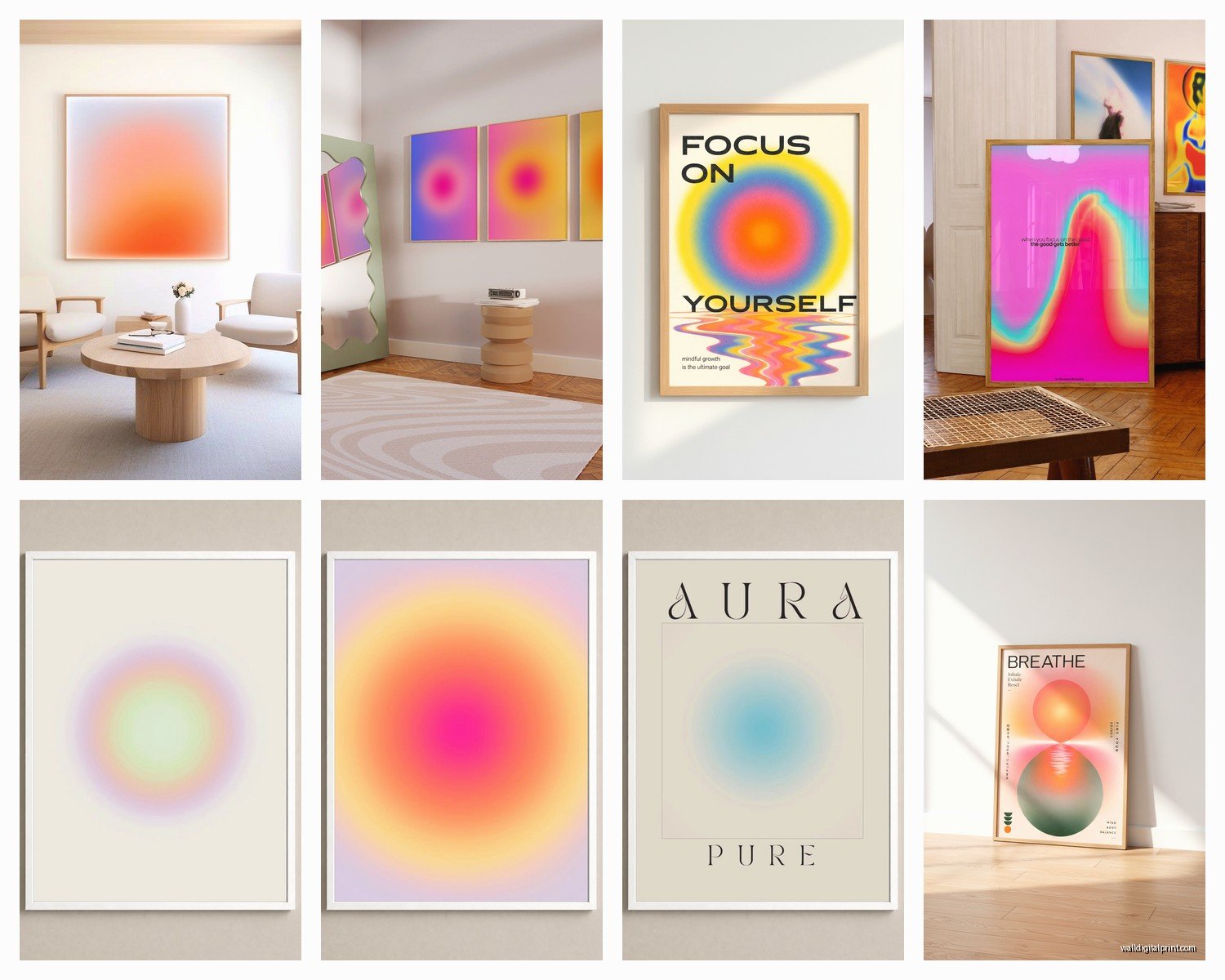
Aura Wall Art: Spiritual Energy Field Rainbow Designs
Jul
So I’ve been completely obsessed with aura wall art lately and honestly it started because a client asked me to find something “spiritual but not too woo-woo” for their meditation room and I went down this whole rabbit hole. Now I have like three pieces in my own apartment and my sister thinks I’ve lost it but whatever.
What Actually Makes Aura Art Work in a Space
Okay so the thing about aura designs is they’re basically these layered rainbow-gradient silhouettes that represent energy fields, right? And they can look absolutely stunning or completely ridiculous depending on how you use them. The key is understanding that they’re BOLD. Like, really bold. You can’t just slap one on any wall and expect it to work.
I learned this the hard way when I put this massive rainbow aura piece above a client’s already-colorful bohemian couch and it looked like a Lisa Frank explosion. Not in a good way.
The best approach I’ve found is treating them as your main color story for the room. If you’re going with aura art, that becomes your primary visual interest and everything else needs to calm down. Think neutral furniture, white or light gray walls, natural wood tones. Let the aura piece do all the talking.
Choosing the Right Style for Your Actual Life
There’s like a million variations of aura art now and honestly some of it is gorgeous and some is just… printed gradient circles that someone’s charging $200 for. Here’s what I’ve noticed actually works:
Body Silhouette Auras
These show a human figure with colorful energy layers radiating outward. Super popular for yoga studios and bedrooms. The ones that work best have clean silhouettes—not too detailed. I got one from this Etsy seller last month that has a meditation pose with about seven color layers and it’s perfect because the figure itself is just solid black so it grounds all that rainbow energy.
You want the color transitions to be smooth, not choppy. I’ve seen some where it looks like someone just used the gradient tool in PowerPoint and called it art. Pass on those.
Abstract Energy Field Designs
No human figure, just pure color waves and energy patterns. These are actually more versatile than you’d think because they read as abstract art first, spiritual second. My friend who’s super skeptical about anything “spiritual” has one in her living room and just tells people it’s contemporary abstract art.
Chakra-Focused Pieces
These specifically map to the seven chakra points with corresponding colors. More literal, more educational, honestly more limiting in terms of where they work in your home. Great for dedicated meditation spaces or if you’re really into energy work, but they can feel a bit instructional for everyday living spaces.
Size and Placement Strategy
Oh and another thing—size matters SO much with these. Because of all the color and movement, a tiny aura print can look kind of insignificant and lost on a wall. You need to go bigger than you think.
For above a bed or sofa, I’m usually recommending at least 36×48 inches. Sounds huge, I know, but the rainbow gradient effect needs space to actually develop and show those layers. I made the mistake of ordering a 16×20 inch print once and you literally couldn’t see the aura effect from more than three feet away. Total waste.
If you’re working with a gallery wall situation, you can go smaller but you gotta be strategic. I did this thing in my hallway where I mixed three 12×16 inch aura portraits with black and white photography and some line drawings. The key was keeping the aura pieces in a vertical line down the center so they created this energetic spine for the whole arrangement.
Where They Actually Look Good
- Bedrooms behind the bed—creates this dreamy, restorative vibe without being too precious about it
- Home office or creative studios—the rainbow energy thing is surprisingly motivating without being those gross corporate “HUSTLE” posters
- Yoga or meditation corners—obvious but true
- Bathrooms—wait this is gonna sound weird but I hung a smaller one in my bathroom and the humidity hasn’t damaged it (it’s acrylic) and there’s something nice about the calming energy when you’re taking a bath
- Living rooms IF and this is important, if the rest of your space is relatively minimal
Where they don’t work: kitchens (too busy), dining rooms (competes with food and people), kids’ rooms unless the kid specifically asked for it (the energy can be a lot for sleep).
Color Palette Coordination
This is where people mess up constantly. They see rainbow art and think they need to pull every single color into their room design. No. Stop. Don’t do that.
Pick ONE or TWO colors from the aura piece and echo them in your accessories. Like, if your aura art has this beautiful deep purple layer, get some purple throw pillows or a purple ceramic vase. That’s it. You’re creating a subtle connection, not matching everything like you’re decorating a theme restaurant.
My current living room has an aura piece that goes from gold through pink to purple to blue. I pulled out just the dusty pink and have it in my curtains and one throw blanket. The rest is cream, natural wood, and black accents. It feels intentional but not matchy-matchy.
Actually gonna mention—the gold tones in aura art are your best friend for making the whole thing feel more sophisticated and less teenage-bedroom-energy. Look for pieces that incorporate warm metallics in the gradient.
Frames and Presentation
Okay so funny story, I ordered this beautiful aura print and it arrived and I was about to put it in a standard black frame when my cat knocked over my coffee onto the frame and I had to scramble to find another option and ended up trying a floating frame situation and it was PERFECT.
Here’s the thing: aura art benefits from either floating frames (where there’s space between the art and the frame edge) or no frame at all if you’re doing canvas or acrylic. Traditional frames can box in the energy too much—yeah I know how that sounds but visually it’s true. The whole point is that the energy is radiating outward, so you don’t want a thick border containing it.
If you must frame, go with:
- Thin metal frames in gold, copper, or silver
- Light natural wood—maple or light oak, not dark walnut
- White or off-white float frames
Skip the thick ornate frames or anything in dark colors. Just trust me on this.
Print Quality Actually Matters Here
Because these pieces are all about smooth color gradients and that ethereal glow effect, print quality is not the place to cheap out. I’ve bought from print-on-demand sites and from actual art sellers and the difference is real.
Look for:
- Giclée prints on archival paper or canvas
- Acrylic or metal prints for a more modern look—the luminosity is insane
- At minimum 300 DPI resolution
- Real photos of the actual print, not just the digital mockup
The cheap prints have visible color banding where the gradients are, and it completely ruins the effect. You can literally see the stripes where one color becomes another instead of that smooth energy-field transition.
I spent like $85 on an acrylic print from a small artist on Instagram and it was worth every penny compared to the $30 Etsy print that looked pixelated. Sometimes you gotta invest.
Mixing Aura Art with Other Styles
This is where it gets interesting because aura art doesn’t have to exist in a total spiritual zen aesthetic bubble. I’ve mixed it with:
Modern Minimalism: Actually perfect together. The aura piece becomes the ONLY decorative element in an otherwise stark room. Very editorial, very “I definitely have my life together” energy.
Scandinavian Design: Works if you go light on the hygge stuff. The natural wood and white walls are ideal backdrops, but skip the excessive candles and cozy textiles or it becomes too much.
Art Deco Revival: Okay this surprised me but metallic aura prints with gold or copper tones fit beautifully with Art Deco’s geometric glamour. The curved energy lines play against angular deco patterns.
Bohemian—WITH CAUTION: You gotta edit heavily. Choose aura art OR patterned textiles, not both. I usually suggest if you’re going boho, use aura art in more muted color palettes—like earth-tone chakra pieces instead of full rainbow.
DIY vs. Buying from Artists
Look, you can technically make your own aura art with digital tools or even watercolors. I’ve seen tutorials. But here’s my honest take after trying it myself one weekend when I was bored—it’s harder than it looks to get that really smooth, glowing quality.
The digital ones I attempted looked flat and computer-generated in a bad way. The watercolor ones were actually pretty but didn’t photograph well and I couldn’t reproduce them.
If you’re artistically inclined, go for it, but otherwise I’d support actual artists who’ve figured out the technique. There are tons on Etsy, Instagram, and Society6 at various price points. I’ve found great pieces from $40 to $300 depending on size and whether it’s a print or original.
Practical Care and Longevity
These prints can fade if you put them in direct sunlight—learned that one the hard way when a client’s gorgeous rainbow aura piece turned mostly pale yellow after a summer in a west-facing room. Use UV-protective glass if you’re framing, or just don’t put them where direct sun hits for hours daily.
Canvas and paper prints need to stay away from humidity. Acrylic and metal prints are way more durable if you’re putting them in bathrooms or basements.
Dust them like you would any art—soft microfiber cloth, no cleaning products directly on the surface.
When It’s Too Much
Real talk: aura art isn’t for everyone or every space. If your style is more traditional, classic, or you prefer muted color palettes across the board, forcing aura art into your space is gonna feel inauthentic.
I had a client who really wanted to be into this trend but every option we tried felt wrong in her French country home. Sometimes you gotta accept that not every trend fits your actual aesthetic, and that’s completely fine.
Also if you already have a lot of color and pattern happening, adding rainbow energy fields is probably overkill. Sometimes the most spiritual thing you can do is leave a wall empty.
But if you’re drawn to these pieces, if you love color but want something more meaningful than random abstract art, if you’re building a space that feels personal and a little bit different from the standard home decor playbook—then yeah, aura wall art might be exactly what you need.
Just remember to keep everything else relatively simple, go bigger than you think, and don’t try to match every color in the rainbow. You’ll be fine.