Wall Art Guide, Wall Art Tutoriels
Tulip Wall Art: Spring Flower Dutch Garden Prints
Jul
So I’ve been obsessing over tulip prints lately and honestly it started because a client wanted to refresh her dining room but didn’t want the typical farmhouse look everyone’s doing. She sent me like fifteen inspiration photos at midnight and half of them had tulips, which I initially thought was gonna be too Easter-y but then I went down this whole rabbit hole and now I’m basically the person everyone texts about spring flower art.
The Dutch Garden Thing Actually Makes Sense
Okay so here’s what I figured out after ordering way too many samples—Dutch garden prints hit different than regular floral art. They’ve got this structured, almost architectural quality because Dutch artists were obsessed with botanical accuracy. You’re not getting those watercolor-y blobs that could be any flower. These are like… portraits of tulips, if that makes sense.
The ones from the Golden Age period (1600s) have this dark moody background situation that works in modern spaces way better than you’d think. I put one in my own kitchen last month and my sister was like “that looks expensive” and it was literally $40 from an Etsy shop that reproduces museum pieces. The dark backgrounds make the tulips pop without being cutesy.
Size Actually Matters More Than You Think
This is where everyone messes up and I did too at first. You see a gorgeous tulip print online, order it, and then it shows up and looks like a postage stamp on your wall. For tulip art specifically, you want to go bigger than your instinct tells you because tulips have this vertical thing going on.
Here’s my rough guide:
- Small spaces or gallery walls: 11×14 minimum, but 16×20 looks more intentional
- Over a console table or nightstand: 18×24 or 20×30
- Dining room or living room: don’t go smaller than 24×36, honestly 30×40 is better
- Large empty wall: 40×60 or go for a triptych situation
I learned this the hard way when I bought three 8x10s thinking they’d look cute clustered together and they just looked… apologetic? Like they were scared of the wall space.
Color Schemes That Won’t Make You Cringe in Six Months
Tulips come in literally every color which is great until you’re staring at 47 tabs trying to decide. My cat knocked over my coffee while I was doing this research last week and I’m still finding sticky spots.
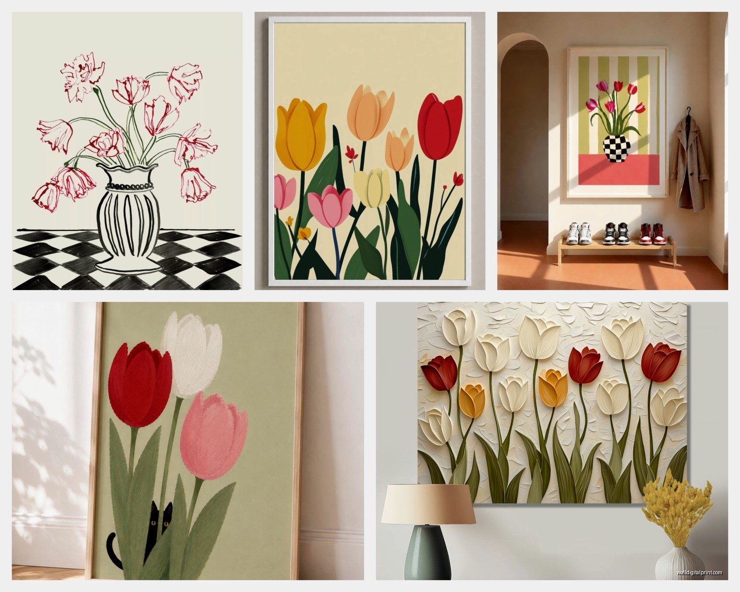
Red tulips: Classic but can read very Valentine’s Day if you’re not careful. The trick is getting prints where the red has depth—burgundy tones, not candy apple. Pairs well with navy, charcoal, or even blush pink walls. I used a red tulip print in a client’s library and it looks sophisticated because everything else in the room is neutral leather and dark wood.
Pink tulips: This is where Dutch garden prints really shine because the historical ones have these dusty, muted pinks that aren’t Barbie-core at all. They work in literally any room. I’m seeing them in masculine spaces paired with black frames and concrete textures and it totally works.
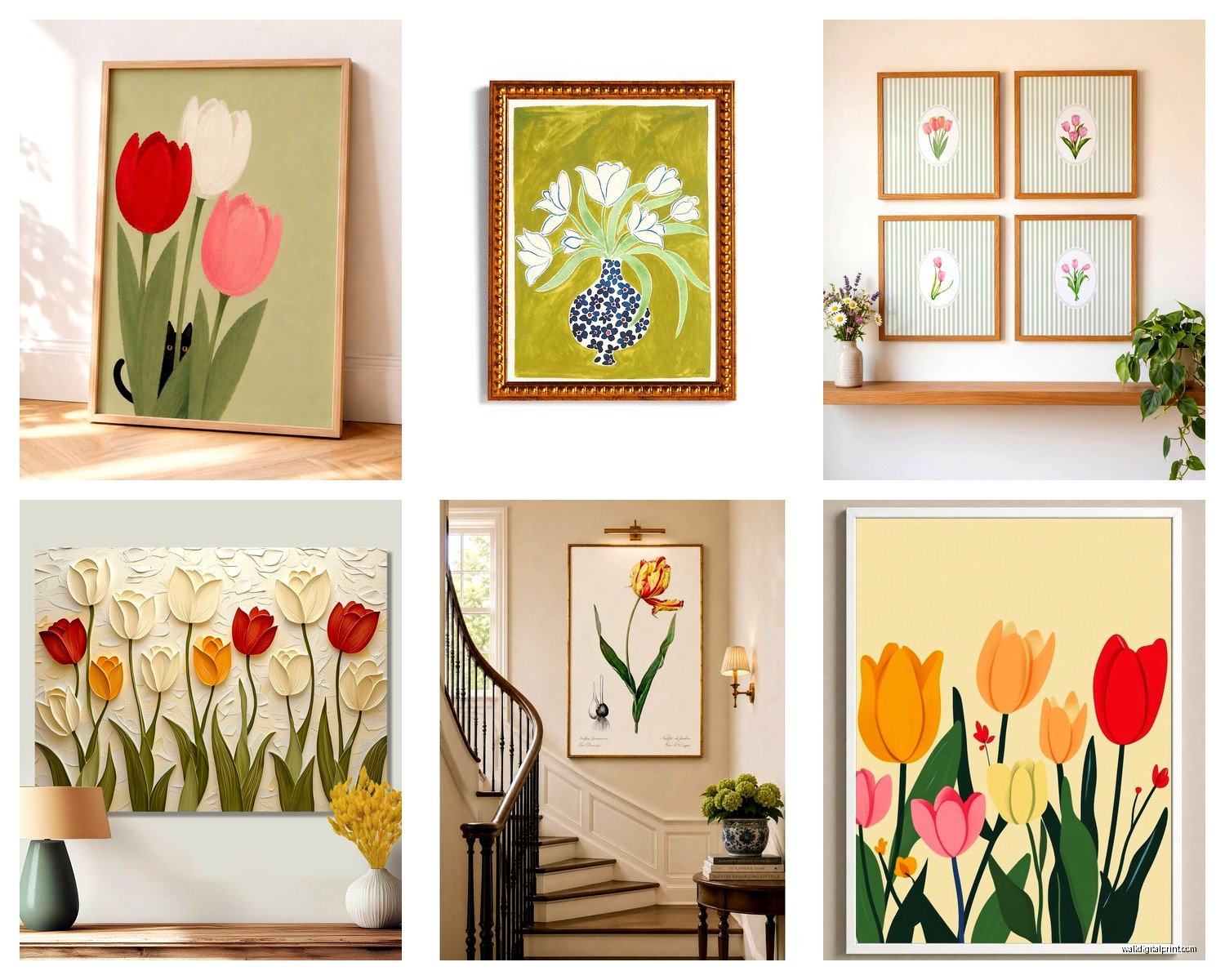
White tulips: Underrated honestly. They give you that fresh spring feeling without screaming SPRING at everyone who walks in. The botanical illustration style ones with the stems and leaves showing are my favorite for this. They’re architectural enough for modern spaces.
Yellow tulips: Gonna be real with you, these are tricky. They can look amazing or they can make your room feel like a dentist’s office. The key is going for prints where the yellow has some variation—not solid sunshine yellow. Look for ones with cream, gold, or even greenish tones mixed in.
Purple/burgundy tulips: These are my secret weapon for people who say they don’t like floral art. They’re moody enough that they read more as still life paintings than flower prints. Work great in bedrooms, home offices, or anywhere you want a sophisticated vibe.
Mixed Color Prints
Dutch garden prints traditionally show multiple tulip varieties together and this is actually the easiest route if you’re indecisive. The variety keeps it interesting and you can pull accent colors from the print for your throw pillows or whatever. Just make sure the print has a unifying element—usually that dark background or a consistent artistic style.
Frame Choices That Won’t Break the Bank
Oh and another thing—frames can make or break these prints and also destroy your budget if you’re not careful. I spent like three hours at a framing shop once and almost cried at the quote.
Black frames: Safe choice, always looks good, makes the colors pop. Go for a simple profile, nothing ornate. I get mine from IKEA mostly (the RIBBA or KNOPPANG) and then swap out the mat for a custom one if I’m feeling fancy.
Natural wood: Works beautifully with the botanical illustration style tulip prints. Light oak or ash tones keep it fresh. Darker walnut tones make it more traditional in a good way.
White frames: I used to think these were boring but they’re actually perfect for maximalist spaces where you need the art to feel lighter. Also good if your walls are colorful.
Gold/brass frames: This is gonna sound weird but thin gold frames with Dutch Golden Age style tulip prints are *chef’s kiss*. They reference the historical aspect without being costume-y. Keep the profile thin though—like quarter inch or less.
For the actual framing, if the print is a reproduction you can usually just get it printed on nice paper and frame it yourself. I use a local print shop that does archival printing for like $15-30 depending on size. Way cheaper than buying pre-framed art that comes in a frame you’ll probably want to replace anyway.
Where to Actually Find Good Prints
I’ve tested this extensively because I’m constantly sourcing for clients and my own spaces.
Museum reproduction sites: The Rijksmuseum in Amsterdam has their entire collection digitized and you can download high-res images for free. Same with the Met and several other museums. You can take these to a print shop or upload to an online printing service. This is how I got that kitchen print I mentioned.
Etsy: Search for “vintage tulip botanical print” or “Dutch tulip art print.” There are shops that specialize in historical botanical reproductions. Read the reviews to make sure the print quality is actually good—some sellers just screenshot images and the quality is garbage.
Society6 and similar: Good for more modern interpretations if you want something less historical. The quality is consistent and they have tons of size options. I ordered a duvet cover from them once while watching some crime documentary at 2am and that’s a different story but their prints are solid.
Local art fairs: If you have botanical gardens nearby, they often have plant-themed art sales. The prices are usually reasonable and you’re supporting local artists. Plus you can see the actual print quality before buying.
Antique shops: Sometimes you can find actual vintage prints for not much more than reproductions cost. They have that authentic aged quality that you can’t really fake. Just check for fading or damage.
Styling Them Without Making It Look Like a Garden Center
Wait I forgot to mention—the biggest mistake I see is people treating tulip prints like they need to live in a spring-themed room. They don’t. Actually they look best when you don’t do the whole spring thing.
In modern spaces: One large-scale tulip print on a white or concrete gray wall. Nothing else competing with it. Maybe a sculptural vase nearby but empty or with one dramatic stem. That’s it.
In traditional spaces: Gallery wall with mixed botanical prints—tulips, peonies, roses. Keep the frames consistent. I did this in a client’s hallway with all black frames and white mats and it looks like something from a historical estate.
In bedrooms: Above the bed is obvious but I actually prefer tulip prints on the wall opposite the bed so you see them when you wake up. Pairs well with linen bedding in neutral tones. The contrast between the soft bedding and the structured tulip forms is nice.
In dining rooms: This is where you can go bigger and bolder. A statement piece or a triptych. The formality of tulip prints suits dining spaces really well.
In bathrooms: Small botanical tulip prints in water-resistant frames. Creates a spa-like feeling without being cliché. I have a tiny one in my powder room and people always comment on it.
Things to Avoid
Don’t mix tulip prints with other spring flowers in the same space—it gets too busy and loses impact. Pick your flower and commit.
Don’t use super colorful mats—stick with white, cream, or black. The mat should disappear.
Don’t hang them too high—center of the print should be at eye level, which is usually around 57-60 inches from the floor.
Don’t go for prints with added text or quotes—keep it purely visual. The “bloom where you’re planted” type stuff makes it feel cheap even if the print is nice.
Seasonal Flexibility
Okay so funny story, I thought I’d have to swap out my tulip prints when spring ended but they’ve been up for almost a year now and I have zero desire to change them. The trick is choosing prints that don’t scream SPRING CELEBRATION.
The historical Dutch ones work year-round because they have that timeless quality. The darker, moodier prints especially feel appropriate in fall and winter. I have a burgundy tulip print that honestly looks more autumnal than spring-like.
If you wanna switch things up seasonally without buying new art, just change the accessories around the print—different throw pillows, seasonal branches in a nearby vase, whatever. The print stays, the mood shifts.
Quick Fixes for Common Problems
Print looks washed out: Wrong paper type. If you’re printing yourself, use a print shop that offers fine art paper or photo paper with a matte finish. Glossy paper makes botanical prints look cheap.
Colors don’t match your space: Try a different mat color. A cream mat can warm up cool-toned prints, a bright white mat can cool down warm-toned prints.
Too formal/traditional: Switch to a more modern frame style or go frameless with a floating mount.
Too casual: Upgrade the frame quality and add a mat if you don’t have one. The mat creates distance between the art and frame that elevates the whole thing.
Looks lonely on the wall: Either go bigger with the print size or create a small gallery wall situation. Three prints in a row works well with tulip art.
The thing about tulip prints is they’re way more versatile than people think. They’re not just for spring, they’re not just for traditional spaces, and they definitely don’t have to cost a fortune. I’ve got them in my own place, I use them constantly for clients, and I’m still finding new ways to make them work.
Just start with one print that actually speaks to you, get it properly sized and framed, and see how you feel. You can always add more later or you might find that one statement piece is all you need.