Wall Art Guide, Wall Art Tutoriels
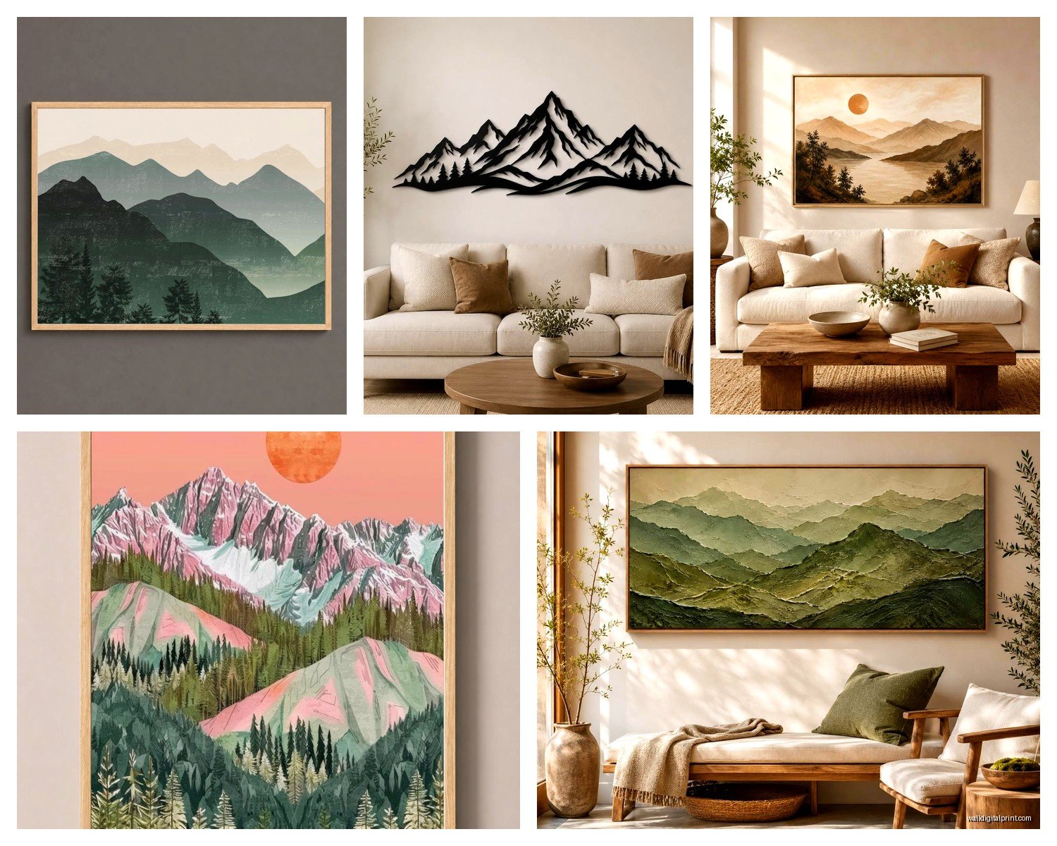
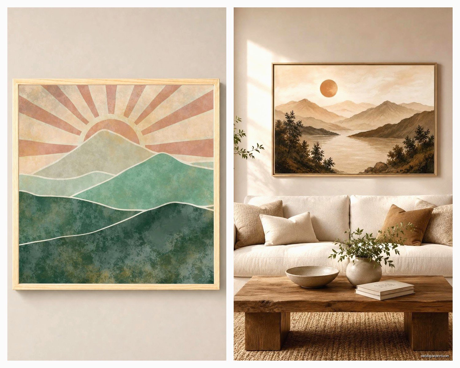
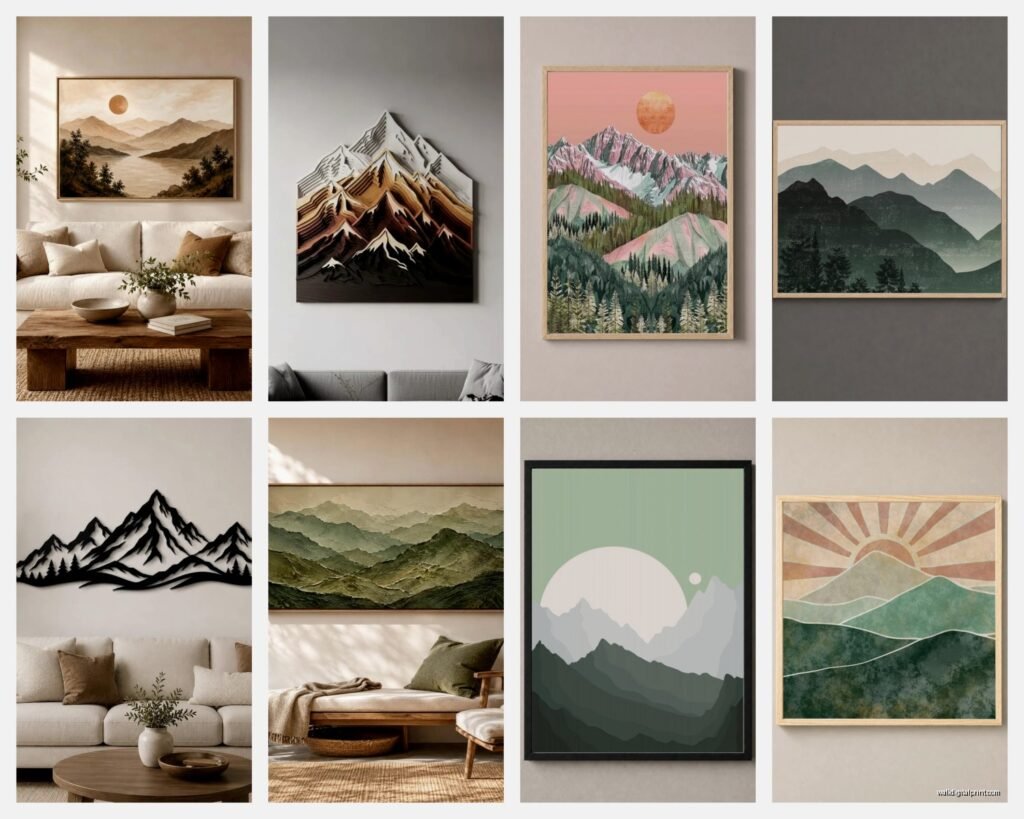
Mountains Wall Art: Alpine Peak Nature Landscape
Jul
So I’ve been down this rabbit hole with mountains wall art lately because honestly, my living room was looking sad and I needed something that didn’t scream “I bought this at a hotel liquidation sale.” Alpine landscapes are trickier than you’d think to get right.
Figuring Out What Actually Works on Your Wall
Okay first thing – and I cannot stress this enough – measure your wall space before you fall in love with anything. I learned this the hard way when I ordered this gorgeous Matterhorn print that was literally 18 inches wide and my wall space was like 6 feet. Looked ridiculous, like a postage stamp. You want your mountain art to take up roughly 60-75% of the wall width it’s going on. Less than that and it just floats there awkwardly.
The height thing matters too. If you’re hanging above a sofa or console table, leave about 6-8 inches between the furniture and the bottom of the frame. I usually go for 7 inches because it feels balanced but not too separated, if that makes sense.
Size Categories That Actually Matter
- Small prints (16×20 to 24×36): Good for gallery walls or tight spaces like hallways
- Medium (30×40 to 40×60): This is your sweet spot for most living rooms above sofas
- Large statement pieces (48×72 and up): When you want the mountains to BE the room
I’ve got a 40×60 canvas of the Dolomites in my office and it’s perfect – big enough to make an impact but doesn’t overwhelm the space.
Color Palettes Because Mountains Aren’t Just Gray and White
This is where people mess up constantly. They think mountain art means cold and sterile, but there’s so much range. I was watching The Crown the other night (totally hooked btw) and noticed how they use landscape art with these warm undertones even in the coldest scenes.
Blue Hour Alpine Scenes
Those twilight mountain shots with deep blues and purples – these work insanely well in bedrooms. The cool tones are calming without being boring. I hung one in a client’s master bedroom last month and she literally texted me at midnight saying she keeps staring at it before sleep. Pair these with warm wood furniture or brass accents to keep things from feeling too cold.
Golden Hour Peaks
When the sun hits the mountains and everything goes amber and pink? Chef’s kiss. These warmer alpine landscapes are perfect for spaces that need energy – living rooms, dining areas, home offices. The warm tones make the room feel more inviting, less like a dentist’s waiting room.
Black and White Drama
Monochrome mountain photography is having a moment and I’m here for it. Super versatile, works with literally any color scheme. But – and this is important – make sure the contrast is strong. Muddy grays will just disappear on your wall. You want crisp whites and deep blacks.
Material Choices That Actually Matter
Okay so funny story, I bought a canvas print once that arrived looking like someone printed it on a bedsheet. The texture was so prominent you couldn’t even see the details of the mountain ridge. Never again.
Canvas Prints
Good for: casual spaces, rooms where you want texture
Bad for: anywhere you need fine detail or archival quality
Canvas gives you that gallery-wrapped look without frames, which is clean and modern. But the weave can obscure details, especially in prints with lots of fine lines like distant mountain ranges or alpine trees. Go for tight-weave canvas if you’re gonna do this.
Framed Prints on Paper
This is what I use most often. You get better detail, more color accuracy, and it feels more intentional. Photo paper or fine art paper both work – photo paper has that slight sheen, fine art paper is matte and sophisticated.
Frame choice here is crucial though. Black frames are safe but can feel heavy with dark mountain scenes. I love natural wood frames with alpine landscapes – the wood echoes the natural element. White frames work great for minimalist spaces or if your mountains have lots of snow.
Metal Prints
Wait I forgot to mention these earlier but they’re actually amazing for mountain landscapes. The print is infused directly onto aluminum, gives you this incredible depth and vibrance. Colors pop like crazy. I have a metal print of the Canadian Rockies and the blues in the glacial lakes are unreal.
Downside: they’re pricey and can feel too modern for traditional spaces. Also my cat knocked one off the wall once and it dented. Still bitter about that.
Acrylic Prints
Ultra-modern, super glossy, makes colors incredibly vibrant. Think of it like your mountain landscape but make it luxury. The depth you get from the acrylic layer is pretty spectacular. But they show fingerprints and dust like nobody’s business, and honestly they can feel too contemporary for some spaces.
Composition Styles to Consider
Not all mountain art is created equal in terms of composition and it affects how the piece feels in your space.
Panoramic Horizontal Views
These long, stretched mountain ranges work perfectly above sofas or beds. They emphasize width and make rooms feel wider. I’m obsessed with panoramic alpine shots that show an entire mountain range – there’s something about that expansive view that makes even small rooms feel bigger.
Vertical Peak Shots
Single dramatic peak compositions in vertical orientation – these are underused and I don’t know why. They’re perfect for narrow wall spaces, next to doorways, in bathrooms. A tall vertical mountain print can make your ceilings feel higher.
Triptychs and Multi-Panel Sets
Three-panel mountain landscapes are everywhere right now and when done right, they’re stunning. The key is making sure the panels actually work together as one cohesive image. I’ve seen so many where it’s just three random mountain photos slapped together and it looks disjointed.
Specific Alpine Regions and Their Vibes
Different mountain ranges genuinely give off different energies, which sounds woo-woo but it’s true.
The Swiss Alps tend to be dramatic and iconic – think Matterhorn, Eiger. These are recognizable and impressive, work great in formal spaces or offices.
The Dolomites have this unique pink/orange coloring during sunrise and sunset. More romantic, softer despite being jagged peaks. Perfect for bedrooms or creative spaces.
The Canadian Rockies give you those incredible turquoise glacial lakes. Super vibrant, works well in modern spaces or anywhere you want a pop of color.
Norwegian fjord mountains are moody and dramatic. Lots of dark blues and grays, often with water in the foreground. These are amazing for creating atmosphere in dens or reading nooks.
The Tetons are rugged and American – if you want that national park vibe, this is your move.
Mixing Mountains with Your Existing Decor
This is where people get nervous but honestly it’s not that deep.
Modern Minimalist Spaces
Go for clean, simple mountain compositions. Black and white photography or single peak shots. Avoid busy foregrounds or too many elements. Frame in black, white, or natural wood with clean lines.
Rustic or Farmhouse Styles
You want warmer mountain scenes here – golden hour lighting, maybe some alpine meadows in the foreground. Wood frames are your friend. Canvas works great in these spaces too.
Scandinavian/Nordic Vibes
Light, airy mountain scenes. Think snow-covered peaks with lots of white space. Minimal foreground elements. White or light wood frames.
Eclectic Bohemian
Honestly you can go wild here. Mix mountain prints with other nature art, use colorful frames, try different sizes in a gallery wall. The mountains can be more stylized or artistic rather than straight photography.
The Gallery Wall Situation
Oh and another thing – if you’re thinking about incorporating mountain art into a gallery wall, there are rules. Not strict rules, but guidelines that’ll save you from chaos.
Keep your mountain pieces to similar color palettes even if they’re different scenes. Three different alpine landscapes with completely different color temps will fight each other.
Vary the sizes but maintain visual balance. I usually do one larger mountain piece as an anchor and smaller complementary prints around it. Mix in some smaller nature elements – alpine flowers, wildlife, forest details.
Keep frames consistent. All black, all wood, or all white. Mixing frame colors in a gallery wall with mountain art specifically tends to look messy because the landscapes themselves already have so much visual information.
My Go-To Gallery Wall Formula
- One large mountain landscape (30×40 or bigger) as the focal point
- Two medium complementary nature prints (maybe alpine meadows or detail shots)
- Three to four smaller prints in a mix of orientations
- Everything in matching frames with consistent matting
Lighting Your Mountain Art
Nobody talks about this enough but lighting can make or break your mountain art. I hung this gorgeous Mont Blanc print and it looked flat and dull until I added proper lighting.
Picture lights are classic – those little lights that mount above the frame. They work great for framed prints but can create glare on glass or acrylic.
Track lighting or adjustable ceiling spots let you angle light onto the art without glare. This is what I use most often.
Natural light is tricky with mountain art. Too much direct sunlight will fade your prints over time. If your art is opposite a window, you’re usually fine. Direct sunlight on the art? Get UV-protective glass or acrylic.
Where to Actually Buy This Stuff
Real talk – I’ve bought from probably 15 different places and quality varies wildly.
Etsy has tons of options, especially for digital downloads you can print yourself. But you gotta read reviews carefully because quality control is inconsistent. I’ve gotten incredible alpine prints from small photographers and also received pixelated garbage.
Society6 and Redbubble are decent for affordable options. The print quality is pretty reliable, lots of frame choices. Not gallery-quality but totally fine for most spaces.
For higher-end stuff, look at actual photography galleries online. Artists who specialize in alpine landscape photography often sell directly. More expensive but the quality difference is noticeable.
Custom printing through professional print shops – if you find a photo you love, you can often get it printed at really high quality. I use a local print shop sometimes and the color accuracy is way better than print-on-demand services.
Common Mistakes to Avoid
Hanging too high – the center of your art should be at eye level, which is usually around 57-60 inches from the floor. Exception is if you’re hanging above furniture.
Choosing art that’s too small – I mentioned this before but seriously, go bigger than you think. Small art on big walls looks lost.
Ignoring undertones – if your room has warm undertones and you hang a super cold blue mountain scene, it’s gonna feel off. Pay attention to the temperature of the colors in your art and your space.
Forgetting about negative space – mountains are dramatic and busy. Make sure they have room to breathe on your wall. Don’t crowd them with too much other stuff nearby.
Seasonal Switching
This is gonna sound extra but I actually swap some of my mountain art seasonally and it’s kinda great. Summer I go for greener alpine meadow scenes, winter I lean into snow-covered peaks. You don’t have to do this but if you’re an art person it keeps things fresh.
Budget Breakdown
Since you’re probably wondering what this actually costs:
Budget-friendly (under $100): Print-on-demand sites, Etsy downloads with local printing, smaller sizes
Mid-range ($100-300): Better quality canvas prints, framed prints from photography sites, medium to large sizes
Investment pieces ($300+): Original photography prints, large-scale pieces, metal or acrylic prints, custom framing
I usually tell people to invest in one really good large piece rather than several mediocre ones. But that’s just me.
Anyway, hopefully this helps you figure out your mountain art situation. There’s honestly so much more I could say about specific compositions and regional styles but this is already getting long and I gotta go feed my dog who’s been staring at me for the past ten minutes.