Wall Art Guide, Wall Art Tutoriels
Dior Wall Art: Fashion Designer Brand Luxury Decor
Jul
So I’ve been totally obsessed with Dior wall art lately and honestly it started because a client asked me to source some luxury fashion pieces for her walk-in closet and I fell down this whole rabbit hole of what actually works versus what just looks like you’re trying too hard, you know?
The Different Types You’ll Actually Find
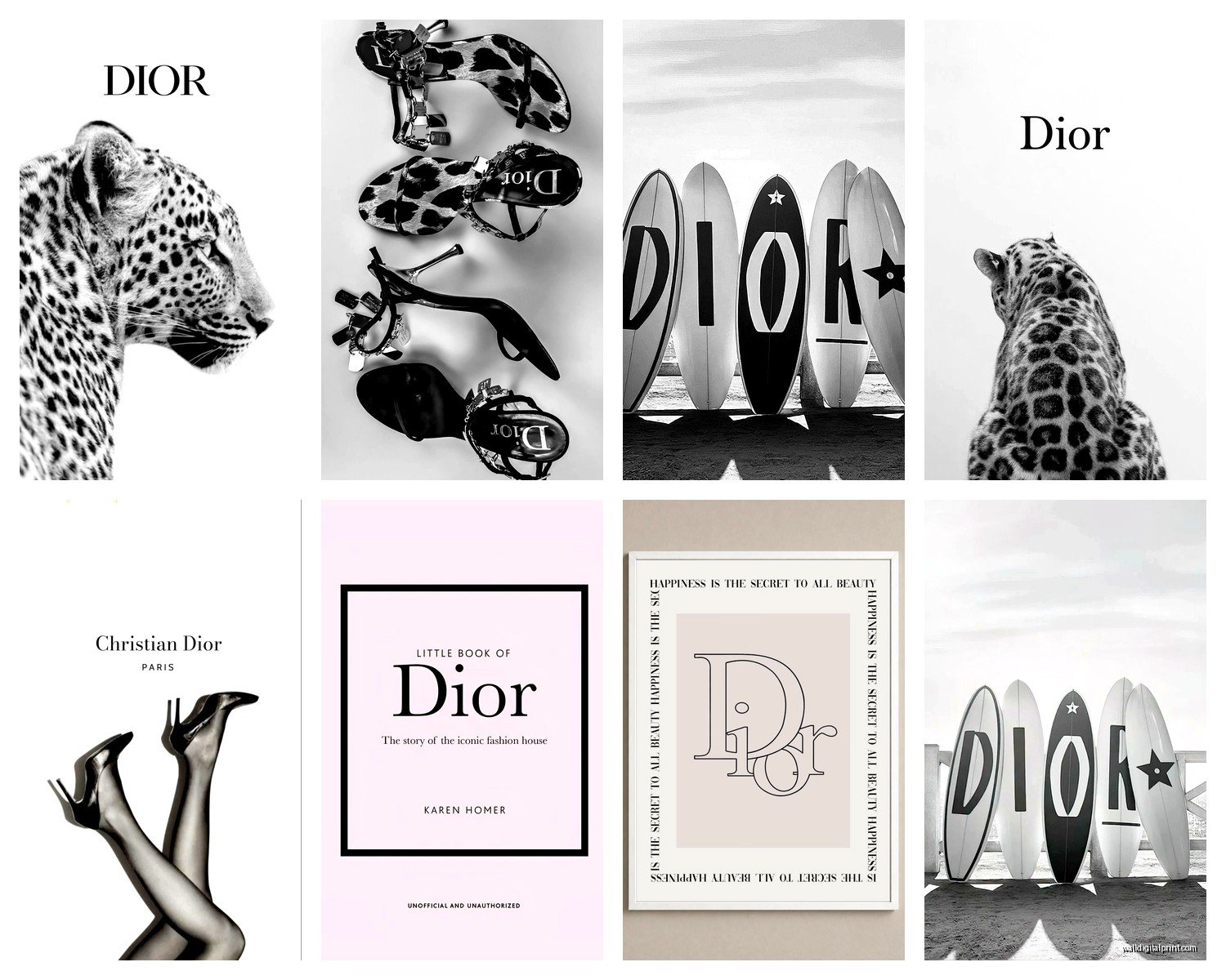
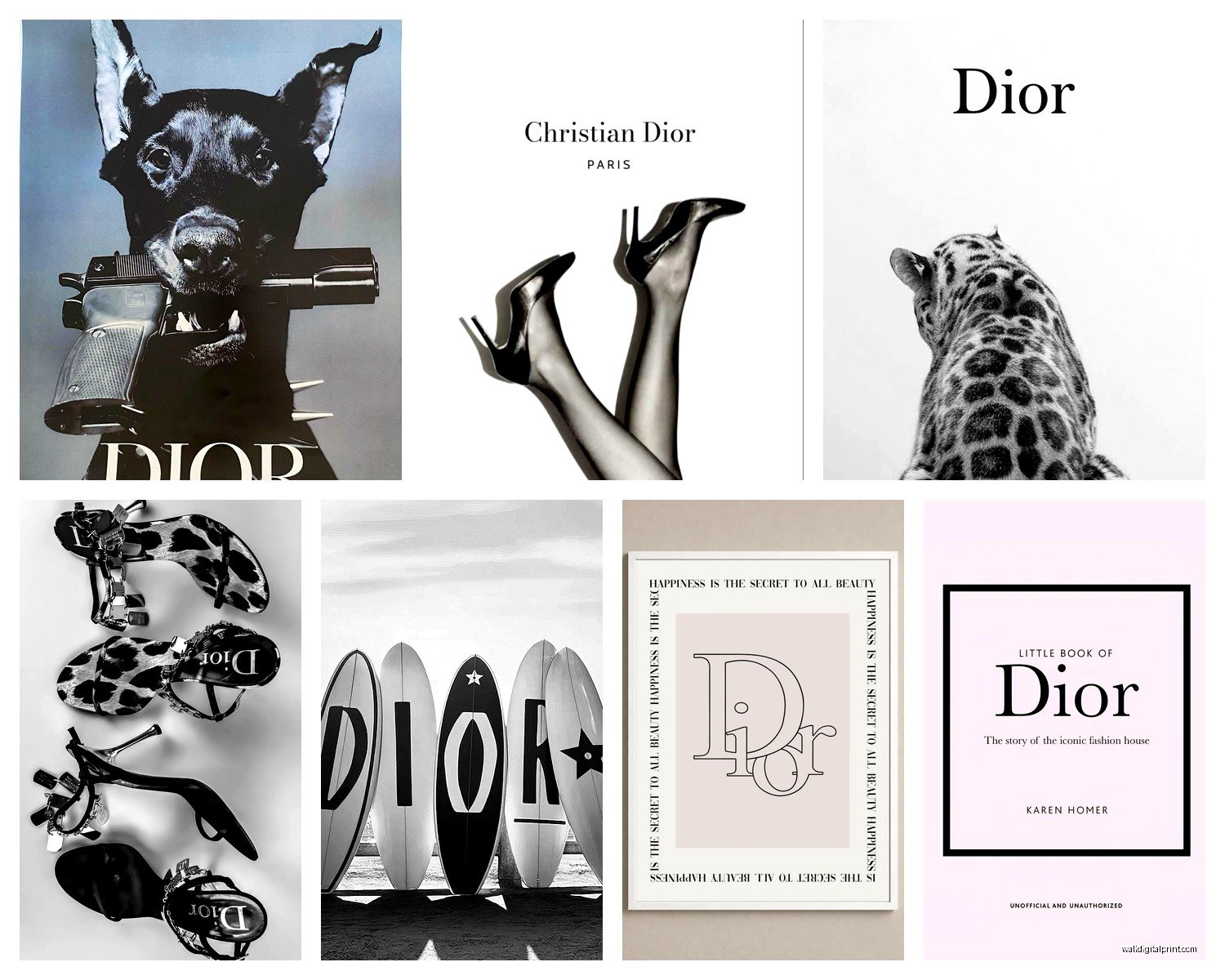
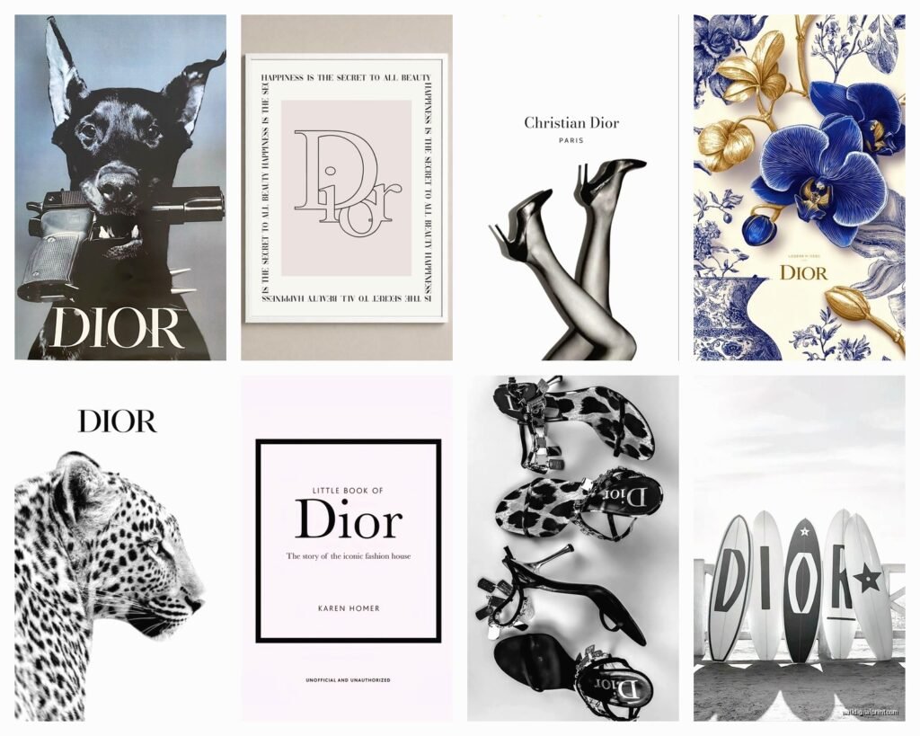
Okay so first thing – Dior wall art isn’t just one thing. There’s like several categories and some are gonna work way better for your space than others. The main ones I see are the vintage poster reproductions, the fashion illustration prints, canvas pieces with the logo or signature elements, and then there’s this whole category of abstract stuff that just has like the Dior vibe without being super obvious about it.
The vintage poster reproductions are probably the most popular and honestly they’re my go-to recommendation for most people. These are based on actual Dior advertisements from like the 50s and 60s, very Parisian, very chic. You can find them framed or unframed and the quality varies SO much. I learned this the hard way when I ordered three different versions of the same Miss Dior ad to compare and wow, the color saturation differences were insane.
Where to Actually Buy This Stuff
Here’s where it gets tricky because Dior doesn’t really sell official wall art through their boutiques in most cases. I mean occasionally they’ll have limited edition artist collaborations but those are like thousands of dollars and honestly? Not always worth it unless you’re a serious collector. Most of what you see online is either vintage original posters (expensive and hard to authenticate) or reproduction prints from various sellers.
Etsy is gonna be your main hunting ground. I know I know, but hear me out – there are some really quality print shops on there that use museum-grade paper and proper printing techniques. The key is reading reviews obsessively and looking at customer photos not just the listing photos. I spent like two hours one night while watching that new show on Netflix (the one about the chef, can’t remember the name) just comparing different Etsy shops.
Some specific things to look for: shops that mention archival paper, giclée printing, and show you the actual texture in their photos. If everything looks too smooth and perfect it’s probably just gonna be a basic poster print that’ll fade.
Sizing and Placement Because This Matters More Than You Think
The biggest mistake I see people make is going too small. Like they’ll get an 8×10 Dior print and hang it on this massive wall and it just looks sad and lost. For a statement piece you really want at least 16×20, preferably bigger. I usually do 24×36 for focal walls or above a dresser.
Oh and another thing – the height you hang it matters SO much. I have this whole thing about eye level but with fashion art specifically, I actually like going slightly higher than traditional gallery height because it creates this aspirational feeling? Sounds pretentious but it works. About 60 inches to the center of the frame usually.
For closets or dressing areas, you can cluster smaller pieces which actually looks really good. I did a gallery wall in my own closet with four different Dior perfume ads from the 60s, all in matching gold frames, and it totally transformed the space. My cat keeps trying to knock them down though which is fun.
The Logo Question
So here’s something nobody talks about – how obvious do you want the branding to be? Some pieces are just the Dior logo in different fonts or styles, super minimalist. Others are full fashion illustrations or vintage ads where the brand is part of a bigger composition.
I personally think the logo-only pieces work better in closets, dressing rooms, or really modern minimalist spaces. They can read as too commercial in a bedroom or living area. But the vintage ads or fashion illustrations feel more like actual art, you know what I mean? They tell a story, they have this whole aesthetic beyond just brand worship.
There’s this one print I keep coming back to – it’s a watercolor-style illustration of a woman in a Dior dress from behind, very abstract and soft, with just a tiny Dior signature in the corner. That kind of subtlety usually works better for main living spaces.
Framing Because You Gotta Frame It Right
Okay this is gonna sound weird but the frame matters more than the actual print sometimes. I’ve seen gorgeous Dior prints totally ruined by cheap frames from like Target or wherever. Not that all affordable frames are bad but there’s a specific look you’re going for with luxury fashion art.
For vintage-style ads I almost always go with thin black frames or gold frames depending on the room. Black works in modern spaces, gold works if you’ve got any traditional or glam elements. White frames can work too but they need to be the right white – not bright white, more of a soft white or cream.
The mat matters too. I usually do a white or cream mat, sometimes black if the piece has a lot of black in it already. Double matting looks extra fancy if you wanna go that route – like a thin inner mat in gold or black with a wider outer mat in white.
Custom framing is expensive though, not gonna lie. If you’re on a budget, Michaels or Hobby Lobby with a 50% off coupon is honestly fine. Just stay away from anything too ornate or busy. The frame should basically disappear and let the art be the focus.
Mixing Dior with Other Art
Wait I forgot to mention – you probably don’t want your whole house to be Dior prints unless you’re like really committed to that specific aesthetic. I usually mix one or two Dior pieces with other fashion illustrations, abstract art, or photography.
In my living room I have a Dior perfume bottle print mixed with some abstract black and white pieces and a vintage fashion photograph that’s not branded at all. It creates this cohesive fashion-forward vibe without being too matchy or theme-y.
The key is sticking to a color palette. Most Dior art is gonna be black, white, gold, maybe some pink or red. Keep your other pieces in that same color family and it’ll all work together even if the subjects are different.
The Bedroom vs Living Room Debate
So here’s my take after doing this in probably 30+ homes – Dior art works GREAT in bedrooms, closets, dressing areas, and home offices. It can work in living rooms but you gotta be more careful about it not looking like a teenager’s room or too commercial.
In bedrooms I go bigger and bolder. Like a large canvas above the bed with a Dior quote or a dramatic fashion illustration. It sets this whole luxurious getting-ready vibe. I did one client’s primary bedroom with a huge Dior perfume bottle print and it literally became the whole design inspiration for the room.
Living rooms need more subtlety usually. Maybe a smaller piece as part of a gallery wall, or something more abstract that just has the Dior aesthetic without being super obvious. Unless your whole living room is very glam and fashion-forward, then you can get away with more.
DIY Options If You’re Crafty
Okay so funny story – I actually made some of my own Dior-inspired art for a client once because she wanted something super specific that didn’t exist. Got some high-res vintage Dior ads (you can find these in design archives and fashion history databases), printed them at a professional print shop, and framed them myself.
This is technically a gray area legally if you’re reproducing copyrighted ads, so I’m not saying everyone should do this, but for personal use and vintage ads that are decades old, a lot of people do it. The quality depends entirely on your source image and where you get it printed though.
FedEx Office and local print shops can do really nice large format prints on good paper. You just need to make sure your digital file is high enough resolution – at least 300 dpi at the size you want to print.
What Actually Looks Expensive vs Cheap
There’s definitely a difference between Dior wall art that looks expensive and elevated versus stuff that looks like dorm room decor. Here’s what I’ve figured out makes the difference:
The printing quality is number one. Fuzzy edges, pixelation, weird color casts – all dead giveaways of a cheap print. The paper matters too – you want something with some weight and texture to it, not just regular printer paper.
The styling around it matters just as much as the art itself. A Dior print in a nice frame, properly hung, with good lighting? Looks luxurious. The same print in a cheap frame hung crooked with a thumbtack? Not so much.
Lighting is something people forget about but it’s huge. I always try to get some kind of light source near fashion wall art – either natural light or a picture light or even just a nearby lamp. Fashion art specifically looks better with good lighting because it’s all about the details and glamour.
The Controversial Take on Canvas Prints
So canvas prints are super popular for Dior art but I’m honestly not always a fan. They can look really good in the right space but they can also look cheap and commercial if not done right. The quality of the canvas print matters SO much – cheap ones have this weird texture and the colors look flat.
If you’re gonna do canvas, go for a reputable company and make sure they’re using actual artist-grade canvas and inks. And honestly? I think framed prints usually look more sophisticated. Canvas has its place but framed paper prints feel more gallery-like and less mass-produced.
The exception is really large pieces. Like if you want something 40×60 or bigger, canvas might be your only affordable option. Just make sure the edges are finished nicely and the stretching is tight and even.
Keeping It From Looking Too Teenage
This is the thing everyone worries about right? Like how do you do fashion brand wall art without it looking immature or try-hard. I’ve definitely figured out some rules here.
Less is more with logos. One piece with obvious branding is chic. Five pieces all screaming DIOR is too much unless you’re doing a dedicated closet or dressing room.
Mix in non-branded pieces. The Dior stuff should be accent pieces not your entire art collection.
Go vintage or artistic over modern and commercial. A vintage 1960s Dior ad feels like fashion history and art. A modern logo print can feel more like advertising.
Frame quality matters more than you think for making it look grown-up. Good frames immediately elevate the whole thing.
My Current Favorites
Okay so right now I’m obsessed with the watercolor-style Dior fashion illustrations. They’re feminine without being too girly, artistic without being too abstract. There’s this one seller on Etsy who does custom ones and they’re incredible – she can match colors to your room which is perfect.
The vintage Miss Dior perfume ads are classics for a reason. Very Parisian, very elegant, work in almost any space. I probably use these more than anything else in client projects.
And then there’s these more abstract pieces that just use the Dior color palette and vibe without being super literal about it. Like abstract gold and black brush strokes with a tiny Dior signature. Those work great for people who want the luxury fashion feeling without it being too obvious.
Honestly the main thing is making sure whatever you choose actually fits your space and style. I’ve seen people try to force Dior art into like a rustic farmhouse aesthetic and it just doesn’t work. But in modern, glam, contemporary, or even traditional-with-a-twist spaces? It can be absolutely perfect and really elevate the whole room.
Just take your time choosing, invest in proper framing, and don’t go overboard with too many pieces. Quality over quantity every single time with this stuff.