
Wall Art Guide, Wall Art Tutoriels
Fern Wall Art: Botanical Green Plant Frond Prints
Jul
So I’ve been completely obsessed with fern prints lately and honestly it started because this client wanted “something green but not another monstera” and I was like okay challenge accepted. Spent way too much time researching this stuff and now my apartment looks like a Victorian conservatory but whatever.
Why Fern Prints Actually Work When Other Botanical Art Doesn’t
The thing about ferns is they’re structured but also delicate? Like you get that geometric repetition in the fronds but it doesn’t feel as harsh as some of those super graphic leaf prints. I’ve been testing different styles in my own place and clients’ homes for like eight months now and the fern prints consistently get the best reaction from people who normally say they don’t like “plant stuff” on their walls.
They photograph really well too which matters if you’re gonna post your space anywhere. The symmetry reads clearly even in bad lighting.
The Main Styles You’ll Actually See Available
Okay so there are basically four categories you’re gonna run into when you’re shopping around:
Vintage Botanical Illustrations
These are the ones that look like they came from an old science textbook. Usually on aged paper or made to look aged. They’ll have those Latin names written in fancy script at the bottom. I have three of these in my hallway and people always ask where I got them. The authentic vintage ones are expensive but the reproductions are everywhere now and honestly unless someone’s got a magnifying glass they can’t tell.
Best for: traditional spaces, libraries, anywhere you want that collected-over-time vibe. They work surprisingly well in modern spaces too if you frame them really simply.
Pressed Fern Prints
These look like someone actually pressed a real fern and photographed it or scanned it. Usually on white or cream backgrounds. Very clean and simple. I tested a set of four in a client’s bedroom last month and they created this really serene feeling without being boring.
The shadows in these prints matter more than you’d think. The ones with subtle shadow detail look way more expensive than the flat ones.
Watercolor Style
More artistic interpretations where the ferns are painted in watercolor. These range from super realistic to pretty abstract. I’m personally picky about these because some of them veer into that mass-market hotel art territory real fast. But when they’re done well they’re gorgeous.
Look for ones where you can see actual watercolor texture and variation in the green tones. Avoid anything that looks too digitally perfect.
Line Drawings
Minimalist black line drawings of fern fronds on white backgrounds. Very Scandinavian. These are having a moment right now and I get why – they’re versatile and easy to mix with other art styles.
Color and How It Actually Affects Your Space
So everyone thinks botanical prints are just green but that’s not really true with ferns. The vintage scientific ones are often more brown and sepia toned. The pressed ones can be anywhere from bright green to almost blue-green to that dried sage color.
I learned this the hard way when I ordered what I thought was a “green fern print” for above my sofa and it arrived looking basically brown. Not bad just not what I expected. Now I always check if the listing shows the actual green of living ferns or if it’s more of an antiqued look.
If your room has warm tones (creams, beiges, warm woods, terracotta) go for the vintage sepia-toned ferns or ones with warmer yellow-greens. I did a whole living room last spring with warm neutrals and these worked perfectly.
If your room has cool tones (grays, whites, blues, cool-toned woods) you want those bright green or blue-green ferns. The pressed ones usually nail this color range.
If you’re working with a really colorful room the black and white line drawings are your friend. They add the organic shape without competing with your existing colors.
Size and Scale Because Everyone Gets This Wrong
Okay so funny story – my friend bought these tiny 5×7 fern prints for above her king-size bed and texted me a photo like “why does this look weird” and I was like oh honey no. Scale matters SO much with botanical prints.
For above a sofa or bed you want to think about filling two-thirds to three-quarters of the wall width. With fern prints specifically I like doing either one large statement piece (like 30×40 minimum) or a grid of smaller ones.
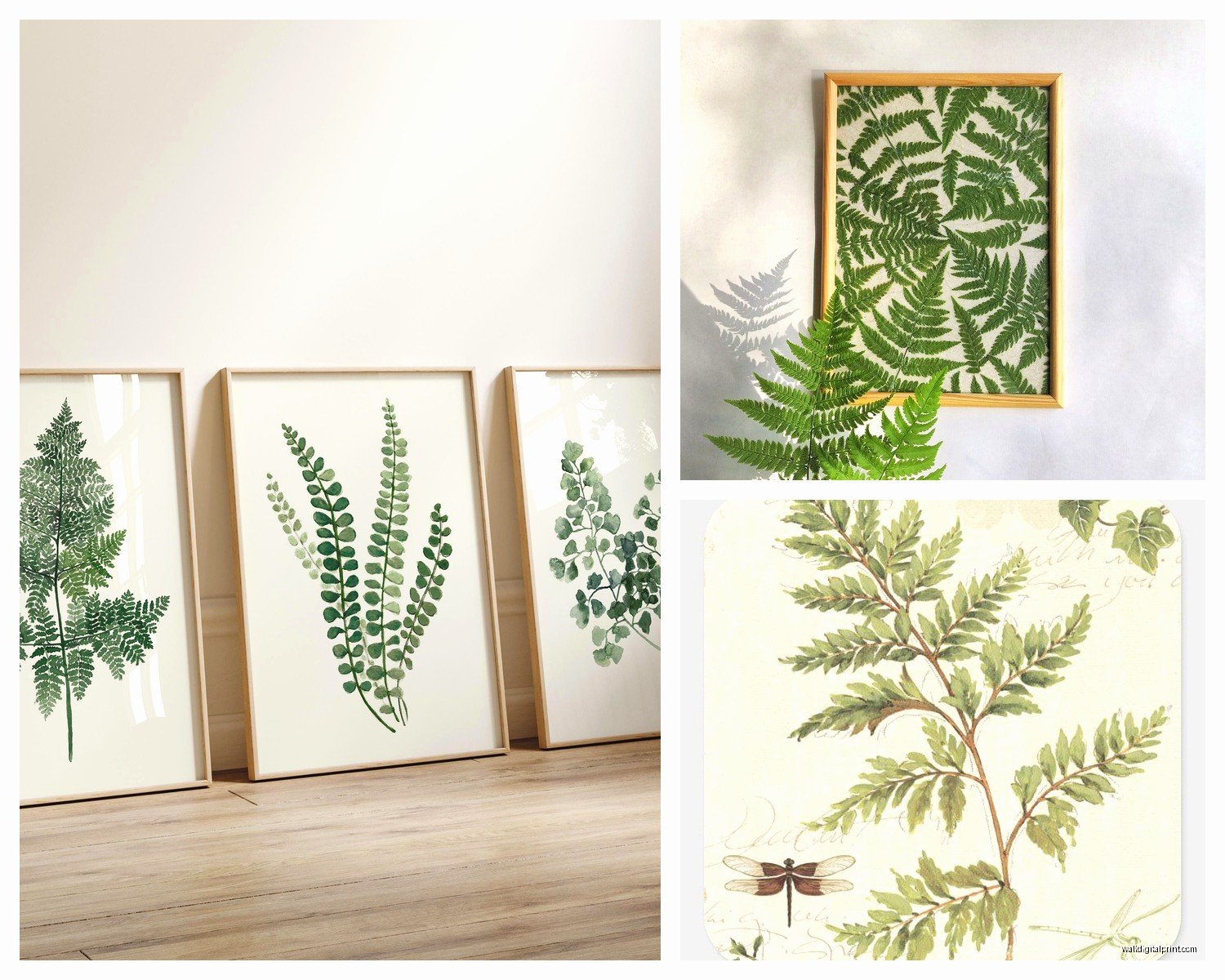
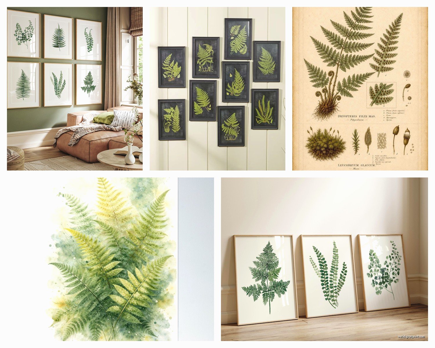
The grid thing works really well with ferns because of their natural symmetry. I did a 2×3 grid of 11×14 pressed fern prints in my dining room and it creates this really cool specimen collection vibe. Each print was like $25 and I got the frames from IKEA so the whole thing was under $300.
Small spaces can actually handle larger prints better than you think. A single large fern print can make a small room feel more intentional and curated instead of cluttered.
Large walls need either a really substantial piece or a grouping. Don’t just center one medium print on a huge wall it’ll look lost.
Framing Options That I’ve Actually Tested
This is gonna sound weird but the frame matters almost more than the print itself with botanical art. I’ve seen beautiful prints look cheap in the wrong frame and mediocre prints look amazing in the right one.
Black Frames
Classic and they make the greens pop. Works with literally any style. I use black frames probably 60% of the time. They create good contrast and definition which fern prints need since they’re often pretty delicate visually.
Go for thin to medium width frames. Thick black frames can overwhelm the subtlety of fern fronds.
Natural Wood Frames
Light or medium wood frames give that organic botanical garden feeling. Really nice with the vintage scientific prints. I have some in oak frames in my office and they feel collected and intentional.
Avoid super orange-toned wood frames with green prints unless you’re specifically going for a 1970s vibe.
White or Cream Frames
Fresh and clean especially with pressed fern prints on white backgrounds. These work well in modern farmhouse or Scandinavian spaces. Can sometimes wash out the print though so make sure there’s enough contrast.
No Frame Just Mat
I’ve been experimenting with this lately – just matting the print and putting it under glass without an actual frame. Gives a really contemporary gallery feel. You gotta mount it properly though or it looks unfinished. My cat knocked one off the wall last week and I’m still finding glass pieces so maybe not if you have pets who jump on stuff.
Where to Actually Buy These
Okay so I’ve ordered from probably twenty different places at this point testing stuff for projects. Here’s what actually worked:
Etsy has the biggest selection of vintage botanical reproductions. Quality varies wildly so check reviews and make sure they show actual product photos not just mockups. I’ve found some amazing small shops that do museum-quality reproductions for like $30.
Society6 and similar print-on-demand sites are hit or miss. The advantage is you can get the print already framed in standard sizes. Quality is decent for the price but it’s not gonna look as good as a specialty botanical print.
Museum shops often have incredible botanical prints. The Met and Kew Gardens both have online shops with gorgeous fern illustrations. More expensive but the quality is there.
Vintage shops and estate sales if you want actual vintage prints. I found a set of six authentic 1920s fern prints at an estate sale for $40 total and they’re some of my favorites. Takes more hunting though.
Mixing Fern Prints with Other Art
This is where people get nervous but it’s actually pretty forgiving. Ferns play well with others because they’re not super demanding visually.
I mix fern prints with landscapes all the time. Works great. Also good with abstract art if the colors coordinate. I have a blue abstract piece next to two fern prints in my bedroom and it feels cohesive because I pulled the blue-green tones through.
What doesn’t work as well is mixing too many different botanical print styles in one sightline. Like don’t do vintage scientific ferns next to modern graphic monstera prints next to watercolor eucalyptus. Pick a style and stick with it for that wall or room.
Creating a Gallery Wall with Ferns
I just finished a gallery wall project last month that was mostly fern prints with a few other elements mixed in. Started with four matching vintage fern prints as the anchor then added two black and white photographs and one small abstract piece.
The trick is repetition. Repeat your frame color, repeat your mat style, or repeat your subject matter. Don’t try to repeat everything or it’ll look too matchy.
Layout the whole thing on the floor first I know everyone says this but seriously do it. Take a photo and look at it on your phone screen because somehow that makes it easier to see if the spacing is off.
Rooms Where Fern Prints Work Best
Bathrooms are actually perfect for fern prints because ferns are naturally moisture-loving plants so there’s a logic to it. I have three small pressed fern prints in my bathroom and every time someone uses it they comment on them. Just make sure they’re properly sealed or framed with glass if it’s a steamy bathroom.
Bedrooms feel calm with fern prints especially the more subtle pressed or watercolor styles. That Victorian bedroom vibe is really pretty if you’re into it.
Home offices benefit from the structured-but-natural quality of ferns. Not as distracting as some botanical prints but still interesting to look at.
Dining rooms are great for the vintage scientific style prints. Creates that natural history museum collected feeling.
Living rooms can handle any style really. This is where you might go bigger and bolder with your fern art.
Common Mistakes I See People Make
Hanging them too high. Bottom of the frame should be about 8-10 inches above your furniture. I see people mount them way up near the ceiling and it looks disconnected from the room.
Choosing prints that are too similar to each other. If you’re doing multiple fern prints vary the species or the style slightly. Like mix a maidenhair fern with a boston fern with a tree fern.
Not considering the undertones. A yellow-green fern print can look really off if your room has blue-gray walls. Test it before you commit.
Cheap matting. If you’re gonna save money anywhere don’t let it be the matting. Acid-free mats that are actually archival quality make such a difference in how expensive the final piece looks.
The Maintenance Reality
These prints basically don’t need maintenance which is part of why I love them. Dust the frames occasionally. Keep them out of direct harsh sunlight if you want the colors to stay true but honestly I have some in south-facing windows and they’ve been fine for over a year.
If you get actual vintage prints those need a bit more care. Don’t hang them somewhere with major temperature fluctuations and definitely keep them out of direct sun.
Seasonal Swapping
Wait I forgot to mention – fern prints are great because they work year-round but I do sometimes swap mine seasonally. In summer I lean toward the brighter greens and in fall/winter I switch to the more brown-toned vintage ones. Not necessary at all but it’s a easy way to refresh a space without spending money.
Takes like ten minutes to swap out prints if you’re using standard frame sizes. I keep my seasonal art in flat files under my bed which is probably excessive but whatever it makes me happy.
The thing about fern prints is they’re having a moment right now but they’re also kind of timeless? Like they’ve been a thing since Victorian times and they’re still relevant. So you’re not gonna look at them in three years and think ugh why did I do that the way you might with some trendier botanical prints.
I’m literally watching my neighbor’s cat in their window right now while I’m typing this and even they have a fern print visible through their window so like everyone’s doing this apparently.
Anyway that’s basically everything I’ve figured out through way too much trial and error with fern wall art. Start with one or two prints in a room you use a lot and see how you feel about them before committing to a whole gallery wall situation.
