Wall Art Guide, Wall Art Tutoriels
Monet Wall Art: Impressionist Water Lily Garden Prints
Jul
So I’ve been obsessing over Monet water lily prints lately because three different clients asked about them in the same week, which is wild, and now I basically know way too much about hanging impressionist garden art in normal human homes.
First thing you gotta know is that not all Monet prints are created equal. I learned this the hard way when I ordered what I thought was a gorgeous Water Lilies reproduction from this random online seller and it showed up looking like someone printed it at a drugstore in 1987. The colors were flat, the brushstrokes were completely lost, and it just looked… sad? Like you could tell it was trying to be fancy art but failing.
Size Actually Matters More Than You Think
Okay so here’s where everyone messes up. They see these gorgeous water lily paintings in museums and think “oh I’ll get a small one for above my desk” and then it arrives and looks like a postage stamp trying to contain an entire garden. Monet’s water lily paintings were HUGE. Like, the man was painting entire pond environments, and when you shrink that down to 16×20 inches, you lose all the impact.
I tell people to go minimum 24×36 for a water lily print if you’re putting it anywhere that’s supposed to be a focal point. My living room has a 40×30 and honestly I wish I’d gone bigger. The whole point of these paintings is to feel immersed in the garden, right? You need enough space for your eye to wander through the lily pads and reflections and that dreamy blurred quality Monet was so good at.
Where to Actually Buy Decent Prints
This is gonna sound weird but museum gift shops are actually not a ripoff for this stuff. I got a really solid print from the Met’s online store last year and the color reproduction was spot-on compared to seeing the actual painting in person. They use better printing methods than most random Amazon sellers.
Etsy can be hit or miss. I’ve found some amazing sellers who do giclée prints on real canvas with gallery wraps, but you gotta read the reviews obsessively. Look for photos from actual buyers, not just the listing photos. If someone’s review says “colors are vibrant!” with a photo where everything looks weirdly neon, run away.
Oh and another thing, Art.com and AllPosters have been around forever and they’re boring but reliable. Their Monet selection is massive and you can usually find discount codes. Not the most exciting option but if you need something that’ll definitely look decent and arrive in one piece, they’re solid.
The Whole Canvas vs. Framed Print Debate
So here’s where I keep changing my mind. Canvas prints feel more “artsy” and you don’t have to deal with framing costs, which can honestly cost more than the print itself if you’re going to a real frame shop. But here’s the thing… canvas prints of water lily paintings can look too casual? Like the whole impressionist garden vibe has this classical elegance thing going on, and sometimes a stretched canvas just looks too contemporary against that energy.
I usually recommend framed prints with a mat for traditional or transitional spaces. The mat creates this breathing room around all that color and texture, and it just feels more finished. For modern or eclectic rooms, canvas can work better because it doesn’t fight with the space.
Wait I forgot to mention, if you do canvas, pay extra for a gallery wrap where the image continues around the edges. Those white-edge canvas prints where you can see the raw canvas on the sides? They look unfinished and cheap. Just trust me on this one.
Which Water Lily Painting Should You Even Choose
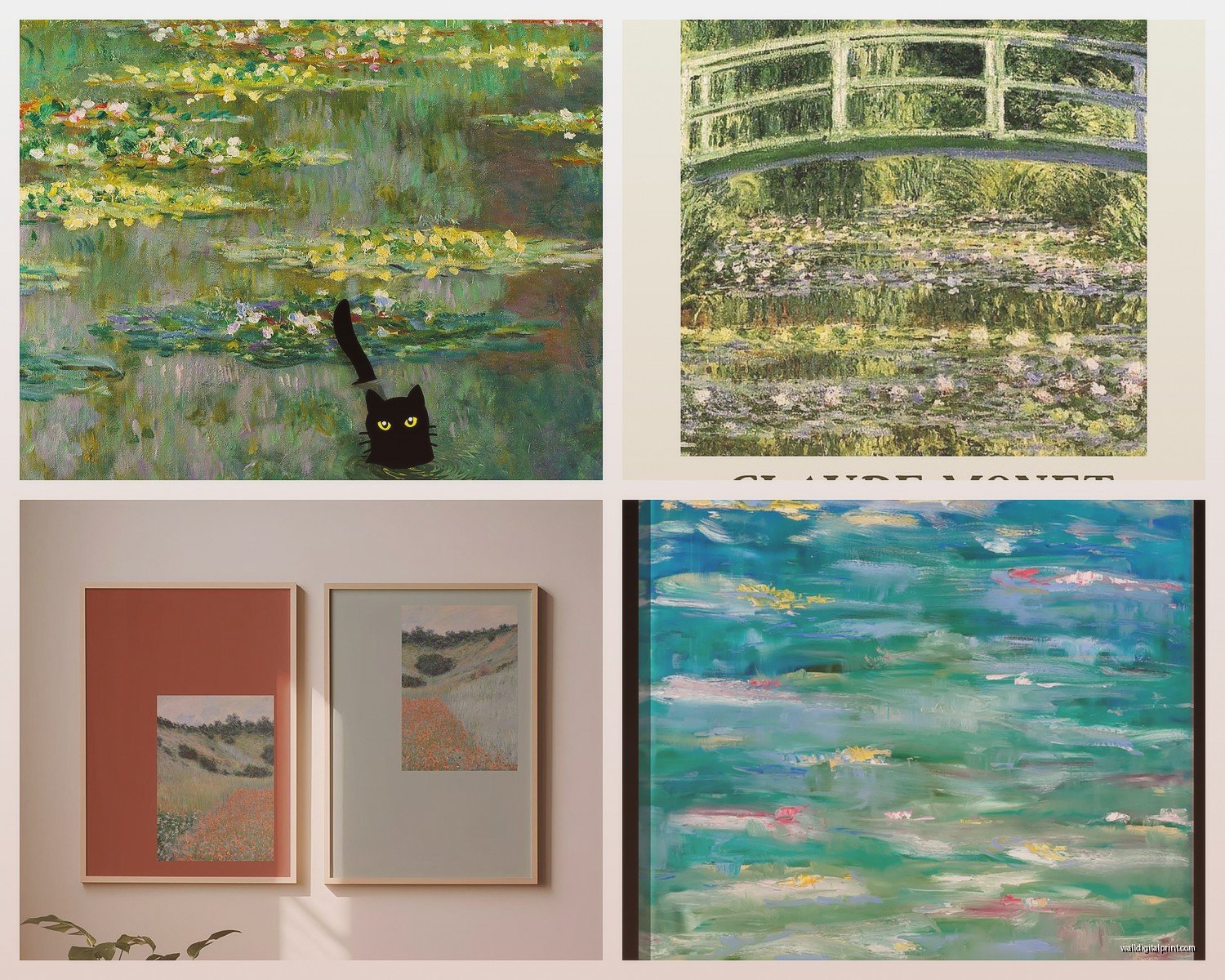
Monet painted water lilies for like 30 years so there are approximately ten million options. The most popular ones are from his later series, especially the really dreamy blue and purple ones. Those work in almost any room because the colors are calming but still interesting.
But honestly my favorite recommendation is the ones with more green and yellow tones. They’re less common as prints which means your space won’t look like every other person who discovered impressionism at HomeGoods. Plus the warmer tones work better in rooms that don’t get a ton of natural light. Those all-blue water lily prints can look really cold in a north-facing room, learned that the hard way in my own bedroom.
If you’ve got a really modern space with lots of white and neutral tones, go for one of the more abstract later paintings where the pond is almost completely blurred. They read as contemporary even though they’re from like 1920. It’s this cool bridge between classical and modern.
Color Matching Without Losing Your Mind
You don’t have to match your Monet print to your throw pillows exactly, that’s actually gonna look more dated than coordinated. But you do want to think about color temperature. If your room is mostly warm woods and creamy whites and terracotta, a super cool-toned blue water lily print is gonna feel jarring.
I usually pull out paint chips and hold them next to print samples on my laptop screen. Yes I know screens aren’t color-accurate but it gives you a general vibe check. You’re looking for harmony not matching.
The green and pink water lily paintings are the most versatile honestly. They’ve got enough color variety that they work with both warm and cool color schemes. My client has one in a room with navy blue walls and copper accents and it’s *chef’s kiss*.
Lighting Makes or Breaks This Whole Thing
Okay so funny story, I hung a beautiful Monet print in a client’s hallway and we both thought it looked amazing until she texted me a week later like “why does my painting look brown?” Turns out the overhead light was these terrible warm LED bulbs that made all the blues and purples turn muddy.
Impressionist paintings need good lighting. Natural light is ideal but if you’re hanging it somewhere without windows, use daylight bulbs (5000K minimum) and consider a picture light. Those little lights that mount above the frame aren’t just for fancy galleries, they actually make a huge difference in how you see the brushstrokes and color variations.
Direct sunlight will fade your print over time though, so if you’ve got a wall that gets blasted by afternoon sun, either use UV-protective glass in your frame or pick a different wall. I know that sounds obvious but I’ve seen so many faded prints in sunny breakfast nooks.
The Japanese Bridge Prints Are a Different Vibe
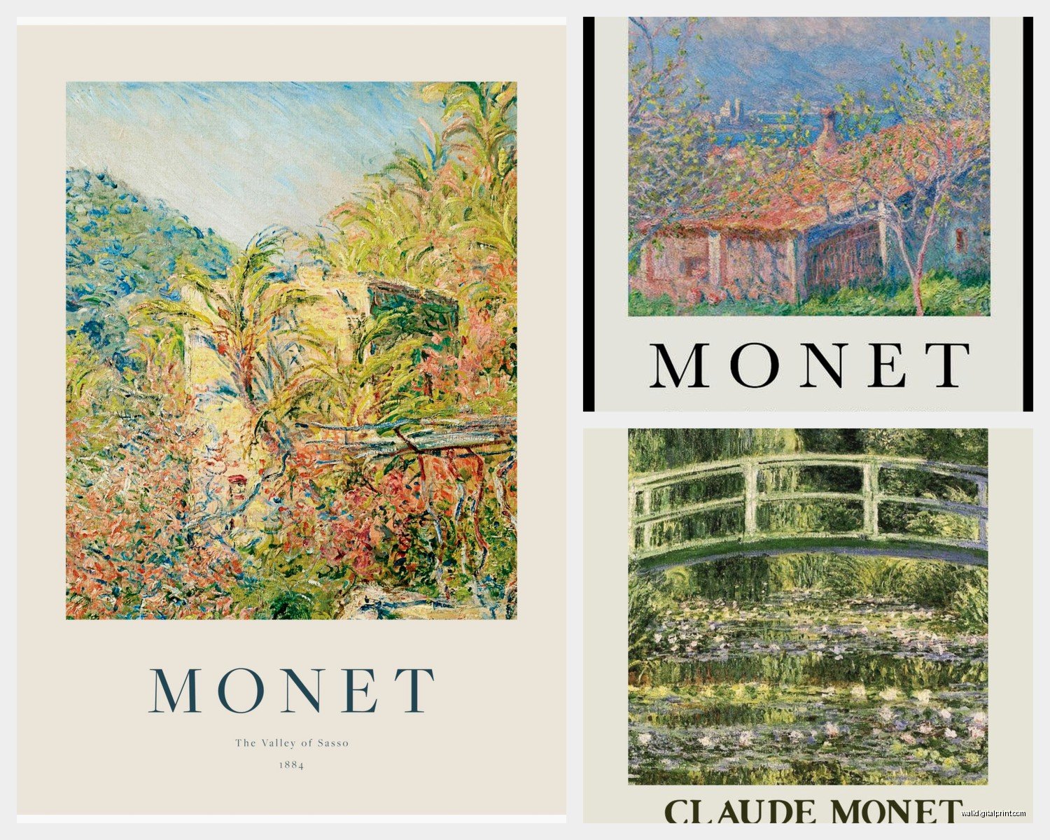
I should mention that Monet’s Japanese bridge paintings are technically also from his water garden at Giverny but they have a totally different feel than the water lily pond paintings. The bridge ones are more structured, more landscape-y. They work better in spaces that need something grounding rather than dreamy.
I use bridge prints in offices and dining rooms a lot. They’ve still got that impressionist softness but there’s a focal point, an anchor. The pure water lily paintings are better for bedrooms and living rooms where you want that floating, peaceful feeling.
My cat knocked over my coffee while I was researching this stuff last week and I had to rewipe my desk three times but anyway, if you’re trying to decide between bridge or lilies, think about whether your space needs structure or flow.
Grouping Multiple Prints
This can look amazing or completely chaotic depending on how you do it. If you’re gonna hang multiple Monet water lily prints, keep them all the same size and use identical frames. The paintings themselves are busy enough with all the texture and color, you don’t need varying frame sizes adding more visual noise.
I did a three-panel water lily arrangement in a client’s bedroom with all matching white frames and it created this triptych effect that feels really serene. But they’re all from the same painting series with similar color palettes. Mixing a blue-toned lily painting with a sunset-colored one with a green one? That’s too much.
Or go the opposite direction and do one large statement piece. Sometimes less is more, especially with impressionist work that’s already so visually complex.
What Rooms Actually Work Best
Bedrooms are the obvious choice and yes they work great there. The whole water garden thing is inherently calming and works with that rest and relaxation vibe. But don’t sleep on putting them in bathrooms if you have the space. The whole water lily pond theme makes sense in a room that’s literally about water, and it elevates a bathroom from purely functional to spa-like.
Living rooms are trickier because you need to think about conversation areas and whether the print will compete with your TV or fireplace. I usually hang them on a wall perpendicular to the main seating area so they’re visible but not fighting for attention.
Dining rooms can work beautifully if you go with the more vibrant, colorful water lily paintings. The later dreamy purple ones might be too subdued for a space where you want energy and conversation.
Style Mixing That Actually Works
You can absolutely put impressionist art in a modern space, it’s one of my favorite things to do actually. The key is keeping everything else pretty minimal. Let the Monet be the ornate, detailed, colorful element and balance it with clean lines and simple furniture.
I’ve also mixed Monet prints into maximalist spaces but you gotta be strategic. The water lily paintings already have a lot of pattern and texture happening, so if your room is full of patterned textiles and busy wallpaper, it can tip into visual chaos. Sometimes it works in an eclectic “more is more” way but it’s risky.
Traditional and transitional spaces are the easiest honestly. Impressionist art was made for rooms with some classical elements. Pair it with antique furniture or traditional molding and it feels right at home.
Budget Real Talk
You can find Monet water lily prints for like $30 on Amazon but they’re probably gonna look like $30 prints. If you want something that actually looks like art and not a dorm room poster, plan to spend at least $100-200 for a decent-sized quality print.
Custom framing will run you another $150-400 depending on size and materials. I know, it’s painful. This is why I often recommend the pre-framed options from museum shops or buying a canvas print and calling it done.
If budget is tight, honestly I’d rather see you get a smaller high-quality print that’s properly framed than a huge cheap print that looks obviously cheap. Size matters but quality matters more.
Wait, another thing about budget – watch for sales around museum exhibition dates. When there’s a big impressionist exhibition happening, museum gift shops often discount their print inventory. I got a gorgeous framed water lily print for 40% off during a Monet exhibition at the National Gallery.
The Prints to Avoid
Anything that looks overly saturated or has that weirdly shiny finish is gonna read as fake immediately. Monet’s actual paintings have this soft, almost muted quality despite all the color. If the print looks like someone cranked up the saturation slider to 100, it’s not accurate to the original.
Also avoid prints where the brushstrokes are completely smoothed out. Part of what makes impressionist art special is that visible texture. If it looks flat like a photograph, you’re losing the whole point.
And please don’t get those prints where they’ve cropped the painting into a weird ratio to fit standard frame sizes. I’ve seen water lily paintings cropped into squares or tall rectangles and it just looks wrong. Respect the original composition.
Maintenance and Long-term Care
Dust your print with a soft microfiber cloth every few weeks. Don’t use cleaning products directly on it, especially if it’s canvas. If it’s behind glass you can use glass cleaner on the glass obviously, but keep it away from the frame edges.
Keep it away from humidity sources. I know I said bathrooms can work but make sure you have good ventilation. Moisture can warp frames and damage canvas over time.
And just generally treat it like actual art even if it’s a print. Don’t hang it somewhere it’ll get bumped constantly or where kids or pets can reach it. Yes it’s a reproduction but a good one still deserves respect.
Okay I think that’s everything I’ve learned from my weird deep dive into Monet prints. My main advice is just don’t overthink it too much – if you love how it looks and it makes your space feel more beautiful, you picked the right one.