Wall Art Guide, Wall Art Tutoriels
Periodic Table Wall Art: Chemistry Science Element Chart
Jul
So I’ve been obsessing over periodic table wall art lately because a client wanted to do this whole science-chic thing in their teenager’s room and honestly it sent me down this rabbit hole where I now own like three different versions myself.
The thing about periodic table prints is they’re weirdly versatile? Like you’d think it’s just for chemistry nerds or kids’ rooms but I’ve actually used them in home offices, above bar carts (because science of mixology or whatever), and even in a really modern kitchen where the homeowner was a retired science teacher.
What Actually Looks Good vs What Looks Like a School Poster
Okay so the biggest mistake people make is buying those laminated classroom-style ones thinking they’ll look cool in a real room. They won’t. I learned this the hard way when I ordered one for $12 thinking I was being budget-savvy and it showed up looking like something you’d find rolled up in a supply closet.
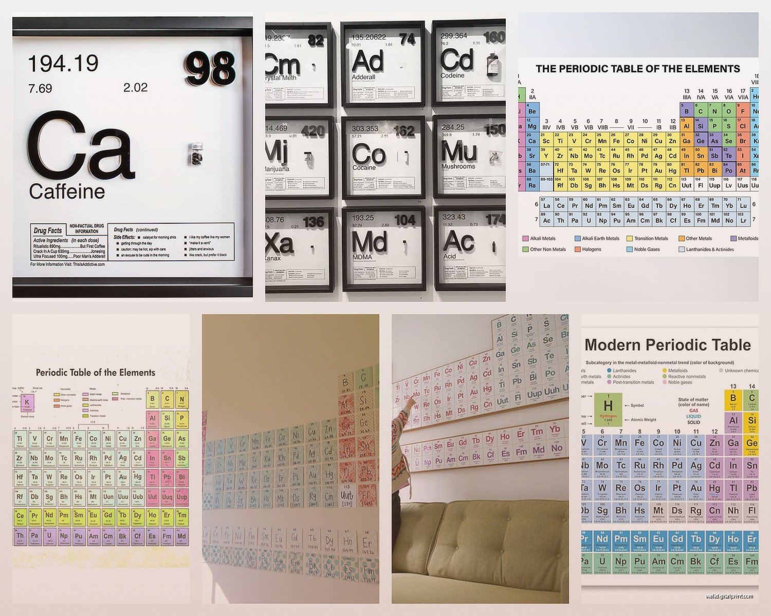
What you want is either a vintage-style print or something with really clean modern design. The vintage ones usually have that aged paper look with muted colors – lots of creams, faded blues, maybe some rust orange. These work insanely well in industrial spaces, farmhouse styles, or anywhere you’ve got exposed brick or wood. I found this amazing one on Etsy last month that had the old-school typography and it looked like it came from a 1960s university lab.
The modern minimalist versions are what I use more often though. Think black and white, super crisp lines, maybe one accent color. These fit into Scandinavian designs, contemporary spaces, modern farmhouse. My favorite has just black text on white background with the element numbers in a subtle gray – sounds boring but it’s actually really striking when you frame it properly.
Size Matters More Than You Think
This is gonna sound weird but the periodic table is one of those things that needs to be big enough to read from like 6 feet away or it just looks like a weird grid pattern. I made this mistake in my own apartment – bought a 16×20 print and hung it over my desk and you literally couldn’t see what it was unless you walked right up to it.
For bedroom or office spaces you want at least 24×36 inches. For a statement piece in a living room or classroom you’re looking at 36×48 or bigger. I did one client’s basement rec room with a massive 40×60 inch canvas and it was absolutely perfect because the room was huge and needed something with visual weight.
The smaller prints work better as part of gallery walls where they’re mixed with other science-themed stuff – like vintage astronomy prints, botanical illustrations, mathematical formulas. Did a whole gallery wall last spring with a small periodic table surrounded by constellation maps and it looked cohesive without the table needing to be the main focus.
Material Choices Because This Actually Matters
Canvas prints are probably the most popular and honestly they’re pretty foolproof. They arrive ready to hang, they’ve got that gallery-wrapped edge thing going on, and they don’t need glass so there’s no glare issues. The texture adds something too – makes it feel less like a poster and more like actual art. Downside is they can look cheap if the printing quality is bad so don’t go with the absolute cheapest option.
Framed prints under glass give you more of a polished sophisticated look. I use these in offices and formal spaces. You can control the frame style which is huge – black metal frames for industrial modern, natural wood for farmhouse, white frames for clean contemporary. The glass protects the print which matters if you’re spending decent money on it. Just watch out for glare if you’re hanging it opposite a window.
Metal prints are having a moment and they’re actually really cool for periodic tables. The printing process makes the colors super vibrant and the metallic surface catches light in interesting ways. These work great in modern spaces, man caves, teen rooms. They’re durable too – I’ve got one in my kitchen area and it wipes clean which is handy.
Oh and another thing – acrylic prints look incredibly high-end. The image gets printed and mounted behind clear acrylic so it has this depth and the colors just pop. These are pricier but if you want something that looks like serious art rather than science decor this is the way to go.
Color Schemes You Gotta Consider
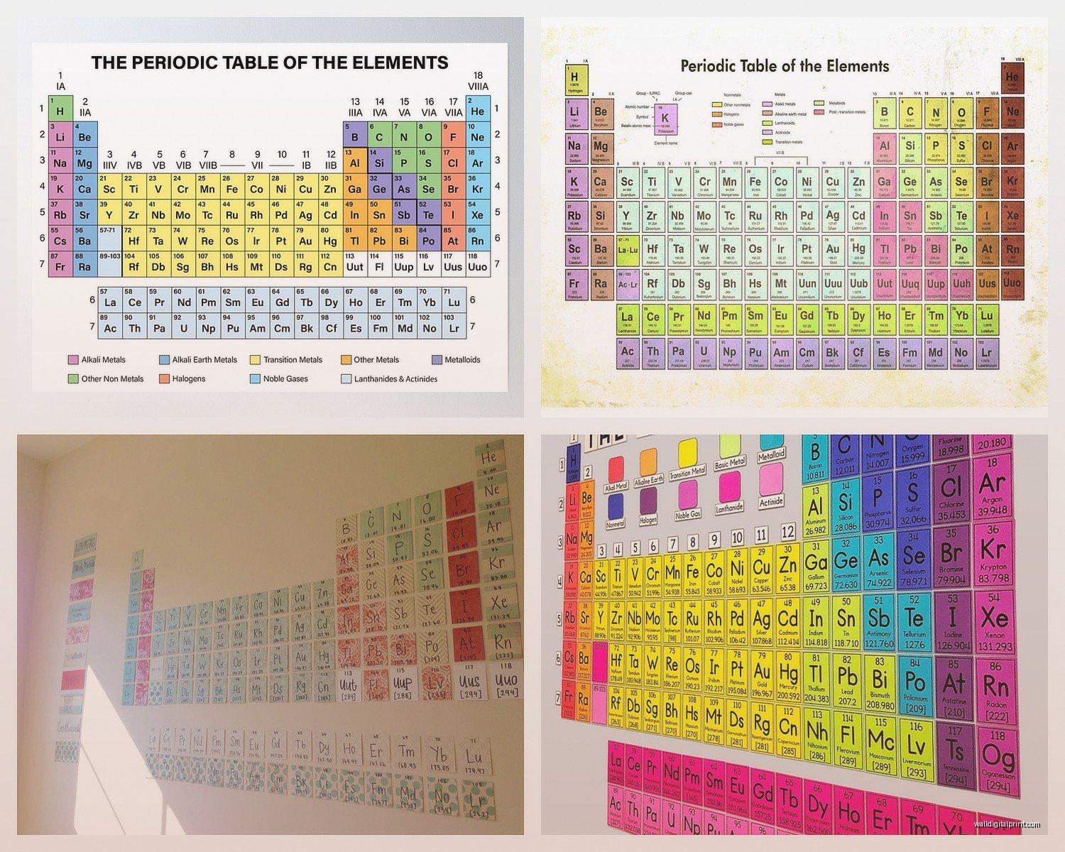
The traditional periodic table has all those different colored blocks representing element categories – your alkali metals, noble gases, transition metals, whatever. Some prints keep these traditional colors which can be really vibrant and fun for kids’ rooms or playful spaces. Blues, greens, yellows, purples all mixed together.
But for adult spaces I usually go with modified color schemes. Black and white is classic and works everywhere. I’m currently watching this documentary about Chernobyl and it’s got me thinking about how the stark black and white versions have this serious scientific credibility that colored ones don’t always capture.
Monochromatic versions in navy blue, forest green, or even rust orange can be really sophisticated. There’s this copper-toned one I used in a client’s library that looked expensive as hell even though it was only like $60. The single color tied into their leather furniture and brass fixtures perfectly.
Rainbow gradients are trendy right now – where the elements fade from one color to another across the table. These can look either really cool or really tacky depending on execution. The subtle gradients work better than the super bright ones in my opinion.
Where to Actually Buy Them
Etsy is honestly my go-to because you can find independent designers who’ve created unique versions. I’ve bought from at least five different Etsy shops and the quality varies but when you find a good one the prints are gorgeous and often customizable. You can usually request different colors or sizes.
Amazon has tons of options especially for canvas prints and they arrive fast which matters when you’re working on a deadline. The reviews help you avoid the really terrible quality ones. Just read through the photo reviews because people will post actual pictures of what showed up.
Society6 and Redbubble have artist-designed versions that are more creative interpretations rather than straight-up accurate periodic tables. Some of them incorporate watercolor effects or geometric patterns. These work better as art pieces than educational tools obviously.
For really high-quality giclée prints I go to specialized science art sites. There are shops that focus specifically on educational and scientific art and their printing quality is consistently excellent. More expensive but worth it for formal spaces or when a client has a bigger budget.
Wait I forgot to mention – if you’ve got basic design skills you can actually make your own. There are templates online and you can customize colors and fonts then get it printed at a local print shop. I did this once for a client who wanted their family name incorporated into the design as element symbols and it turned out really unique.
Styling It So It Doesn’t Look Random
The periodic table has such a strong visual structure that it can actually anchor a whole room’s design. I use it as a starting point for color schemes sometimes – pulling accent colors from whichever version we’re using.
In a kid’s room I’ll pair it with other educational art – world maps, alphabet prints, number charts. Keeps the learning theme going without being too matchy-matchy. Add some floating shelves with books and science toys and you’ve got a cohesive space.
Home offices look great with the periodic table as the focal point above the desk paired with minimal accessories. Keep the desk clean, add a simple desk lamp, maybe some metal organizers to echo the scientific vibe. I’m not a fan of cluttering up these spaces with too much stuff.
For living rooms or common areas you gotta balance the technical nature of the periodic table with warmer elements. I’ll hang it on a wall with wood paneling or brick, add some plants, include textured textiles. The contrast between the rigid grid structure and organic natural elements actually looks really intentional.
Gallery walls are perfect for smaller periodic table prints. Mix it with vintage science book covers, black and white photography, botanical prints. The key is varying the frame sizes and layouts so it doesn’t look too uniform.
Lighting Considerations Nobody Talks About
If you’re hanging a framed print under glass you gotta think about glare. Opposite a window is gonna be rough – you’ll just see reflection instead of the actual print. I usually do perpendicular walls to windows or use picture lights to illuminate from above.
Canvas prints are more forgiving with lighting but they still look better with some dedicated light on them. Track lighting or wall sconces positioned to highlight the print make it look way more intentional. My cat knocked over a lamp once and it made me rethink the whole lighting setup in my living room actually.
Backlighting is something I’ve experimented with for acrylic or metal prints – putting LED strips behind them so they glow. This works amazingly well in modern spaces or entertainment rooms. The periodic table’s grid structure looks really cool when lit from behind.
Educational vs Decorative Balance
Here’s the thing – some periodic tables are scientifically accurate and updated with current element names and atomic weights. Others are stylized versions that might have outdated info or simplified details. Figure out which matters to you.
If you’re buying for a student or actual learning purposes get an accurate current version. The International Union of Pure and Applied Chemistry updates element data occasionally so recent prints are more reliable. These usually look more technical and less artistic.
For purely decorative purposes you can prioritize aesthetics over accuracy. Vintage-style prints might show element configurations that aren’t current but they look cooler on the wall. Same with artistic interpretations that simplify or modify the information.
I’ve used both types depending on the client and space. Science teachers obviously want accuracy. Interior design clients usually want whatever looks best even if it’s showing 1970s data.
Framing Options That Actually Matter
If you buy an unframed print you’re gonna need to frame it yourself which gives you control but requires effort. I take prints to a local frame shop when clients have budget for custom framing – you can match the frame perfectly to the room’s existing finishes.
Ready-made frames from Target or Ikea work fine for standard sizes. The Ribba frames from Ikea are like $20 and look decent for casual spaces. Black frames are safe, wood frames add warmth, white frames keep things light and contemporary.
Floating frames where the print sits between two pieces of glass are really sleek for modern spaces. The periodic table’s grid looks good with this treatment because you can see the whole design without a border interrupting it.
For canvas prints you don’t need frames at all which saves money and effort. Just hang them directly on the wall. Some people add floating frames to canvas prints for a more finished look but I usually skip this unless the space is really formal.
Actual Prices You Should Expect
Basic poster prints run $15-40 depending on size. These are fine for kids’ rooms or temporary spaces but the quality shows. Paper is thin, colors might be off, they need frames obviously.
Canvas prints usually range $50-150 for decent quality in standard sizes. This is where I spend most often because the price-to-impact ratio is good. They look substantial without breaking the budget.
Framed prints from online retailers run $80-200 depending on size and frame quality. Sometimes worth it for the convenience of getting everything together but you’re paying for that convenience.
Custom framing for a nice print can easily hit $200-400 if you’re going to a professional frame shop. I only do this for high-end projects or really special pieces that deserve the investment.
Metal and acrylic prints start around $100 and go up from there based on size. These are splurges but they genuinely look more expensive than their price point.
Okay so I think that covers most of what I’ve learned through way too much time researching and hanging these things. The periodic table is one of those design elements that seems super specific but actually works in more spaces than you’d expect once you figure out the right style and size for your situation.