Wall Art Guide, Wall Art Tutoriels
Moose Wall Art: Canadian Wildlife Lodge Cabin Decor
Jul
So I’ve been working with moose wall art for like three years now and honestly it’s one of those things where clients either get it immediately or they’re totally lost on how to make it work without their living room looking like a Bass Pro Shop exploded.
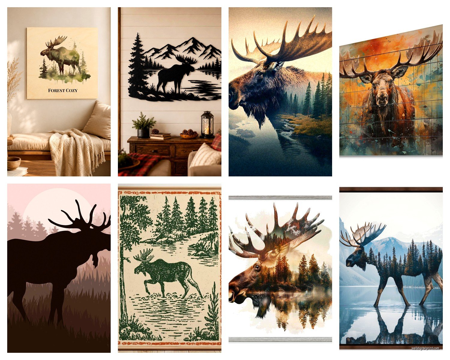
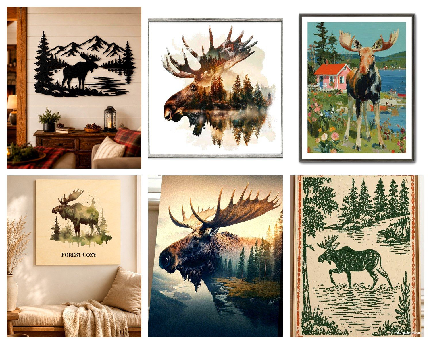
First thing you gotta know is that moose art comes in basically four categories and they do NOT all work the same way. You’ve got your realistic photography prints, your vintage illustration style, your silhouette/minimalist stuff, and then what I call “kitschy cabin” which is like… cartoon moose wearing scarves. I’m not here to judge but that last category is really hard to make sophisticated.
The realistic photography is honestly my go-to for most spaces. I found this one print last year from a Canadian photographer—can’t remember his name right now, my dog is literally barking at nothing and it’s distracting—but it was this incredible shot of a bull moose in morning fog. The thing about photographic moose art is you want that atmospheric quality. A straight-on moose portrait against a white background? That’s gonna read as zoological, not decorative. You want context. Mist, water, forest backdrop, golden hour lighting. That’s what makes it art instead of a nature documentary screenshot.
Size matters SO much with this and I see people mess it up constantly. A tiny 16×20 moose print on a huge wall just looks sad and lost. Moose are massive animals and the art should reflect that sense of scale. I usually go minimum 30×40 for a focal wall, and honestly bigger is better. I did a client’s den last fall with a 48×60 moose print and it was absolutely perfect—commanding but not overwhelming because the moose itself has this calm, majestic energy.
Oh and another thing, the frame can completely make or break this. You’d think rustic wood frames are the obvious choice but they can actually make it too theme-y too fast. I’ve had the most success with simple black frames or even thin metal frames in bronze or black. It modernizes the whole thing. The rustic barnwood frame thing only works if you’re going full lodge aesthetic, which is fine, but if you’re trying to blend moose art into a more contemporary space you need that visual restraint.
Color palette is where people get tripped up. Moose are brown. Forests are brown and green. Water is blue-grey. You’re working with a pretty earthy, muted palette automatically. This is actually GOOD because it means moose art is surprisingly versatile. I’ve put moose prints in rooms with navy walls, sage green walls, charcoal grey, even this one cream-colored living room where the moose photo had so much white snow in it that it totally worked.
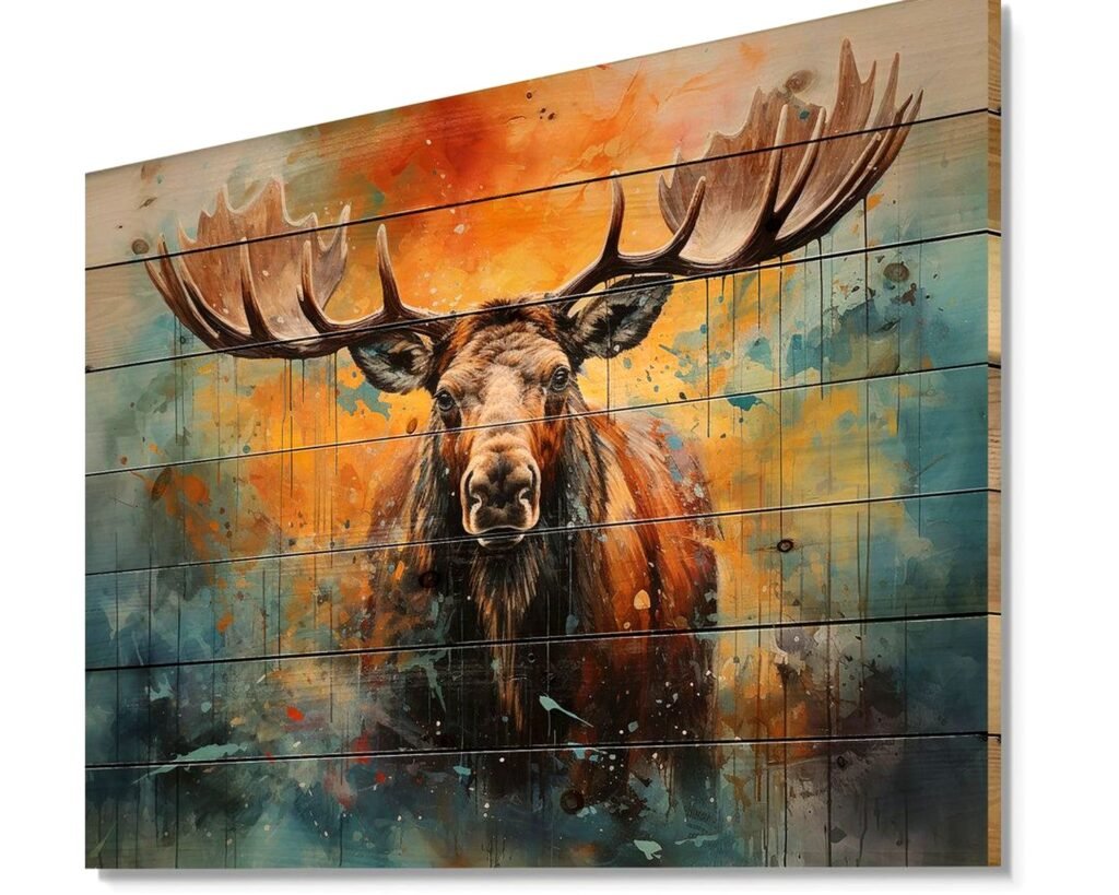
What doesn’t work—and I learned this the hard way—is trying to force moose art into a space with lots of warm reds or oranges unless you’re deliberately going hunting lodge vibes. The colors just fight each other. Moose art wants cool tones or neutrals. Warm greys, not beige necessarily but those greige situations can work.
Wait I forgot to mention the vintage illustration style which honestly might be my favorite for certain spaces. There are these incredible early 1900s naturalist drawings of moose that have this scientific-meets-artistic quality. They’re usually on aged paper backgrounds, very detailed line work, sometimes with Latin names at the bottom. These are PERFECT for home offices or libraries because they have that collected, intellectual vibe. I found a set of three on Etsy last month—procrastinating when I should’ve been writing a blog post about spring decor trends—and they were like $45 for digital downloads that I got printed at a local print shop for another $60. Way cheaper than buying original vintage prints which can run hundreds of dollars.
The silhouette approach is great if you want moose decor but your style is more Scandinavian or minimalist. Just the black outline of a moose against white or cream. Super clean, very Scandi cabin. I use these a lot in mudrooms or entryways where you want that cabin nod but don’t want anything too heavy or detailed. They also work really well in kids’ rooms if you’re doing a woodland nursery theme but don’t want it to skew too babyish.
Placement is something I think about probably too much. The obvious spot is above a sofa or fireplace but honestly some of the best moose art installations I’ve done have been in unexpected places. I put a massive moose photograph in a client’s dining room last winter and everyone thought I was crazy until they saw it. It became this incredible conversation piece and actually made sense because they’d gotten the photo during a trip to Banff and the dining room was where they entertained—it had story and connection.
Hallways are underrated for moose art. A long horizontal print of a moose walking through a meadow in a hallway? Perfect. Gives you something interesting to look at, the horizontal orientation fits the space, and hallways can handle more dramatic or specific art since you’re not living with it the same way you are in a family room.
This is gonna sound weird but lighting makes such a difference and almost nobody thinks about it. Moose art—especially photography—needs good lighting to show the detail and atmosphere. I always recommend picture lights for larger pieces or at minimum making sure there’s enough ambient light. A dark moose photo in a dark corner just becomes a brown blob. You lose all the texture and depth.
If you’re doing a gallery wall situation with moose art, you gotta be careful not to make it too matchy. Like, five different moose photos all in black frames all the same size looks like a weird moose shrine. Mix in other Canadian wildlife—I’m thinking elk, bears, maybe some forest landscapes without animals. Or mix moose photography with vintage maps of Canadian national parks, pressed botanicals, that kind of thing. You want moose to be part of the story, not the entire story unless you’re literally decorating a hunting lodge.
Material and printing quality actually matters more than you’d think. I’ve seen the same moose image printed on cheap poster paper versus printed on fine art paper or canvas and it’s night and day. The cheap version looks like a poster you’d get at HomeGoods (no shade to HomeGoods but you know what I mean). The quality version looks like actual art. Canvas is good for a more casual cabin feel. Fine art paper with matting and framing is better for sophisticated spaces.
Metal prints are having a moment and they can actually look incredible with moose photography. The colors get this intensity and depth, and there’s something about the slight sheen that works with nature photography. I did a client’s basement bar area with a moose metal print and it was so unexpectedly modern and cool.
Oh and if you’re renting or don’t want to commit to permanent art, there are these fabric wall hangings now that are basically like tapestries but more refined. I found one with a moose in a forest scene that was printed on this beautiful linen-look fabric. You can hang it with a simple rod or even just thumbtacks in a casual space, and it adds texture plus the imagery. Way less commitment than drilling holes for a heavy framed piece.
Scale mixing is something I’ve been experimenting with lately. Like, one oversized moose print as the anchor, then smaller complementary pieces around it. But the sizes need to be deliberately different—not accidentally different. So maybe a 40×60 moose photo, then two 11×14 prints of forest details or antler close-ups. The variety keeps it interesting but the theme stays coherent.
Color vs black and white is a personal choice but I’ll say this—black and white moose photography is easier to decorate around because you’re not locked into a color palette. But color photography, when it’s done well with those misty blues and forest greens, creates more atmosphere. I probably use color 60% of the time and black and white 40%, depends on the room’s existing vibe.
For actual cabin or lodge spaces, you can obviously go harder on the moose theme. I worked on a lake house last summer where we did moose art in the living room, moose-antler drawer pulls in the guest bath, a subtle moose pattern in the throw pillows. It worked because the whole property was leaning into that aesthetic. But in a suburban home or city apartment, you gotta show more restraint. One really good moose piece, maybe a couple small supporting elements, that’s it.
Budget-wise, you can do this at any price point honestly. I’ve found gorgeous moose prints on Etsy for $30-50 that you can download and print yourself. Gonna need to factor in framing costs which can range from $50 for a basic frame at Target to $300+ for custom framing. Mid-range, you’re looking at maybe $200-400 total for a quality print and decent frame. High-end, original photography or paintings can be thousands but that’s obviously not necessary for most people.
The thing nobody tells you is that moose art can actually make a room feel bigger if you do it right. A horizontal moose scene with lots of open landscape creates visual space. It’s that sense of wilderness and openness. I’ve used this trick in smaller dens or offices where you want to avoid that closed-in feeling.
Seasonality is real with this stuff. Moose art hits different in fall and winter—it just feels right. Summer, it can feel a bit off unless you have a lake house or mountain cabin situation. I don’t rotate my clients’ art seasonally usually but I have noticed people are more drawn to adding moose pieces in September through February.
Anyway, that’s basically everything I’ve learned from actually using this stuff in real spaces. The key is just not overthinking it—if you love moose and want that cabin vibe, commit to one really good piece, frame it properly, and place it somewhere it can actually be appreciated. Don’t scatter tiny moose things everywhere, that’s how you end up looking like a themed restaurant.