Wall Art Guide, Wall Art Tutoriels
Large Neutral Wall Art: Oversized Earth Tone Designs
Sep
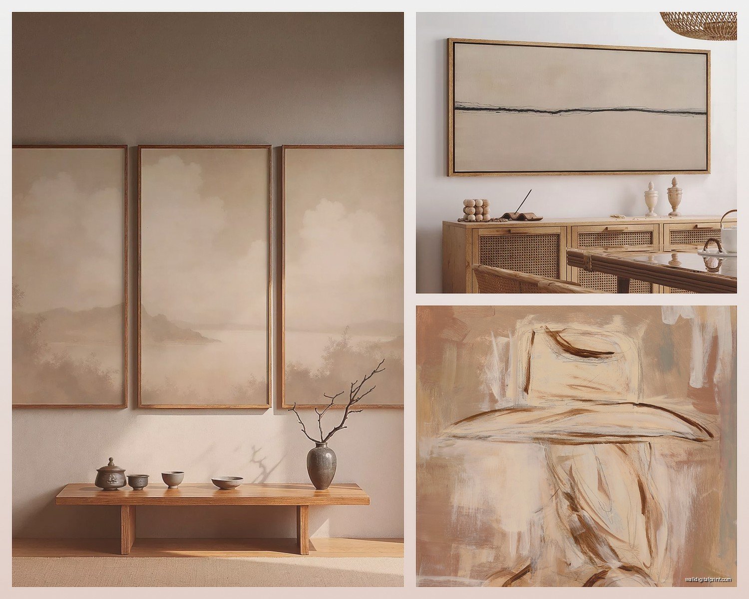
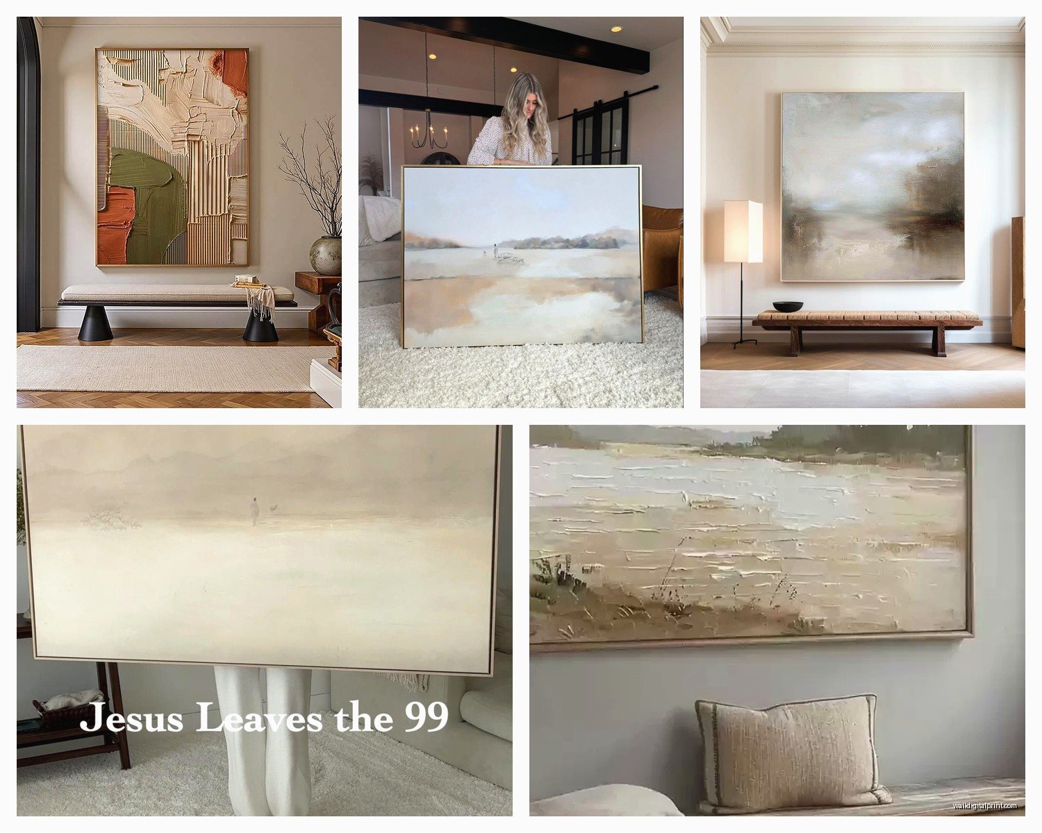
So I’ve been obsessing over large neutral wall art lately because honestly, those earth tone pieces are like the secret weapon nobody tells you about when you’re trying to pull a room together. Like, everyone’s out here stressing about accent walls and wallpaper and I’m just throwing up a massive 60×40 inch abstract in terracotta and cream and suddenly the whole space looks intentional.
Why Size Actually Matters More Than You Think
Okay so here’s the thing about oversized art that took me forever to figure out—you need to go bigger than feels comfortable. I’m talking like, awkwardly big. If you’re looking at a wall and thinking “hmm maybe 30×40,” you actually need 40×60 or bigger. I learned this the hard way in my own living room where I hung what I thought was a substantial piece and it just looked like a postage stamp floating on this massive wall.
The rule I use now is measure your wall space and aim for art that takes up about 60-75% of the width. So if you’ve got an 8-foot wide wall space above your sofa, you’re looking at something around 58-72 inches wide. Yeah, it’s gonna feel huge when you’re ordering it online, but trust me.
Where to Actually Find Good Oversized Neutral Pieces
Alright so I’ve spent way too much time (like, my dog Max was literally pawing at me to go for a walk and I was still scrolling) looking at different sources for these:
- Etsy shops that do custom sizes—this is where I’ve had the most success honestly
- Minted for their framing options, though they’re pricier
- Society6 if you want something more affordable but the quality can be hit or miss
- Local art fairs because sometimes you find someone doing massive abstract work for way less than online
- West Elm and CB2 when they’re having sales—never pay full price there
Oh and another thing, those “giclée print” descriptions you see everywhere? That’s just fancy talk for high-quality inkjet printing on canvas. Not a bad thing at all, just don’t let it intimidate you or make you think it’s worth extra money.
Earth Tone Combos That Actually Work
So earth tones sound simple but there’s like a million ways to mess this up. I curated an exhibition last year that was entirely neutral palette and lemme tell you, the wrong neutrals next to each other can look muddy and sad.
The combinations I keep coming back to:
Terracotta + Cream + Charcoal—this one’s my go-to because it works in literally any room. The terracotta gives you warmth without being aggressive, cream keeps it light, charcoal adds depth.
Sage + Taupe + Ivory—more subtle, great for bedrooms or spaces where you want calm energy. I did this in a client’s primary bedroom and she literally texted me at like 11pm saying she’d never slept better (probably placebo but whatever works).
Ochre + Sand + Espresso—richer, more sophisticated. This is what I’d put in a dining room or office space where you want it to feel elevated.
Rust + Wheat + Slate—probably my favorite right now? There’s something about that rust orange that feels both vintage and modern somehow.
What to Avoid
Don’t mix cool and warm earth tones unless you really know what you’re doing. Like, a cool gray-taupe with a warm terracotta can look off. Stick within the same temperature family.
Also gonna be real with you—avoid anything that looks too “corporate hotel art.” You know what I mean, those super generic blurry landscapes or the beige-on-beige-on-beige gradient stuff. Your space deserves better.
The Framing Situation
Okay so this is where people either spend way too much or cheap out in the wrong places. For oversized pieces, you’ve basically got three options:
Canvas gallery wrap—this is where the print continues around the edges of the frame. No additional framing needed, you just hang it. Super clean, modern look. This is what I use probably 70% of the time because it’s cost-effective and looks intentional.
Floating frame—the canvas sits inside a frame with a gap between them. Looks expensive, adds about $200-400 to your cost depending on size. Worth it if the piece is going somewhere prominent like above a fireplace or in an entryway.
Traditional frame with mat—honestly for oversized stuff this gets crazy expensive and heavy. I only go this route if it’s a paper print or if someone specifically wants that gallery look.
Wait I forgot to mention—if you’re ordering a canvas print, pay attention to the depth. Standard is like 0.75 inches but you can get 1.5 inch depth which looks way more substantial on the wall. The extra $30-50 is worth it for anything over 40 inches wide.
How to Hang Something That Heavy Without Destroying Your Wall
This is gonna sound weird but I’ve gotten really into the technical side of hanging art after a 48×60 inch piece fell off a client’s wall at 3am and scared the crap out of her cat. So here’s what actually works:
For anything over 30 pounds you need wall anchors, period. Those little picture hooks from the hardware store aren’t gonna cut it. I use these heavy-duty drywall anchors rated for like 75 pounds each and use two of them even if the piece only weighs 25 pounds. Better safe than sorry.
The actual process:
- Find your studs if possible—that’s always gonna be the most secure
- Measure twice, mark with pencil where you want the top center of your piece
- Measure the hanging wire or hardware on the back of your art when it’s pulled taut
- Subtract that measurement from your top mark—that’s where your hook goes
- Use a level, seriously just use a level
- Install your anchors or screws
- Get someone to help you lift it because trying to do it alone is how art gets dropped
Pro tip that changed my life: use two hooks spaced like 16-24 inches apart instead of one centered hook. Keeps the piece from tilting and shifting over time.
Styling Around Large Neutral Art
Okay so you’ve got this gorgeous oversized earth tone piece on your wall, now what? The whole room needs to support it without competing with it.
My client canceled yesterday so I spent an hour comparing different styling approaches and here’s what I’ve figured out: less is more but not in a boring way.
If your art is above a sofa, you don’t need throw pillows in the exact same colors. Actually that usually looks too matchy-matchy. Instead pull out like one accent color from the art and echo it in maybe one pillow and something else across the room—a vase, a throw blanket, whatever.
The furniture underneath should be substantial enough to anchor the piece. Like if you’ve got a 60-inch wide painting above a tiny loveseat, it’s gonna look weird. The furniture should be at least 2/3 the width of the art, ideally more.
Lighting That Makes Your Art Look Expensive
This is something I see people skip all the time and it’s such a missed opportunity. Proper lighting can make a $200 print look like a $2000 original.
Picture lights are the obvious choice but they’re kinda traditional looking. What I’ve been doing lately is using adjustable track lighting or even just strategically placed floor lamps that angle up toward the art. Creates this gallery vibe without being too precious about it.
If you’re going the picture light route, the width should be about half the width of your art. So for a 60-inch wide piece, you want a 30-inch light. And warm white bulbs, always. Cool white makes earth tones look muddy and sad.
Budget Breakdown Real Talk
Since you’re probably wondering what this is actually gonna cost you:
Budget Option ($150-400):
Large canvas print from Society6 or similar, gallery wrap, DIY hanging. Totally valid approach, I’ve done this in rental properties and guest rooms. Just make sure you’re looking at actual dimensions and reading reviews about print quality.
Mid-Range ($400-800):
Higher quality print from Minted or Etsy, maybe a simple floating frame, professional hanging if you’re not comfortable with it. This is the sweet spot for most people honestly.
Splurge ($800-2000+):
Original art or limited edition prints, custom framing, maybe commissioned work in exactly the colors you want. Worth it for focal point rooms where you’re gonna be spending a lot of time.
I’m not gonna lie, I’ve spent way too much on art over the years but I’ve also scored amazing pieces for under $300 that look way more expensive than they were.
Common Mistakes I Keep Seeing
Hanging it too high—the center of your art should be at eye level, which is usually around 57-60 inches from the floor. Exception is if it’s above furniture, then you want like 6-8 inches between the furniture and the bottom of the frame.
Choosing art that matches your walls too closely. If you’ve got beige walls, don’t get beige art in the exact same tone. You need some contrast even within a neutral palette.
Forgetting about the room’s natural light. That gorgeous warm-toned abstract might look totally different if your room gets harsh afternoon sun versus soft northern light. Try to look at samples in your actual space if possible.
Oh and another thing—not considering the room’s purpose. A really bold abstract with lots of movement might be too stimulating for a bedroom where you want calm energy. Save those for living spaces.
My Current Favorites for Specific Rooms
Living room: Large horizontal pieces with movement and multiple earth tones. Abstract landscapes work great here, or geometric designs with organic shapes.
Bedroom: Softer, more minimal designs. Think watercolor effects, gentle gradients, nothing too busy or dark. I’m really into those Japanese-inspired minimalist pieces right now with like one brushstroke in rust or ochre on cream.
Dining room: You can go bolder here. Richer colors, more dramatic compositions. This is where those deep terracotta and espresso combinations really shine.
Office/study: Structured geometric abstracts in earth tones. Something that feels intentional and grounded but not boring.
The thing about oversized neutral art is it’s kind of like…it gives your space this immediate credibility? Like you walk in and it looks like someone who knows what they’re doing decorated the place, even if the rest of your furniture is from IKEA or whatever. It’s the anchor point that makes everything else make sense.
Anyway, start with figuring out your exact wall dimensions and go from there. And seriously, size up—you won’t regret it.