Wall Art Guide, Wall Art Tutoriels
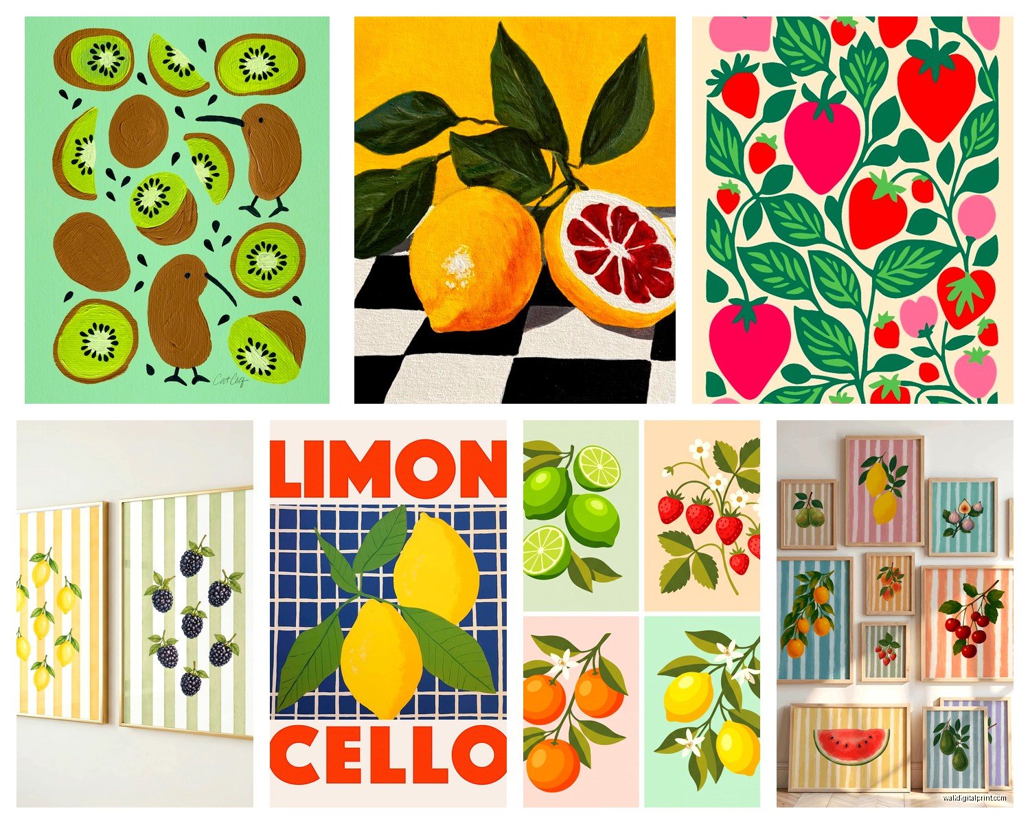
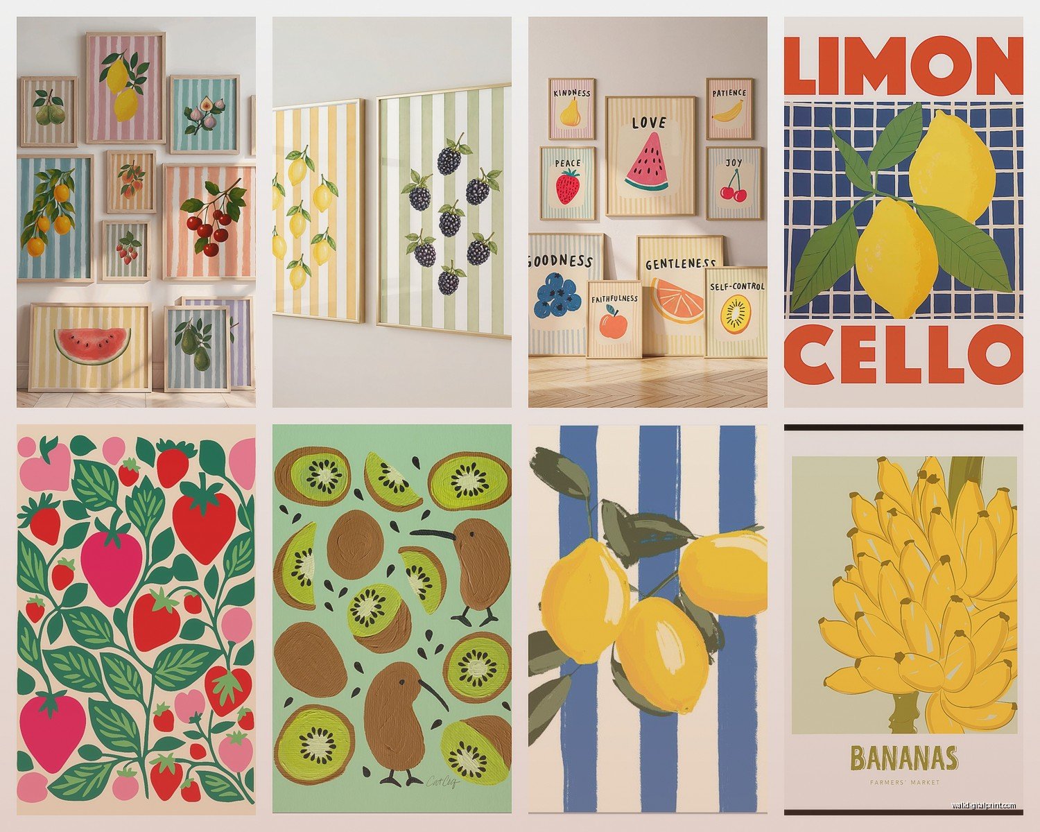
Fruit Wall Art: Kitchen Food Still Life Botanical
Jul
So I’ve been absolutely obsessed with fruit wall art lately and honestly it started because I needed something for this client’s kitchen renovation but then I kinda went down a rabbit hole. Like, I have 47 tabs open on my laptop right now and my cat keeps sitting on the keyboard so if this seems scattered, that’s why.
Why Fruit Art Actually Works When Other Kitchen Art Doesn’t
Okay so here’s the thing – most kitchen art is either too cutesy (those “but first coffee” signs, ugh) or too serious. Fruit hits this perfect middle ground because it’s literally food, so it makes sense in a kitchen, but it’s also been painted by serious artists for centuries. Like, Caravaggio painted fruit. You can’t argue with Caravaggio.
I did this whole kitchen last month where the client wanted “something cheerful but sophisticated” and I was like…that’s literally fruit. We went with this vintage botanical print of lemons and it completely transformed the space. The yellow tones picked up the brass hardware she’d chosen and suddenly everything felt intentional instead of just random stuff on walls.
The Different Styles You’re Gonna See
Vintage Botanical Prints
These are my go-to honestly. They’re those detailed illustrations that look like they came from old science textbooks – because they did. You can find reproduction prints from places like Pierre-Joseph Redouté’s work (he did roses but also fruit). The detail is insane. Every little seed and leaf vein is there.
Best for: kitchens with white or cream cabinets, farmhouse vibes, places that need something classic that won’t look dated in five years
Where I actually buy them: Etsy has tons of public domain downloads you can print yourself. I use a local print shop that does museum-quality printing on cotton paper. Costs like $40 total versus $200 for a pre-framed version from West Elm.
Modern Minimalist Line Drawings
Think one continuous line forming a pear or an orange. Very Scandinavian. Very clean. I’ll be honest, I was skeptical of these at first because they seemed too trendy, but they’ve been around for like a decade now so I guess they’re staying?
They work really well in modern kitchens with handleless cabinets and that whole minimal aesthetic. But – and this is important – you need good framing. A cheap frame makes these look like you printed them from Pinterest (even if you did print them from Pinterest).
Watercolor Still Life
Softer, more painterly. These give you color without being aggressive about it. I used a set of three watercolor fig prints in a kitchen with sage green cabinets and the purple-ish tones in the figs just…worked. Didn’t plan it, just got lucky.
The thing with watercolors though is they can look washed out if your kitchen gets harsh light. I learned this the hard way. South-facing window + pale watercolor = you can barely see it by noon.
Bold Modern Pop Art Style
Bright colors, graphic shapes, sometimes verging on abstract. There’s this artist on Instagram who does these incredible citrus cross-sections in neon colors and I’m obsessed but also they’re like $800 for an original so…yeah.
These are great if your kitchen is otherwise pretty neutral and you want one statement piece. White subway tile, white cabinets, stainless steel appliances – then BAM, giant hot pink grapefruit print.
Size and Placement Because This is Where Everyone Messes Up
Okay so funny story, I once hung a beautiful pear print perfectly centered on a wall and stepped back and it looked like a postage stamp. Scale is everything and most people go too small.
General rule I use: if you’re hanging above a console table or sideboard, the art should be about 2/3 to 3/4 the width of the furniture. For a blank wall, think bigger than feels comfortable. Your brain will adjust after a day but small art on a big wall always looks tentative.
For kitchens specifically:
Above the table: Either one large piece (36″ x 48″ range) or a gallery wall. I did a grid of nine identical lemon prints in simple black frames and it looked so much more expensive than it was.
On the wall opposite your sink: This is what you’ll stare at while doing dishes, so make it good. Medium to large size. Something with enough detail that you notice new things. I have a client who has this massive vintage apple variety chart and she texts me photos of it randomly being like “did you know there are 47 types of apples on here?”
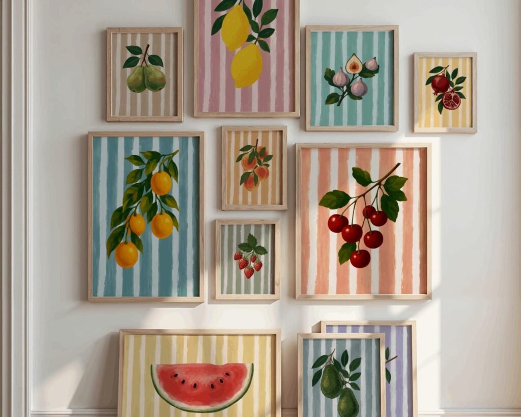
Small wall next to fridge or awkward spaces: This is where smaller prints work. 8×10 or 11×14. Group odd numbers – three or five prints looks better than two or four for some reason our brains like.
Framing Options That Don’t Cost a Million Dollars
Real talk – custom framing is expensive. Like shockingly expensive. I once got quoted $300 to frame an $8 print and almost cried.
What I actually do: IKEA frames for anything standard size (they have really nice wood ones now), or I order from Frame It Easy online for custom sizes. Their quality is solid and it’s like 1/3 the price of a frame shop.
For vintage botanical vibes: thin black or dark wood frames with a white or cream mat. Classic, never wrong.
For modern stuff: frameless clip frames or thin metal frames. There are these brass clip frames on Amazon that are chef’s kiss for minimalist kitchens.
For watercolors: I like a thin wooden frame in a light wood tone. Oak or maple. Makes them feel more organic.
Oh and another thing – you don’t always need glass. I know that sounds weird but for some prints, especially if they’re in a spot where grease splatter won’t reach, you can skip the glass and mount them on foam board. Gives them more texture and depth.
The DIY Route If You’re Into That
I mentioned this earlier but downloading public domain botanical prints and printing them yourself is honestly the way to go if you’re on a budget. The Biodiversity Heritage Library has thousands of fruit illustrations you can download for free in high resolution.
My process: download the image, clean it up in Photoshop if needed (I just adjust brightness and contrast usually), upload to a printing service or take it to FedEx Office on a flash drive. Print on matte photo paper or cardstock. Frame. Done.
Costs breakdown: $0 for image, $15-30 for printing depending on size, $20-40 for frame. So you’re looking at under $75 for something that looks like it cost $300.
Color Coordination Without Being Matchy-Matchy
This is where it gets fun but also where people overthink it. You don’t need your fruit art to exactly match your kitchen colors but there should be some relationship.
I look at:
– Undertones (warm vs cool)
– Accent colors you’ve already got going
– What mood you want
Like if you have a kitchen with a lot of warm wood tones, citrus fruits (oranges, lemons) tend to work better than cool-toned berries. But then I broke that rule in a kitchen with cherry cabinets and used blueberry prints and it was perfect so…rules are flexible.
One trick I use – and this is gonna sound weird but – I take a photo of the kitchen on my phone, then pull up potential art on my laptop screen and hold my phone next to it. It’s not perfect but it gives you a sense of whether the colors are gonna fight each other.
Mixing Fruit Art With Other Stuff
You don’t have to commit to all fruit all the time. I mix it with:
– Herb prints (still food-related, different vibe)
– Vintage kitchen tools or utensils as actual wall decor
– Abstract art in complementary colors
– Family photos in similar frames
The key is keeping either the frame style consistent OR the color palette consistent. Both is too much, neither is chaos.
Themes Within Fruit That Actually Work
All citrus: lemons, oranges, grapefruits, limes. Very cohesive, bright, cheerful.
Stone fruit: peaches, plums, apricots. More romantic and soft.
Berries: strawberries, raspberries, blackberries. Cottage-core energy.
Tropical: pineapples, mangoes, papayas. Fun for a breakfast nook or if your kitchen opens to a patio.
Single fruit in different styles: like three different artistic interpretations of a pear. This is more advanced but looks really cool when done right.
What Doesn’t Work (Things I’ve Learned the Hard Way)
Mixing too many styles. Like a realistic oil painting apple next to a geometric line drawing orange next to a watercolor peach. Your eye doesn’t know where to land.
Going too literal in a modern kitchen. If you have sleek contemporary cabinets and minimalist everything, a super traditional Dutch master style still life is gonna look confused.
Tiny prints on huge walls. I said this already but I’m saying it again because I keep seeing people do this.
Prints that are too dark in kitchens without much natural light. I put these gorgeous deep purple fig prints in a galley kitchen with no windows and they just disappeared into the wall. Moved them to a hallway with better light and suddenly they were beautiful again.
Where to Actually Shop
For Originals (if you wanna spend):
– Local art fairs and farmers markets sometimes have affordable original pieces
– Etsy (search for original fruit paintings, prices range wildly)
– Instagram artists (I’ve commissioned three pieces this way, usually $200-500 range)
For Prints:
– Etsy for vintage botanical reproductions and indie artists
– Society6 and Redbubble for modern designs
– Minted has really nice quality prints, bit pricey but they run sales
– Desenio for affordable Scandinavian-style prints
– Museum shops (The Met, Smithsonian) have amazing reproduction prints
For Free Downloads:
– Biodiversity Heritage Library
– Rawpixel (public domain section)
– New York Public Library Digital Collections
– Rijksmuseum (their whole collection is downloadable)
Practical Stuff Nobody Tells You
Kitchens get greasy. Even with a good range hood, there’s moisture and grease in the air. Don’t hang valuable original art right next to your stove unless you want to clean it constantly or watch it deteriorate.
Use proper hanging hardware. Those little sawtooth hangers that come on cheap frames are not sufficient for anything over like 2 pounds. I use D-rings and picture hanging wire for anything substantial.
Wait I forgot to mention – if you’re renting, Command picture hanging strips are actually really good now. They hold way more weight than they used to and I’ve used them in probably 20 client homes without any paint damage.
The lighting in your kitchen changes how art looks throughout the day. If possible, prop up prints in the space and live with them for a few days before committing to hanging. I know this sounds extra but I’ve returned so many prints because they looked different in the store lighting versus home.
Oh and if you have open shelving, you can lean smaller framed prints on the shelves instead of hanging everything. Gives you flexibility to switch things out and it’s very Instagram-worthy if you care about that.
Making It Feel Curated Not Random
The difference between “I have fruit art in my kitchen” and “I have a thoughtfully designed kitchen” is usually just consistency and intention.
Pick a lane: vintage botanical, modern minimal, colorful contemporary, whatever. Then stick with it for that space. You can have different vibes in different rooms but within the kitchen, commit.
Frame consistency matters more than you think. All black frames, all wood frames, all metal frames – it just looks more pulled together even if the art itself varies.
Space things evenly. I use painter’s tape to map out gallery walls before hammering a single nail. Sounds tedious but it’s way better than 15 holes in your wall that you have to patch.
Actually this whole thing has made me want to redo my own kitchen art situation because I currently have this random print my mom gave me that I don’t even like but I haven’t gotten around to replacing it and every time I see it I’m like…you literally do this for a living, Sophia.
Anyway. Fruit art. It’s good. Start with one piece you really love, see how it feels, build from there. Don’t overthink it but also don’t just grab the first thing you see at HomeGoods because you feel like you need something on the wall.