Wall Art Guide, Wall Art Tutoriels
Snoopy Wall Art: Peanuts Charlie Brown Comic Character
Jul
So I’ve been down this Snoopy wall art rabbit hole for like three weeks now because a client wanted to do this whole nostalgic Peanuts thing in their reading nook and honestly? It’s way more complicated than you’d think to get it right without looking like a kids’ room threw up on your walls.
The Different Types and What Actually Works
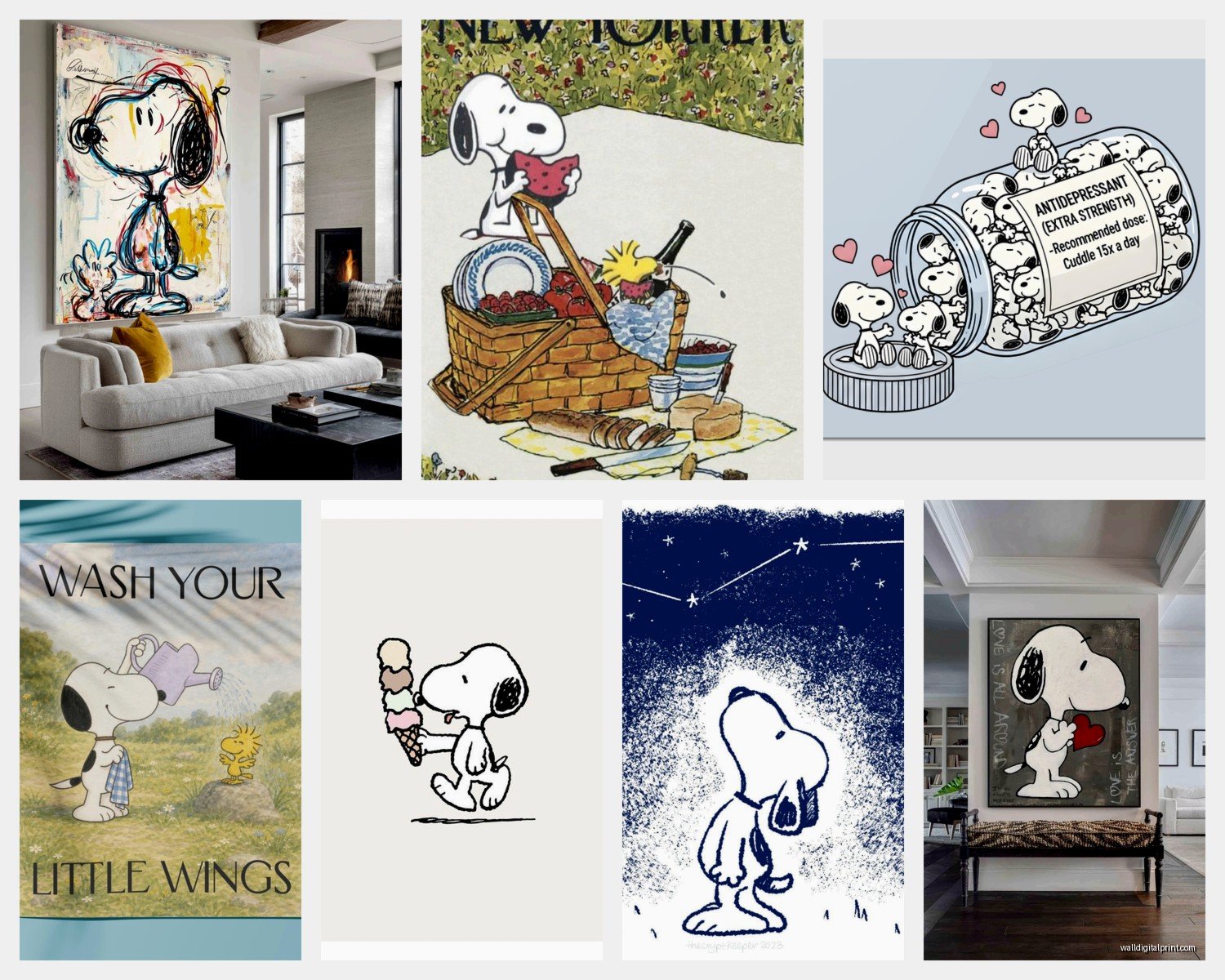
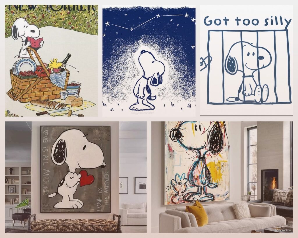
Okay so first thing – there’s basically three main categories of Snoopy art you’re gonna encounter. There’s the vintage comic strip prints, the modern graphic interpretations, and then like… the actual licensed character art that looks more cartoon-y. I tested all three in different spaces and they each have their vibe.
The vintage comic strip stuff is honestly my favorite for adult spaces. You know those black and white panels with the actual dialogue? Those work insanely well in offices or reading areas because they don’t scream “children’s character” – they read more as pop art or graphic novel aesthetic. I found this set of four panels on Etsy where Snoopy’s doing his whole writer thing on the doghouse and it’s chef’s kiss for a home office. The key is getting them in actual frames though, not the cheap poster frames. I learned this the hard way when my cat knocked one off the wall and it just… crumpled.
Modern graphic interpretations are trickier. These are like when artists do minimalist versions or use unexpected color palettes. I saw one that was Snoopy in all blush pink and sage green tones and it was gorgeous but you gotta be careful because some of them venture into that “trying too hard to be trendy” territory. The ones that work best stick to maybe two or three colors max and have clean lines.
Size and Placement Because This Matters More Than You Think
Wait I forgot to mention – scale is where everyone messes up. A tiny 8×10 Snoopy print on a big wall looks sad and lost. I did a whole gallery wall for someone’s hallway and we used varying sizes but the largest was 24×36 inches. That became the anchor piece – it was Snoopy and Woodstock lying on the doghouse looking at stars.
For single statement pieces you want at least 16×20 minimum unless you’re doing a tight grouping. Actually scratch that – if you’re putting it in a bathroom or small powder room you can go smaller because the space itself is intimate.
Gallery wall configuration… okay so this is gonna sound weird but I use painter’s tape on the floor first. Like I lay out the whole arrangement on the ground, take a photo from above, then recreate it on the wall. Saved me so many nail holes. For Snoopy stuff specifically I mix the comic panels with some solid graphic pieces. So like three vintage comic strips, two modern minimalist Snoopy silhouettes, maybe one piece that’s just Woodstock by himself.
Color Schemes That Don’t Look Juvenile
The color thing is huge. If you go with the classic red doghouse, yellow Woodstock, bright primary colors situation… it’s gonna read as kid’s room no matter what you do. Not saying that’s bad if that’s your vibe but if you’re trying to make it sophisticated you gotta rethink the palette.
Black and white is the easiest sophisticated route. Those vintage comic strips I mentioned? Already black and white. Done. Add black frames and suddenly it’s gallery-worthy.
But if you want color – and honestly sometimes you gotta have color because all black and white can feel cold – go with muted versions. I did a living room where we used Snoopy art in navy, cream, and rust tones. The artist had recolored everything in these deeper sophisticated shades and it completely changed the energy. You can find prints like this on Society6 or Redbubble where independent artists do their own takes.
Earth tones work surprisingly well too. Snoopy in terracotta, olive green, and cream looks expensive somehow? My client was skeptical but when we hung it next to her leather couch and brass floor lamp the whole thing just clicked.
Frame Selection Nobody Talks About
Oh and another thing – frames make or break this. You cannot and I repeat CANNOT use those flimsy black plastic poster frames from Target. I mean you can but it’s gonna look exactly like what it is.
For vintage comic strips I love thin black metal frames or even thin wood frames in walnut or oak. Keep it simple because the art itself has enough going on with the panels and text.
For modern graphic pieces you can get away with thicker frames or even floating frames. I found these amazing floating frames at West Elm that make the art look like it’s suspended and it adds this whole other dimension.
White frames can work but they’re risky with Snoopy stuff because combined with the cartoon character it can tip too cutesy. Unless you’re going for that bright airy Scandinavian vibe with lots of white space then okay maybe.
Matting is your friend for smaller prints. A small 8×10 print in a 16×20 frame with a thick mat suddenly has presence. I usually do white or cream mats for this unless the art has a specific color I want to pull out.
Where to Actually Buy Quality Prints
So I spent an hour comparing prices when my client canceled last week and here’s what I found. Official Peanuts merchandise from their actual store is obviously legit but honestly pretty expensive for what you get. The quality is good but you’re paying for the licensing.
Etsy is where I’ve had the most success finding unique vintage-style prints and also artists who do really cool interpretations. Just make sure to read reviews and check if it’s actually a print or a digital download you have to print yourself. I’ve been burned by that before.
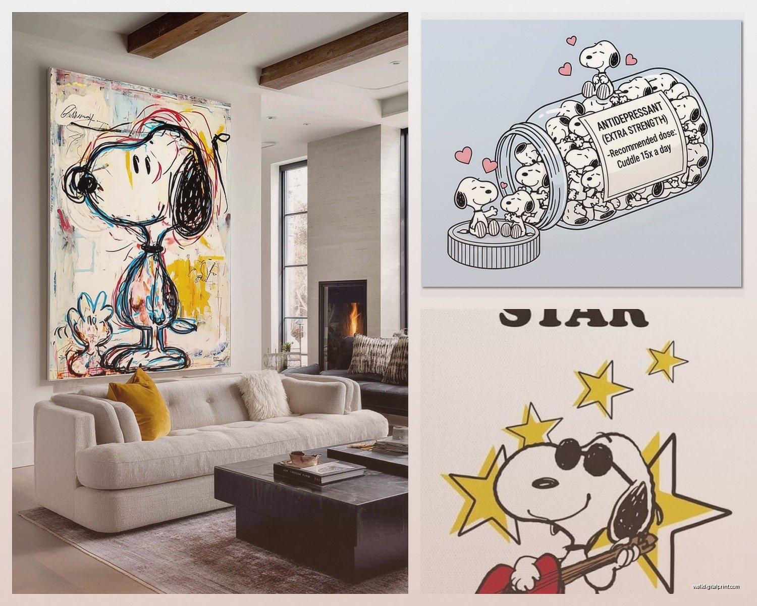
Society6 and Redbubble have tons of options from independent artists. Quality varies but they’re print-on-demand so returns are usually easy if something shows up looking weird. I ordered a canvas print from Society6 of Snoopy as Joe Cool and the colors were way more vibrant than the online preview but actually in a good way?
For actual vintage comic strips you can sometimes find original newspaper clippings on eBay but they’re fragile and yellowed which might be the aesthetic you want or might not be. I framed one for myself and it’s cool but definitely reads as vintage collectible more than clean modern art.
The Rooms Where This Actually Works
Home office is like the number one spot. Snoopy typing away on his doghouse as “a dark and stormy night” – it’s perfect writer/creative energy. I’ve done this in three different home offices now and it always gets compliments.
Reading nooks or library areas are also primo real estate for Peanuts art. There’s something about the literary connection with Snoopy’s writing ambitions that just fits. Plus you can mix in other book-related decor and it all feels cohesive.
Kitchens and dining areas can work if you go the vintage route. Those old comic strips where the gang is having philosophical discussions? Weirdly perfect for a breakfast nook. I hung a series above a banquette and it became a conversation starter.
Bedrooms are hit or miss. Main bedroom probably not unless you’re really committed to the theme, but a guest room? Yeah that can be charming. It’s whimsical without being too personal. I did a guest room with Snoopy and Woodstock friendship-themed prints and guests always mention how it makes them smile.
Bathrooms – okay hear me out. A small powder room with one perfectly placed Snoopy print can be delightful. It’s unexpected and fun. I put a vintage comic strip about Snoopy’s supper dish in someone’s powder room and it’s genuinely hilarious.
Mixing With Other Decor Styles
This is where it gets interesting because Snoopy art isn’t just for one aesthetic. Mid-century modern actually pairs beautifully with Peanuts stuff because they’re from the same era basically. The clean lines of MCM furniture with vintage Peanuts prints just works. I did a whole living room like this with a walnut credenza, arc lamp, and a large Snoopy dancing print and it looked like it could be in a design magazine.
Scandinavian minimalism can incorporate it if you’re strategic. Black and white prints, simple frames, lots of negative space. Don’t overdo it – maybe two or three pieces max in the whole room.
Farmhouse or cottagecore vibes can actually work with the more wholesome Snoopy moments. Like Snoopy and Woodstock in the garden or countryside scenes. Pair with natural wood frames and it reads as sweet rather than childish.
Industrial loft spaces – this is gonna sound weird but vintage comic strips in industrial metal frames against exposed brick is amazing. The contrast between the whimsical character and the rough industrial elements creates this cool tension.
Common Mistakes I Keep Seeing
Too much too fast. People get excited and buy like ten different Snoopy prints and hang them all at once and it’s overwhelming. Start with one or two pieces and live with them for a bit. See how they feel in the space.
Mixing too many different art styles of Snoopy in one area. Like don’t put a vintage comic strip next to a modern watercolor interpretation next to a bright cartoon-y piece. Pick a lane within each room or wall grouping.
Ignoring the rest of the room’s color palette. If your whole room is cool tones and you bring in a Snoopy print with bright warm reds and yellows it’s gonna clash. Either adjust the print colors or adjust your decor.
Hanging stuff too high. Art should generally be at eye level which is like 57-60 inches from the floor to the center of the piece. I see Snoopy art up near the ceiling all the time and it’s just… why.
DIY Options If You’re Crafty
You can definitely make your own if you’re into that. I’ve done iron-on transfers of Snoopy onto canvas drop cloth for a really textured vintage look. Just make sure you’re not violating copyright if you’re planning to sell anything – personal use is usually fine but commercial gets dicey.
Mod Podge and vintage comic book pages onto wood panels is another option I’ve tried. It’s more time intensive but you get a really unique dimensional piece. I did this with a series of Sunday comic strips and mounted them on reclaimed wood and it turned out gorgeous.
Cross-stitch or embroidery patterns of Snoopy can be really charming framed up. There’s something about the handmade quality that elevates it beyond just character merch. My sister did one for me and it’s in my hallway.
Lighting Considerations
Direct sunlight will fade prints faster than you think. I had a client with beautiful Snoopy prints in her breakfast nook that got morning sun and within six months they were noticeably lighter. UV-protective glass or acrylic is worth it if the art is gonna be in a sunny spot.
Picture lights can make even simple prints look expensive and intentional. Those little brass or bronze picture lights mounted above the frame add this gallery quality. I added one above a Snoopy print in a hallway and suddenly people treated it like serious art.
In rooms with multiple light sources think about how the art looks at different times of day. That navy and cream print I mentioned earlier looked completely different in morning light versus evening lamplight – both good but different.
Okay so basically the key to making Snoopy wall art work in adult spaces is treating it like actual art instead of character merchandise. Quality prints, proper framing, thoughtful placement, and integration with your existing decor. It’s totally doable to have that nostalgic Peanuts love without your space looking like a dorm room.
And honestly once you get one piece up that works you’ll probably want more because there’s something genuinely joyful about having Snoopy around. Just pace yourself and stay strategic about it.