Wall Art Guide, Wall Art Tutoriels
Cheetah Wall Art: Fastest Land Animal African Safari
Jul
So I’ve been absolutely obsessed with cheetah wall art lately and honestly it started when a client asked me to help her create this African safari vibe in her living room without making it look like a themed restaurant, you know? Like we wanted sophisticated but still wild and exciting.
The thing about cheetah art specifically is it’s tricky because you can go really wrong really fast. I’ve seen so many spaces where someone throws up a generic spotted print and it just looks… I don’t know, flat? But when you nail it, there’s this incredible energy because cheetahs have that perfect combo of elegance and raw power that nothing else really captures.
Finding the Right Style Without Making It Look Tacky
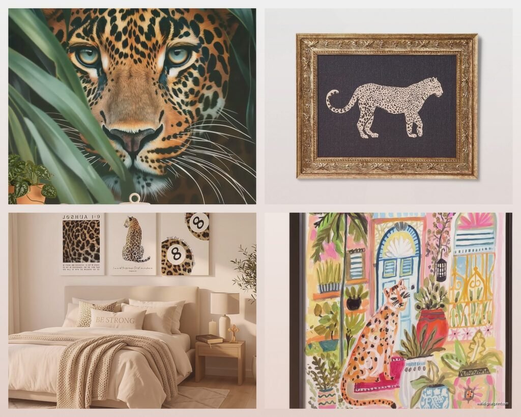
Okay so first thing – you gotta decide what KIND of cheetah energy you want. Are we talking photographic realism, abstract interpretation, or like that mid-century modern graphic style? I spent three hours last Tuesday (my dog kept interrupting because apparently 2pm is playtime) comparing different styles and here’s what I figured out.
Photographic prints work best in modern or contemporary spaces. Look for high-resolution images where you can see individual spots and whiskers. The detail matters SO much here. I found this one photographer on Etsy who shoots in Namibia and the quality is insane – you can see the muscle definition when the cheetah’s running. Those prints run about $80-150 for a good 24×36 inch size, but honestly worth it if you’re going this route.
Watercolor or painted styles are where I usually steer people who have more traditional or eclectic decor. There’s this beautiful loose quality that keeps it from feeling too serious. I paired one with some vintage brass frames in a client’s study and it completely changed the room. The colors tend to be warmer and softer which makes them easier to work with if you’ve got a lot of other stuff going on in the space.
Line art or minimalist illustrations – okay this is gonna sound weird but these are my secret weapon for smaller spaces or rentals. They’re sophisticated, they don’t overwhelm, and they’re usually cheaper. Found a set of three cheetah line drawings for like $45 total as digital downloads that I printed at a local print shop for another $60. Total game changer for a client’s home office.
Size and Placement Because This Is Where Everyone Messes Up
The biggest mistake I see is people buying art that’s too small for their wall. Like you need the cheetah to have PRESENCE, right? It’s the fastest land animal, not a timid little house cat.
For above a sofa, you want something that’s about two-thirds to three-quarters the width of the furniture. So if your couch is 84 inches, you’re looking at roughly 56-63 inches of art width. You can do this with one large piece or a diptych or triptych situation.
I did a whole gallery wall last month with cheetah photography mixed with African landscape shots and some abstract pieces in similar tones. The main cheetah portrait was 30×40 inches and then everything else was smaller – 11x14s and 16x20s. The key was keeping the cheetah as the focal point and letting everything else support it.
Height Matters Too
Center your art at 57-60 inches from the floor. This is standard gallery height and there’s a reason for it – it’s average eye level. Unless you’re hanging above furniture, then you want 6-8 inches between the top of the furniture and bottom of the frame.
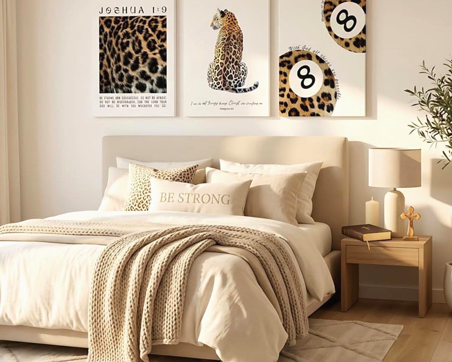
Oh and another thing – in bedrooms, I sometimes go lower with animal art because you’re seeing it from bed level a lot. Hung a gorgeous cheetah print at 55 inches in a client’s master and it feels way more intimate and intentional.
Color Coordination Without Being Matchy-Matchy
Cheetahs are naturally tan, gold, cream, and black – pretty neutral actually which is great news. But you can’t just throw them into any color scheme and expect it to work.
With warm neutrals: This is the easiest pairing. Taupes, creams, warm grays, camel colors. Add some black accents to echo the spots. I’m obsessed with pairing cheetah art with cognac leather furniture and brass fixtures. Chef’s kiss.
With cool grays: You need to bridge the temperature gap. I use warm wood tones or ochre/mustard accents to connect the warm cheetah tones with cooler wall colors. Did this in a client’s dining room with gray walls and it needed those warm middle tones or it felt disjointed.
With bold colors: Okay so funny story, I had a client with this gorgeous deep teal living room and she was convinced cheetah art wouldn’t work. We tried it anyway with a large black and white cheetah portrait (basically high contrast, almost no tan tones) and added gold frames and some rust-colored pillows. Absolutely stunning. The trick is going more graphic and less naturalistic when you’re working with saturated colors.
With white walls: Literally everything works. This is your playground. You can go full color photographic, sepia tone, black and white, whatever. White walls let the art do all the talking.
Frame Choices That Actually Matter
I used to think frames were just frames but nope, they completely change the vibe.
- Black frames: Modern, clean, let the image pop. Work with literally everything. This is my default.
- Natural wood: Warmer, more organic. Great for bohemian or Scandinavian-leaning spaces. Light oak or walnut both work.
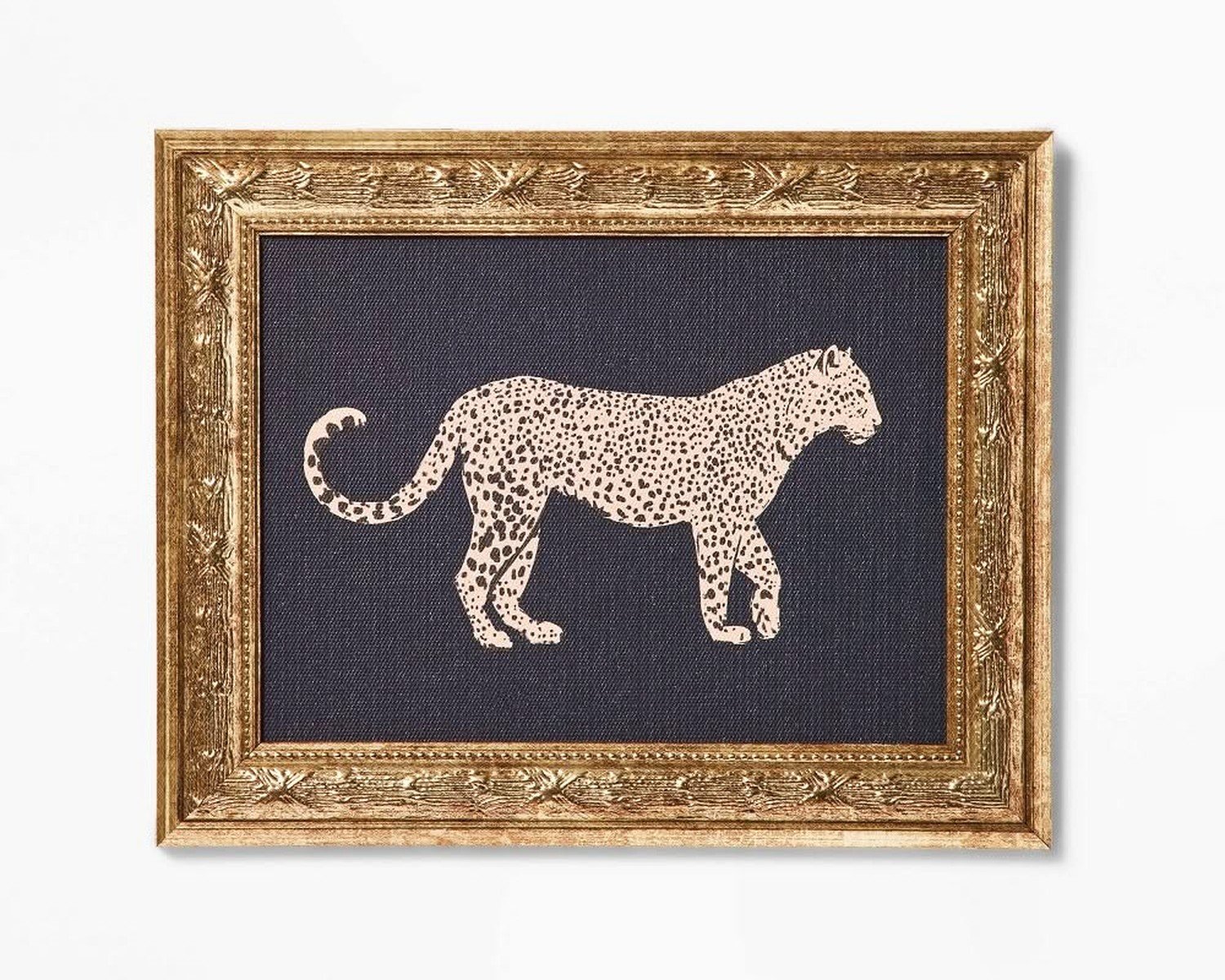
- Gold or brass: Glamorous, traditional. Use these sparingly – they’re a statement. I love them with black and white cheetah photos though.
- White frames: Coastal, airy, casual. Good for lighter spaces but can wash out some prints.
- No frame/canvas wrap: Contemporary and affordable. The image wraps around the edges. Works if your art is high quality and you want that gallery feel.
For my own apartment I went with a massive canvas wrap cheetah mid-sprint and it’s borderline aggressive but I love it. Cost me $120 from one of those online canvas sites during a sale.
Matting Yes or No
If you’re doing framed prints under glass, matting adds sophistication and breathing room. I typically use white or cream mats that are 2-3 inches wide. For cheetah art specifically, a wider mat can make even a smaller print feel more substantial and gallery-worthy.
Skip the mat if you’re doing canvas or if you want a more modern edge-to-edge look.
Where to Actually Buy This Stuff
Gonna be real with you, I’ve tried SO many sources and here’s what’s actually good:
Etsy: Best for unique pieces and supporting actual artists. Search for “cheetah photography print” or “cheetah watercolor” and filter by reviews. I’ve bought probably 15 pieces from various sellers and only had one issue (wrong size shipped, they fixed it immediately).
Society6 and Redbubble: Good for trendy styles and lots of size/format options. Quality is decent. Not amazing, but decent. Prices are reasonable and they run sales constantly.
Local print shops: If you find digital art you love (legally downloaded, obviously), printing locally often gives you better quality than online canvas places. I have a print shop I use that does this gorgeous archival printing for about $3 per square foot.
Framebridge: More expensive but their quality is incredible. I framed a cheetah photograph through them for a client’s entryway and it looks like a museum piece. You upload your image or mail them a print and they custom frame it. Takes 3-4 weeks but worth the wait.
HomeGoods/TJ Maxx: Hit or miss but sometimes you find absolute gems. I found a 40×30 framed cheetah print for $60 that would’ve been $300+ elsewhere. You gotta go regularly though because inventory changes constantly.
wait I forgot to mention – avoid Amazon for actual art prints unless you’re okay with mediocre quality. It’s fine for frames but the art itself is usually dropshipped mass production stuff that looks washed out in person.
Styling Around Your Cheetah Art
The art is your anchor but you need supporting elements or it’ll feel random and theme-y.
Textures are your friend. Think woven baskets, jute rugs, linen curtains, leather, rough wood. These natural textures echo the African savanna without being literal about it. I added a chunky jute rug under a client’s console table that had cheetah art above it and suddenly everything clicked.
Plants add life. Tall dramatic plants like bird of paradise, snake plants, or fiddle leaf figs. They bring in that wild organic element. My snake plant is currently blocking half my TV but whatever, it looks good with the art.
Metallic accents. Brass, copper, or aged bronze. These warm metals complement the golden tones in cheetah fur. I’m talking lamps, picture frames, decorative objects, hardware.
Keep patterns minimal. The cheetah spots ARE your pattern. If you add too many competing patterns it gets chaotic. Stick to solids and subtle textures mostly. Maybe one geometric pattern in small doses if you must.
Multiple Pieces and Gallery Walls
If you wanna do more than one cheetah piece, you need a strategy or it becomes a weird cheetah shrine.
Diptych or triptych sets showing one cheetah in sequence or different angles work great. There are sets specifically designed to hang together. These look amazing above long furniture like sideboards or beds.
Mix with other African wildlife sparingly. Maybe one cheetah and one acacia tree landscape. Or cheetah plus elephant. Don’t do like five different animals unless you’re actually opening a zoo.
Mix with abstract art in similar colors. This is actually my favorite approach. The cheetah is representational and bold, then you balance it with abstract pieces that pull the same color palette. Creates visual interest without being too literal.
I did this whole gallery wall where the main piece was a running cheetah, then surrounded it with abstract paintings in golds, blacks, and creams, plus some brass sunburst mirrors. My client was nervous about mixing styles but it turned out so good. The abstract pieces let your eye rest between looking at the detailed cheetah.
Lighting Makes or Breaks It
You can have the most beautiful cheetah art and if your lighting sucks, nobody will appreciate it properly.
Picture lights mounted above the frame are classic and dramatic. Battery-operated ones exist now which is great for renters. About $30-80 depending on finish.
Track lighting or adjustable ceiling lights aimed at the art. This is what galleries do. You want the light hitting the art at about a 30-degree angle to minimize glare.
Natural light is complicated. You want enough to see the art but direct sunlight will fade prints over time. UV-protective glass helps but it’s expensive. I usually position statement art on walls perpendicular to windows rather than directly across from them.
Ambient lighting in the room matters too. Warm white bulbs (2700-3000K) make cheetah art look richer and more golden. Cool white bulbs can make it look washed out.
Budget Real Talk
You can do this at basically any price point, you just gotta be realistic about what you’re getting.
Under $100: Digital download prints you print yourself, smaller canvas prints from online retailers, thrift/discount store finds. This absolutely works for most spaces. I’ve done entire rooms where the art cost under $100 total and looked expensive because of good framing and styling.
$100-300: Good quality canvas prints, professionally framed prints from Etsy artists, smaller original pieces. This is the sweet spot for most people. You’re getting decent quality that’ll last and look good.
$300-1000: Large original paintings, high-end photography prints, custom framing. This is investment art that should last decades. I go this route for focal walls in main living spaces.
Over $1000: Commissioned work, gallery-represented artists, massive statement pieces. Only necessary if you’re really serious about art collecting or have a huge space to fill.
The biggest bang for your buck is honestly good framing of affordable prints. A $40 print in a $100 frame looks way better than a $140 print in a cheap frame.
Common Mistakes I Keep Seeing
Too many spots everywhere. Cheetah print fabric AND cheetah art is usually overkill. Pick one or the other.
Wrong proportions. Tiny art on huge walls. Size up, always. When in doubt, go bigger.
Ignoring the room’s existing style. You can make cheetah art work in most spaces but you gotta adapt the style of the art to match. Traditional room needs traditional art treatment, modern room needs contemporary approach.
Hanging it crooked. Use a level. Please. Nothing ruins expensive art faster than wonky hanging.
Too theme-y. If every single item in your room screams SAFARI, it’s too much. The cheetah art should feel intentional, not costume-y.
okay I think that’s everything I’ve learned from like two years of working with cheetah art in different spaces. It’s honestly such a versatile subject if you approach it right. The speed and grace of cheetahs translates into this incredible energy on your walls without being aggressive or overwhelming when you balance it properly with your other design elements.