Wall Art Guide, Wall Art Tutoriels
Chess Wall Art: Strategic Board Game Intelligence Decor
Jul
So I’ve been completely obsessed with chess wall art lately and honestly it started because a client wanted something “intellectual but not pretentious” for their home office and I went down this rabbit hole that lasted like three weeks.
Why Chess Art Actually Works (When It Could Be So Cringe)
Here’s the thing about chess decor – it walks this super thin line between looking sophisticated and looking like you’re trying way too hard to seem smart. I’ve seen it go both ways. The key is treating it like art first, chess second. If you’re buying something just because it has chess pieces on it, you’re gonna end up with something that screams “I watched Queen’s Gambit once.”
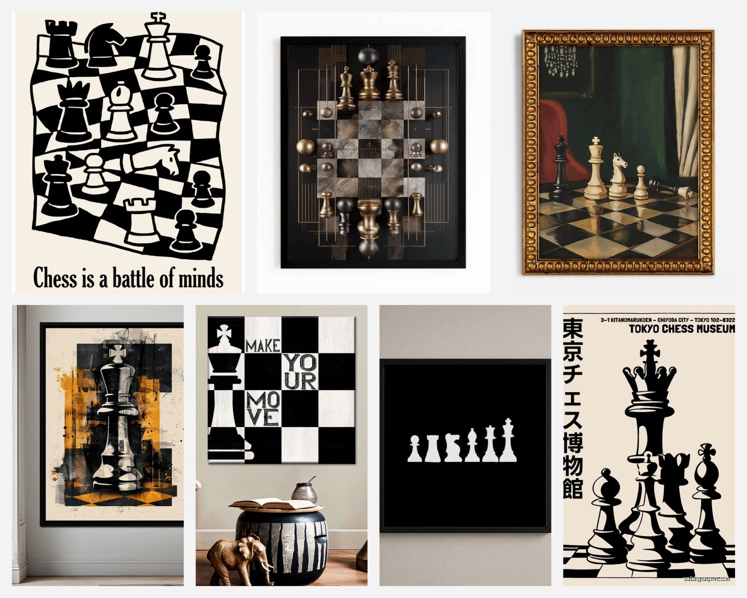
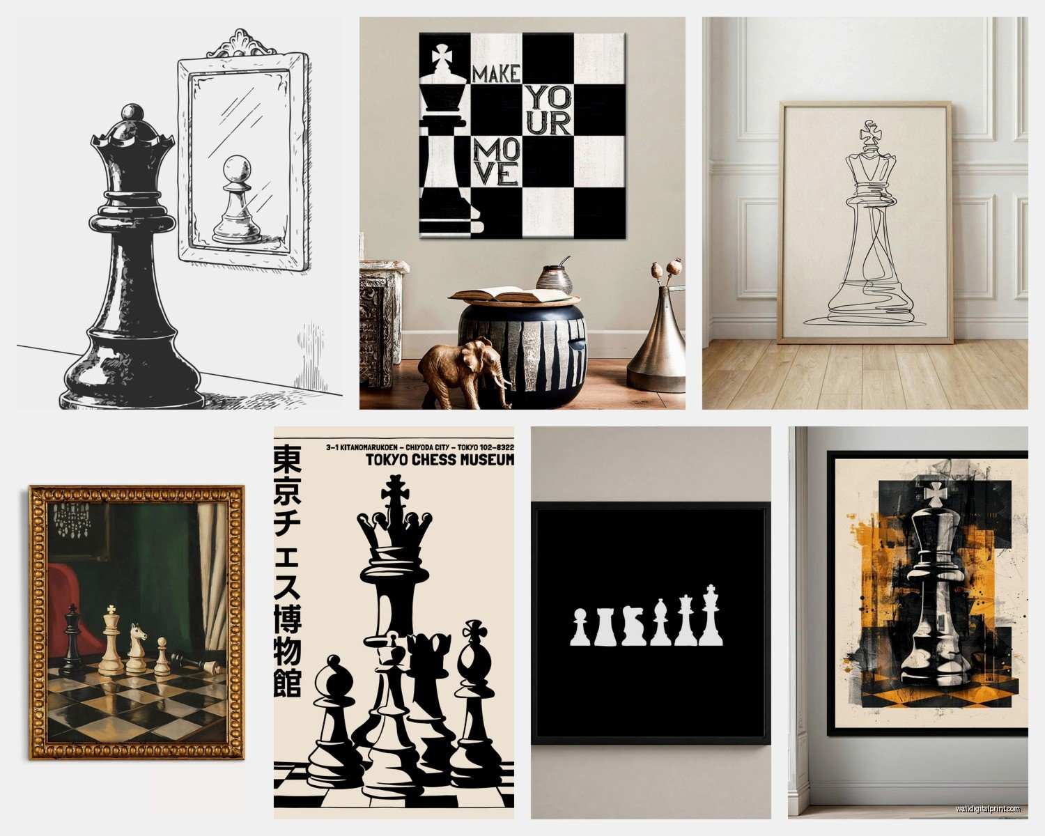
The pieces I actually recommend are either really abstract interpretations or vintage-style tournament posters. There’s this one seller on Etsy (gonna find the name hold on) that does these minimal line drawings of famous chess positions and they’re *chef’s kiss* because unless you really know chess, they just look like interesting geometric art.
What Actually Looks Good on Your Wall
Vintage Tournament Posters
Okay so vintage chess tournament posters from like the 60s and 70s are having a moment and I’m here for it. The Soviet-era ones especially have this amazing graphic design quality. I found a reproduction of a 1972 Reykjavik poster (Fischer vs Spassky, the cold war match) and it’s got these bold colors and typography that would work even if you didn’t care about chess at all.
You can get quality prints for like $30-80 depending on size. I usually go with 24×36 for a home office or 16×20 for a smaller space. Frame it in a simple black or wood frame – nothing ornate because the poster itself is already doing the work.
Abstract Piece Arrangements
This is where it gets fun. There are artists who photograph chess pieces in really dramatic lighting or arrange them in patterns that are more about form than function. I bought this triptych last month where each panel shows a different piece (king, queen, knight) shot in stark black and white with crazy shadows and it looks more like a fashion photograph than game art.
The trick with these is scale. Go bigger than you think. A tiny 8×10 photo of a chess piece just looks sad and literal. But a 30×40 canvas of a knight with dramatic lighting? That’s a statement.
Board Position Art
Wait I forgot to mention – there are these really cool pieces that show famous games mid-play. Like the position from Kasparov’s match against Deep Blue or Bobby Fischer’s “Game of the Century” when he was 13. For people who know chess, these are like… emotional? Which sounds ridiculous but it’s true.
For people who don’t know chess, they just look like interesting grid patterns with shapes. I have one in my own place that’s actually the position from my dad’s first tournament win and I had it custom made, but you can find prints of famous positions pretty easily.
Materials That Don’t Look Cheap
So I’ve tested a bunch of different print methods because my cat knocked over my coffee onto a canvas print once (long story, I cried) and learned some things the hard way.
Canvas prints work great for colorful or painted-style chess art. They have that gallery wrapped look that doesn’t need a frame. But get the thicker 1.5 inch depth, not the thin ones. The thin ones look like you printed something at Kinko’s.
Metal prints are actually perfect for chess art, especially the minimalist or photographic styles. The colors pop and there’s something about the medium that makes it feel modern and intentional. They’re pricier though – expect to pay $100-200 for a decent size.
Framed prints are my go-to honestly. You have more control over the final look and you can change the frame later if your style evolves. I use this framing place that does custom sizes for reasonable prices, but even Framebridge or just buying frames separately works.
Oh and another thing – if you’re getting multiple pieces, keep the frame style consistent. I see people mix black frames with wood frames with white frames and it just looks chaotic, not curated.
Acrylic and Glass
There are these acrylic prints that are basically like… the image is printed on the back of a thick acrylic panel so it has this depth and glossy quality. They’re stunning for the right piece but they’re also heavy and expensive. I used one for a client’s chess-themed library and it was worth it because the whole room was high-end, but for most spaces it’s overkill.
Where to Actually Buy This Stuff
Etsy is gonna be your best friend here. Search for “chess art print,” “vintage chess poster,” or “chess photography” and you’ll find tons of independent artists. I’ve bought from at least a dozen sellers and the quality is usually solid if they have good reviews.
Society6 and Redbubble have chess designs too but they’re more hit or miss. The advantage is you can get the same design on different products – canvas, framed print, metal print, whatever. The disadvantage is some of the designs are pretty generic.
For actual vintage posters (not reproductions), check eBay and specialty poster sites. I found an original 1980s chess championship poster for $60 that’s now worth way more, but you gotta be patient and check regularly.
Custom Options That Are Worth It
If you or someone you know plays chess seriously, getting a custom print of a meaningful game position is actually not that expensive. There are services that’ll take the chess notation and create a clean diagram. I did this for my dad’s birthday and it cost like $45 for the print.
You can also commission artists to do interpretive pieces. I worked with an artist who did this incredible watercolor series based on chess openings and it was around $300 per piece, which isn’t bad for original art.
Styling It Without Looking Like a Chess Club
This is gonna sound weird but the secret to making chess art work is surrounding it with stuff that has nothing to do with chess. If you have chess art next to chess books next to a chess set, it’s too much. It becomes your whole personality.
I usually pair chess art with:
- Plants (always plants)
- Other abstract or geometric art that shares similar colors or composition
- Vintage cameras or other collectibles
- Regular books on shelves that aren’t about chess
- Textured elements like a woven wall hanging or macrame
The chess piece becomes one element in a broader aesthetic story, not the main character.
Color Schemes That Work
Black and white chess art is the easiest to style because it’s neutral. Throw it in a room with pops of color and it grounds everything.
But if you want color, think about what already exists in your space. I have a client with a lot of warm terracotta and brass tones, so we found chess art with vintage orange and brown tones that tied everything together.
There are also these really cool modern interpretations in jewel tones – emerald green boards with gold pieces, sapphire blue with silver. These work in more maximalist or eclectic spaces.
Size and Placement Reality Check
People always go too small with wall art. Like, always. That space above your desk? You’re thinking 16×20, but you actually need 24×36 minimum.
Here’s my rough guide:
- Above a desk: 24×36 or 30×40
- Small wall space or gallery wall component: 11×14 or 16×20
- Statement wall: 40×60 or larger (or a triptych that spans 4-6 feet total)
- Bedroom accent: 24×36
Also hang it at eye level, which is around 57-60 inches from the floor to the center of the piece. I see so much art hung way too high and it makes the whole room feel off.
Gallery Wall Approach
If you’re doing a gallery wall with chess as the theme, mix different styles. Combine a vintage poster with a modern photograph with an abstract piece. Use different frame sizes but keep the frame color consistent.
I did one recently with five pieces – three different sizes – arranged in an asymmetrical cluster. The largest piece was off-center and everything else balanced around it. It took like an hour to get the spacing right (use paper templates first, trust me) but it looked intentional and collected rather than matchy-matchy.
The Pieces That Surprised Me
Okay so funny story – I bought this piece that’s just a close-up photograph of chess piece shadows on a board and I thought it would be too subtle, but it’s become my favorite. The geometry of the shadows creates this whole secondary pattern that’s more interesting than the pieces themselves.
Also those exploded view diagrams of chess pieces? Where you can see all the parts separated out like a technical drawing? Those are unexpectedly cool in a modern space. Very blueprint aesthetic.
And vintage chess clock art – there’s something about the mechanical nature of old chess clocks that photographs really well. Gears and numbers and worn leather cases.
What to Avoid
Inspirational quotes about chess and life. Just no. “Life is like chess” or whatever – it’s too on the nose and honestly kind of cheesy.
Super literal paintings of people playing chess unless they’re genuinely well-executed classical pieces. There’s a lot of mediocre “man thinking hard over chess board” art out there.
Anything that looks like clip art. You’ll know it when you see it – the pieces look computer generated and flat.
The Amazon Problem
You can find chess art on Amazon but it’s mostly the stuff I just told you to avoid. Generic, printed-on-demand designs that a thousand other people have. If you’re gonna go Amazon, at least read reviews carefully and look at customer photos.
Making It Personal
The best chess art tells some kind of story or has meaning beyond just “I like chess.” Maybe it’s art from a tournament you attended, or a position from a game you played, or a vintage poster from a match that happened the year you were born.
I helped a client create a whole wall of chess memorabilia that included vintage scoresheets (framed behind glass), photos from their grandfather’s chess club in the 1950s, and modern prints that tied it all together visually. It was personal and interesting and not at all generic.
If you’re buying for someone else, find out if they have a favorite player or era of chess. Fischer era stuff looks totally different from modern chess art. Classical period chess illustrations have a whole different vibe than contemporary minimalist designs.
Look, at the end of the day chess wall art works when it enhances your space rather than defining it. Start with one piece you genuinely love looking at, live with it for a while, and then build from there if you want more. Don’t rush into buying a whole set just because they’re sold together.
And honestly? The best piece is the one that makes you happy when you walk past it, whether that’s because it’s beautiful or meaningful or just fits perfectly in that weird space above your bookshelf.