Wall Art Guide, Wall Art Tutoriels
Cross Wall Art: Christian Religious Faith Symbol Decor
Jul
So I’ve been styling crosses for client homes for like six years now and honestly it’s trickier than people think because you’re dealing with something super personal but also it’s literally just wall decor and you don’t want it to look like a church supply catalog exploded in your living room.
Size Actually Matters More Than You Think
Okay so first thing – everyone gets the size wrong. I had this client last month who bought this massive 36-inch iron cross for above her couch and when we hung it up it looked like… I don’t even know, like a funeral home? The rule I use is your cross should be about 2/3 to 3/4 the width of whatever furniture it’s hanging above. So if your couch is 84 inches wide, you want something in the 56-60 inch range. Or you can do a grouping of smaller crosses which actually looks less intense.
For bedroom walls where there’s no furniture reference point, I usually go between 18-24 inches. Anything bigger starts feeling like it’s watching you sleep which is weird even if that’s kinda the point spiritually speaking.
The Woods vs Metals Thing
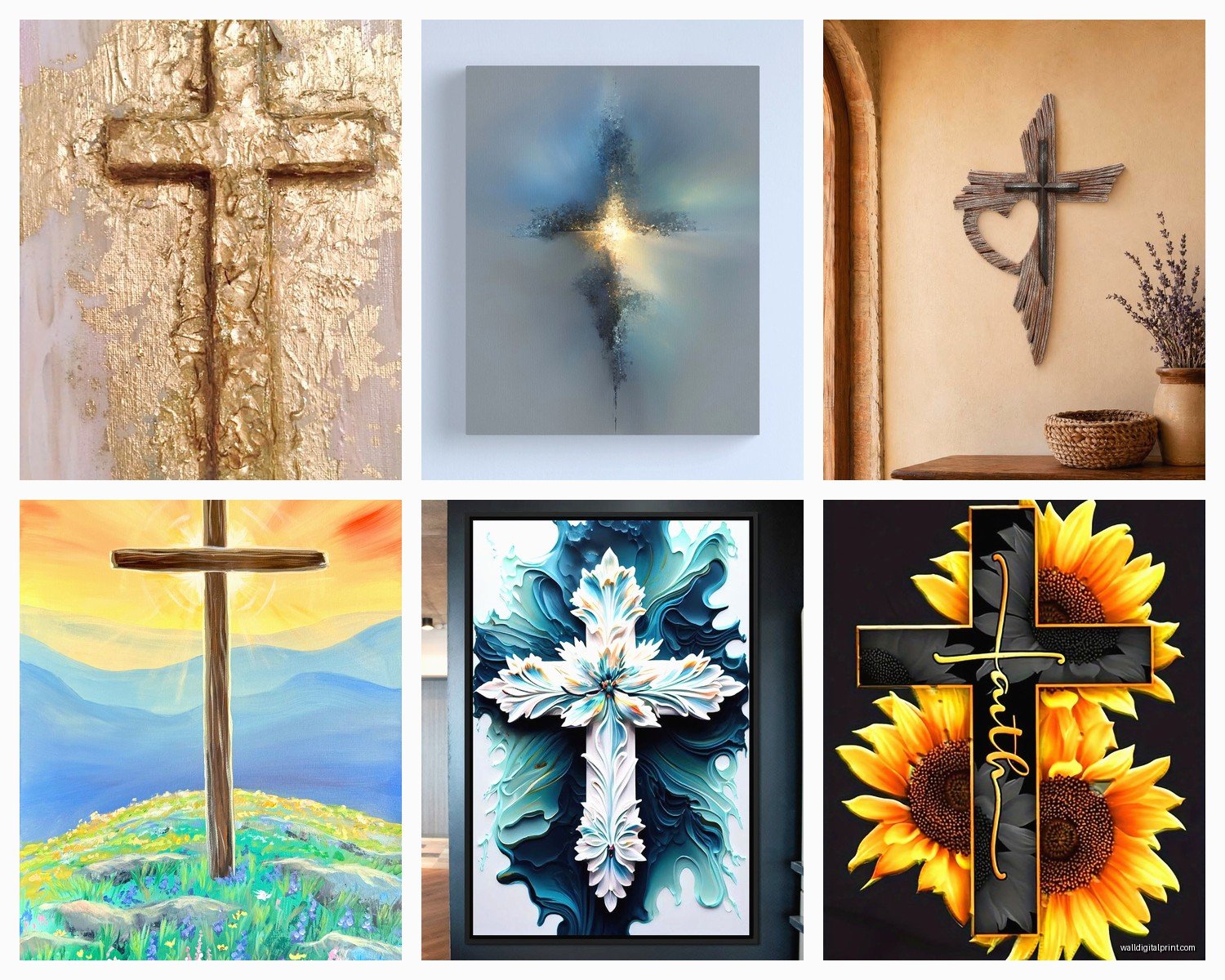
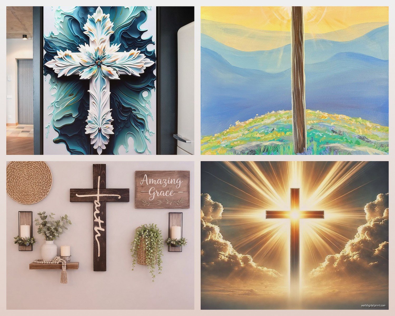
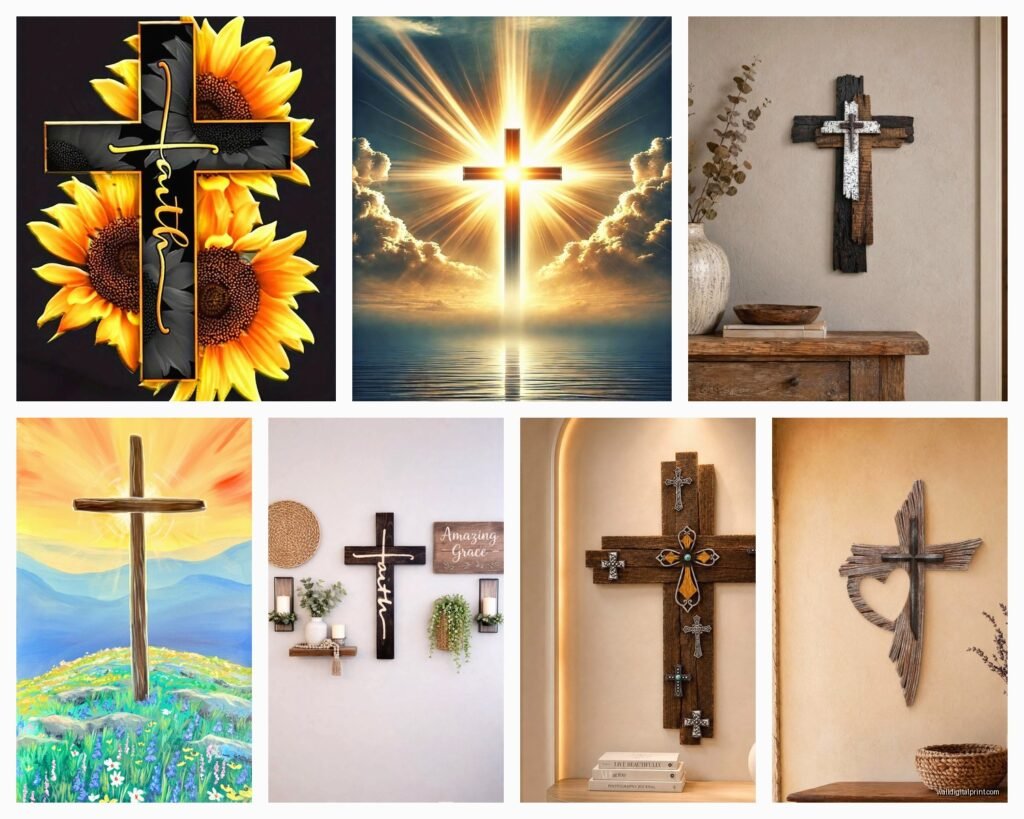
Wooden crosses give you that rustic farmhouse vibe which works if that’s your aesthetic but can look really dated if you’re not careful. I’ve been seeing a lot of reclaimed wood crosses on Etsy and some are gorgeous but some look like someone just nailed two pieces of fence together. The good ones have actual texture – you want to see grain variation, maybe some natural edge, weathering that looks intentional not just old.
Metal crosses are having a moment right now. The wrought iron scrollwork ones from like the 2000s are definitely out unless you’re going for that specific Mediterranean look. What’s working better now are the simpler metal silhouettes – flat black steel, brushed bronze, even matte gold if your room can handle it. My cat knocked over my coffee while I was installing one of those hammered copper crosses last week and honestly the patina it created looked better than the original finish so sometimes chaos works in your favor.
Where to Actually Hang Them
Living room is the obvious choice but it can feel really formal. I’ve had better luck putting crosses in unexpected spots – hallway galleries, above a reading nook, in the entryway which actually makes sense symbolically. One client put a small cross collection in her laundry room and said it reminds her to pray while doing mundane tasks which I thought was actually pretty smart.
Master bedroom is traditional and works great but think about the wall you’re choosing. Above the bed is classic but if you’ve got a upholstered headboard situation it might compete visually. The wall opposite your bed so you see it when you wake up is another option.
The Height Formula Nobody Tells You
Standard gallery height is 57-60 inches to the center of the artwork but with crosses it’s different because they’re symbolic not just decorative. I usually go slightly higher – around 62-65 inches to center – because it creates this subtle upward eye movement. Sounds pretentious but it actually works. You want people’s gaze to lift slightly.
If you’re hanging above furniture, leave 6-8 inches between the furniture top and the bottom of the cross. Less than that and it looks like it’s sitting ON the furniture, more than that and it floats weird in dead space.
Mixing Crosses With Other Decor
This is where people get nervous but honestly you can mix crosses into gallery walls just fine. I did this whole thing last spring where we integrated a simple wooden cross into a gallery wall with family photos and botanical prints. The trick is treating the cross as an anchor piece – it should be one of the larger elements and positioned slightly off-center or at a focal point.
Wait I forgot to mention – if you’re doing multiple crosses on one wall, odd numbers work better. Three or five crosses in varying sizes creates visual interest without looking like a collection display. Keep them in the same material family though. Don’t mix rustic wood with shiny metal unless you really know what you’re doing.
The Color Coordination Nobody Talks About
White or cream crosses on white walls can look really elegant and subtle if that’s your vibe. But they also kinda disappear so you need good lighting. I’m seeing more people paint wooden crosses to match their accent colors which feels very DIY Pinterest but can actually look sophisticated if you use the right paint. Matte finish only though – glossy painted crosses look like craft projects.
Dark crosses on light walls obviously have the most contrast and visual impact. If your walls are dark you’re gonna need a light-colored cross or one with metallic elements that catch light. I installed a whitewashed wood cross on a charcoal accent wall last month and the client texts me photos of it like every week because she’s obsessed with how it pops.
Style Specific Recommendations
For modern farmhouse which everyone and their mother wants right now – go with natural or weathered wood, simple lines, maybe some dimension but not too ornate. The crosses that look like they’re made from old barn beams work great here. Bonus points if there’s a metal bracket detail or wrapping.
Modern minimalist spaces need clean-lined crosses. I’m talking simple silhouettes, metal or painted wood, no embellishment. There’s this one brand that makes these geometric interpretation crosses that are basically abstract but still clearly read as crosses and they’re perfect for contemporary spaces.
Traditional or transitional rooms can handle more ornate crosses. The ones with carved details, inlaid elements, decorative finials. Just make sure the level of ornateness matches your other decor – if your space is pretty simple otherwise, an elaborate cross will stick out.
Bohemian or Eclectic Spaces
This is actually where you have the most freedom. Woven crosses, crosses made from unexpected materials like rope or beads, carved wooden crosses from different cultures. I have a client who collects crosses from her travels and displays them salon-style on one wall and it’s actually really beautiful because each one has a story.
Lighting Makes or Breaks It
Okay so funny story – I installed this gorgeous carved cross for a client and she called me two days later saying she hated it. Went back over and realized the lighting was all wrong. Cross was in a shadow basically all day. We added a picture light above it and suddenly it was her favorite piece in the house.
If your cross has texture or dimension, you want light that creates shadows and highlights those details. Side lighting or spotlighting from above works. Flat front lighting washes everything out. For metal crosses, lighting angle matters even more because you’re working with reflection.
The Grouping Strategy
Three crosses in a horizontal line is probably the most common arrangement and it works but it’s also kinda basic. What I’ve been doing instead is asymmetrical groupings – one larger cross with two or three smaller ones arranged around it in a loose cluster. Keeps it interesting.
Vertical arrangements work great for narrow wall spaces like between windows or next to a doorframe. Stack three crosses vertically with the largest in the middle or at the bottom.
The grid arrangement – like four or six crosses in an even grid – can look really striking but also very formal so it depends on your space. I used this in a prayer room once and it made sense there but in a casual living space it might feel too rigid.
Material Quality Checks
When you’re shopping online which let’s be honest is where most people buy this stuff now, you gotta watch out for cheap construction. For wooden crosses, zoom in on the photos and look for actual wood grain. If it looks too uniform it’s probably printed vinyl on MDF which is gonna look cheap in person.
Metal crosses should have some weight to them. Check the product weight in the description – if a 24-inch metal cross weighs less than 2 pounds it’s probably flimsy stamped metal that’ll look tinny. You want something with substance.
Hanging hardware matters too. The good ones come with proper mounting hardware, not just a sawtooth hanger on the back. For anything over 3 pounds you want wall anchors included or at least recommended.
Finish Quality
For painted or stained finishes, read reviews specifically mentioning the finish quality. I’ve ordered crosses that looked great in photos but the paint was literally chipping off when I unboxed them. Look for terms like “sealed,” “protected finish,” or “topcoat” in the description.
Distressed finishes should look intentional not just beat up. There’s a difference between artfully weathered and actually damaged. If you can’t tell from photos, that’s probably a red flag.
The Budget Reality
You can find decent crosses for $30-50 in the 18-24 inch range. Under $30 and you’re usually getting something that looks cheap in person unless you’re going super minimal. The $50-100 range is where you get better materials and construction – solid wood, quality metal, good finishes.
Over $100 you’re usually paying for size, artisan construction, or unique design. I’ve specified $300 crosses for clients and they’re beautiful but you gotta really want it. For most people a well-chosen piece in the $60-80 range is gonna look great and feel substantial.
Maintaining Them
Wooden crosses need dusting obviously but also watch for direct sunlight which will fade stained finishes over time. If you’ve got a cross in a sunny spot, rotate it like once a year or expect the color to change.
Metal crosses just need occasional dusting. The ones with crevices or scrollwork collect dust like crazy so keep a small brush handy. Wrought iron can rust if you’re in a humid climate so maybe skip that for bathroom or kitchen locations.
Oh and another thing – if you’re renting and worried about nail holes, there are these heavy-duty picture hanging strips that work up to like 16 pounds. I’ve used them for medium-sized crosses and they hold fine. Just follow the instructions exactly about wall texture and application time.
The whole process doesn’t need to be this huge spiritual decorating journey. Pick something that feels meaningful to you, make sure it fits your space proportionally, hang it at the right height with proper lighting, and you’re good. I’m literally watching reality TV while writing this so clearly it’s not that deep even though it represents something deep if that makes sense.
Just don’t overthink it to the point where you end up with nothing on your walls because you’re paralyzed by choices. Better to hang something that mostly works than to leave the space empty for months while you search for the perfect piece.