
Wall Art Guide, Wall Art Tutoriels
Water Wall Art: Ocean Lake River Aquatic Photography
Jul
So I’ve been hanging water photography in homes for like six years now and honestly it’s one of those things that seems straightforward until you’re standing there with a massive ocean print wondering why it looks completely wrong in the space.
Picking the Right Water Scene for Your Actual Room
Okay so here’s what nobody tells you – not all water images work everywhere. I learned this the hard way when I put this gorgeous stormy ocean piece in a client’s bedroom and she called me saying she couldn’t sleep because it felt “too aggressive.” Which like, fair.
Calm lake photography works best in bedrooms and reading nooks. The still water thing actually does affect the vibe, I know that sounds woo-woo but I’ve tested this enough times. You want those misty morning lake shots, maybe with some fog, definitely nothing with dramatic waves or dark storm clouds.
Ocean photography with waves and movement – that goes in living rooms, offices, hallways. Anywhere you want energy basically. I’ve got this turquoise wave shot in my own office and it genuinely makes me feel more productive, or maybe I just stare at it wishing I was at the beach instead of answering emails.
Rivers and streams are your middle ground. They’ve got movement but it’s gentle, so they work almost anywhere. I use river shots a lot in dining rooms and entryways because they’re interesting enough to look at but won’t dominate a conversation.
Size Matters Way More Than You Think
This is gonna sound obvious but I see people mess this up constantly. Your wall art should take up about 60-75% of your available wall space width-wise. I literally bring a measuring tape to every consultation because eyeballing it is how you end up with tiny art that looks like it’s floating in space.
For above a couch – you want the art to be roughly two-thirds the width of the couch. So if your couch is 90 inches, you’re looking at 60 inches of art width. That could be one large piece or a gallery wall situation.
My cat just knocked over my coffee so hold on… okay back.
The Gallery Wall Approach
If you’re doing multiple water photos together, keep them in the same color family. Like all cool tones or all warm sunset water shots. I did this arrangement last month with three different water bodies – ocean, lake, river – but kept everything in blue-gray tones and it looked cohesive instead of chaotic.
Space them 2-3 inches apart. Not 6 inches, not touching. This specific range just works visually and I don’t make the rules.
Color Temperature Is Everything
Wait I forgot to mention this earlier but it’s actually the most important part. Water photography comes in basically two color temperatures – cool (blues, grays, greens) and warm (golden hour, sunset, sunrise stuff).
Cool-toned water art makes rooms feel bigger and more serene. I use it in small spaces constantly because it visually recedes, creating depth. It also works great in rooms with warm wood furniture because of the contrast.
Warm-toned water photography makes spaces feel cozier but can also make them feel smaller. I’m careful with this in already-small rooms unless they’re getting tons of natural light. In a big open-plan living area though? Golden hour ocean shots are incredible.
Your wall color matters here too – cool water art on warm walls creates nice tension, same combination on same temperature can feel flat. I usually do a quick phone mockup before committing because returns are annoying.
Frame Choices That Actually Work
Okay so funny story, I used to overthink frames constantly until I realized there are basically three approaches that work for water photography and everything else is just… extra.
Simple black frame: This is my go-to like 70% of the time. It grounds the image without competing with it. Works with literally any water photograph. I buy them in bulk from this one supplier because my clients always want them.
Natural wood frame: Use this for warmer water tones or if your room has a coastal/organic vibe. Lighter woods for beach scenes, darker woods for more dramatic ocean or lake shots. I just finished a lake house project where we used weathered gray wood frames and it was *chef’s kiss*.
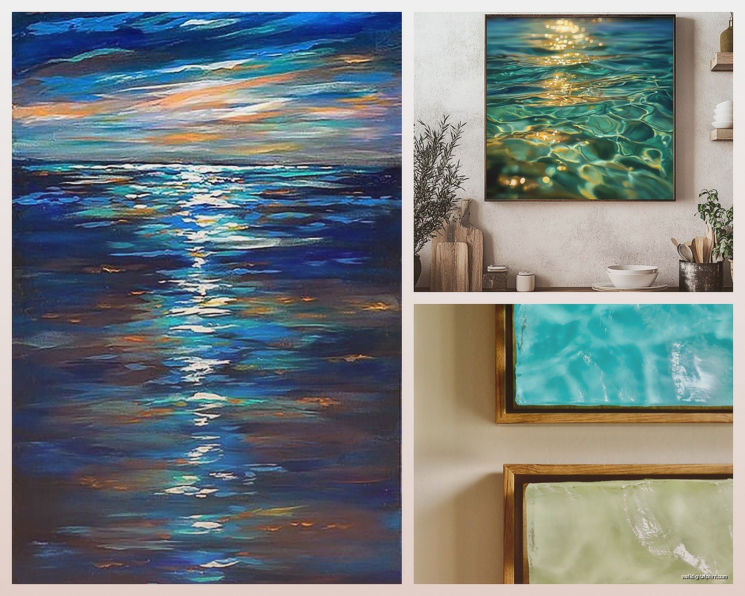
No frame/canvas wrap: This works for really bold colorful water shots, especially if you want a modern gallery feel. The image wraps around the edges. I’m less excited about this option because it dates faster, but in the right contemporary space it’s perfect.
What About Metal Prints
Oh and metal prints for water photography are actually amazing if your budget allows. The way they handle the reflective quality of water is just different – more luminous somehow. I used an aluminum print of ocean waves in a modern condo bathroom and the client texts me photos of it like every few months because she’s still obsessed.
They’re pricey though, gonna be honest. Usually 3-4x the cost of a regular framed print.
Where to Actually Source Good Water Photography
This is where I probably spend too much time but the quality difference between a random internet print and actual photography is massive.
Local photographers: Check Instagram hashtags for your area plus “photographer” or “seascape.” I’ve found incredible talent this way and the prints are usually higher quality because they’re overseeing the whole process. Plus you get a unique piece.
Art fairs and markets: Coastal areas especially have artists selling ocean and lake photography. You can see the print quality in person which saves so much hassle. I bought this amazing Lake Michigan print at a street fair three years ago and still get compliments on it.
Online fine art print shops: There are curated sites specifically for photography prints. They’re more expensive than mass market but less than galleries. Quality is consistent which matters when you’re ordering sight unseen.
I avoid the really cheap print-on-demand sites for anything larger than 16×20 because the resolution usually can’t handle it. You’ll get that pixelated look or the colors will be off.
Hanging Height Because Everyone Asks
Center of the artwork should be at 57-60 inches from the floor. This is “gallery height” and it actually works in homes too, not just museums.
Exception – if you’re hanging above furniture, leave 6-8 inches between the furniture top and the bottom of the frame. So you measure from the couch up 6-8 inches, that’s where your frame starts, then the center of the FRAME should still ideally be around that 57-60 inch mark if possible.
I use a laser level now because I got tired of the whole “measure with a tape, hold it up, step back, it’s crooked, do it again” dance. Cost like $25 and saves so much time.
Lighting Your Water Art
This is gonna sound weird but water photography really comes alive with the right lighting. Natural light is obviously ideal – I try to position these pieces where they’ll catch indirect sunlight during the day.
If you’re adding picture lights, use LED with a color temperature around 3000K. Warmer than that and cool-toned water looks muddy, cooler and it can feel too stark. I learned this after installing a 5000K light above a client’s ocean print and it looked like a hospital.
Track lighting or recessed lights work great too if you angle them properly. You want to avoid glare on the glass, so position lights at a 30-degree angle from the wall.
Style-Specific Approaches
Coastal/Beach House: This seems obvious but people still get it wrong – you don’t need literal beach photography in a beach house. Sometimes an abstract water closeup or underwater shot is more interesting. I did a whole coastal renovation where we used nothing but underwater kelp forest photos and it was way more sophisticated than typical beach scenes.
Modern/Minimalist: Clean horizon lines, minimal composition. Think one sailboat on calm water, or just sky and ocean in two distinct color blocks. Black and white water photography works incredibly well here too. I’m actually watching this documentary about ocean conservation while writing this and the cinematography would make amazing prints for modern spaces.
Traditional/Classic: Seascapes with some drama – waves, boats, cloudy skies. These should be properly framed with substantial frames, not canvas wraps. Darker, moodier water tones work better than bright turquoise.
Bohemian/Eclectic: You’ve got more freedom here. Mix water photography with other art types, use unexpected colors like sunset pinks and oranges over water, or go with really closeup abstract water textures. I layered a water print with some driftwood and shells in a shadow box situation once and it was very boho.
Common Mistakes I See Constantly
Putting ocean art in rooms with no visual connection to water. Like if your whole house is desert minimalist and suddenly there’s a beach scene, it feels random. You need some supporting elements – blues in your textiles, natural textures, something that creates a thread.
Choosing water photography that’s too literal or cliché. The sunset over ocean with palm tree silhouette thing is so overdone. Unless it’s an actually exceptional photograph, it reads as generic hotel art.
Ignoring the room’s natural light. A dark, moody ocean scene in an already-dark north-facing room just makes everything feel heavy. I always consider which direction the windows face before selecting the tone of water art.
Mixing too many water bodies in one space without a unifying element. Three different water photos need to share something – color palette, printing style, framing, or composition approach.
My Actual Process for Clients
When someone asks me to help them choose water art, here’s what I do: First, I look at their existing colors and figure out if we’re going cool or warm toned. Then I measure the wall space and calculate the size range. I take photos of the space from multiple angles because what looks good standing there doesn’t always photograph well and vice versa.
Then I create a shortlist of 3-4 options, usually from different sources, at different price points. I’ll do a quick digital mockup using my phone – there are apps for this now that are surprisingly accurate. We narrow it down, I order samples if possible (some photographers offer small size proofs), and then we commit.
The whole process takes longer than people expect but it’s worth it because wall art is expensive and permanent-ish.
Budget Real Talk
You can find decent water photography prints starting around $100 for smaller sizes if you know where to look. Local artists often have more flexible pricing than galleries. For a really statement piece, quality framed and everything, expect $300-800 depending on size.
If that’s not realistic, honestly a really good quality print from a photographer’s online shop in a simple IKEA frame looks better than a cheap print in an expensive frame. Prioritize the image quality and resolution over fancy framing.
I’ve seen people spend $1000+ on custom framing for a $50 print and it just doesn’t make sense to me unless there’s sentimental value involved.
Okay I think that covers most of what people actually need to know. The main thing is just taking your time with the selection and really considering how the specific water image works with your space, not just whether you like it in isolation. I’ve bought so many prints for my own place that looked amazing on the website but completely wrong on my walls, so now I’m way more methodical about the whole thing.
