Wall Art Guide, Wall Art Tutoriels
Prada Wall Art: Italian Fashion Luxury Brand Designer
Jul
So I’ve been working with Prada wall art for like three years now and honestly it’s one of those things that sounds super intimidating but actually isn’t once you figure out the vibe you’re going for.
Understanding What Actually Works in Real Spaces
The thing with luxury brand art is that it can go tacky SO fast if you’re not careful. I learned this the hard way when a client bought this massive Prada Marfa print and wanted it in their bedroom and it just… didn’t work. Too much visual noise. Prada wall art works best when you treat it like an accent piece, not the main character of your room, if that makes sense?
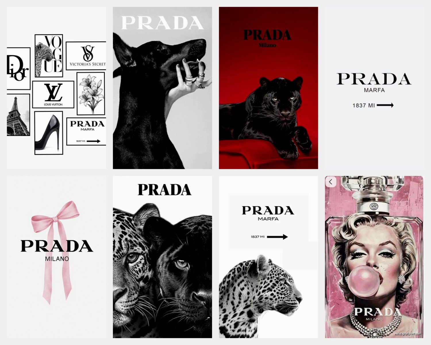
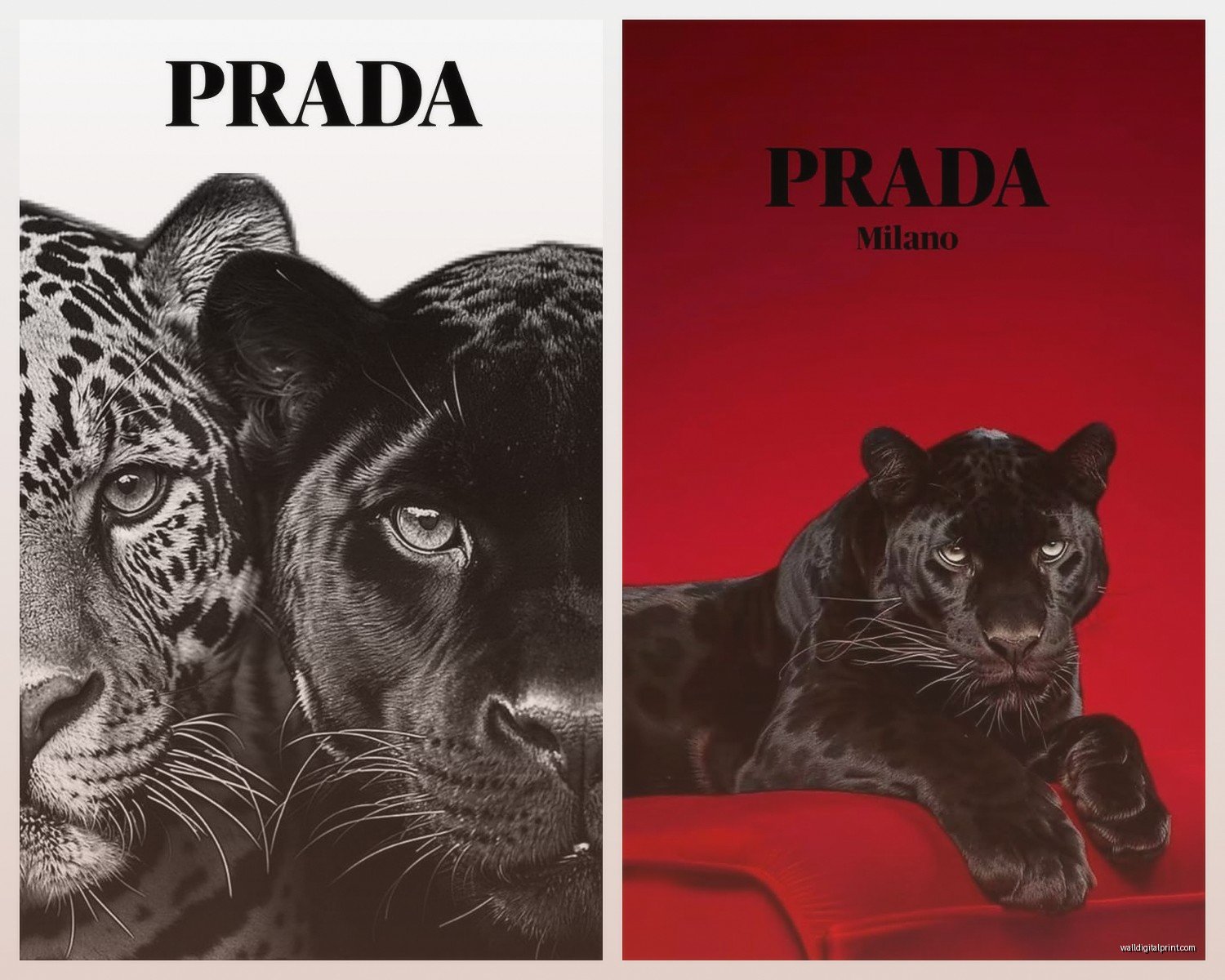
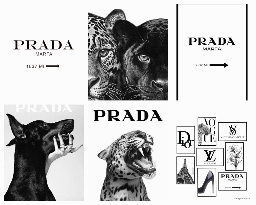
The prints I see working best are the minimalist ones – think black and white Prada storefront photography, the iconic triangle logo in simple compositions, or those abstract fashion sketches that reference the brand without screaming it. My go-to is usually finding pieces that have maybe 60% negative space because then they don’t compete with your actual furniture and existing decor.
Where to Actually Source These Pieces
Okay so this is gonna sound weird but don’t buy from the first “luxury wall art” website you find on Google. I’ve tested probably fifteen different sources and here’s what I’ve figured out:
Etsy sellers – surprisingly good for licensed prints and original interpretations. Look for shops that have been around 3+ years with consistent reviews. I found this seller last month who does these gorgeous watercolor Prada bags and the quality was better than expected.
Independent artists on Society6 or Redbubble – they do Prada-inspired work that’s legally in the clear because it’s transformative art. The canvas quality on Society6 is actually really solid, I’ve used their stuff in staging projects.
Vintage poster dealers – if you want actual authentic Prada advertising materials from the 90s or early 2000s, this is your route. It’s pricier but you’re getting the real deal. There’s this dealer in Milan I work with sometimes… anyway, that’s probably overkill for most people.
Custom print shops – you can bring in high-res images and have them printed on whatever material you want. Just be aware of copyright stuff here, obviously.
The Size Thing Nobody Talks About
Everyone asks me about sizing and honestly it depends so much on your wall situation but here’s my basic formula that works like 80% of the time:
For above a sofa or bed, you want your art to be roughly two-thirds to three-quarters the width of the furniture piece. So if your couch is 84 inches, you’re looking at a piece (or gallery wall arrangement) that’s about 56-63 inches wide.
Single statement pieces work best at 30×40 inches or larger – anything smaller reads as an afterthought unless you’re doing a curated gallery wall situation.
My cat just knocked over my coffee which is perfect timing because I need a break from looking at measurements anyway.
The Color Coordination Reality Check
So Prada’s brand colors are very specific – that particular shade of green (Prada green, it’s literally called that), black, white, and sometimes red. When you’re integrating Prada art into a space, you gotta decide: are you matching these colors or contrasting them?
I’ve had the most success with neutral rooms where the Prada piece becomes the color pop. Like an all-white bedroom with grey accents and then BAM, a Prada green shopping bag print. It works because everything else is calm.
If your room already has a lot going on color-wise, stick with black and white Prada prints. The simple Prada text logo on white background, or those architectural shots of their stores. These blend better and don’t fight with your existing palette.
Oh and another thing – frame color matters more than people think. Black frames make it feel more gallery-like and serious. Natural wood frames (especially light oak) soften the luxury brand edge and make it feel more approachable. White frames can work but they need really clean, modern spaces or they look cheap.
Framing Options That Actually Matter
I tested a bunch of framing options last year when my client canceled three appointments in a row so I spent like four hours comparing different frame styles with the same Prada print:
- Floating frames (where there’s a gap between the art and frame) – super modern, works great with canvas prints
- Gallery frames with white matting – classic, makes even a simple print look expensive
- Frameless (just mounted to backing board) – only works if your print quality is REALLY good, otherwise it looks unfinished
- Shadow boxes – if you’re framing actual objects like shopping bags or packaging, this is your move
The matting thing is crucial. A $30 print in a $100 frame with proper matting looks way better than a $200 print in a basic frame with no mat. The mat creates visual breathing room and makes your eye focus on the art itself.
Creating a Gallery Wall Without Making It Look Like a Dorm Room
This is where people either nail it or it becomes a mess. I’ve done probably fifty Prada-themed gallery walls at this point and here’s the structure that consistently works:
Start with one larger anchor piece (24×36 or bigger) and arrange smaller pieces around it. The anchor should be your most impactful image – maybe a vintage Prada runway photo or a really striking product shot.
Keep your spacing consistent – I use 2-3 inches between frames. Measure this, don’t eyeball it. I learned that lesson the hard way and had to reposition like twelve frames.
Mix in some non-Prada pieces that complement the aesthetic. Like if you’re doing fashion-forward Prada art, add some abstract geometric prints or minimalist photography. It keeps it from feeling too branded and one-note.
The Layout Trick I Wish Someone Told Me Earlier
Lay everything out on the floor first in the exact arrangement you want. Take a photo from directly above. Use that photo as your reference when you’re actually hanging. Sounds obvious but I cannot tell you how many times I tried to wing it and ended up with uneven spacing.
Or if you’re not into the whole “measure twice hang once” thing, those picture hanging strip systems where everything clips onto a rail are honestly genius for gallery walls. You can adjust positions without making new holes.
Different Room Applications That Work
Living rooms – above the sofa is classic but also consider creating a dedicated art wall opposite your seating area. I did this in my own place with three large Prada storefront photos and it became the focal point when you walk in.
Bedrooms – keep it more subtle here. A single framed piece above the bed or a small gallery wall on a side wall. The bedroom with the massive Prada print I mentioned earlier? We moved it to their walk-in closet and it was PERFECT there. Closets and dressing areas are actually ideal for fashion brand art.
Home offices – this is where you can go a bit more bold with the branding. A statement Prada piece behind your desk for Zoom calls? Chef’s kiss. Just make sure the lighting doesn’t create glare on the glass.
Entryways – first impression territory. A medium-sized piece (20x30ish) on your entry wall sets a sophisticated tone without overwhelming the small space.
Bathrooms – okay hear me out. A small Prada perfume bottle illustration in a powder room? It’s cheeky and fun and actually works if your bathroom has the right vibe. Not for everyone but I’ve done it twice and both clients loved it.
Mixing High and Low (The Budget Reality)
Not everything needs to be expensive, that’s the secret honestly. I mix $25 Etsy prints with $400 vintage posters all the time and if they’re all framed nicely, you can’t tell which is which from across the room.
Spend money on:
- Frames and matting (this is where quality shows)
- One or two statement pieces if you can
- Professional printing for anything over 20×30
Save money on:
- Smaller accent pieces (8×10, 11×14)
- Digital downloads you can print yourself
- Prada-inspired rather than official imagery
I got my favorite Prada piece at a flea market for $30 – it’s an original 1998 ad campaign poster and it’s now worth like $300+ but the seller had no idea. Keep your eyes open at estate sales and vintage shops.
The DIY Route That Doesn’t Suck
If you’re crafty (or want to pretend you are), you can create some really cool Prada-inspired pieces yourself. I’ve done this with clients who have tight budgets:
Fashion magazine pages featuring Prada editorials, carefully removed and framed in matching frames – creates a cohesive look for under $100.
Custom typography prints using Prada fonts and quotes from Miuccia Prada – there are free design tools that make this easy.
Pressed Prada shopping bags or tissue paper in shadow boxes – sounds weird but I’ve seen this look incredibly chic in the right setting.
Lighting Considerations You’re Probably Ignoring
The best Prada print in the world looks meh with bad lighting, I’m just gonna say it. If you’re investing in nice wall art, invest in proper lighting too.
Picture lights mounted above frames work great for creating that gallery effect. LED strips are getting better and some have adjustable color temperature which is clutch for making sure your blacks look black and your whites look white, not yellow.
Natural light is tricky – you want enough to see the art but direct sunlight will fade prints over time. UV-protective glass is worth it if your art is on a wall that gets afternoon sun.
Wait I forgot to mention – if you’re hanging anything valuable, use proper picture hanging hardware. Those little sawtooth hangers that come with cheap frames are not gonna cut it for anything over 5 pounds. D-rings and picture wire, or even better, those professional gallery hanging systems.
Common Mistakes I See All The Time
Hanging art too high – the center of your piece should be at eye level, which is roughly 57-60 inches from the floor. People always hang stuff too high and then wonder why their room feels off.
Matching everything too perfectly – if all your Prada pieces are the same size, same frame, same matting, it looks like a corporate office. Mix it up a little.
Forgetting about scale in relation to furniture – that massive print might look amazing in the store but if your room is 10×12 feet it’s gonna overwhelm everything.
Choosing trendy over timeless – fashion is cyclical but some Prada imagery is more classic than others. The logo and storefront shots will always work. That neon campaign from 2019? Maybe not so much in five years.
Not considering the room’s purpose – your meditation corner probably doesn’t need bold Prada branding, you know?
Okay so that’s basically everything I’ve figured out through trial and error and probably too many hours scrolling through art websites when I should be sleeping. The main thing is to trust your gut – if a piece speaks to you and fits your space, it’s probably the right choice regardless of what any guide says.