Wall Art Guide, Wall Art Tutoriels
One Piece Wall Art: Anime Manga Pirate Series Character
Jul
So I just finished putting together this massive One Piece gallery wall for a client last month and honestly? I learned so much about what actually works versus what just looks cool on Pinterest. Let me break down what you need to know if you’re thinking about doing anime wall art, specifically One Piece stuff.
The Canvas vs Poster Debate Nobody Tells You About
Okay so first thing – everyone’s gonna try to sell you canvas prints because they look “premium” but here’s what I found. Canvas works amazing for close-up character shots like Luffy’s determined face or Zoro with his swords, but for those epic battle scenes or the crew shots? Posters under acrylic actually pop more. The colors stay sharper. I tested this in my own living room with a Wano arc print and the difference was wild.
Canvas tends to mute the vibrant reds and blues that make One Piece so visually striking. Unless you’re getting a really high-quality giclee print (which gonna cost you like $200+ for a decent size), stick with poster prints in nice frames. I know it sounds basic but trust me on this one.
Size Actually Matters Here
The biggest mistake I see people make is going too small. One Piece has this massive, epic scale to it, right? So a tiny 8×10 print of the Thousand Sunny just looks… sad. For a focal piece, you want minimum 24×36 inches. I did a 40×60 of the Straw Hat crew for someone’s game room and it completely transformed the space.
But here’s the thing – if you’re doing a gallery wall with multiple characters, you can mix sizes. I did this setup where Luffy was the biggest at 24×36, then had Zoro and Sanji at 16×20 on either side, with smaller 11x14s of Nami, Usopp, and Chopper below. Created this cool pyramid effect that actually mimicked the crew hierarchy kinda.
Character Selection Strategy
Oh and another thing – don’t just pick your favorite characters without thinking about color balance. I made this mistake initially. Put together all my favorite moments which ended up being like… all red and black because Luffy’s gear forms, Ace’s fire, you know. The wall looked weirdly monochromatic even though each piece was cool individually.
What worked better was thinking about the color palette:
- Luffy – reds, yellows (straw hat)
- Zoro – greens, blacks, steel grays
- Nami – oranges, blues
- Sanji – blacks, yellows, blues
- Robin – purples, blacks
- Brook – blacks, whites, some purple
Mix these intentionally and your wall won’t look like it’s screaming at you. My cat literally avoided that first all-red wall I did – animals are sensitive to that stuff I swear.
The Art Style Question
This is gonna sound weird but not all One Piece art styles work on walls. The official Oda manga panels? Sometimes too busy for wall art. All those speed lines and text boxes… they’re meant for page reading, not wall viewing from across a room.
What actually looks better:
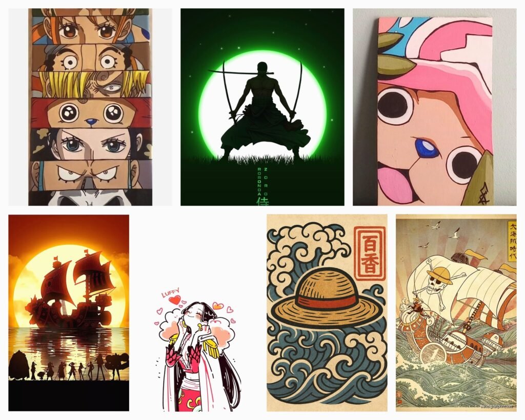
Minimalist character designs – those simplified silhouette prints with just the character outline and maybe their signature weapon or hat. These are PERFECT for modern spaces and they don’t overwhelm.
Watercolor interpretations – found this Etsy artist who does One Piece characters in watercolor style and wow. It elevated the whole thing. Made it feel less “dorm room” and more “this person has taste AND likes anime.”
Vintage wanted poster style – okay so these are fun for a themed room. The bounty posters with the aged paper look? Super cool for a home office or game room. Less great for your main living room unless your whole aesthetic is eclectic.
Epic scene landscapes – the Going Merry sailing into sunset, the arrival at various islands, Skypiea clouds. These work as statement pieces and honestly most guests won’t even clock them as anime immediately, which can be a plus depending on your situation.
Framing Makes or Breaks Everything
Wait I forgot to mention – the frame situation is crucial. I spent like three weeks testing different frame styles and here’s what I found works:
Black frames – classic, safe, works with everything. But can feel heavy if you do a whole wall of them. Better for 1-3 pieces max.
White frames – surprisingly good for the more colorful One Piece art. Creates breathing room. Works especially well in smaller spaces because it doesn’t close in the wall.
Natural wood – this is my secret weapon. Light oak or bamboo frames give One Piece art this unexpected sophisticated vibe. The warm wood tones actually complement the adventure/nautical theme without being too literal about it.
No frame/floating mount – for canvas only, and only if the edges are properly done. I’ve seen too many cheap canvas prints with staples showing on the sides. Not cute.
Layout Patterns That Actually Work
Okay so funny story – I initially tried to arrange a client’s One Piece collection in chronological story order. East Blue saga at the top, working down through the arcs. Looked terrible. Too rigid, didn’t flow visually.
What works better is thinking about visual weight and color distribution. Put your darkest/heaviest pieces on the bottom or balanced across the wall. I usually map it out on the floor first, take a photo, then adjust until it feels balanced.
The Grid – if you’re doing same-size prints, a clean grid is foolproof. 3×3 of different crew members, each in matching frames. Very Instagram-friendly. Almost too perfect though, can feel sterile.
The Salon Style – this is what I ended up doing most often. Different sizes clustered together with 2-3 inches between frames. Looks collected over time (even if you bought everything last Tuesday). The trick is keeping the spacing consistent even though sizes vary.
The Statement Plus Satellites – one big centerpiece (like 30×40 of Luffy in Gear 5 or the whole crew) with smaller complementary pieces around it. This is actually the easiest to get right because the big piece does most of the work.
Where to Actually Buy This Stuff
I’ve tested like every platform at this point. Redbubble and Society6 have tons of options but quality is hit or miss depending on the artist. I always order a small print first to test before committing to a large piece.
Etsy has some incredible artists doing One Piece interpretations – watercolors, minimalist designs, vintage styles. More expensive but usually better quality and more unique. You’re not gonna show up to your friend’s house and see the exact same Luffy poster.
Amazon is… fine for basics. Good if you want official merchandise vibes. Not great for unique art.
Displate is interesting – metal posters that mount with magnets. I tried these with some One Piece designs and they’re genuinely cool, especially for characters with metallic elements like Zoro’s swords or Franky. Easy to swap out too which is nice if you’re indecisive.
The Lighting Component Everyone Forgets
This is so important – your One Piece wall art needs proper lighting or it just disappears. I learned this the hard way when a client called me back saying the wall “didn’t pop” like it did in my staging photos. Their overhead lighting was too dim and too far away.
Picture lights are overkill unless you’re doing one statement piece. What works better is track lighting or even LED strip lights behind the frames if you wanna get fancy. I did an RGB LED setup behind someone’s Luffy canvas that could change colors and okay yes it’s extra but it looked AMAZING during game nights.
Natural lighting is trickier – you don’t want direct sunlight fading your prints. I had a Shanks poster fade in like six months because it was right by a west-facing window. Use UV-protective glass or acrylic if sun exposure is unavoidable, or just plan your layout away from direct light.
The Room Context Thing
Where you’re putting this matters more than people think. A full One Piece wall in your bedroom? Cool, it’s your space. Same wall in your dining room? Might be a choice depending on your situation.
I’ve done One Piece installations in:
Game rooms/entertainment spaces – no brainer, go wild, full themed experience works here
Home offices – actually great for this. The adventure/determination themes are surprisingly motivating. Keep it to 1-3 pieces though, you don’t want visual chaos while you’re trying to work
Bedrooms – works really well, just maybe avoid the intense battle scenes right above your bed. Go for calmer ocean scenes or character portraits
Living rooms – this is where you gotta be strategic. Mix your One Piece pieces with other art or keep them to one wall/section. Unless your whole aesthetic is anime, then disregard everything I just said
My client canceled today so I spent an hour comparing the different Wano arc prints available and honestly the quality variation is huge. Some look like they were printed on a home printer, others are legit gallery quality. Always check reviews and if possible, order samples.
Budget Real Talk
You can do this cheap or expensive, both can look good. I’ve seen $200 total walls that looked incredible and $2000 walls that looked messy. It’s not about spending more, it’s about being intentional.
Budget option: Quality poster prints ($15-30 each) in IKEA frames ($10-20). Seriously, IKEA’s RIBBA frames are perfectly fine for this. Get 5-6 pieces, arrange them well, you’re golden for under $200.
Mid-range: Mix of canvas prints and framed posters, better quality frames, maybe one or two custom/artist pieces. $400-600 range.
Investment level: Custom commissioned art, gallery-quality prints, professional framing, proper lighting. $1000+ but it’ll genuinely look like curated gallery work.
The thing is, you can start budget and upgrade over time. That’s actually how most of my best installations happened – people started with a few pieces and added to it gradually. Creates a more authentic collected feel anyway.
Maintenance and Longevity
Oh yeah so posters under glass need dusting maybe monthly, canvas needs it less often. I use a microfiber cloth, nothing wet unless something actually spilled on it. Had someone use Windex directly on their canvas print once and it… don’t do that. Just don’t.
If you’re using command strips to hang (which I do recommend for renters), check them every few months. I had a Chopper print fall at 3am once and nearly gave my client a heart attack. The strips can lose adhesion over time, especially in humid environments.
Color fading is real. Even without direct sunlight, prints will fade over 5-10 years. It’s just something to accept. The ocean scenes with lots of blues tend to fade faster in my experience. If you want something truly permanent, you’re looking at museum-quality archival prints with UV protection, which gets pricey.
Wait I should mention – if you’re renting, take photos of your wall layout before you move. I cannot tell you how many times I’ve tried to recreate a gallery wall in a new space and couldn’t remember exactly how it was arranged. Save yourself the frustration.
The Straw Hat crew has been sailing for over 20 years now and the art keeps evolving. Your wall can too. Don’t stress about making it perfect forever – make it great for right now, and adjust as you find new pieces you love or your space changes. That’s honestly the best approach to any themed wall art anyway.