Wall Art Guide, Wall Art Tutoriels
City Wall Art: Urban Skyline Architecture Photography
Jul
So I’ve been obsessing over city skyline photography for wall art lately and honestly it’s changed how I look at every client space now. Like, I used to think it was just for bachelor pads or corporate offices but then I hung this massive Chicago skyline print in a living room last month and the whole vibe just… elevated.
Why This Actually Works When Other Art Doesn’t
Okay so the thing about urban architecture photography is it gives you those clean lines and structure that abstract art promises but never quite delivers. You know what I mean? Like you buy some random geometric print thinking it’ll anchor the room and instead it just kinda floats there doing nothing. But a good skyline photo – especially black and white – actually grounds your space because it has real depth and recognizable forms.
I discovered this totally by accident when a client’s expensive abstract piece fell through (shipping damage, whole nightmare) and we needed something FAST. Grabbed this New York skyline shot from a local photographer and it became the whole focal point. The building lines created this natural vertical pull that made her 8-foot ceilings look way taller.
Which Cities Actually Photograph Well
Not all skylines are created equal for wall art, and I learned this the hard way. Here’s what I’ve tested:
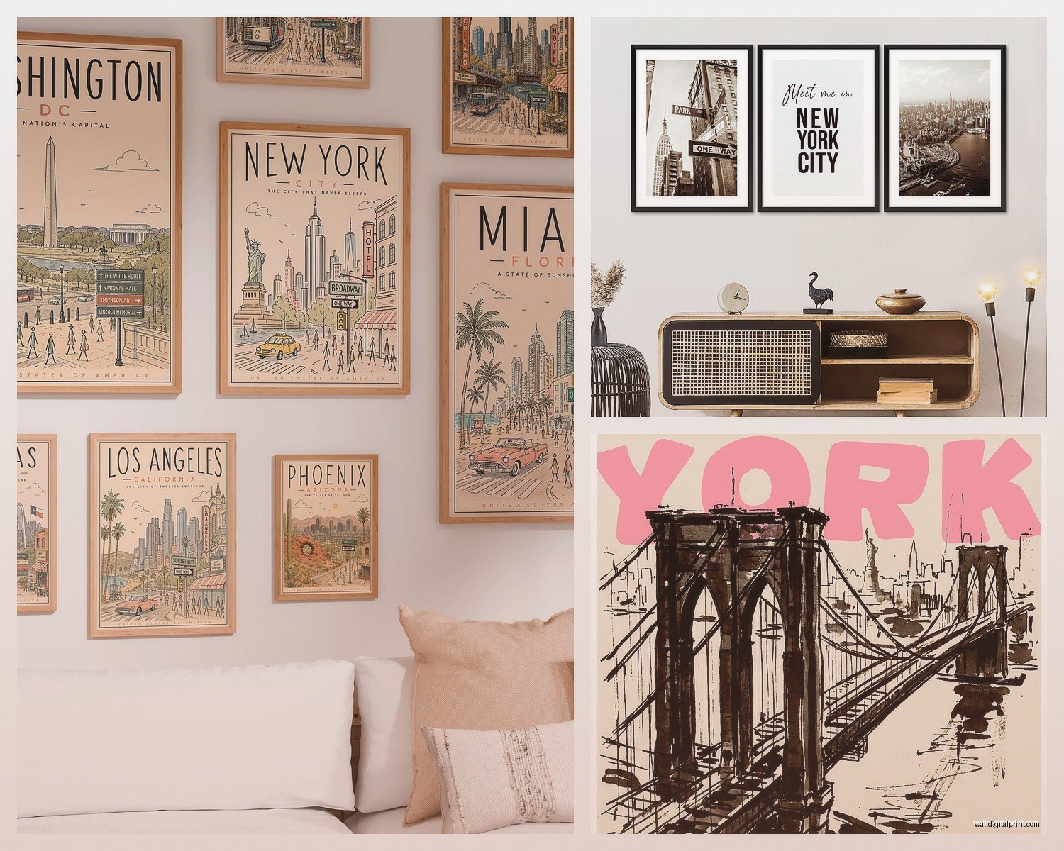
New York – Obviously works everywhere. The mix of Art Deco and modern glass creates contrast that reads well from across a room. Empire State Building gives you that iconic anchor point your eye needs.
Chicago – This is actually my favorite right now? The architecture is just… chef’s kiss. Those Willis Tower (yeah I still call it Sears Tower whatever) shots with the river in the foreground give you layers. Super important for preventing that flat poster look.
Hong Kong – Wild density, crazy vertical energy. But you gotta be careful because it can feel chaotic in a small room. Works best in modern spaces with minimal furniture.
Dubai – Burj Khalifa shots are everywhere but they’re often too sterile. Need to find ones with some grit or interesting light.
London – Surprisingly hard to make work? The skyline isn’t as dramatic unless you get those specific Thames angles with the Shard and Tower Bridge. When it works though, it works.
Tokyo – Amazing at night but the daytime shots often look too busy. The signage and density need really careful framing.
Black and White vs Color (This Matters More Than You Think)
So I used to automatically go black and white because it felt more sophisticated or whatever. But then I hung this sunset-lit skyline in a dining room with warm wood tones and holy crap the difference.
Here’s my actual breakdown:
Go black and white when:
- Your room has lots of competing colors already
- You want that gallery/modern feel
- The architecture itself is the star – like Chicago’s geometric buildings
- You’re working with industrial or Scandinavian design
- The space feels too warm and you need to cool it down visually
Go color when:
- You have a neutral room that needs a punch
- Sunset/sunrise shots with those pink and orange tones – these are magic in bedrooms btw
- You want to pull specific accent colors from the photo into your decor
- The city has distinctive lighting (Vegas, Times Square, etc.)
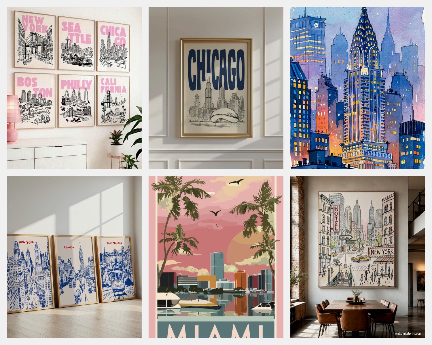
I have this one client who was SO set on black and white and I finally convinced her to try a blue hour shot of San Francisco and she literally texted me a week later saying her husband kept stopping to look at it. The deep blues picked up the throw pillows and suddenly everything connected.
Size and Scale (Where Most People Screw Up)
Okay so this is gonna sound weird but I actually measure skyline prints differently than other art. Because they’re horizontal and have all this internal detail, you need to think about viewing distance.
For over a sofa – you want MINIMUM 40 inches wide. I know that sounds huge but trust me. I see so many people hang like a 24×16 print over a 7-foot sofa and it just looks sad and disconnected. The skyline needs to command that wall space.
My cat just knocked over my coffee but anyway
For a narrow wall or hallway – vertical cityscape shots work better. Think looking straight up at buildings. These create that gallery feel without overwhelming the space.
For large walls (like 12+ feet) – this is where you can do a multi-panel skyline. I did a three-panel New York triptych last year that was each panel 30×40 and the impact was insane. But you gotta make sure the panels are actually part of a continuous image, not just three random city shots.
The Viewing Distance Formula I Actually Use
Take the width of your print in inches, divide by 2, and that’s roughly how many feet away you should be able to view it comfortably. So a 60-inch wide print works best when your main seating is about 10 feet back. Closer than that and you’re just seeing buildings, not the composition.
Print Quality Stuff You Gotta Know
I’ve tested pretty much every print method at this point because I kept getting burned by cheap options that looked amazing online.
Canvas prints – Everyone defaults to these but honestly? They can make architecture photography look muddy. The texture of canvas fights with the sharp lines of buildings. I only use canvas for skylines when it’s a more artistic, impressionistic shot.
Metal prints – THIS is where it’s at for city photography. The aluminum gives you this depth and the blacks are actually black. Costs more but the difference is wild. I hung a metal print Chicago skyline in my own office and the reflection and dimension… yeah I stare at it too much.
Acrylic/plexiglass – Gorgeous and modern but crazy expensive. The colors pop like nothing else though. Best for smaller statement pieces (like 24×36) where you want maximum impact.
Framed prints – Traditional but versatile. Go for museum-quality prints with a simple black or white frame. The frame shouldn’t compete with the architecture. I learned this after trying a fancy ornate frame on a minimalist skyline and it looked ridiculous.
Lighting Your Skyline Print (Everyone Forgets This Part)
So here’s the thing nobody tells you – skyline photography needs good lighting or it just becomes a dark rectangle on your wall. Especially black and white prints.
Picture lights are your friend. Those little LED strips that mount above the frame? Game changer. They bring out all the detail in the buildings that gets lost in ambient room lighting.
If you can’t do picture lights, make sure there’s a nearby lamp or track lighting aimed at it. I positioned a floor lamp specifically to highlight a client’s Seattle skyline and it went from background decoration to actual art.
Avoid direct sunlight though – learned this the hard way when a gorgeous sunset Manhattan print faded after like 6 months near a west-facing window. UV protection glass helps but it’s expensive.
Mixing Skylines with Other Art
This is where it gets fun. You CAN mix city photography with other pieces but you gotta be intentional.
What works:
- Pairing a large skyline with smaller black and white portraits or abstracts
- Mixing different cities if they’re all the same style (all B&W, all blue hour, etc.)
- Combining architectural details with a wide skyline shot – like close-ups of specific buildings
- Adding vintage city maps or blueprints around a modern skyline photo
What doesn’t work:
- Mixing skylines with nature photography – the vibes are too different unless you’re going for contrast
- Combining different color temperatures (warm sunset skyline + cool blue ocean = chaos)
- Too many cities in one room – feels like a random travel collage
Where to Actually Buy These (Real Talk)
I’ve wasted so much money figuring this out.
Local photographers – Check Instagram and local art fairs. You get unique shots nobody else has and you can often request custom sizes. Plus you’re supporting actual artists. Found my favorite Chicago photographer this way and now I commission pieces for clients.
Online print shops – Places that specialize in architectural photography tend to have better quality than general poster sites. Look for ones that show the actual photographer credits.
Avoid generic poster sites – The resolution is usually terrible and you end up with pixelated buildings. I bought a cheap Paris skyline once and you could see the individual pixels from like 5 feet away. Returned it immediately.
Gallery websites – More expensive but the curation is better. They usually have exclusive partnerships with photographers so you’re getting actually good compositions.
wait I forgot to mention – Etsy can be hit or miss but there are some amazing photographers on there. Just make sure to read reviews and ask about print quality before ordering. I found this incredible Tokyo photographer on Etsy who does custom panoramas.
Styling Around Your Skyline Print
The art is one thing but making it work with your actual room is another. Here’s what I do:
Pull one accent color from the photo if it’s color. Like if there’s warm streetlight glow, bring in brass or gold accessories. If it’s blue hour, add navy or deep blue textiles.
Echo the geometry – City photography is all about lines and shapes. Repeat that with angular furniture, geometric rugs, or linear shelving. Creates visual harmony without being too matchy.
Keep it minimal below the print – Don’t clutter up the console or sofa beneath your skyline. The photo has enough visual complexity. Maybe one simple plant or a couple books.
Consider the mood – Nighttime skylines work better in cozy spaces with warm lighting. Daytime architectural shots fit brighter, airier rooms.
I’m literally watching this design show right now where they put a huge Vegas strip photo in a bedroom and it’s giving me anxiety just looking at it. Too much visual energy for a sleep space.
Different Rooms Different Vibes
Living rooms – Go big or go home. This is where you can do those massive panoramic prints or multi-panel installations. The skyline becomes the conversation piece.
Home offices – Honestly perfect for city photography. It adds sophistication without being distracting. I prefer B&W here to keep focus on work.
Bedrooms – Controversial opinion but I actually love a soft, dreamy skyline here. Think foggy mornings or subtle sunset tones. Not the harsh midday stuff.
Dining rooms – Dramatic nighttime skylines work great. The sparkle of city lights adds energy to dinner parties.
Hallways – Vertical architectural shots or a series of smaller city detail photos. Creates that gallery walk feel.
The Mistakes I See All The Time
Hanging it too high – the center of your print should be at eye level, which is like 57-60 inches from the floor. Not ceiling level.
Choosing a city you’ve never been to just because it looks cool – this sounds dumb but there’s something weird about having NYC art when you’ve never visited. Get a city that means something to you.
Not considering the time of day in the photo – a bright sunny skyline in a room with blackout curtains and moody lighting? Doesn’t work.
Mixing too many styles – pick a lane. Either all modern glass towers or all classic architecture. The mix usually looks confused.
Okay I think that covers most of what I’ve learned through way too much trial and error and client projects. The main thing is just make sure the scale is right and the quality is actually good because a pixelated skyline is worse than no skyline at all tbh