Wall Art Guide, Wall Art Tutoriels
Supreme Wall Art: Streetwear Brand Hypebeast Fashion
Aug
So I’ve been setting up Supreme wall art for clients forever now and honestly the whole hypebeast aesthetic is trickier than you’d think because it can go from “cool curated streetwear vibes” to “teenage boy’s bedroom” real fast if you’re not careful.
Understanding What Actually Works on Your Walls
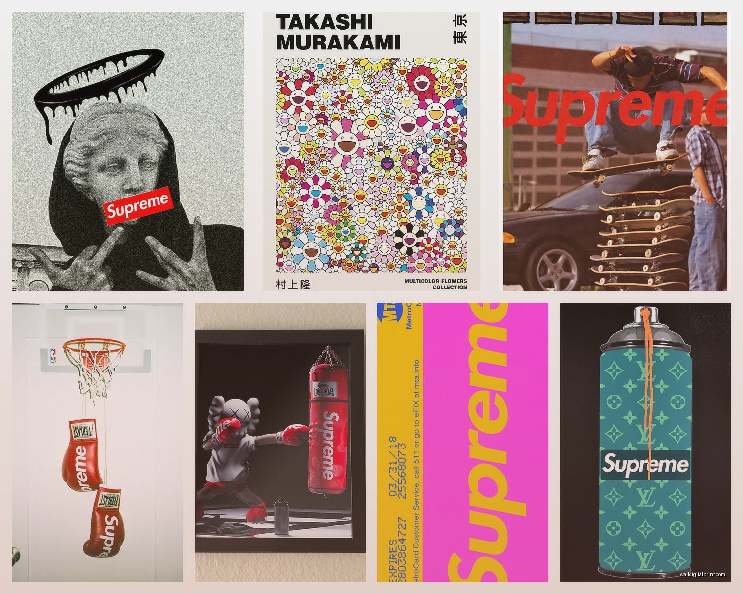
First thing – not everything Supreme makes translates well to wall art. I learned this the hard way when a client bought like five box logo tees thinking we’d just frame them and call it a day. We did, and it looked… okay? But here’s the thing, the pieces that work best are the ones with actual graphic design merit. The collaborations with artists like KAWS, Takashi Murakami, or even those Christopher Wool pieces from way back – those have visual interest beyond just the logo.
You’re gonna want to focus on:
- Limited edition skateboard decks (these are honestly perfect)
- Vintage poster drops from the 90s and early 2000s
- Artist collaboration prints
- Selected graphic tees with strong imagery, not just text
- Accessories like bandanas or scarves that can be mounted flat
The skateboard decks are my go-to because they’re already designed as displayable objects. Supreme knows people frame these, so the graphics are usually full-bleed and visually striking.
The Framing Situation (This Matters More Than You Think)
Okay so here’s where most people mess up – they either go too cheap or too museum-grade. For Supreme stuff, you want something in between. I use simple black frames mostly, sometimes white if the wall situation calls for it, but the key is UV-protective glass or acrylic. This stuff fades like crazy if you don’t protect it, especially the older pieces with that vintage screen printing.
For tees, you need shadowbox frames – minimum 2 inches deep. Regular frames won’t work because of the fabric thickness and you need that dimension. I usually go with 20×24 or 24×30 frames depending on the shirt size. Mount them on acid-free foam board (seriously, don’t skip this, the yellowing is real).
Skateboard decks are easier actually. You can find deck display mounts on Amazon for like $15-30, or go fancier with acrylic wall mounts that make them look like they’re floating. I did a client’s home office last month with three decks in the clear acrylic mounts and it looked super clean against a concrete gray wall.
My Framing Process for Tees
This is gonna sound tedious but it’s what keeps everything looking professional:
- Steam the shirt gently to remove any wrinkles (never iron directly)
- Place acid-free tissue paper between the shirt and backing board
- Use straight pins from behind to secure, never pin through the visible parts
- Position so the graphic is centered in the frame window
- Seal the back with tape to prevent dust getting in
Wait I forgot to mention – if you’re framing a really valuable piece, take it to a professional framer. I know a guy who tried to DIY frame his Supreme x Louis Vuitton collab tee and put the pins right through the logo. Like… $800 mistake right there.
Gallery Wall Layouts vs Single Statement Pieces
So this depends entirely on your space obviously, but I’ve found Supreme works best either as a single large focal point or in a very curated gallery of 3-5 pieces max. Those massive gallery walls with like 20+ items? Too busy for this aesthetic. The whole point of hypebeast culture is exclusivity and rarity, so you want each piece to breathe.
For a single statement piece, I love using the larger skateboard decks or a framed vintage poster. There was this Supreme x Scarface poster from 2003 that I tracked down for a client’s media room – mounted it solo on the main wall, spotlit it, and that was it. Didn’t need anything else.
Gallery arrangements work when you’re mixing Supreme with other streetwear brands or complementary artists. Like I did this one setup with two Supreme decks, a Stüssy vintage tee, and a small KAWS print. The key is keeping similar frame styles and maintaining consistent spacing – I usually do 2-3 inches between frames for this look.
Color Coordination Without Looking Too Matchy
The Supreme color palette is actually really versatile – lots of red obviously, but also black, white, camo patterns, photographic prints. You don’t want everything to match your room colors exactly because that feels forced. Instead, pull one or two accent colors from your Supreme pieces and echo them in small doses around the room.
I had this client with a red and black Supreme AKIRA collaboration piece, and we brought in just a couple of red accent pillows and a black side table. That’s it. The wall art stayed the hero, everything else was supporting cast. My cat knocked over a plant while I was staging that room actually and we had to reshoot the whole thing but whatever, it turned out great.
Walls Colors That Work
Honestly? White, light gray, or charcoal gray are your friends here. Supreme graphics are usually so bold that they need a neutral backdrop. I’ve seen people try to mount this stuff on red walls or busy wallpaper and it’s just… visual chaos.
The one exception is exposed brick – that industrial texture actually pairs really well with streetwear aesthetics because it has that urban authenticity. Just make sure there’s enough contrast between the brick tone and your framed pieces.
Lighting Because Everyone Forgets About This
You need dedicated lighting for wall art or it just looks flat and lifeless. I typically use:
- Picture lights mounted above frames (battery-operated ones are fine for smaller pieces)
- Track lighting aimed at the wall for gallery arrangements
- LED strip lights behind floating mounts for a modern glow effect
The LED strips behind skateboard decks? Game changer. Makes them look like museum installations. You can get color-changing ones but I usually just stick with warm white because the colored lights can distort the artwork’s actual colors.
Natural light is tricky – it’ll fade your pieces over time even with UV glass, so avoid hanging valuable Supreme items in direct sunlight. I learned this when a client’s Murakami print started losing its vibrancy after six months facing an east window. We moved it and the difference was obvious.
Mixing High and Low (The Secret Sauce)
Okay so funny story – I used to think you had to go all-in on authentic Supreme pieces only, but that’s not realistic for most people and honestly not even necessary. The best installations I’ve done mix genuine limited pieces with high-quality reproductions or complementary items.
Like you might have one real Supreme x The North Face poster as your centerpiece, then surround it with affordable skateboard decks from other brands, or even custom prints that match the aesthetic. Nobody’s checking authenticity tags when they’re on your wall – they just need to look cohesive and intentional.
That said, if you’re gonna invest in one authentic piece, make it your focal point. The rest can be supporting players.
Where to Actually Source This Stuff
StockX and Grailed are obvious for authentic pieces but you’re paying resale prices. I’ve had good luck with:
- Local streetwear consignment shops (you can inspect in person)
- eBay if you know how to spot fakes (check seller feedback religiously)
- Instagram sellers in the streetwear community (risky but sometimes great finds)
- Estate sales and thrift stores for vintage pieces (rare but it happens)
For reproductions or inspired pieces, Etsy has tons of options. Just search “Supreme poster” or “streetwear wall art” and you’ll find everything. Quality varies wildly though, so read reviews and check the seller’s other items.
Spotting Fakes (Quick Tips)
Not gonna lie, this gets complicated, but basic red flags:
- Blurry or pixelated graphics (Supreme’s printing is always crisp)
- Wrong font on the box logo (the spacing and weight should be specific)
- Tags that look off (compare to verified images online)
- Price too good to be true (if a “vintage” tee is $40, it’s probably fake)
When in doubt, post photos in the Supreme subreddit or a streetwear authentication group. People are surprisingly helpful about this stuff.
Room-by-Room Applications
Living room – Keep it subtle. One or two pieces max, treated like fine art. I did a client’s living room with a single framed Supreme x Comme des Garçons SHIRT collaboration piece and it elevated the whole space without screaming “I’m a hypebeast.”
Home office – This is where you can go a bit harder. Gallery wall of skateboard decks, mix of brands, maybe some sneaker displays integrated. It’s your personal space so the streetwear energy makes sense.
Bedroom – Honestly depends on your age and living situation. If you’re under 30 and living alone, go for it. Older or sharing space? Keep it more curated and sophisticated. One statement piece above the bed or a small gallery on an accent wall.
Entryway – Great spot for a single bold piece that sets the tone. I love using a framed vintage Supreme tee in the entry of a modern apartment.
Maintenance and Long-term Care
Dust your frames monthly with a microfiber cloth. For the glass, use regular glass cleaner but spray it on the cloth first, never directly on the frame. Moisture getting into the frame edges is bad news.
Check the mounting hardware every six months, especially for heavier skateboard decks. I had one fall off a wall once during a party and it was… not great. Make sure you’re using appropriate wall anchors for your wall type – drywall anchors for drywall, masonry bits for brick or concrete.
If you notice any fading, consider rotating pieces seasonally or moving them to lower-light areas. This is especially important for pieces with vibrant reds and blues which fade faster.
Budget Breakdowns (Real Numbers)
Starter setup ($200-400):
- 2-3 reproduction prints or affordable authentic accessories
- Basic black frames from IKEA or Amazon
- Simple mounting hardware
Mid-range ($400-1000):
- 1-2 authentic limited pieces
- Custom framing with UV protection
- Better lighting setup
- Mix of authentic and high-quality reproductions
High-end ($1000+):
- Multiple authentic collaboration pieces
- Professional museum-quality framing
- Custom lighting design
- Rare vintage items
I usually tell clients to start small and build over time. This isn’t something you need to complete in one shopping trip. Part of the appeal is curating your collection thoughtfully.
The whole thing is really about balance – you want that streetwear edge without making your space look like a teenager’s bedroom or a retail store. When done right, Supreme wall art brings this unexpected sophistication because you’re elevating cultural artifacts into fine art territory, which is kinda what the brand’s been doing with their artist collabs all along anyway.