Wall Art Guide, Wall Art Tutoriels
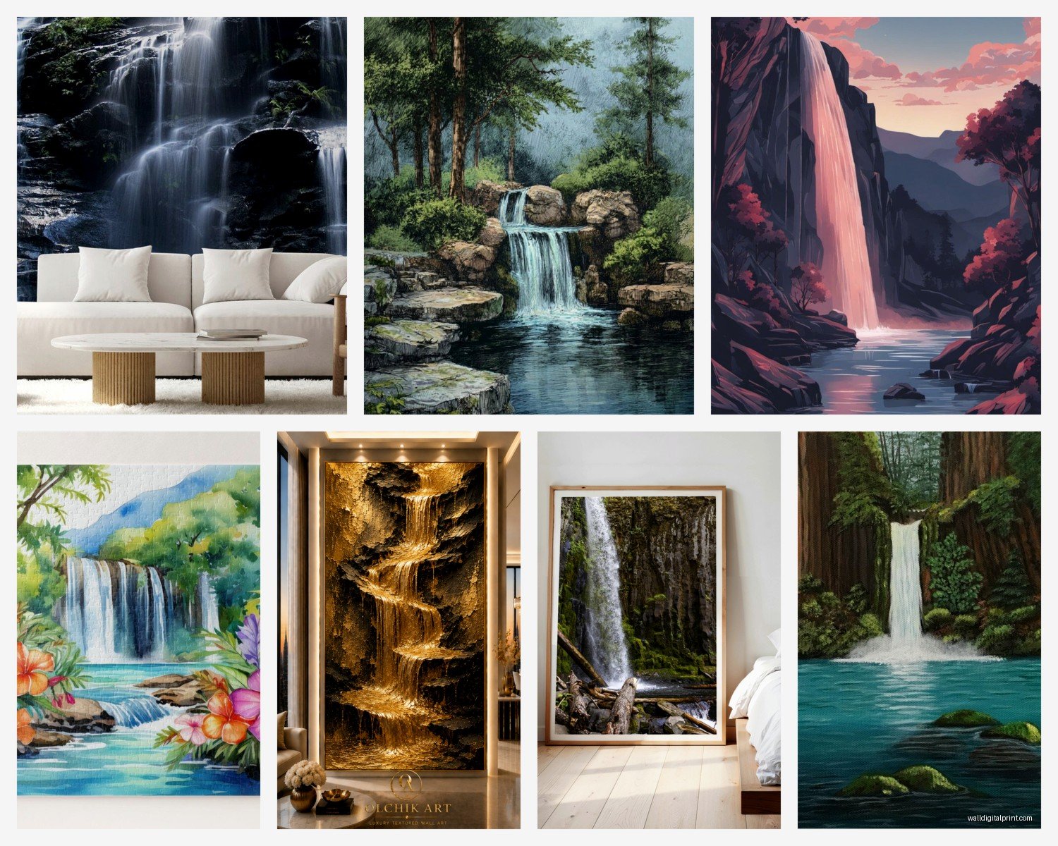
Waterfall Wall Art: Cascade Nature Water Flow Photography
Aug
So I’ve been basically living and breathing waterfall photography for walls lately and honestly it started because a client wanted something “zen but not boring” for their bathroom and I went down this whole rabbit hole. Let me tell you what actually matters when you’re choosing this stuff because there’s SO much bad advice out there.
Size Is Everything and Everyone Gets It Wrong
Okay so first thing – people always go too small. Like, always. I did it with my first waterfall piece and it just looked sad and awkward on this big empty wall. Here’s what I learned the hard way: for a statement wall (like above a sofa or bed), you want the art to take up about 60-75% of the furniture width. So if your couch is 84 inches, you’re looking at roughly 50-60 inches of art width.
But here’s where it gets interesting with waterfall photography specifically – vertical orientation is your friend. Most waterfalls naturally flow downward (duh) so a tall vertical piece actually emphasizes that cascade effect way better than a wide horizontal one. I’ve got this 24×36 inch vertical waterfall print in my office and the way your eye follows the water down creates this whole movement thing that a horizontal just doesn’t do.
For smaller spaces like bathrooms or narrow hallways, go with something in the 16×20 or 20×30 range. My favorite bathroom installation was this 20×30 Iceland waterfall shot – the homeowner initially wanted three small prints and I was like no no no, one larger piece will make the space feel bigger, not smaller. She trusted me and now sends me photos of it constantly.
The Whole Shutter Speed Thing Nobody Explains Properly
Wait I forgot to mention – the technical side actually matters for how the piece feels in your space. Waterfall photography basically comes in two styles based on shutter speed and this changes EVERYTHING about the mood.
Long exposure (slow shutter) gives you that silky, misty, dreamy water effect. This is what most people think of when they picture waterfall art. The water looks like flowing silk or smoke. It’s calming, it’s peaceful, it works amazing in bedrooms and bathrooms. I use these in spaces where people need to decompress.
Fast shutter captures every individual water droplet frozen in time. It’s more dramatic, more energetic, shows all the texture and power. This works better in offices, living rooms, entryways – spaces with more activity.
I tested both styles in my living room (my dog thought I was insane moving art around for three days) and the fast shutter one actually felt too intense for relaxing in the evening. Switched to long exposure and it completely changed the vibe.
Color Temperature Makes or Breaks the Room
This is gonna sound weird but the color tone of your waterfall matters more than the actual waterfall itself sometimes. I’ve seen gorgeous Yosemite falls photos that completely clashed with a room because the photographer shot it at the wrong time of day.
Cool tones (blues, greens, grays) – these are your Icelandic waterfalls, Pacific Northwest scenes, anything shot in overcast conditions. Super calming, pairs well with modern minimalist spaces, works with cool gray walls, white trim, chrome fixtures. I just finished a condo where we did all cool-toned waterfall art and it made the space feel like a spa.
Warm tones (golden hour shots, tropical waterfalls, autumn foliage around the falls) – these bring energy and coziness. Better for traditional spaces, rooms with warm wood tones, anywhere you’ve got brass or gold fixtures.
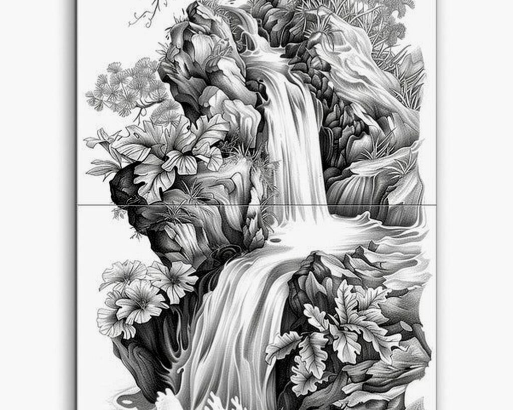
Neutral/black and white – honestly this is the cheat code if you’re not sure. A good black and white waterfall photograph works with basically any color scheme. The contrast and composition matter more than color coordination.
Print Quality Because Cheap Ones Look Terrible
Oh and another thing – I learned this the expensive way. Not all prints are created equal and with waterfall photography you’ve really gotta pay attention to the printing method.
Canvas prints are popular but here’s the truth: they soften details. For long exposure silky water this can actually work fine, but if you’ve got a detailed fast-shutter shot with all those water droplets, canvas will blur it out. I prefer canvas for large-scale pieces (40+ inches) where you’re viewing from further away.
Metal prints are *chef’s kiss* for waterfall art. The colors pop, the contrast is incredible, and water literally looks like it’s moving. They’re pricier but worth it for high-impact spaces. Just installed a metal print of Havasu Falls in someone’s entryway and every single person who visits comments on it. The turquoise water against red rock on metal is just stunning.
Acrylic/glass prints give you that depth and dimension. The waterfall looks like it’s behind glass (because it is) and creates this almost 3D effect. Great for modern spaces but they’re heavy – make sure your wall can handle it.
Regular framed photo prints work too obviously, just make sure you’re getting at least 300 DPI resolution. Anything less and you’ll see pixelation, especially in the water details.
Choosing Your Actual Waterfall Location
Okay so funny story, I spent like two hours last Tuesday comparing different waterfall locations for a client’s meditation room and here’s what I figured out about which waterfalls photograph best for wall art.
Iceland waterfalls (Skógafoss, Seljalandsfoss, etc.) – dramatic, moody, often shot with that epic Nordic light. These work amazing in modern spaces, look great in black and white, pair well with industrial design elements.
Tropical waterfalls – vibrant greens, lush vegetation, usually warmer tones. Perfect for bringing life into basement spaces or rooms without much natural light. Just did a home gym with a Hawaiian waterfall print and it completely transformed the windowless space.
Mountain waterfalls (Yosemite, Rockies, etc.) – grand, powerful, often include dramatic rock formations. These need space to breathe. Don’t put a massive Yosemite Falls print in a tiny powder room – it’ll feel claustrophobic.
Forest waterfalls – intimate, peaceful, lots of greenery. These are super versatile and work in almost any room. Less dramatic than the big famous falls but often more livable for everyday spaces.
Multi-tiered cascades – my personal favorite for vertical wall spaces. The eye follows the water down through multiple levels which creates natural visual interest.
Framing Decisions That Actually Matter
This is where people overthink things but also somehow get it wrong. Let me break down what actually works.
For modern/contemporary spaces, I’m doing mostly floating frames (where there’s a gap between the art and frame) or no frame at all with gallery-wrapped canvas or metal prints. Clean lines, let the waterfall be the star.
Traditional spaces can handle more ornate frames but keep it simple – you don’t want a baroque gold frame competing with a powerful natural scene. I like simple wood frames in walnut or black for most waterfall art in traditional rooms.
The mat situation – if you’re framing a print, a white or light gray mat creates breathing room and makes the piece feel more substantial. I usually go with a 2-3 inch mat border for pieces under 24 inches, wider for larger prints.
Placement Strategy Room by Room
Living room – above the sofa is classic for a reason. Make sure the bottom of the frame sits 6-8 inches above the sofa back. I also love a large waterfall piece on the wall opposite windows – it creates a nature view where there isn’t one.
Bedroom – either above the bed as a headboard alternative or on the wall you see when you wake up. Keep it calming – long exposure, cool or neutral tones. My own bedroom has this dreamy Multnomah Falls print and it’s the first thing I see every morning.
Bathroom – honestly waterfall art is like made for bathrooms. The humidity won’t hurt metal or acrylic prints. Keep the size appropriate – a massive waterfall in a small bathroom feels weird. I usually go for 16×20 or 20×24 max in standard bathrooms.
Home office – this is where you can go more dramatic. A powerful waterfall scene can be energizing. I’ve got a fast-shutter Iceland waterfall behind my desk and somehow it helps me focus. Don’t ask me why.
Hallways – vertical waterfalls are perfect for narrow hallway walls. Create a gallery of different waterfalls or go with one statement piece.
The Lighting Thing Nobody Talks About
Wait I forgot to mention lighting because it’s actually super important. Your beautiful waterfall print will look like garbage if the lighting’s wrong.
Avoid direct sunlight – it’ll fade your prints over time and create glare. If you’ve got a sunny wall, either use UV-protective glass or pick a different wall.
Picture lights are great for creating drama but position them carefully. Top-mounted picture lights work best – they illuminate the whole piece evenly and emphasize that downward water flow.
For metal and acrylic prints, be careful with lighting angles because they’re reflective. I learned this when I installed a gorgeous metal waterfall print and the ceiling light reflected right in the middle of it. Had to adjust the hanging height to fix it.
Natural light from the side actually works beautifully with waterfall art – it creates dimension and makes the water look more three-dimensional.
Mixing Waterfall Art With Other Pieces
Okay so if you’re doing a gallery wall situation… waterfall photography can be tricky to mix. It’s such a strong subject that it tends to dominate.
What works: mixing different waterfall shots (different locations, different shutter speeds) in similar frames creates cohesion. Or pair one large waterfall with smaller abstract water closeups.
What doesn’t work: trying to mix a dramatic waterfall with unrelated subjects like random beach scenes or city photography. Pick a theme and commit.
I did a whole water-themed gallery wall recently – waterfall, ocean waves, rain on leaves, water droplets – all in black and white with matching black frames. It worked because the element connected everything even though the subjects were different.
Budget Real Talk
You don’t gotta spend a fortune but you do need to invest in quality printing. Here’s roughly what you’re looking at:
Small canvas prints (16×20) – $50-150 depending on quality
Large canvas (30×40+) – $150-400
Metal prints – $100-500 depending on size
Acrylic prints – $200-600+
Custom framing – add $100-300
I usually tell people to spend more on the print quality than the frame. You can always upgrade the frame later but a cheap print will always look cheap.
Also there’s tons of great waterfall photography on sites like Etsy where you can buy the digital file and print it locally. Just make sure you’re getting high resolution files (at least 300 DPI at your desired print size).
Common Mistakes I See All the Time
Hanging too high – the center of your art should be at eye level, roughly 57-60 inches from the floor. Unless it’s above furniture, then different rules apply.
Going too matchy-matchy – you don’t need the waterfall colors to exactly match your throw pillows. Actually that usually looks forced.
Forgetting about scale – that tiny 8×10 waterfall print is not gonna cut it above your king bed, sorry.
Picking based only on the famous name – yeah Niagara Falls is iconic but if the photograph itself isn’t well-composed, it won’t work as art. The photography quality matters more than the waterfall’s fame.
Ignoring your room’s existing vibe – a dramatic black and white Icelandic waterfall might be gorgeous but if your room is all soft pastels and shabby chic, it’s gonna clash.
My cat just knocked over my coffee while I’m writing this so that’s fun… anyway where was I
Quick Maintenance Tips
Canvas – dust gently with a soft dry cloth, don’t use cleaning products
Metal – can actually be cleaned with a damp cloth, they’re pretty durable
Acrylic/glass – glass cleaner is fine but spray the cloth not the art directly
Framed prints – dust the glass and frame, make sure it’s sealed properly to keep moisture out
Check your hanging hardware annually especially for heavy pieces. I had a metal print fall once (not my finest moment) because the wall anchor failed.
The whole point is that waterfall wall art isn’t just about slapping a pretty picture on your wall. It’s about understanding how the movement, colors, scale, and style work within your actual space with your actual lifestyle. Take your time choosing, don’t rush it, and honestly trust your gut – if a piece makes you feel something when you look at it, that’s probably the one.