
Wall Art Guide, Wall Art Tutoriels
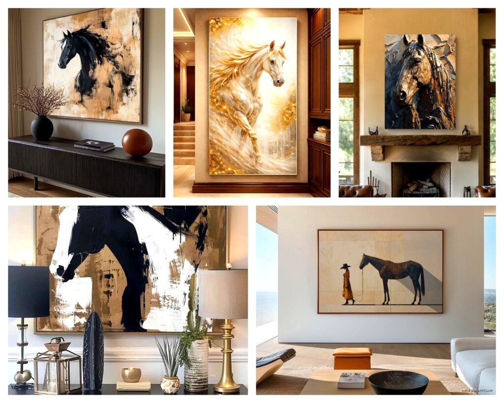
Large Horse Wall Art: Oversized Equestrian Stallion Pieces
Aug
So I’ve been obsessing over these massive horse pieces lately and honestly it started because a client wanted to fill this ridiculous 12-foot wall in their foyer and I was like… what doesn’t look stupid at that scale? Horses, apparently.
Scale Is Everything and Also Really Confusing
Okay first thing – when people say “large” they mean wildly different things. I’ve seen 24×36 listed as large and I’ve seen 6×8 FEET listed as large. Here’s what actually matters: measure your wall height and aim for art that’s roughly 2/3 to 3/4 the height of the furniture below it OR if it’s a standalone wall piece, think about it taking up maybe 60-75% of the visual space. Not the whole wall because that looks like you’re trying too hard.
I learned this the hard way when I ordered what I thought was a huge canvas and it showed up and looked like a postage stamp on my client’s wall. The listing said 40 inches and I didn’t realize that was diagonal measurement which is… why do they do that.
Finding the Right Stallion Vibe
There are basically four camps of horse art and you gotta figure out which one you’re actually going for:
- Photorealistic close-ups (dramatic, moody, lots of detail in the eyes and mane)
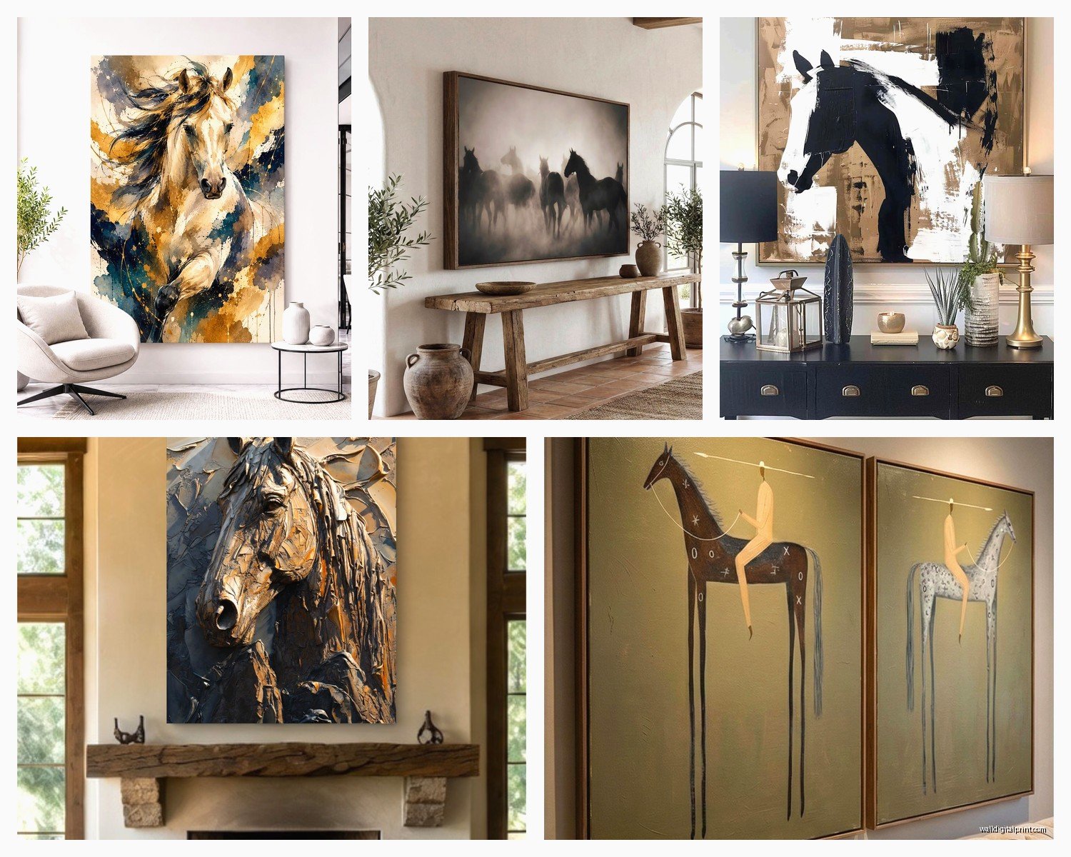
- Abstract/artistic interpretations (watercolor effects, geometric, metallics)
- Action shots (running, rearing, multiple horses)
- Vintage/western style (sepia tones, ranch vibes, nostalgic)
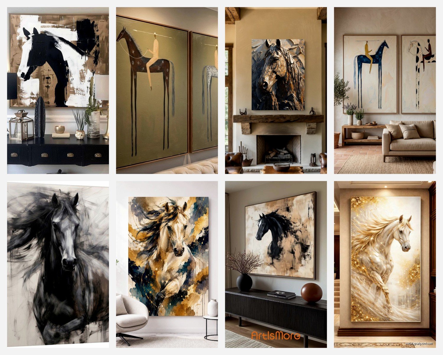
The photorealistic ones are having a MOMENT right now. I’ve placed probably eight of these in the last six months. Black stallions especially – there’s something about a black horse on a light background or vice versa that just… works. The contrast does all the heavy lifting for you design-wise.
Material Choices That Actually Matter
Canvas is the default everyone goes to but wait – there are better options depending on your situation. Canvas stretched over wood frames is fine but it can warp over time especially in humid areas. My own dining room piece started sagging after like two years and I live in Seattle so there’s that.
Metal prints are incredible for horse art specifically because you can get this almost 3D effect with the shine catching light. The blacks look REALLY black and if you’ve got a modern or industrial space this is your answer. They’re pricey though – like probably 40% more than equivalent canvas.
Acrylic face-mounting is my current favorite thing. It’s where they print on paper or metallic paper and then mount it behind thick acrylic. The depth is insane and horse eyes behind acrylic have this wet, alive quality that’s kind of unsettling in a good way? My cat absolutely hates the horse piece I have in my hallway, won’t walk past it, which is hilarious but also inconvenient.
Framing or No Framing
Gallery wrapped canvas (where the image wraps around the edges) looks fine without a frame if you’re going for casual or farmhouse vibes. But if you want it to feel expensive or you’re putting it in a formal space, frame it. Even a simple float frame makes such a difference.
For really large pieces like 5+ feet, framing gets complicated and expensive fast. I usually do a thin metal frame or wood float frame – nothing chunky because the piece itself is already making a statement. You don’t need a 4-inch ornate gold frame competing with a 6-foot stallion.
Color Coordination Without Being Matchy-Matchy
This is gonna sound weird but the color of the horse matters less than the background and accent colors. I’ve put brown horses in rooms with zero brown and it worked because the background had this dusty blue that pulled from the pillows.
White/gray horses are the most versatile – they read as neutral and work with basically any color scheme. Black horses need more thought. They can look too heavy if your room is already dark, but in a light space they’re like… chef’s kiss. That contrast thing I mentioned earlier.
Action shots with dust or movement usually have these warm golden or cool blue tones that you can pull into your room. I did a running herd piece for a client and we pulled the rust-orange from the dust cloud into throw blankets and suddenly the whole room felt intentional.
Where to Actually Buy These Things
Okay so funny story – I spent like three hours last Tuesday comparing options because my client canceled last minute and I was already in research mode. Here’s what I found:
Etsy has tons of printable files which is great if you want to control the printing yourself. You can take the file to a local print shop and get exactly the size and material you want. Usually runs $50-150 for the file depending on the artist, then printing costs vary wildly. A 4×6 foot canvas print might be $300-600 depending on your area.
Wayfair and Overstock have ready-made options that ship fast. Quality is hit or miss – read the reviews and look for mentions of “color accuracy” and “canvas thickness.” Thin canvas looks cheap no matter how good the image is.
Specialty equestrian art sites exist and the quality is usually better but you’re paying for it. Expect $800-2000 for a really large piece. The photography is usually original though, not stock images everyone else is using.
Custom Commission Route
If you have a specific vision or want a particular horse breed in a specific pose… commission it. I’ve worked with three different horse artists and the price range is WILD. Anywhere from $500 to $5000 depending on the artist’s following and whether they’re doing original oil painting versus digital art that gets printed.
Digital art for printing is usually more affordable and you can request specific sizes. Oil paintings are one-of-a-kind but getting them scanned and printed large format so you can keep the original and display a print is also an option I’ve done.
Hanging These Massive Things Without Destroying Your Wall
Oh and another thing – installation is no joke with oversized pieces. Anything over 4 feet needs more than just a sawtooth hanger. Here’s my actual process:
For canvas pieces up to about 40 pounds, I use two heavy-duty D-rings on the back (one on each side about 1/3 down from the top) and hang from two wall anchors or studs. Find the studs if you can because drywall anchors always make me nervous with expensive art.
For metal or acrylic pieces over 30 pounds, I’m using a French cleat system. It’s basically two interlocking pieces where one mounts to the wall and one to the art. Super secure and you can adjust the positioning slightly side-to-side even after it’s up.
Get a laser level. Not the app on your phone, an actual laser level. They’re like $25 and worth it because being off by even half an inch when something is 6 feet wide is VERY obvious.
Styling the Wall Around It
The horse should be the statement piece which means everything else needs to chill out. I usually keep the wall pretty minimal – maybe one or two smaller pieces flanking it if the wall is huge, but honestly a single oversized horse piece works best alone.
What you put on the opposite wall matters though. You want some visual weight to balance things out but not compete. I did a gallery wall of smaller black and white photos across from a massive color horse portrait and it worked because the color stayed on one side.
Lighting is huge and nobody thinks about it until the art is up. If you’ve got a detailed close-up with lots of texture in the mane or muscle definition, you want lighting that creates some shadow and depth. A simple picture light mounted above or track lighting aimed at an angle works better than flat overhead lighting.
Room-Specific Considerations
Living rooms can handle dramatic rearing stallions or action shots. Bedrooms should probably be calmer – a serene profile or gentle grazing scene. I made the mistake of putting an intense action shot in a bedroom once and the client said it was “too much energy” which… yeah fair.
Dining rooms are great for horse art actually? Something about the formal-but-not-stuffy vibe. I like pairing traditional dining furniture with a contemporary horse piece to keep things from feeling too country club.
Home offices need something inspiring but not distracting. A close-up profile shot works better than a busy herd scene. You want to glance up and feel motivated, not get lost studying the image for ten minutes.
Mistakes I’ve Definitely Made
Ordering without checking the resolution of the print file – ended up with a pixelated mess that looked fine in the thumbnail but terrible at 5 feet wide. Always ask about DPI (should be at least 150, preferably 300 for large format).
Not considering the viewing distance. A super detailed piece looks amazing up close but if you’re viewing it from 15 feet away across a room, you lose all that detail. Sometimes a simpler, bolder composition works better for large spaces.
Choosing a busy background when the room already has pattern going on. Horse in a field with flowers and fence and barn and… it’s too much. Simple backgrounds – solid colors, minimalist landscapes, gradient effects – let the horse be the focus.
Forgetting about the ceiling height situation. Standard 8-foot ceilings can’t really handle a 6-foot vertical piece without it feeling cramped. You need at least 6 inches of wall above and below the art, preferably more.
The Multi-Panel Thing
Wait I forgot to mention – multi-panel horse art is really popular right now. Like a single horse image split across 3 or 5 canvases that you hang with small gaps between them. It’s called triptych or polyptych depending on the number of panels.
These can be easier to hang than one massive piece because each panel is lighter and more manageable. Plus you can adjust the spacing between panels to fit your exact wall width. The gaps between panels should be consistent – I do 2-3 inches usually.
The downside is they only work if you have a relatively uninterrupted wall. You can’t really do this over a couch with lamps on either side because the panels need to span across as one visual unit.
Maintenance Real Talk
Dust your horse art. Sounds obvious but canvas especially collects dust in the texture and it dulls the colors over time. I use a super soft microfiber cloth and barely touch it – just sweep across the surface every few weeks.
Keep it out of direct sunlight. UV rays will fade any print over time. If you’ve got a wall with harsh afternoon sun, either choose a different wall or invest in UV-protective glass/acrylic for framed pieces.
For canvas, if it starts sagging, you can tighten it from the back. Most stretched canvases have little wooden wedges in the corners that you can tap in gently to increase tension. This is like a five-minute fix that makes it look new again.
Okay I think that’s everything I’ve learned from placing probably 20+ large horse pieces in the last couple years. The main thing is just commit to the scale – if you’re gonna go big, actually go big. A 40-inch piece on a 15-foot wall looks more awkward than a 6-foot piece. Own the drama of it and keep everything else simple around it and you’re good.
