Wall Art Guide, Wall Art Tutoriels
As for Me and My House Wall Art: Joshua 24:15 Scripture
Aug
So I’ve been working with this Joshua 24:15 scripture piece for like three years now and honestly it’s one of those things that looks simple but can go SO wrong if you don’t think through the placement and style first.
The main thing people mess up is they buy this massive wooden sign because it looks amazing online, then it completely dominates their entryway and makes everything feel like a church lobby instead of their actual home. I did this at my sister’s place and we had to repaint her whole hallway to make it work, so learn from my mistakes here.
Figuring Out Which Style Actually Fits Your Space
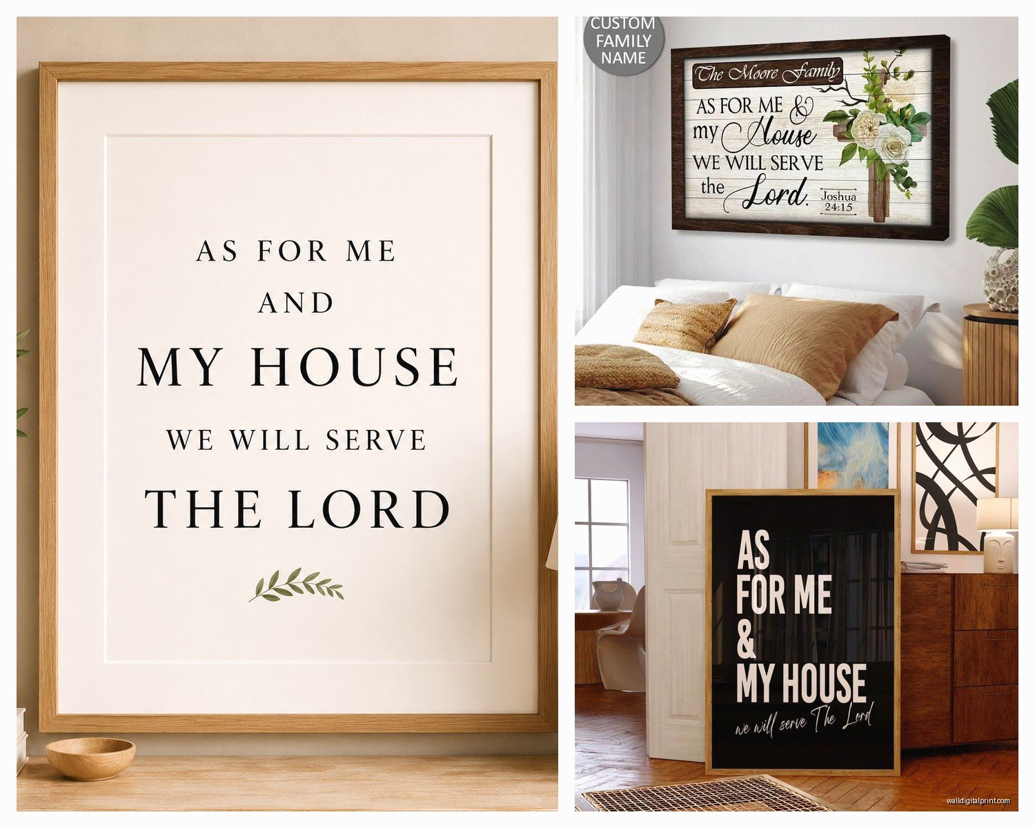
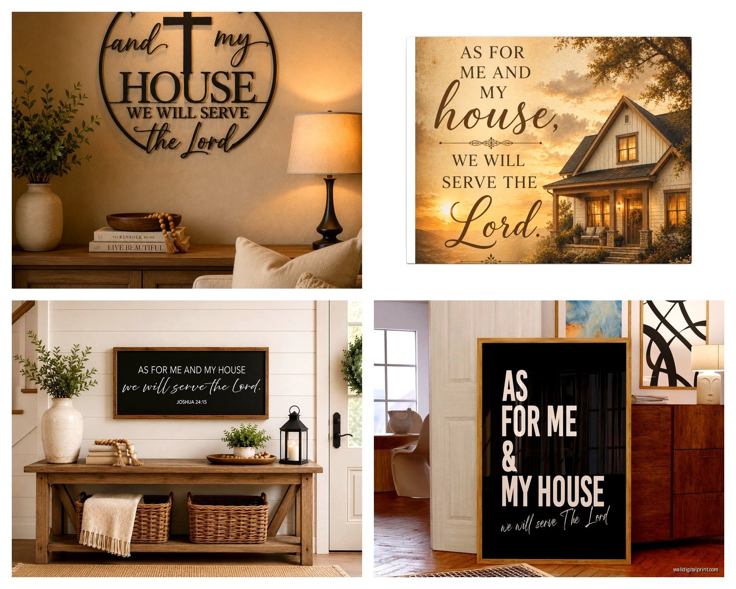
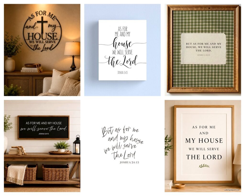
Okay so there are basically four main styles of this scripture art and they each work in totally different rooms. The farmhouse wood signs are everywhere right now, the modern minimalist prints, the vintage-looking canvas pieces, and then the metal script versions.
The farmhouse wood ones work best in spaces that already have wood tones and textures. Like if you’ve got shiplap or exposed beams or even just wood furniture, it’ll blend better. But here’s the thing nobody tells you—if your walls are already busy with wood textures, adding a huge wooden sign just creates visual noise. My client last month had this beautiful reclaimed wood accent wall and wanted to mount a 4-foot wooden sign on it and I literally had to talk her down because it would’ve been texture overload.
For modern minimalist prints, you want clean lines in the rest of your space. These work amazing in homes with lots of white walls, simple furniture, maybe some geometric patterns. I’ve got one in my own bedroom actually, just black text on white paper in a thin black frame, and it’s probably my favorite version because it doesn’t scream “I’M RELIGIOUS DECOR” at everyone who walks in. It just looks like intentional art.
The vintage canvas pieces are tricky because they can read really dated really fast. Unless you’re committing to a full vintage aesthetic with the right accessories, they kinda just look like something from a church basement sale? Not trying to be harsh but I’ve seen this happen too many times.
Metal script versions are having a moment and I actually really like these for transitional spaces. They work in both traditional and modern settings if you pick the right finish. Bronze looks traditional, matte black reads modern, and brushed nickel goes either way.
Size Guidelines That Actually Make Sense
This is where people really mess up. The standard advice is the art should take up 2/3 to 3/4 of the furniture width below it, but with scripture art that has a lot of text, you need to think about readability too.
For entryways, if you’re putting this on the main wall people see when they walk in, go bigger. Like 36 to 48 inches wide minimum. Anything smaller looks like an afterthought. I tested this in my own entryway with different sizes and the 24-inch version just got lost, even though technically the proportions were “correct” according to design rules.
Above a console table, you want at least 24 inches but probably 30-36 inches works better. The sign should feel substantial without overwhelming the table surface.
In living rooms above a sofa, this is where you can go really big. 48 to 60 inches is not too much if you’ve got a standard sofa. But—and this is important—if you’re gonna put other things on the wall with it, size down. You can’t have a huge scripture sign AND a gallery wall happening. Pick one vibe.
For bedrooms, I actually recommend going smaller and more intimate. Like 18 to 30 inches max. You’re seeing this from your bed, you don’t need it to be massive. Plus bedrooms should feel personal and calm, not like a public declaration space.
The Height Thing Nobody Gets Right
Hang it at eye level, which is around 57 to 60 inches to the center of the piece. But if you’re putting it above furniture, the rule changes—you want 6 to 8 inches between the top of the furniture and the bottom of the art.
I see so many people hang these way too high, like they’re trying to get it closer to heaven or something, and it just looks disconnected from the room. Your art should feel anchored to your space, not floating near the ceiling.
Color Coordination Without Making It Weird
The scripture itself is obviously the focal point, so you don’t want it competing with a bunch of other colors. If you go with a natural wood version, pull that wood tone into at least two other places in the room. Maybe your coffee table and a picture frame, or your flooring and a wooden bowl on the console table. This creates visual flow.
For black and white versions, these are honestly the easiest because they go with literally everything. But you can make them feel more intentional by echoing that high contrast elsewhere. Black frames on other art, white vases with black accents, that kind of thing.
If you’re doing a colored version—and some people do painted wood signs in navy or sage green or whatever—that color needs to be one of your room’s accent colors, not a random addition. I had a client who bought a beautiful turquoise version and then had zero turquoise anywhere else in her house and it looked so out of place until we added throw pillows and a vase in similar tones.
Oh and another thing, the text style matters for color coordination too. Script fonts feel more traditional and work with warmer color palettes. Block letters read modern and work better with cooler tones and neutrals.
Styling Around It Without Overdoing It
This is gonna sound weird but the biggest mistake is making the whole wall about this one piece. Like people put it up and then add crosses on either side and maybe some praying hands art and it becomes very very churchy very fast.
Instead, style it like you would any other statement art. If it’s above a console table, add maybe two or three other elements that have nothing to do with scripture. A plant, some books, a decorative box. Keep it balanced but not matchy.
For gallery walls that include this piece, make it the largest item and build around it with family photos, abstract art, maybe a mirror. The scripture becomes part of your story, not the whole story.
I’ve found that mixing in natural elements helps a ton. A wreath to one side, some greenery, wooden beads, cotton stems. This softens the formality of having scripture on your wall and makes it feel more lived-in.
Wait I forgot to mention lighting—if you can add a picture light above it or position it where natural light hits during the day, it makes such a difference. The text becomes more readable and the whole piece feels more intentional.
Different Rooms Need Different Approaches
Entryways: This is the classic spot and for good reason. It’s literally a statement about your household as people enter. Keep the rest of the entryway simple. A bench or console table, a mirror maybe, and let the scripture be the main visual focus. I usually do a large version here, 40 inches or bigger.
Living rooms: Above the sofa is popular but honestly I like it better on a side wall where it’s not competing with the TV or fireplace. It becomes a conversation piece without being the only thing people look at. If you do put it above the sofa, keep your coffee table decor minimal so the room doesn’t feel cluttered.
Kitchens: Okay so this works better than you’d think, especially in eat-in kitchens or dining areas. A smaller version, maybe 20 to 30 inches, on the wall near your table. It reinforces the gathering and fellowship aspect of the scripture. Just make sure it’s not too close to cooking areas where it’ll get greasy—learned that the hard way at my own place.
Bedrooms: Above the bed is the obvious spot but I actually prefer it on the wall opposite the bed where you see it first thing when you wake up. Feels more intentional that way. Keep it proportional to your bed width though, you don’t want it wider than your headboard.
Hallways: If you’ve got a long hallway, this can anchor the space really nicely. Center it on the longest wall and keep other wall decor minimal in that hallway so it stands out.
Material Choices That Hold Up
Wood signs are durable but they show dust like crazy. If you’ve got allergies or pets, you’re gonna be wiping it down constantly. The textured ones are even worse for collecting dust in the grooves.
Canvas prints are lighter and easier to hang but they can fade over time if they’re in direct sunlight. I’ve got one in my guest room that’s been there for five years and the edges are definitely getting lighter.
Metal pieces are probably the most durable and easiest to clean, just wipe with a damp cloth. But they’re heavier so you need proper wall anchors. Don’t just use the little nails that come with it or you’ll have a hole in your wall and a dented sign on your floor. Trust me on this one.
Framed prints give you the most flexibility because you can change the frame if your style changes. I did this in my office, started with a rustic frame and swapped to a modern one when I repainted and it completely updated the look without buying new art.
The Price Reality Check
You can spend anywhere from like $20 for a basic print to $300+ for a custom wood sign. The sweet spot for quality is usually around $60 to $120. Below that and you’re getting something that looks cheap in person even if the photos online are good. Above that and you’re mostly paying for size or custom work.
Etsy has tons of options and you can often get custom sizing which is worth the extra money if you’ve got an odd wall space. Just read reviews carefully because quality varies wildly between sellers.
HomeGoods and Hobby Lobby rotate their scripture art pretty regularly so if you’re patient you can find good deals. I got mine at HomeGoods for like $35 and it’s held up great.
My cat knocked over a $200 custom piece last year and it survived without damage, so sometimes the investment is worth it for durability. But I’ve also got a $40 one that looks just as good from normal viewing distance, so…
Making It Feel Personal Not Preachy
The key is integrating it naturally into your existing decor. Don’t rearrange your entire room around it. Find a spot where it fits with what you already have going on.
Mix your decor styles. Even if the scripture piece is farmhouse style, throw in some modern elements elsewhere in the room. This keeps it from feeling like a themed space.
Consider doing a version with just the reference (Joshua 24:15) instead of the full text. It’s subtler and honestly starts better conversations because people have to ask what it means.
Layer it with other meaningful items—family photos, souvenirs from trips, other art you love. When it’s part of a larger collection of things that matter to you, it feels authentic instead of performative.
And look, if you’re putting this up just because you think you should or because everyone else in your church group has one, maybe skip it? Your home should reflect what actually matters to you, not what you think should matter. But if this scripture genuinely resonates with your family’s values, then yeah, put it up and style it in a way that feels true to how you actually live.
The placement should make sense for your daily life too. Like don’t put it in a room nobody uses just because that’s the “proper” spot. Put it where your family actually gathers and where it’ll be part of your everyday experience.