
Wall Art Guide, Wall Art Tutoriels
Blue Heron Wall Art: Wading Bird Water Wetland Scene
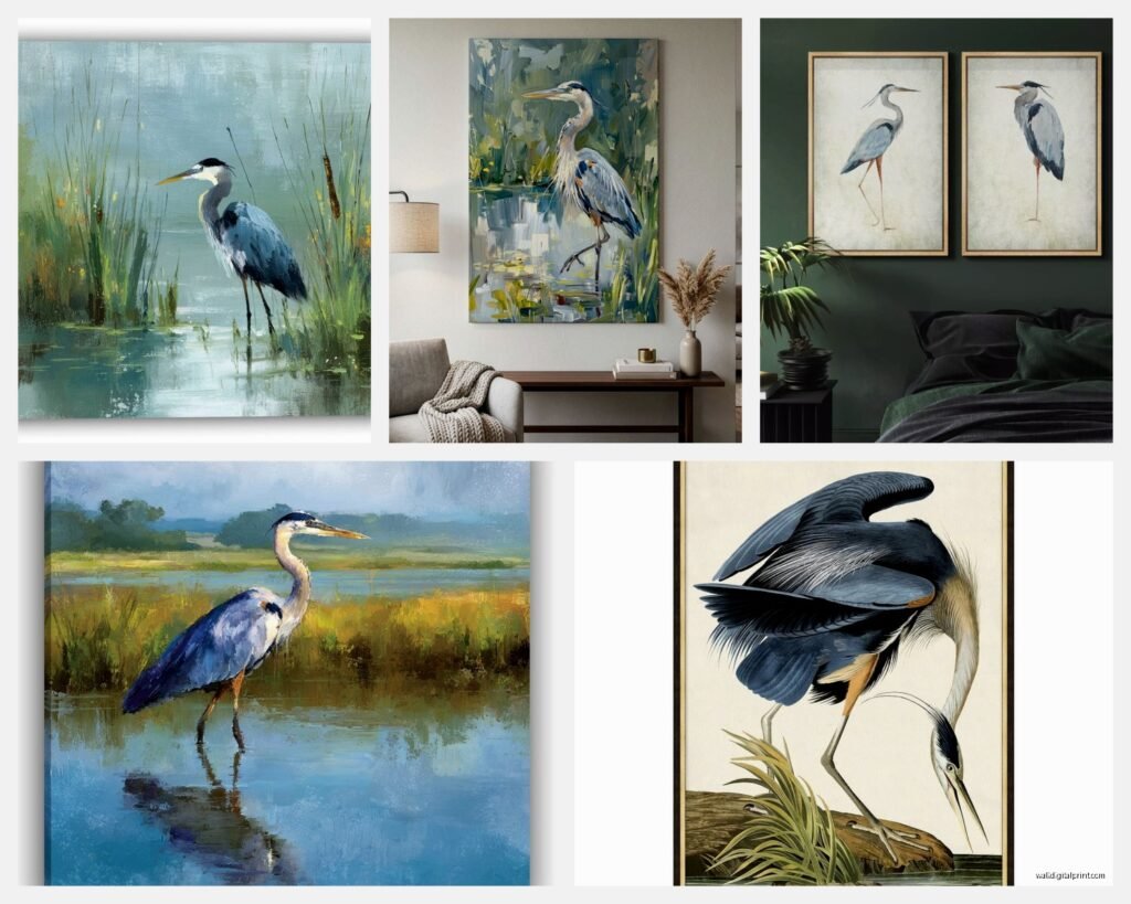
Aug
So I’ve been totally obsessed with blue heron wall art lately and honestly it started because a client wanted to redo their bathroom with this whole coastal wetland vibe and I fell down this rabbit hole of wading bird imagery. Like, I didn’t expect to become the person who has opinions about heron art but here we are.
Finding the Right Style Without Looking Like a Hotel Lobby
Okay so first thing – blue heron art comes in like a million styles and some of it is absolutely gorgeous and some of it looks like what you’d see in a dentist’s office waiting room. The difference is usually in the details and the color palette. I spent way too much time (my dog was literally staring at me like “walk??” while I scrolled) comparing different approaches.
Photographic prints can be stunning but they need to be high resolution. I’m talking at least 300 DPI if you’re going bigger than 16×20. I learned this the hard way when I ordered what looked amazing online and it showed up pixelated. The thing with heron photos is you want to see the texture in their feathers, that blue-grey coloring that changes in different light. If it’s blurry it just looks like a grey blob with a beak.
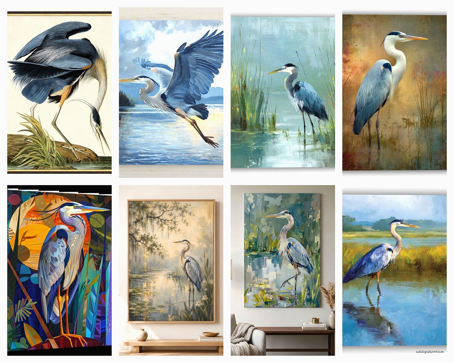
Watercolor styles are having a moment right now and honestly? They work really well with wetland scenes. The soft edges match the misty morning vibe that herons naturally exist in. I found this one artist on Etsy who does these incredible loose watercolors where the heron is detailed but the background bleeds into abstract water reflections and it’s *chef’s kiss*. But make sure the colors aren’t too wishy-washy – you still want some depth.
The Realism vs Abstract Debate
This is gonna sound weird but I actually think semi-abstract works best for most spaces. Like, you want people to recognize it’s a heron immediately, but if it’s too photorealistic it can feel heavy in a room. I had a piece that was almost scientific illustration level of detail and it dominated the entire wall in a way that wasn’t great. The eye needs somewhere to rest.
Line drawings are super trendy right now too – that minimalist single-line or sketch style. They work amazingly in modern spaces or if you’re mixing with other art. I hung three different wading bird line drawings in my own hallway (a heron, an egret, and a sandpiper) and they create this really cohesive gallery wall without being matchy-matchy.
Size and Placement Because Location Matters More Than You Think
Oh and another thing – where you’re actually putting this matters SO much. I see people buy art they love and then stick it somewhere random and wonder why it doesn’t work.
For bathrooms, which is surprisingly popular for water bird art, you gotta think about humidity. Either frame it properly with sealed backing or go with canvas or metal prints. I love a good aluminum print for bathrooms – the colors stay vibrant and moisture isn’t an issue. There’s something perfect about heron art in a bathroom anyway since they’re water birds. Just make sure it’s not directly in the shower spray line because I’m not a miracle worker.
Living rooms can handle bigger statements. Like 30×40 or even larger if you have the wall space. The key is leaving enough breathing room – at least 6-8 inches on each side between the frame edge and any furniture or corners. A heron in a wetland scene has this natural horizontal orientation usually, so it works great above sofas or console tables.
The Height Thing Everyone Gets Wrong
Hang it at eye level, which is around 57-60 inches from the floor to the center of the artwork. Not the top, not the bottom – the CENTER. I cannot tell you how many times I’ve walked into someone’s home and their art is like six inches from the ceiling. Your heron should not be nesting in the crown molding.
If you’re hanging above furniture, the bottom of the frame should be 6-8 inches above the furniture top. This creates visual connection without making everything feel cramped.
Color Coordination Without Being Boring
Wait I forgot to mention the whole color situation. Blue herons aren’t actually super blue – they’re more slate grey with blue undertones. So when you’re looking at art, pay attention to what other colors are included in the wetland scene.
- Warm tones – amber reeds, golden hour lighting, rust-colored grasses – these make the piece feel cozy and work with wood furniture
- Cool tones – blues, greens, misty greys – more contemporary and calming, great for bedrooms
- High contrast – dark water with bright sky or vice versa – adds drama and works as a focal point
- Muted/monochromatic – everything in the same tonal family – very sophisticated but can read flat if not done well
I personally love when there’s a bit of warm light in the scene even if the overall palette is cool. It adds dimension. My favorite heron print has this early morning light hitting the water and it makes the whole thing glow. People always comment on it.
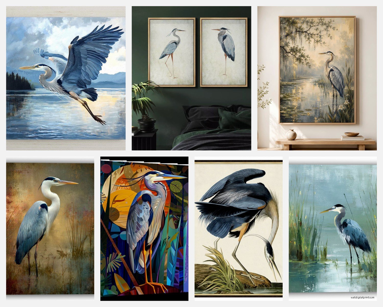
Frame Choices That Don’t Scream Basic
Okay so funny story – I once spent $400 on a custom frame for a $60 print and honestly? Worth it. The frame can completely make or break the piece.
For wetland scenes, I usually avoid ornate frames. They compete with the natural setting. Simple wood frames work great – think maple, oak, or walnut depending on your existing furniture. Black frames are classic and make colors pop but they can feel heavy with darker heron images.
White or cream frames give it that coastal gallery feel. Really popular right now and they brighten everything up. Just make sure the white isn’t too stark or it’ll create harsh contrast.
Natural wood floater frames are my secret weapon for canvas prints. They make even affordable prints look expensive and gallery-worthy. The gap between the canvas edge and frame adds this shadow depth that’s really elegant.
Mat or No Mat
If you’re framing a print (not canvas), use a mat. It doesn’t have to be huge – even 2-3 inches makes a difference. It gives the image breathing room and protects the print from touching the glass. I usually go with off-white or light grey mats for heron art. White can be too stark and cream sometimes clashes with the blue-grey tones.
Where to Actually Buy This Stuff
So you’re probably wondering where to find good heron art that doesn’t cost your entire paycheck. I’ve tested a bunch of sources and here’s what actually works.
Etsy is goldmine if you’re willing to dig. Search for “blue heron print” or “great blue heron art” and filter by your size needs. Lots of artists sell digital downloads that you can print locally, which is usually cheaper than buying a physical print plus shipping. Just make sure you’re downloading high-res files – should be at least 300 DPI at the size you want to print.
Society6 and Redbubble have tons of options and they do the printing and framing for you. Quality is pretty consistent and they have sales constantly. I’ve ordered probably a dozen things from Society6 and only had one issue with a frame arriving dinged up – they replaced it no questions asked.
Local art fairs and nature centers sometimes have amazing photography. Nature photographers who actually spend time in wetlands capturing herons in their habitat often sell at these venues and the quality is usually exceptional. Plus you can see exactly what you’re getting before buying.
The Print Your Own Route
If you find a digital download you love, printing it yourself through a local print shop or even Costco (their photo center is surprisingly good) can save you money. Just make sure you’re printing on the right paper – I like matte fine art paper for nature scenes. Glossy can create weird reflections and cheap paper makes colors look dull.
Styling Around Your Heron Art
This is where it gets fun because blue heron art is actually pretty versatile even though it seems specific.
Don’t go overboard with the theme is my main advice. You don’t need cattails and duck decoys everywhere. The art makes the statement – keep everything else more subtle. Maybe some natural fiber textures, a piece of driftwood, or some simple greenery. I made the mistake once of going full wetland theme for a client and it felt like a nature museum exhibit instead of a home.
Books with blue or grey spines look great styled near heron art. Sounds random but it creates color cohesion without being obvious. Same with pottery in earth tones or that blue-grey ceramic that’s everywhere right now.
Mixing With Other Art
Blue heron art actually plays well with others if you’re building a gallery wall. I like pairing it with:
- Abstract water or sky images
- Other birds but in different styles – like if your heron is realistic, add a minimalist bird sketch
- Landscape photography from similar environments
- Botanical prints of wetland plants
Keep the frames consistent if you’re doing a gallery wall. Same color family at least, even if the exact style varies slightly. This keeps everything cohesive while still being interesting.
Lighting Makes or Breaks It
Oh wait I almost forgot the lighting thing which is actually super important. Art needs proper lighting or it just disappears into the wall.
Picture lights are classic – those little brass or nickel lights that mount above the frame. They work great for traditional spaces but can feel formal. If you go this route, make sure the light extends across the full width of the art.
Track lighting or adjustable spotlights give you more flexibility. You can angle them to avoid glare on glass and adjust as needed. I have track lighting in my living room and it’s perfect for changing out art seasonally (yes I do that, I might have a problem).
Natural light is tricky with art. It’s beautiful but UV rays fade colors over time. If your heron art is in direct sunlight, use UV-protective glass or acrylic. It costs more but your print will last way longer. I learned this after watching a gorgeous print fade to basically nothing in a sunny hallway over two years.
Seasonal Flexibility
One thing I love about wetland scenes is they work year-round but can shift in feel depending on what else is happening in your space. In summer I style mine with lighter, brighter accessories. In fall and winter I lean into the moody grey tones with darker textiles and warmer lighting. Same art, totally different vibe.
If you get bored easily like me, having art that adapts to different seasonal styling is key. The heron stays constant but everything around it can change and it still works.
Quality Indicators to Look For
Since you’re gonna be looking at a bunch of options, here’s what separates good heron art from mediocre:
Detail in the feathers and eyes – even in stylized pieces, these should have some definition. Blurry or muddy details usually mean low quality source material or printing.
Balanced composition – the heron shouldn’t be awkwardly placed. It should feel natural in the scene, whether it’s centered or using rule of thirds. If something feels “off” visually, trust that instinct.
Color depth – there should be variation in tones, not flat single colors. Even in the water, you want to see movement and light play. Flat backgrounds make everything look amateur.
Print quality matters – look for reviews mentioning print quality if buying online. Terms like “giclée print” or “archival inks” indicate better quality that won’t fade quickly.
Okay so that’s basically everything I wish someone had told me before I started collecting wading bird art. It’s actually become one of my favorite things to help clients with because it’s specific enough to be interesting but versatile enough to work in so many spaces. My cat just knocked over my water glass so I’m gonna stop here but seriously, if you find a heron piece you love, just get it. You can always figure out the rest later.
