
Wall Art Guide, Wall Art Tutoriels
Islamic Wall Art: Arabic Calligraphy Muslim Faith Decor
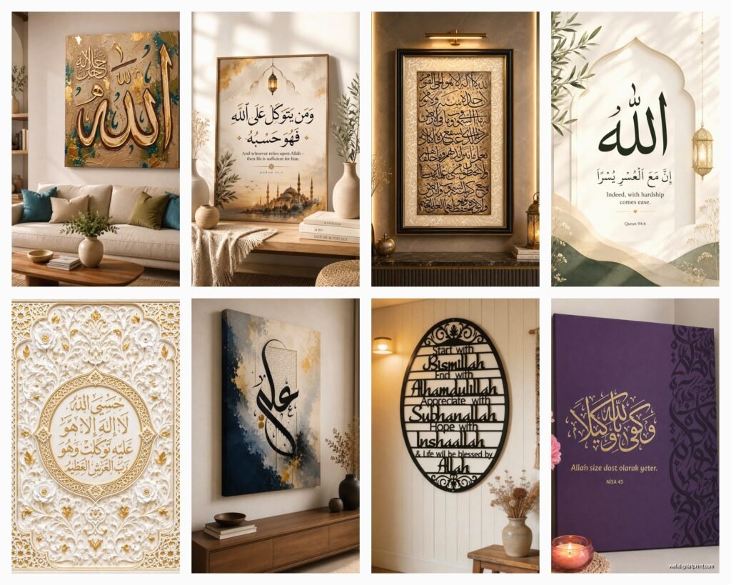
Aug
So I’ve been diving deep into Islamic wall art lately because honestly, three of my clients in the past month alone asked about incorporating Arabic calligraphy into their spaces, and I had to learn this stuff fast. Let me tell you what actually works versus what just looks good on Instagram but falls flat in real rooms.
Starting With What Actually Matters
Okay so first thing – you gotta know what the calligraphy actually says. I made this mistake early on where I bought this gorgeous piece for a client’s dining room and didn’t verify the translation properly. Turns out it was a Quranic verse that’s typically used in prayer spaces, not dining areas. My client was super gracious about it but I felt like an idiot. Now I always, always confirm the meaning and appropriate placement with someone who actually knows.
The most common phrases you’ll see are:
- Bismillah (In the name of Allah) – works literally anywhere, entrance halls are popular
- Alhamdulillah (Praise be to Allah) – dining rooms, living spaces
- Mashallah (God has willed it) – nurseries, family photo walls
- Ayat al-Kursi (Throne Verse) – protection verse, often near doorways
- The 99 Names of Allah – statement pieces, usually large scale
The Styles Nobody Tells You About
There’s like six main calligraphy styles and they give completely different vibes. Thuluth is the one you see everywhere – it’s got those elegant, flowing lines with dramatic curves. Super readable, works in modern spaces. Kufi is the geometric one, all angles and straight lines, and honestly it’s my favorite for contemporary interiors because it reads almost like abstract art to people unfamiliar with Arabic script.
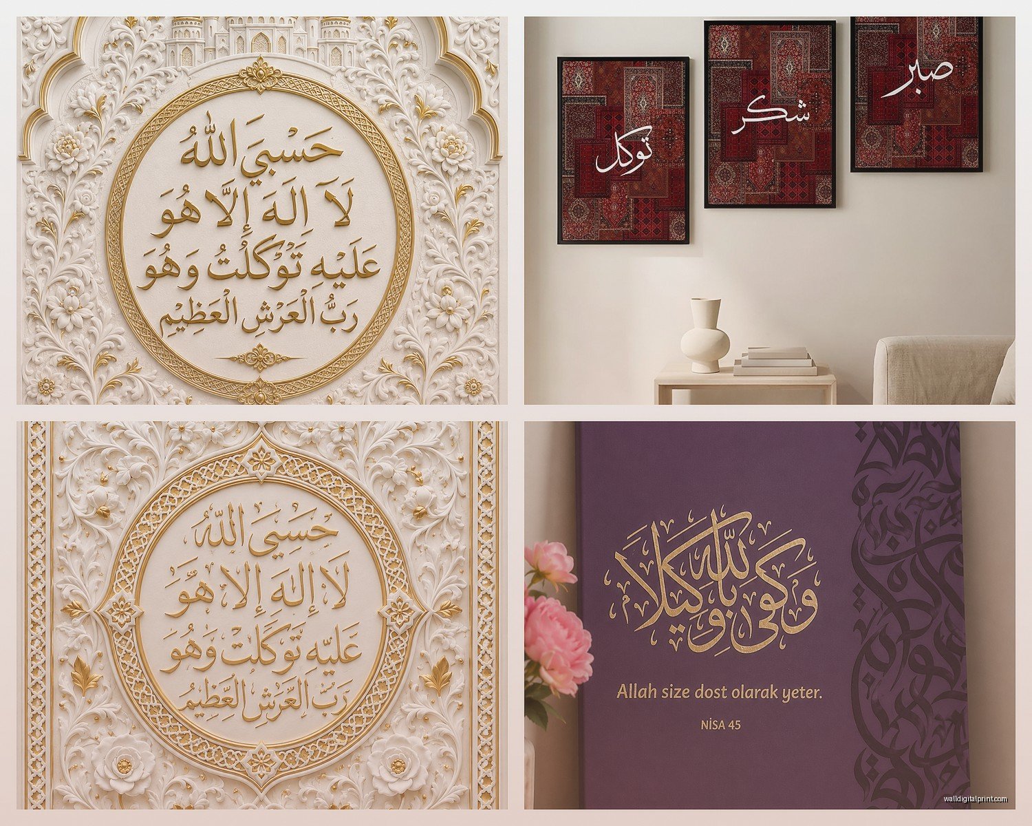
Naskh is more compact and was traditionally used for Quran copies, so it’s got this scholarly feel. Diwani is the ornate Ottoman style – beautiful but can look busy in small spaces. I used Diwani once in a huge foyer with 14-foot ceilings and it was stunning, but in a regular living room? Too much.
Wait I forgot to mention Ruq’ah – it’s more casual, almost like cursive handwriting. Not as common in wall art but I’ve seen it work really well in home offices or study spaces.
Colors That Don’t Scream “I Bought This At A Tourist Shop”
Everyone defaults to gold on black or gold on navy and like… it can work but it’s so expected. My cat literally knocked over my coffee while I was working on a mood board last week and the stain actually inspired this whole color palette – these warm terracotta and cream combinations that feel way more organic.
Here’s what I’ve been doing instead:
- Charcoal gray calligraphy on warm white – sophisticated, not harsh
- Deep emerald with rose gold accents – luxe without being gaudy
- Natural wood burned or carved calligraphy – brings in texture
- Matte black on textured linen or canvas – gallery vibes
- Single color tone-on-tone – like cream on slightly darker cream, super subtle
The metallic trend is still going but please, if you’re gonna do gold, make it brushed or antique gold. That shiny bright gold looks cheap unless you’re going for a very specific traditional aesthetic.
Size and Placement Because This Is Where Everyone Messes Up
Okay so funny story – I hung a massive Ayat al-Kursi piece in my own living room last year, centered above the sofa like you’re “supposed to” do with art, right? Looked ridiculous. The piece was 48 inches wide and my sofa is only 76 inches, and because Arabic reads right to left, the visual weight was all wrong. Ended up moving it to a longer wall where it could breathe.
The rule I use now: if it’s a horizontal piece, it should be about 60-75% of the furniture width below it. But honestly with Arabic calligraphy, you also gotta consider the directional flow. If the composition has strong movement to the right (which is the end of the phrase in Arabic), you want space on that side or it feels cut off.
For vertical pieces – those work amazing in narrow spaces like hallways or between windows. I did a floor-to-ceiling piece in a client’s stairwell using three connected panels with the 99 Names arranged vertically and it’s probably my favorite project from last year.
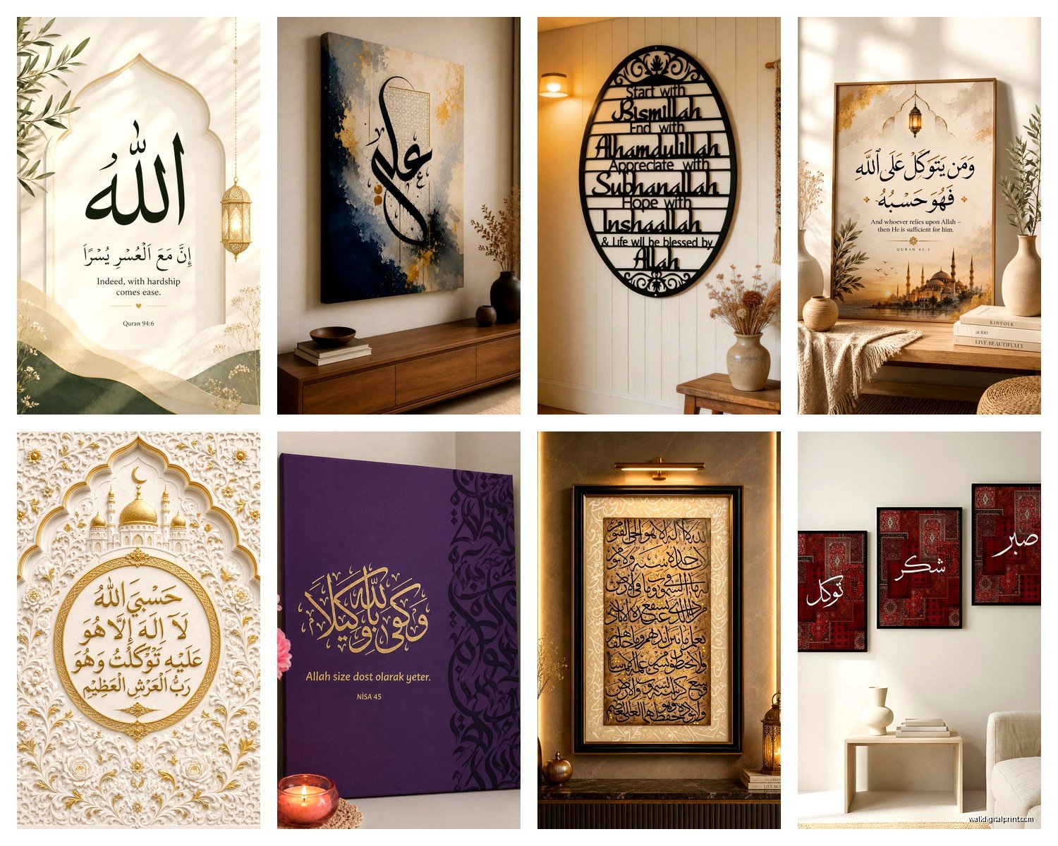
The Gallery Wall Approach
This is gonna sound weird but mixing Islamic calligraphy with other art actually works better than doing all calligraphy. I learned this from a Muslim colleague who said her home had family photos, landscapes, and maybe one or two calligraphy pieces per room – it felt more lived-in, less like a religious showroom.
When I do gallery walls now, I’ll include:
- One statement calligraphy piece as the anchor
- Geometric Islamic patterns in complementary frames
- Abstract pieces that echo the colors
- Maybe some photography if it fits the theme
The key is keeping the frames consistent or at least coordinated. All black frames, all natural wood, or all brass – don’t mix frame finishes with calligraphy because the script is already complex enough visually.
Materials and Quality Checks
So I spent an hour comparing different printing methods when my client canceled last month (she moved the project to spring), and here’s what matters: Canvas prints are everywhere but they can look flat. If you’re going canvas, make sure it’s gallery-wrapped, at least 1.5 inches thick, and has some texture to it.
Metal prints are having a moment – the calligraphy is printed directly on aluminum and it’s got this luminous quality. Works incredibly well in modern spaces, super durable, but pricey. I’m talking $200+ for a decent sized piece.
Acrylic prints give you that glossy, high-end look. The calligraphy appears to float behind the acrylic which creates depth. These are my go-to for contemporary interiors but they’re heavy – you need proper wall anchors.
Wood prints or laser-etched wood pieces bring warmth. There’s this Etsy seller who does custom Kufi calligraphy on reclaimed barn wood and it’s *chef’s kiss* for farmhouse or transitional spaces. Runs about $150-300 depending on size.
What To Avoid
Vinyl wall decals – just don’t unless it’s temporary or you’re renting. They peel, they leave residue, and they look cheap. I’ve seen exactly one installation where decals worked and it was in a kid’s room where the parent knew they’d redo it in a few years anyway.
Mass-produced prints from big box stores often have errors in the calligraphy or inappropriate phrasing. Always buy from Muslim artists or at least shops that work with Muslim consultants. There are Facebook groups where you can post a picture and ask for verification before you buy.
Lighting This Stuff Properly
Oh and another thing – lighting makes or breaks calligraphy art. The script has all these curves and angles that create shadows, and if you light it wrong, you lose half the visual impact. Picture lights mounted above the frame work great for traditional spaces. For modern interiors, I use track lighting positioned at a 30-degree angle.
If the piece has metallic elements, you want lighting that hits it at an angle to catch the shimmer. Straight-on lighting flattens metallic finishes.
Natural light is tricky because you don’t want direct sunlight fading the piece, but indirect natural light actually makes calligraphy more readable during daytime. I always test placement with the lighting conditions at different times of day before committing to the final spot.
Custom Versus Ready-Made
Ready-made pieces are gonna be cheaper and faster – you can find decent stuff on Etsy, Islamic bookstores, or specialized online shops for anywhere from $40 to $300. The downside is you get what everyone else has.
Custom work from a real calligrapher starts around $300 and goes up to thousands depending on size, complexity, and the artist’s reputation. But here’s the thing – you can request specific verses, color schemes, and styles. I had a piece commissioned for a client’s meditation room with a specific Hadith about peace that you just don’t find in mass production.
If you’re gonna go custom, budget at least 6-8 weeks for completion and framing. These artists aren’t just writing – they’re creating compositions, often by hand, and it takes time.
The Digital Artist Middle Ground
There’s a middle option that’s pretty cool – digital artists who do custom calligraphy compositions but deliver them as print files. You pay $100-200 for the design, then you can print it yourself at whatever size you need. I’ve used this approach when clients want matching pieces in multiple rooms but don’t want to pay for multiple original artworks.
Just make sure you get high-resolution files (at least 300 DPI) and clarify the usage rights. Some artists sell personal-use-only licenses.
Room-Specific Ideas That Actually Work
Living rooms – go for something meaningful but not too religious-specific if you have diverse guests. “Alhamdulillah” or simple geometric patterns with subtle calligraphy woven in work well. Scale it appropriately; I see too many tiny pieces on huge walls.
Bedrooms – protection verses or peaceful phrases. Keep colors calm. I did a client’s master bedroom with “And He is with you wherever you are” in soft gray tones and it’s exactly the vibe a bedroom should have.
Kitchens and dining rooms – “Bismillah” is traditional, or verses about gratitude and sustenance. These spaces can handle slightly more decorative styles since you’re not staring at them for hours like you would in a living room.
Home offices – verses about knowledge, patience, or guidance. I like Naskh style here because it’s got that scholarly feel. Keep it at eye level when you’re seated so it’s actually readable when you’re working.
Entryways – protection verses are traditional, or welcoming phrases. This is where you can make a statement with size since people aren’t lingering here. Just make sure it’s the first thing visible when the door opens.
Prayer rooms – obviously this needs to be appropriate Quranic verses and placed respectfully. Qibla direction matters for placement. If you’re designing this space for someone, consult with them extensively about their preferences.
Mixing With Other Decor Styles
Modern minimalist – stick with Kufi calligraphy in monochrome palettes, clean lines, maybe a single statement piece rather than multiple. Less is more here.
Bohemian – you can layer more, mix in geometric patterns, use warmer metallics like copper or bronze. Multiple smaller pieces work in boho spaces where eclectic is the point.
Traditional – this is where ornate Diwani or Thuluth styles shine, richer colors, proper frames with matting. You can go more elaborate here.
Scandinavian – yes, really. I’ve done this successfully with black calligraphy on white or natural wood backgrounds, keeping everything minimal and letting the script be the only ornate element in an otherwise simple space.
Maintenance and Long-Term Care
Canvas and paper prints – keep away from humidity, dust gently with a microfiber cloth, no cleaning products. If it’s behind glass, clean the glass only.
Metal and acrylic – you can use glass cleaner on these but spray the cloth, not the art directly. Wipe gently in one direction.
Wood pieces – dust regularly, occasionally treat with wood conditioner if they’re not sealed. Keep away from direct heat sources.
The biggest enemy is actually sunlight – UV rays fade everything eventually. If you’ve got a piece in a sunny spot, consider UV-protective glass or rotate it with another piece seasonally.
Budget Breakdown
Under $50 – small prints, basic frames, mass-produced but you can find decent stuff if you’re patient. Good for trying out the style before committing.
$50-150 – better quality prints, nicer materials, more size options. This is my sweet spot for most clients’ secondary spaces.
$150-500 – gallery-quality prints, unique pieces from independent artists, custom digital designs, quality frames. Where you should invest for main living areas.
$500+ – original calligraphy, large-scale installations, premium materials like museum-quality acrylic or hand-carved wood. Special occasion pieces or statement walls.
I always tell clients to invest more in fewer pieces rather than buying lots of cheap ones. One stunning piece beats five mediocre ones every time.
Anyway, I’ve been watching this documentary on Netflix about Islamic architecture while writing this and it’s giving me so many ideas for my next project, but that’s probably more than you wanted to know. The main thing is just make sure the calligraphy is correct, the placement makes sense, and it fits your actual space rather than trying to recreate some Instagram photo. Start with one piece, live with it for a while, then add more if it feels right.
