Wall Art Guide, Wall Art Tutoriels
The Man in the Arena Wall Art: Teddy Roosevelt Quote
Aug
So I’ve been obsessing over The Man in the Arena quote lately and honestly it’s become this whole thing in my design work. A client asked about it last month and now I can’t stop seeing it everywhere, which is how I know something’s actually good for wall art, right?
The quote itself is from Teddy Roosevelt’s 1910 speech and it’s that whole “It is not the critic who counts” thing. You’ve probably seen it on Instagram or something. But here’s what I figured out after actually hanging like five different versions in various spaces – there’s a huge difference between prints that work and prints that just sit there looking forgettable.
Finding the Right Version
Okay so first thing, you gotta decide what style actually fits your space. I made this mistake in my own office where I bought this super ornate vintage-looking version with scrollwork and everything, and it just felt… off? Too busy. My cat knocked it off the wall anyway so maybe that was a sign.
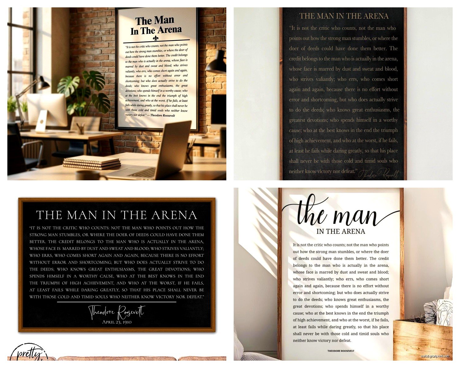
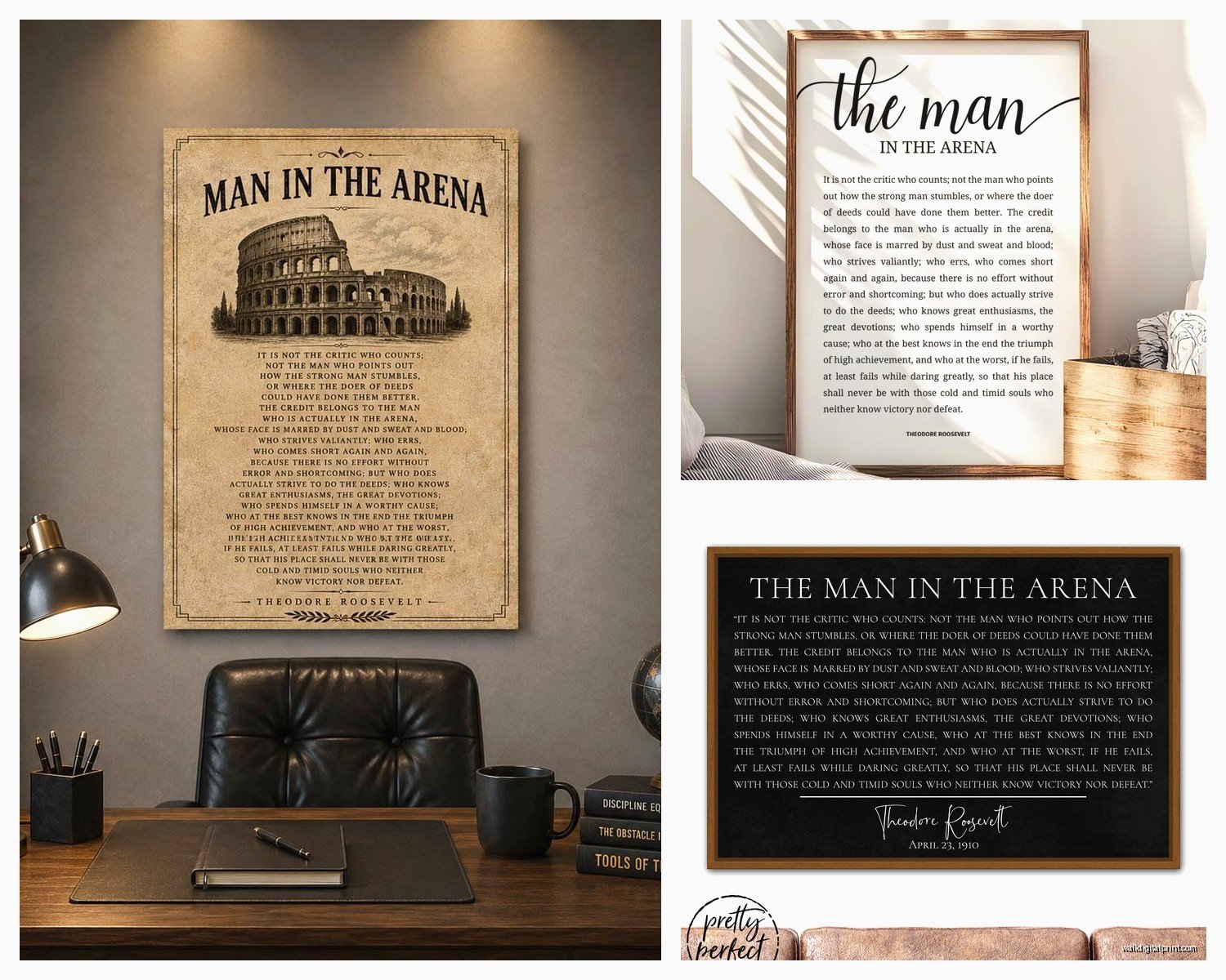
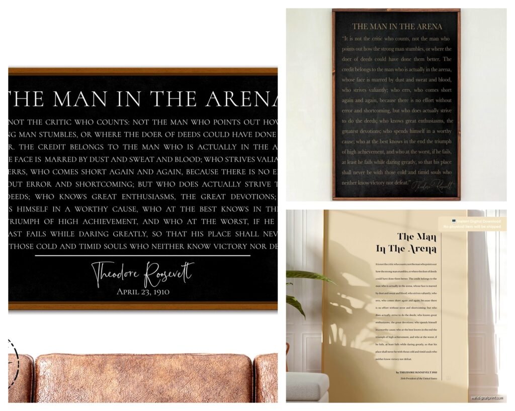
The minimalist black and white versions are honestly the safest bet. I found this one on Etsy from a shop that does clean typography – just black text on white or cream background. It’s boring to describe but it works in like 90% of spaces. The font matters more than you’d think though. Sans serif feels modern and direct, serif feels more traditional and weighty. For this quote specifically, I lean toward serif because Roosevelt wasn’t exactly a minimalist dude, you know?
There are also these distressed vintage poster styles that look like old newspapers or propaganda posters from that era. Those can be really cool in the right space – I used one in a client’s home office that had a lot of leather and dark wood. But in a bright, airy room? Nah. Too heavy.
Size Actually Matters Here
This is gonna sound weird but this quote needs space to breathe. It’s not a short punchy phrase – it’s a whole paragraph basically. I tried putting an 8×10 version on a wall once and you literally had to walk up to it and squint to read it, which defeats the entire purpose.
My rule: minimum 16×20 if you’re putting it on a decent sized wall. I actually prefer 24×36 for most spaces. Yeah it feels big when you’re ordering it online but trust me, when you get it on the wall with furniture and everything else competing for attention, you want it large enough to actually read from across the room.
I did a 30×40 in a client’s gym and that was perfect because you could read it while on the treadmill or whatever. The whole point is it’s supposed to motivate you when you’re in the arena yourself, right? Can’t do that if you can’t read it.
The Frame Situation
Oh and another thing – framing makes or breaks this. I’ve tested cheap Amazon frames, custom framing, and the middle ground options. Here’s what actually works:
For modern spaces, go frameless or use a thin black metal frame. There’s this company called Framebridge that does good work but it’s pricey. I’ve also had luck with those magnetic poster hangers – the wooden ones that clamp top and bottom. Super clean look and way cheaper than traditional framing.
Traditional spaces need a real frame. I usually do black or dark walnut. Nothing ornate though – simple profile, maybe an inch wide. Let the quote be the focus. I made the mistake of using this gorgeous gold baroque frame once and it was just… a lot. The quote got lost in all that decoration.
If you’re on a budget, Target and Michael’s both have decent ready-made frames. Just wait for the 50% off sales at Michael’s because their regular prices are insane. I literally have alerts set up for their sales at this point.
Where to Actually Buy These
Okay so I’ve ordered from probably fifteen different places testing this out. Etsy is honestly your best bet for variety and quality. Search “Man in the Arena print” and you’ll get hundreds of options. Look for shops that show actual photos of the print in frames or on walls, not just digital mockups.
I really like this one shop called… wait I gotta check my orders… okay it’s called InkistPrints. They do museum-quality printing and the paper quality is noticeably better than the cheap stuff. Around $30 for a large print which isn’t bad.
Amazon has options too but they’re hit or miss. The quality can be really inconsistent. I ordered the same print twice from the same seller and they looked different – different paper weight, slightly different printing quality. So if you go Amazon route, just know you might need to return it.
There are also these canvas versions everywhere. I’m kinda meh on canvas for text-heavy stuff? It works better for images in my opinion. The texture of canvas can make smaller text harder to read and this quote has some smaller text in it. But I’ve seen it work in more casual spaces like a home gym or garage office.
The Actual Hanging Process
This is where people mess up constantly. You’d think hanging a frame is simple but I’ve seen so many Man in the Arena prints hung at the wrong height or in weird spots.
Standard rule is center of the frame at 57-60 inches from the floor. That’s museum height and it works. But honestly for this specific piece, I sometimes go slightly higher if it’s going in a space where you’re usually standing – like a home office where you’re at a standing desk, or that gym I mentioned.
In a bedroom or reading nook where you’re often seated, you might go slightly lower so it’s at eye level when you’re in that position. I have one client who put it above his bed and we went lower than usual because he wanted to read it before falling asleep, which is actually kinda nice.
Wall anchors are your friend unless you’re hitting a stud. I use these EZ Anchor ones that twist in – they hold way more weight than those plastic sleeve anchors. For anything over 20×30 I’m definitely using two hanging points, not just one centered hook.
Lighting Considerations
Wait I forgot to mention lighting which is actually super important. If you’ve got a print with white or light background, be careful about glare. I learned this the hard way in my own place – hung it opposite a window and during certain times of day you literally couldn’t read it because of the glare.
Either use non-glare glass in your frame (adds like $30-50 to framing costs) or just be strategic about placement. I’ve also used small picture lights mounted above the frame which looks really sharp in traditional spaces. Battery operated LED ones are like $20 on Amazon and you don’t need to deal with wiring.
Making It Work in Different Rooms
So I’ve placed this quote in offices, gyms, bedrooms, even a kitchen once. Each space needs slightly different treatment.
Home Office: This is the obvious choice and yeah it works great here. I usually put it on the wall you face while working, not behind your desk. You want to actually see it. Pair it with simple shelving or keep the wall pretty minimal otherwise. The quote is enough.
Gym/Workout Space: Honestly perfect for this and it’s become super popular. Go bigger here – you want to read it while working out. The distressed vintage style actually works well in gym spaces because they tend to be more utilitarian anyway. I did one gym with exposed brick and the vintage poster style looked amazing.
Bedroom: This one’s trickier. It’s a very… active quote? Motivational and about striving and fighting. That’s not everyone’s bedroom vibe. But I’ve made it work by going with softer colors – like a cream background instead of stark white, or dark gray text instead of black. Above a reading chair or on a wall near a window where morning light hits it.
Living Room: Can work but you gotta be intentional. It needs to fit with your overall aesthetic. In a modern living room with lots of clean lines and neutral colors, the minimalist version works. In a more traditional space with dark furniture, the vintage style can be really cool. Just don’t let it fight with a bunch of other wall art – give it space.
I had this client who wanted to put it in their kitchen and I was skeptical but we made it work in a breakfast nook area. It actually became a conversation piece because it’s unexpected there.
What to Avoid
Okay real talk, some versions of this print are just bad. Avoid anything with:
- Cheesy motivational poster vibes – you know the ones with the eagle soaring or whatever
- Too many fonts mixed together – I’ve seen versions that use like four different typefaces and it’s chaos
- Weird color combos that don’t make sense – saw a neon version once and just… why
- Poor quality scans where the text is fuzzy – this happens a lot with cheaper prints
- Incorrect or shortened versions of the quote – some people cut it down and it loses impact
Also skip the super cheap canvas prints from those print-on-demand sites. I tested a few and the canvas was so thin you could see through it and it arrived wrinkled. Not worth saving $15.
The Full Quote vs. Excerpts
So there’s the famous excerpt that everyone knows – “It is not the critic who counts…” through “…who at the worst, if he fails, at least fails while daring greatly.” That’s the core of it and honestly, that’s what most prints feature.
But the full speech section is longer and I’ve seen prints with more context. Those are interesting but they get wordy for wall art. Unless you’re doing a huge print or multiple panels, stick with the famous excerpt. It’s famous for a reason – it’s the best part.
I did see this cool three-panel version once where each panel had a section of the longer quote. That actually worked really well in a long hallway. But for most people, single print with the main excerpt is the way to go.
DIY vs. Professional Printing
You can definitely DIY this if you want. Download a high-res file from Etsy (make sure you’re buying the digital download version), and print it yourself at a local print shop or even FedEx Office if you’re desperate. I’ve done this when I needed something same-day for a client staging.
The quality difference between professional printing and FedEx is noticeable though. Professional printing on good paper stock just looks richer – deeper blacks, crisper text. But if budget is tight or you need it immediately, the FedEx route works fine from a few feet away.
Some people make their own designs in Canva which… okay look, you can do this but typography is harder than it looks. I’ve seen some rough homemade versions. If you’re gonna DIY the design itself, spend time on the font choice and spacing. Or just buy a good digital file from someone who knows what they’re doing.
Pairing with Other Wall Art
This quote is pretty bold and statement-making so you gotta be careful about what else goes on the wall. I usually treat it as the anchor piece and keep everything else minimal.
If you’re doing a gallery wall, put the Man in the Arena print as the largest piece and surround it with simpler elements – maybe some black and white photos, simple line art, stuff that doesn’t compete. I did a client’s office where we centered the quote and flanked it with two smaller black and white landscape photos. Clean and balanced.
Avoid putting it near other text-heavy art. Two quotes on the same wall is almost always too much. Your eye doesn’t know where to focus.
Oh and another thing – this quote pairs surprisingly well with vintage maps or botanical prints if you’re going for that classic study vibe. The map gives you visual interest without competing for attention, and both have that timeless quality.
Just wrapped a project where we put the quote in a home office with some vintage National Geographic maps and dark green walls and it looked so good. Very Teddy Roosevelt actually, which was kinda the point.
The whole thing about this particular quote is it’s meant to inspire action, not just sit there looking pretty. So wherever you put it, make sure it’s somewhere you’ll actually see it and read it occasionally. Otherwise you’re just buying wall filler and there are prettier options for that.