Wall Art Guide, Wall Art Tutoriels
Photography Wall Art: Fine Art Photo Print Display Guide
Sep
So I’ve been hanging photography prints for like 15 years now and honestly the biggest mistake I see people make is buying these gorgeous fine art prints and then just… completely botching the display part. Like they’ll spend $300 on a limited edition photograph and stick it in a $15 frame from Target which, no judgment, but also kinda yes judgment?
Let me back up. You’re looking at photography wall art and wondering how to actually display it properly, right?
First thing – and I cannot stress this enough – understand what you’re actually buying. Fine art photography prints come in different types and the display method changes based on that. You’ve got your traditional prints on paper (usually cotton rag or alpha cellulose), metallic prints, canvas wraps, metal prints, and acrylic face mounting. Each one needs different handling.
Paper Prints Are Still King (But High Maintenance)
Okay so traditional fine art prints on archival paper are what most galleries use. They’re printed on either matte or semi-gloss fine art paper, usually with pigment-based inks that’ll last like 100+ years if you don’t mess them up. The thing is, paper is delicate. You need UV-protective glass, acid-free matting, and you gotta keep them away from direct sunlight even WITH the UV glass because I’ve seen prints fade anyway when people ignore this.
I always mat paper prints. Always. The mat creates this buffer between the glass and the print surface which prevents moisture buildup. Use at least a 2-inch border, though I usually go 3-4 inches for anything larger than 16×20. White or off-white mats are classic for a reason – they don’t compete with the image. My cat knocked over a framed print last month and the mat literally saved it from touching the broken glass, so there’s that practical benefit too.
Frame Selection for Paper Prints
Wood frames are my go-to. Real wood, not that composite stuff that chips if you look at it wrong. For black and white photography, I love a simple black wooden frame – classic, never goes out of style. For color work, it depends on the dominant tones. Warm photographs (lots of oranges, reds, yellows) look amazing in natural wood or gold-toned frames. Cool-toned images do better with black, silver, or grey frames.
Frame width matters more than people think. A thin half-inch frame on a 30×40 print looks cheap and flimsy. Go at least 1.5 inches wide for anything over 20×24. Large prints (like 40×60) can handle 2-3 inch frames and actually look better with that substantial border.
Metal and Acrylic Prints Are Easier Honestly
Wait I should mention – if you want less maintenance, metal or acrylic prints are gonna be your friend. Metal prints are literally the image infused into coated aluminum. They’re vibrant, they don’t need glass, and they’re super durable. I have one in my bathroom which you’re NOT supposed to do with paper prints because humidity, but the metal print has been fine for three years.
Metal prints come with a float mount system usually, so they hang about an inch off the wall. Creates this cool shadow effect. You can go frameless with these or add a float frame if you want. I did a whole gallery wall of metal prints in different sizes last year and just left them frameless – looked super modern and clean.
Acrylic face mounting is when they mount the print behind a thick sheet of acrylic (like 1/4 inch usually). The acrylic makes the colors POP like crazy, adds depth, and protects the print. They’re heavy though. Like you need actual wall anchors, not just nails. Learned that the hard way when one crashed down at 2am and my dog lost his mind.
Actually Hanging the Things
Okay so you’ve got your print, it’s framed or mounted, now what?
Eye level is generally 57-60 inches from the floor to the center of the artwork. This is the standard gallery height and it works in most spaces. But like… if everyone in your house is tall, adjust up. If you’re displaying above furniture, different rules apply.
For prints above a sofa or console table, hang them 6-8 inches above the furniture. The artwork should be roughly 2/3 the width of the furniture piece. So if your sofa is 90 inches wide, your print or gallery wall arrangement should be around 60 inches wide. This is gonna sound weird but I measure this stuff with painters tape on the wall first because I’ve made too many unnecessary holes.
Gallery Wall Layouts
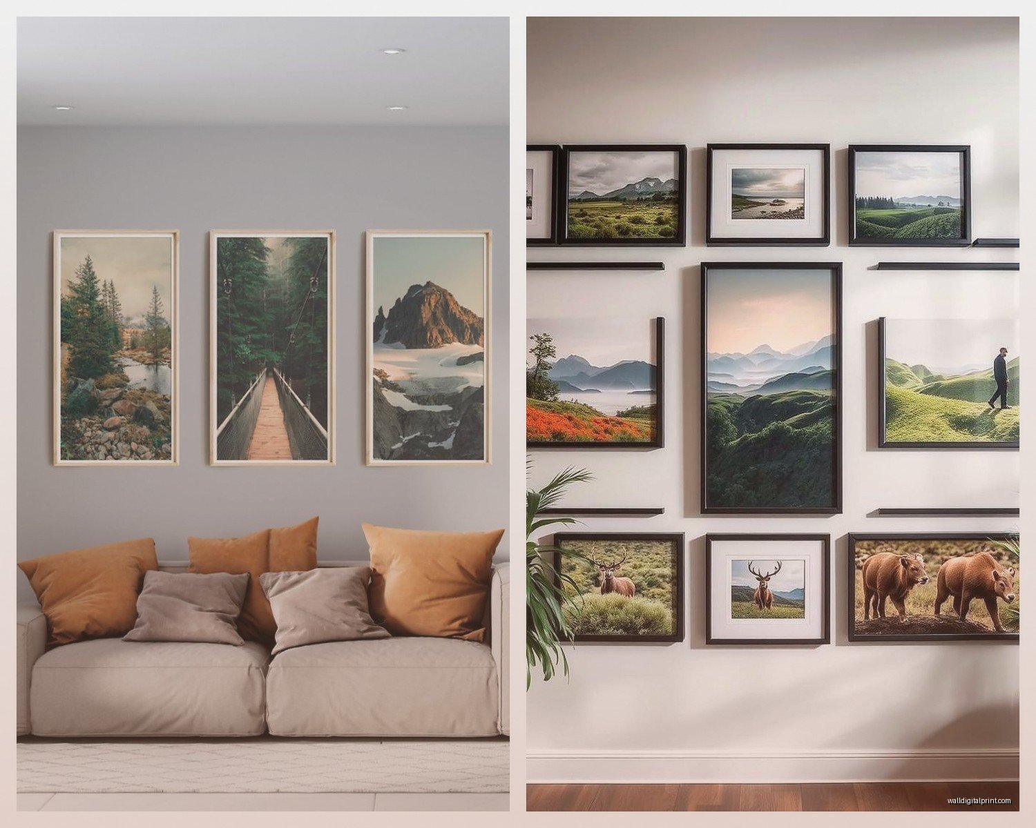
Gallery walls with multiple photography prints are having a moment but they’re tricky. Here’s what actually works:
Grid layout – all frames the same size, evenly spaced. Super clean, modern, works best with a cohesive series of photographs. Keep 2-3 inches between frames. I did this with a client’s travel photography collection and we used all matching black frames, all 16×20 prints, in a 3×3 grid. Looked incredible.
Salon style – different sized frames, tighter spacing (like 1-2 inches), more organic arrangement. This is the “collected over time” look. Mix orientations (vertical and horizontal), but keep frame styles consistent. All black, all wood, all white – whatever, just don’t mix frame styles unless you’re going for that maximalist eclectic thing which is hard to pull off.
For salon walls, I lay everything out on the floor first, take a photo, then trace each frame on kraft paper and tape the paper to the wall to visualize it. Yes it takes forever. Yes it’s worth it.
Lighting Makes or Breaks It
You can have the most gorgeous fine art photograph perfectly framed and it’ll look mediocre with bad lighting. Natural light is great but inconsistent. You want dedicated picture lights or track lighting.
Picture lights mount above the frame and shine down. They work well for traditional framed prints but can create glare on glass. LED picture lights don’t get hot (important for archival prints) and the color temperature matters – go for 3000K for warm light or 4000K for neutral. I usually stick with 3000K because it’s more flattering in homes.
Track lighting or adjustable ceiling spotlights give you more flexibility. Aim them at a 30-degree angle to minimize glare. For metal or acrylic prints without glass, you have more freedom with lighting angles.
Oh and another thing – avoid putting valuable photography prints in direct sunlight even with UV glass. I don’t care what the framer said, the sun will eventually fade them. I’ve seen it happen to prints that were supposedly “totally protected.”
What About Groupings and Themes
This is super subjective but I’ll tell you what I’ve seen work. Monochromatic series (all black and white or all color) create cohesion. Thematic groupings work too – all landscapes, all portraits, all architectural photography.
Don’t mix wildly different photography styles on the same wall unless you really know what you’re doing. Like don’t put moody black and white street photography next to bright colorful food photography. They’ll compete and both will look worse.
If you’re mixing sizes, use odd numbers. Three prints, five prints, seven. The asymmetry creates visual interest. Center the largest print and arrange smaller ones around it, or do a descending size arrangement.
Mounting Hardware That Won’t Fail You
Standard picture hanging wire and hooks work for lightweight frames (under 15 pounds). Anything heavier needs wall anchors or you need to hit a stud. I use a stud finder – not the app on your phone, an actual tool because the apps are useless.
For heavy prints (acrylic face mounts, large frames), I use these heavy-duty picture hangers rated for like 50-100 pounds. They have multiple nails that go in at an angle. Or if I can hit a stud, wood screws with felt pads on the screw head.
French cleats are amazing for really heavy pieces or if you want easy adjustability. They’re two interlocking pieces – one mounts to the wall, one to the frame. Super secure and you can slide the artwork along the cleat to adjust positioning.
My client canceled yesterday so I spent an hour comparing different hanging systems and honestly for most standard framed prints, the simple sawtooth hangers that come pre-installed work fine if you’re using proper wall anchors.
Spacing and Arrangement Math
For a grid of same-sized prints, measure your wall width, subtract the total width of all frames, then divide the remaining space by the number of gaps plus one. That gives you equal margins on the ends and between frames.
Example: 120-inch wall, four 20-inch frames. That’s 80 inches of frames, 40 inches of space. Five gaps (before first frame, between all frames, after last frame) means 8 inches of space in each gap.
For vertical spacing in multi-row arrangements, I keep it consistent with the horizontal spacing. So if frames are 3 inches apart horizontally, make them 3 inches apart vertically too.
Caring for Your Display
Dust frames regularly with a microfiber cloth. For glass, use glass cleaner but spray it on the cloth first, not directly on the frame (liquid can seep under the glass and damage the mat or print).
Check your prints every few months for any signs of fading, moisture damage, or insects. Yeah, insects. Some bugs eat paper and glue. Found this out the unfortunate way with a vintage print that had beetles or something behind the mat. It was disgusting.
If you’re in a humid climate, consider using silica gel packets behind the backing board. Moisture is the enemy of paper prints.
Where to Actually Hang Photography
Living rooms and hallways are obvious. Bedrooms work great for calmer, more personal photography. I love putting landscape photography in bedrooms – it’s peaceful.
Bathrooms are tricky. Paper prints will get damaged from humidity. Metal or sealed canvas prints work better. I’ve done architectural photography in powder rooms and it looks really sophisticated.
Kitchens can handle photography but keep prints away from the stove area where grease and heat accumulate. Food photography in dining rooms is maybe too on-the-nose but some people love it.
Don’t forget stairways. They’re perfect for vertical gallery walls where you can create a rising or descending arrangement that follows the stairs.
The thing nobody tells you is that sometimes you just gotta try it and see. I’ve had prints I thought would look perfect in a space that just… didn’t work once they were up. The colors were wrong or the scale was off or whatever. Don’t be afraid to move things around until it feels right, even if that means more nail holes to patch later.