
Wall Art Guide, Wall Art Tutoriels
Trendy Wall Art: Latest Design Trends & Viral Styles 2026
Aug
So I’ve been absolutely drowning in wall art requests lately and honestly the trends for 2026 are kinda wild but also? Actually wearable if that makes sense for walls. Like my client yesterday walked in with this Pinterest board that was basically throwing up every viral style at once and I had to sit her down with coffee and be like okay let me explain what’s actually gonna work.
The Organic Curve Moment That Won’t Die
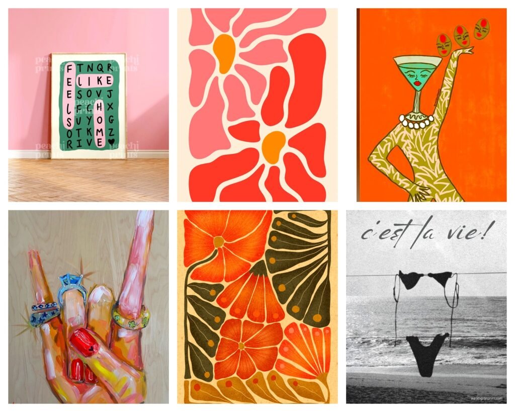
First thing – those wavy, organic abstract pieces are STILL everywhere and they’re not going anywhere. I’m talking about the ones with those flowing curves in terracotta, sage green, cream, maybe a burnt orange thrown in. You’ve seen them. Everyone’s aunt has one now probably but here’s the thing… the 2026 version is getting more textured. Like we’re moving past the flat painted look into actual dimensional pieces.
I just curated a show last month and this emerging artist had these sculptural wall pieces that were basically the organic curve aesthetic but with like, actual depth? Plaster mixed with natural fibers, so when the light hits them throughout the day they look completely different. That’s the direction it’s heading. If you’re gonna invest in this trend now, look for pieces with actual texture or consider DIY-ing it with texture paste which I’ve been experimenting with at like 11pm after watching too much Netflix and it’s surprisingly therapeutic.
How to Actually Style Organic Curves Without Looking Basic
- Don’t center them perfectly – hang them slightly off-center, it creates tension in a good way
- Pair with one angular piece nearby, the contrast makes both look more intentional
- Go bigger than you think or do a cluster of smaller ones, the medium single piece thing is what’s making everyone’s walls look samey
- Layer them over textured wallpaper if you’re feeling bold, I did this in my own bedroom and my cat absolutely hates it but visually it’s *chef’s kiss*
Okay So the Maximalist Gallery Wall Is Back But Different
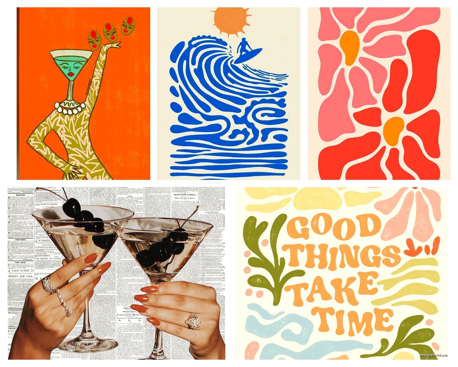
Remember when everyone was doing the symmetrical gallery wall with matching frames? Yeah we’re burning that rule book apparently. The viral gallery walls I’m seeing now are like… controlled chaos? Mixing frame styles, sizes, art types, even throwing in 3D objects.
I literally spent three hours last week installing one for a client and we used vintage mirrors, framed pressed flowers, a small shelf with a sculptural object, traditional prints, and this weird metal wall hanging she got from an estate sale. The trick is having a color story that connects everything even when the styles are all over the place.
My Actual Process for Gallery Walls That Don’t Look Messy
Take everything you wanna hang and lay it out on the floor first – I know everyone says this but people still skip it and then text me at midnight being like “I put 47 holes in my wall help.” Start with your largest piece as an anchor, then build around it with medium pieces, then fill gaps with small stuff. Leave more space between pieces than feels comfortable, like 3-4 inches minimum. Cramped gallery walls feel dated now.
Oh and another thing – mix in at least one unexpected element. I’ve been using vintage plates, small macramé pieces, even framed fabric swatches. Saw someone on Instagram use an antique hand mirror and it totally elevated the whole wall from “I bought a gallery wall kit” to “I actually curated this.”
The Oversized Single Statement Piece Trend
This is gonna sound weird but the pendulum is also swinging toward ONE massive piece instead of multiple smaller ones. Like I’m talking floor-to-almost-ceiling situations. The viral posts I’m seeing are these huge abstract pieces or large-scale photography that just dominates a wall.
Installed one last month that was literally 6 feet tall and my client was nervous it would overwhelm her living room but honestly? It made the whole space feel more expensive and intentional. The key is making sure the piece has enough visual interest to carry that much real estate – solid colors or too-simple designs fall flat at that scale.
What Actually Works at Large Scale
- Abstract landscapes with lots of color variation and movement
- Black and white photography with strong contrast and detail you can get lost in
- Textured pieces where the material itself creates interest (woven fiber art is huge for this)
- Botanical prints but like the moody dramatic ones not the basic fern leaf situation
Budget tip because I know these can get insane – check out Minted or Desenio for large-scale prints that don’t cost your entire paycheck, then invest in good framing. Or honestly? Find an emerging artist on Instagram and commission something. I’ve connected with so many talented people who charge like a third of what galleries do.
Wait I Forgot to Mention the Whole Earthy Sculpture Thing
So beyond flat art, sculptural wall pieces are having a MOMENT. I’m seeing woven fiber art, ceramic wall installations, wooden carved pieces, basically anything that casts a shadow and has dimension. This feels very 2026 to me because it’s like we’re craving tangible texture after years of staring at screens.
My friend just got this ceramic wall piece from a local artist – it’s these organic shapes that look like tide pools or something, glazed in this gorgeous sage and cream, and it completely transformed her dining room. Cost her like $400 which sounds like a lot but compared to a painting of similar impact? Actually reasonable.
Where to Find This Stuff
- Etsy obviously but filter by “made to order” to find actual artists not dropshippers
- Local art fairs and markets – I’ve found my best pieces at random weekend markets
- Instagram hashtags like #ceramicwallart #fiberartist #wallsculpture
- West Elm and CB2 have surprisingly good options if you need something quick
The Color Palettes That Are Actually Trending
Okay so color-wise, we’re seeing a shift away from the millennial pink and gray situation finally. Thank god. The viral palettes right now are:
Earthy Rich Tones: Think terracotta, deep olive, rust, cream, chocolate brown. This feels very grounded and warm without being boring. I’m using this palette in probably 60% of my projects right now.
Moody Jewel Tones: Deep emerald, sapphire blue, burgundy, gold accents. This is for people who want drama but in a sophisticated way not a “I decorated in 2005” way. Pairs really well with black frames and dark walls.
Washed Pastels: Not the bright Easter egg pastels but like… if you took pastels and dunked them in gray water? Dusty rose, muted lavender, soft sage, pale terracotta. Very European cottage core but make it modern.
The real trend though is moving away from matchy-matchy. Your wall art doesn’t need to perfectly coordinate with your throw pillows anymore. Actually it probably shouldn’t? The most interesting spaces I’m styling have art that introduces colors that AREN’T in the rest of the room, it creates visual interest.
Digital Art and Prints Are Getting Fancy
There’s this whole thing happening where digital art is being printed on really interesting materials and it’s blurring the line between “just a print” and “actual art piece.” I’m seeing prints on wood, metal, acrylic, textured paper, even fabric mounted on frames.
Ordered a print on brushed aluminum last week for a client’s office and when it arrived I was like oh okay this is actually really cool? The way the metal catches light makes it feel way more expensive than it was. Cost like $150 for a 24×36 versus $800+ for original art of similar size.
Print Quality Actually Matters Now
People are getting pickier about print quality and honestly they should be. If you’re gonna do prints, invest in good ones. Look for giclée printing on archival paper, or those fancy printing services that use high-end printers. A cheap print in an expensive frame still looks cheap, but a quality print in a simple frame can look amazing.
The Unexpected Viral Styles I Keep Seeing
Okay so there are some wild cards that keep popping up that I didn’t expect:
Vintage Maps and Blueprints: But styled in a modern way? Like huge architectural drawings or antique maps framed simply in black or natural wood. It’s giving sophisticated and collected without trying too hard. Especially popular in home offices and dining rooms.
Line Art But Make It Interesting: The basic one-line face drawings are officially over (sorry), but line art that’s actually complex and interesting is trending. Think botanical line drawings with tons of detail, or abstract linear compositions that have actual depth to them.
Photography of Textures: Close-up shots of natural textures – tree bark, rock formations, water, sand. Sounds boring maybe but when printed large and framed minimally it’s super striking. Very hotel-chic in the best way.
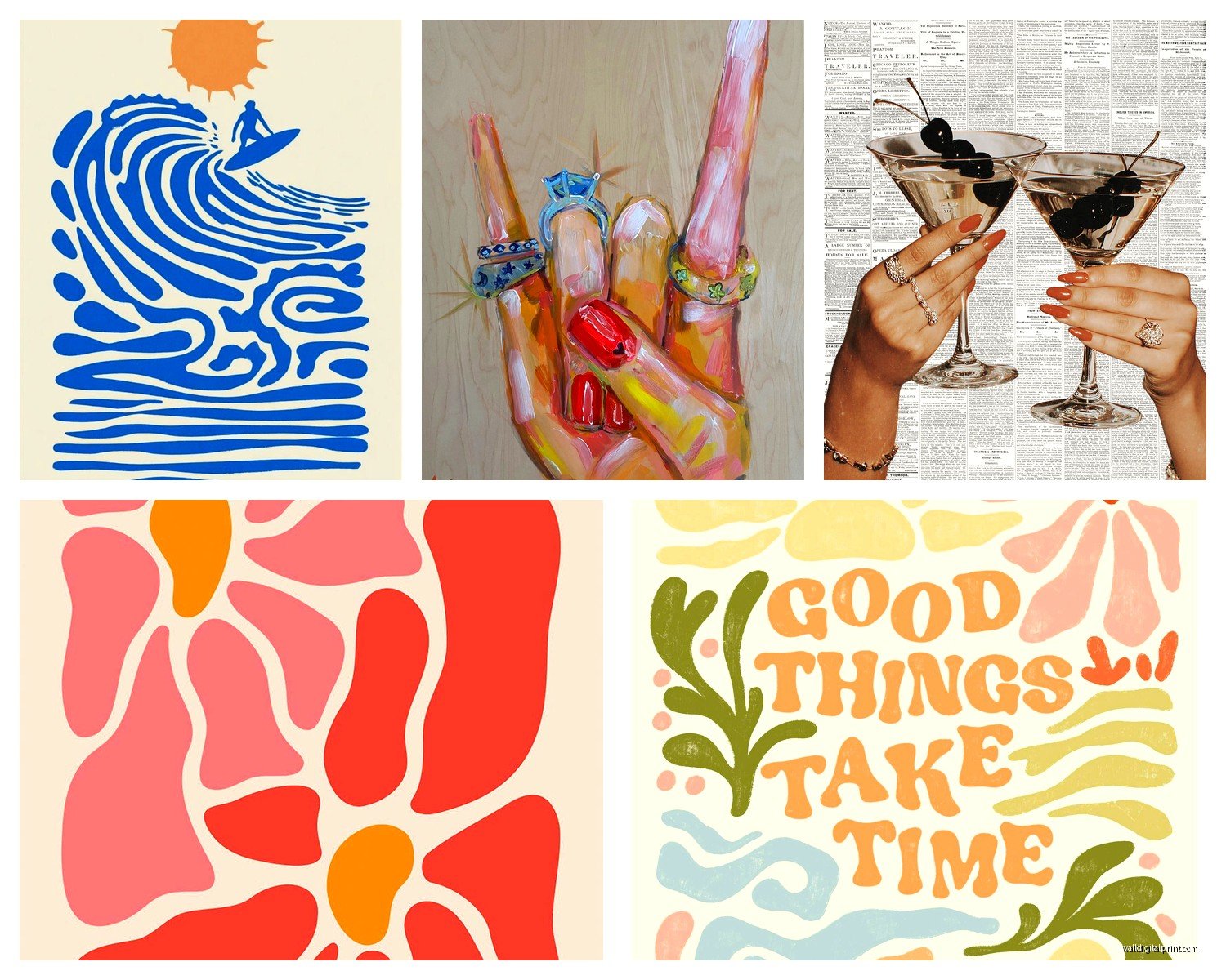
Vintage-Inspired Posters: The whole retro poster aesthetic is viral right now – think 70s ski posters, vintage travel prints, old exhibition posters. But people are mixing them with modern pieces to keep it from feeling theme-y.
How to Mix Styles Without It Looking Random
This is where everyone gets stuck and honestly it’s more intuition than rules but here’s what I tell clients:
Pick ONE connecting element across different styles – could be color palette, frame style, subject matter, or even just the mood/vibe. Like you can mix abstract art with photography with vintage prints if they all have a similar moody, earthy color palette. Or mix wildly different colors and subjects if all the frames are identical simple black.
I did this in my living room where I mixed a modern abstract piece with a vintage botanical print and a black and white photo, but they all had similar tonal values and all were framed in natural wood. Looks intentional and collected instead of “I grabbed random stuff from HomeGoods.”
The Mistakes I See Everyone Making
- Hanging everything too high – the center of your art should be at eye level which is like 57-60 inches from the floor, not way up near the ceiling
- Going too small – when in doubt size up, undersized art makes rooms feel cheaper
- Matching frames too perfectly – a little variation in frame style adds character
- Forgetting about lighting – art needs good lighting to look expensive, even cheap art looks better with proper lighting
- Following trends too literally – take inspiration but make it work for YOUR space and style
Budget-Friendly Ways to Do This
Because I know not everyone has unlimited art budgets and honestly some of my favorite installations were done on a shoestring:
Frame things yourself – thrift stores always have frames, spray paint them all one color for a cohesive look. I’ve done this probably 50 times and it always looks more expensive than it was.
Print your own art – there are so many printable art shops on Etsy where you buy the digital file and print it yourself at a local print shop. Way cheaper than buying pre-printed stuff.
Mix expensive and cheap – one really good piece mixed with some affordable prints looks way better than all mediocre pieces. Splurge on one thing and budget the rest.
DIY abstract art is actually easier than you think – I was skeptical but I made some textured abstract pieces for my guest room using texture paste, acrylic paint, and a palette knife. Took like two hours, cost maybe $60 in supplies, and people always ask where I bought them.
Actually Sourcing This Stuff
Where I actually find wall art that doesn’t look like everyone else’s:
Local estate sales are criminally underrated – found a massive vintage landscape painting for $40 last month that just needed a good cleaning. Following local estate sale companies on Instagram is how I find the good ones before they get picked over.
Saatchi Art and Artfinder for original pieces from emerging artists – way more affordable than galleries and you’re supporting actual artists. I’ve commissioned three pieces through Saatchi and every experience was great.
Society6 and Redbubble for trendy prints but here’s the secret – look at what’s trending, find an artist you like, then go to their actual website or Instagram and buy directly. They make more money and you often get better quality.
Thrift stores but you gotta reframe most things – I never buy art at thrift stores for the frame, always for the actual art, then I reframe it. Changes everything.
Honestly just following artists on Instagram and DMing them about commissions has gotten me some of my favorite pieces. Most artists are super approachable and way more affordable than you’d think.
The Thing About Trends Though
Here’s my real advice after doing this for like 15 years – trends are fun and can inspire you but your walls should ultimately make YOU happy. I have clients who ignore every trend and just collect what they love and their homes always feel more authentic than the ones where we chased every viral moment.
That said, understanding what’s current helps you make choices that’ll feel fresh for a while instead of dated immediately. Like those “Live Laugh Love” signs or the basic chevron patterns – those were trendy once and now they’re punchlines.
The stuff I mentioned here – the organic shapes, the maximalist galleries, the sculptural elements, the rich earthy colors – these feel like they have staying power because they’re rooted in actual design principles not just social media moments. But also who knows, maybe in 2027 we’ll all be hanging something completely different and I’ll be writing another one of these at midnight while my dog judges my life choices.
