Wall Art Guide, Wall Art Tutoriels
FY Wall Art: Trending Social Media Aesthetic Designs
Aug
So I’ve been totally obsessed with FY wall art lately and honestly it’s because my Instagram feed won’t stop showing me these incredibly aesthetic designs that somehow make even my chaotic studio look curated. Let me walk you through what’s actually working right now because I just redid three client spaces and my own bedroom with these trending pieces.
What Even Is FY Wall Art and Why It’s Everywhere
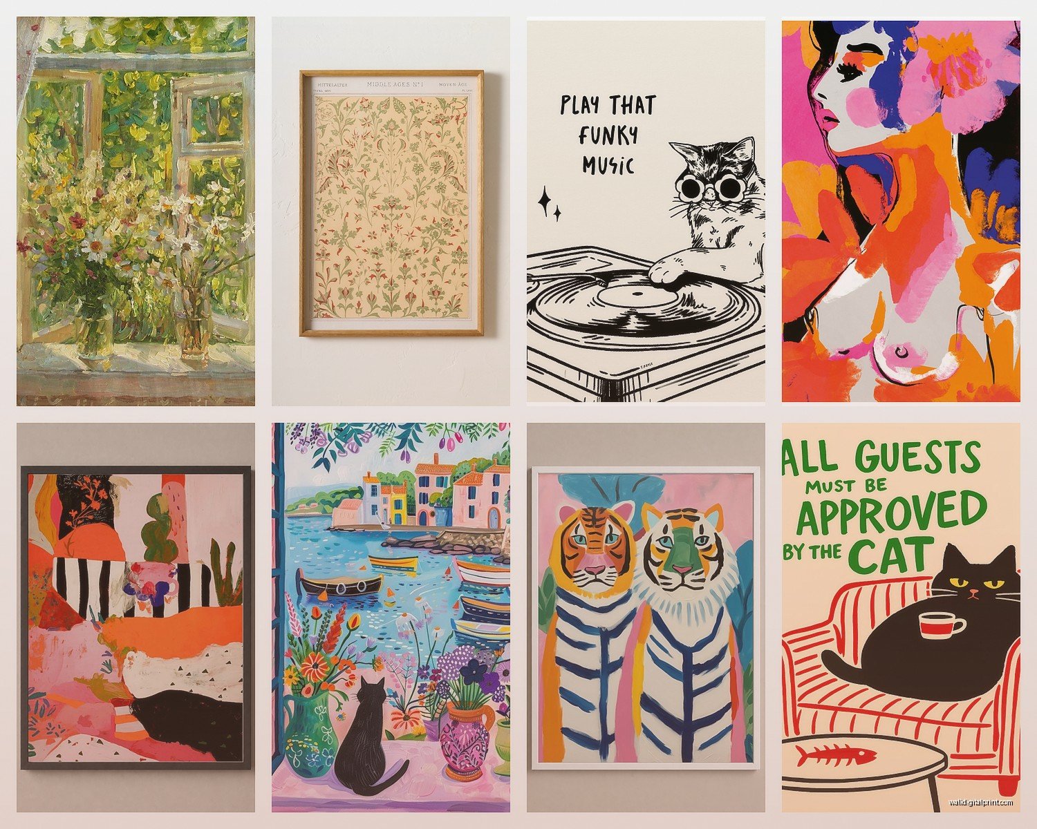
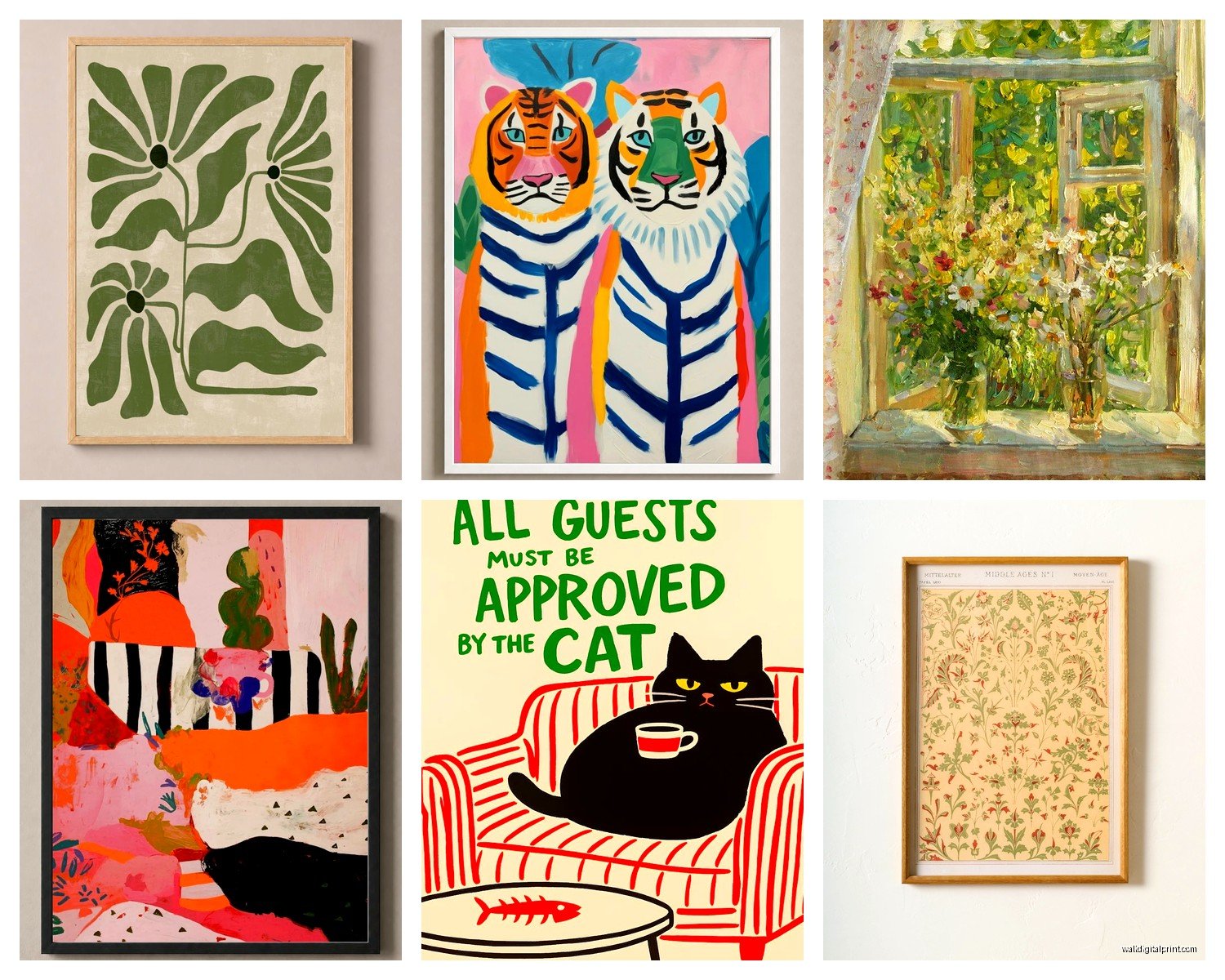
Okay so FY wall art is basically those super trendy, social media-ready designs that look like they walked straight out of a perfectly filtered Pinterest board. Think abstract shapes, neutral tones mixed with pops of color, line art, motivational quotes that don’t make you cringe, and those weirdly satisfying geometric patterns. The whole point is they photograph well and create that “aesthetic” vibe everyone’s chasing on TikTok and Instagram.
I tested like fifteen different styles last month when a client wanted her home office to be “Insta-worthy but also functional” and here’s what I learned actually matters.
The Trending Styles That Don’t Look Dated in Six Months
Abstract Organic Shapes
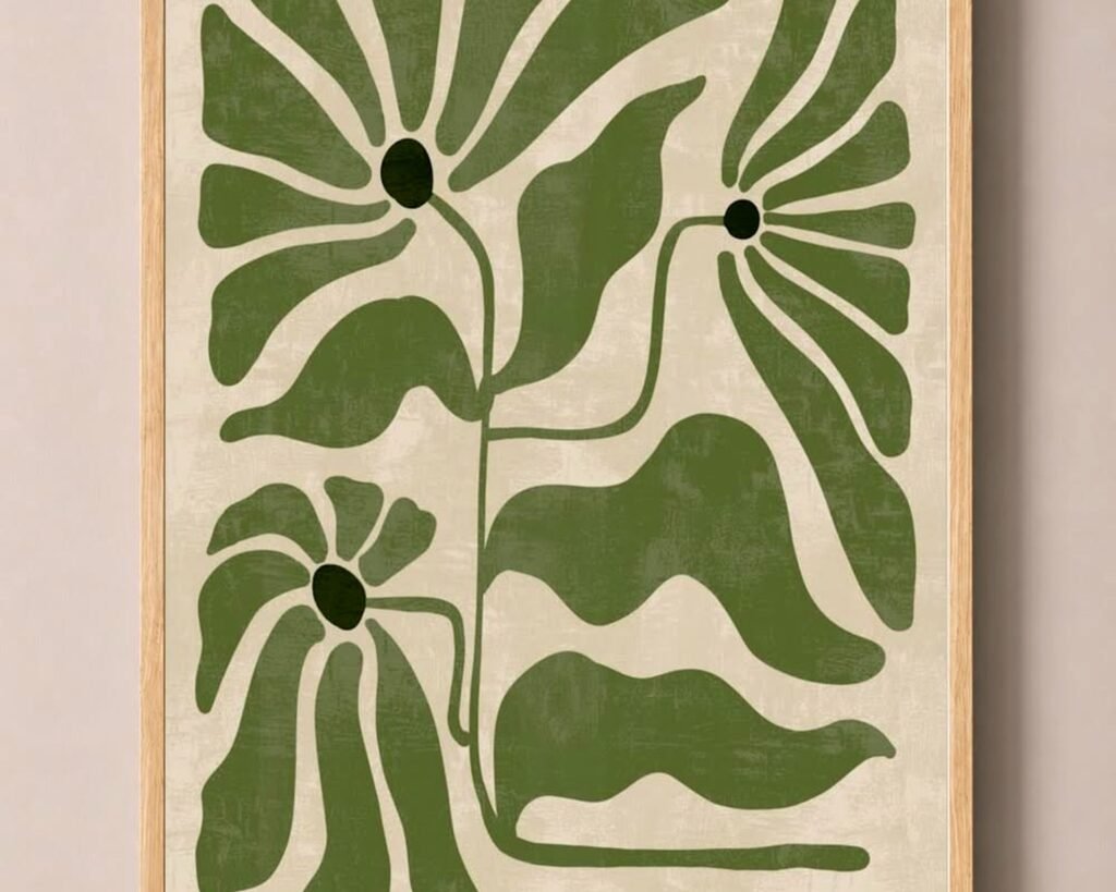
These are those blobby, curved designs in earthy tones. Terracotta, sage green, beige, mustard yellow. They’re everywhere for a reason—they’re neutral enough to not overwhelm your space but interesting enough to not be boring. I hung a set of three in my living room above the couch and my cat immediately claimed the couch as her new Instagram backdrop, so there’s that.
The trick with these is layering different sizes. Don’t just get three identical squares. Mix a large vertical piece with two smaller horizontal ones or do that asymmetrical gallery wall thing. I use the rule of odd numbers because our brains find it more visually interesting.
Line Art Portraits and Figures
Single-line drawings of faces, bodies, hands holding flowers, that sort of thing. Super minimalist but they add this sophisticated touch that makes your space look intentional. I was skeptical at first because they seemed too trendy but honestly they’ve stayed popular way longer than I expected.
For these, black frames on white walls is the move. Or if you’re feeling bold, get the prints in a warm sepia tone and use light wood frames. I did this in a client’s bedroom and she literally cried because it looked so good, which was… a lot, but also validating.
Gradient Color Washes
Think sunset vibes, those dreamy color transitions from pink to orange to purple. These work shockingly well in spaces that need a focal point but you don’t want anything too literal or busy. My friend has one above her bed and every time she posts a mirror selfie people ask where it’s from.
The thing nobody tells you is these need good lighting. Natural light makes them glow, but bad overhead lighting makes them look flat and kinda cheap even if they weren’t.
Where to Actually Buy This Stuff Without Breaking the Bank
Okay so funny story, I used to think you had to spend hundreds per piece but then my client canceled last minute one day so I spent like three hours comparing prices and quality across different platforms.
Etsy is where I get most of my digital downloads now. You pay maybe ten to twenty bucks, download the file, and print it yourself at Staples or FedEx for like five dollars per print. The quality is identical to those pre-printed ones that cost sixty bucks. Just make sure you’re downloading high-resolution files, at least 300 DPI.
Society6 and Redbubble are great if you don’t wanna deal with printing yourself. They have independent artists, the quality is consistent, and they run sales constantly. I got a set of four abstract pieces during a 30% off sale and spent maybe eighty dollars total.
Target and Urban Outfitters surprisingly have decent options if you need something immediately. The selection rotates fast though so if you see something you like, grab it. I’ve gone back for clients a week later and the entire collection was different.
How to Actually Arrange These Without Looking Try-Hard
This is where people mess up the most. You can have gorgeous individual pieces but if the arrangement is off, the whole vibe collapses.
The Gallery Wall Approach
Start with your largest piece as the anchor, usually at eye level which is around 57 to 60 inches from the floor to the center of the artwork. Then build around it. I literally lay everything out on the floor first, take a photo from above, and move things around until it looks balanced.
Use painter’s tape to map it out on your wall before hammering anything. Sounds annoying but I’ve saved myself so many extra holes this way. My landlord appreciates it too.
Space between frames should be consistent, usually 2 to 3 inches. Closer feels cramped, wider feels disconnected. Unless you’re going for that super airy Scandinavian minimal thing, then you can push it to 4 inches.
The Simple Three-Piece Linear
If gallery walls stress you out, just do three same-sized frames in a horizontal line. Works above a couch, bed, console table, whatever. Make sure the total width is about two-thirds to three-quarters the width of your furniture piece below it.
I did this in my bedroom with three abstract prints in matching black frames and it took maybe twenty minutes total. Sometimes simple is the answer and you don’t gotta overcomplicate it.
The Single Statement Piece
One large piece, like 30×40 inches or bigger, centered on a wall. This works best on walls with minimal furniture or in entryways. The piece needs to be interesting enough to stand alone though, so those super detailed abstract designs or bold gradient pieces work better than minimal line art for this approach.
Color Coordination Without Looking Matchy-Matchy
Pick a color palette with like three to four main colors and stick with it. Look at what’s already in your room—your throw pillows, rug, curtains. Pull one or two colors from those and add one new accent color through your wall art.
I have this sage green velvet chair and a terracotta rug, so I chose wall art with those tones plus some warm beige and a touch of dusty pink. Everything ties together but it doesn’t look like I bought a matching set from a catalog.
Oh and another thing, black and white pieces are your cheat code. They go with literally everything and add contrast without introducing new colors you have to coordinate around.
Framing Options That Don’t Look Cheap
The frame matters SO much and I didn’t realize this until I compared the same print in different frames side by side.
Black frames are classic and make colors pop. They work in modern, traditional, eclectic spaces. You really can’t go wrong. I buy mine from IKEA because their Ribba and Silverhöjden frames look way more expensive than they are.
Light wood frames give that airy Scandinavian or boho vibe. Oak or ash tones work with warm color schemes. I use these in bedrooms and spaces where I want things to feel softer.
Gold or brass frames add instant sophistication but can look dated if you’re not careful. Thin gold frames are safer than chunky ornate ones. I use these sparingly, usually for smaller accent pieces.
No frame with clip hangers is very trendy right now for that effortless aesthetic. The print just hangs from two small clips or wooden magnetic hangers. Super affordable and easy to swap out when you want something new.
Mixing Prints with Other Art Forms
Don’t make your whole wall just prints. Mix in some texture. I’ll add a small woven wall hanging, a macramé piece, or even a decorative mirror within a gallery wall to break up the flatness.
Also dried flowers or pampas grass in a wall-mounted vase adds dimension. I have this one wall in my hallway that’s mostly FY prints but there’s a small shelf with a trailing pothos plant and it makes the whole thing feel alive instead of staged.
The Thing About Trends Nobody Mentions
These designs are trendy, which means in three years you might be tired of them. That’s why I always tell people to use removable picture hanging strips for lighter pieces or at least keep the frames neutral so you can swap out prints easily.
I rotate my wall art seasonally now. Warmer tones and abstract pieces in fall and winter, lighter colors and line art in spring and summer. The frames stay the same, I just swap the prints. Costs me basically nothing since I buy digital downloads and it keeps my space feeling fresh.
Lighting Makes or Breaks the Whole Thing
This is gonna sound weird but I’ve seen gorgeous wall art look completely dead because of bad lighting. If your art wall doesn’t have natural light, add a picture light or position a floor lamp nearby.
Warm white bulbs (2700-3000K) make art feel cozy and intimate. Cool white (4000K+) makes it feel modern and crisp. I use warm white in bedrooms and living spaces, cooler white in home offices and kitchens.
Also avoid direct overhead lighting that creates glare on glass frames. Angled lighting from the side or below works better. I learned this the hard way after installing a gorgeous gallery wall that had terrible glare every evening when the overhead lights were on.
Common Mistakes I See All the Time
Hanging things too high. Seriously, everyone does this. Art should be at eye level, not floating near the ceiling.
Choosing all the same size frames. It looks like a grid in a corporate office. Vary your sizes for visual interest.
Ignoring the scale of your wall. A tiny 8×10 print on a massive empty wall looks lost. You need pieces that fill the space appropriately.
Buying prints without checking the resolution. Blurry, pixelated art immediately looks cheap no matter how nice your frames are. Always check for 300 DPI minimum.
Wait I forgot to mention—when you’re buying digital downloads, read the usage rights. Some are only for personal use, which is fine for your home, but if you’re doing this for a business or Airbnb, you might need commercial licensing.
My Current Favorite Combinations
Right now I’m obsessed with pairing abstract organic shapes in neutral tones with one bold geometric piece in a jewel tone. Like three beige and terracotta abstracts with one emerald green geometric print. It creates this focal point without overwhelming the space.
Also mixing photography with line art. A black and white architectural photo next to a simple line drawing creates interesting contrast. I did this in a client’s dining room and people always comment on it.
And this might be basic but the classic “quotes + abstract” combo still works if the quote isn’t something cringey. I avoid the “live laugh love” territory and go for something more poetic or a single word in interesting typography.
Making It Work in Rental Spaces
Since I’ve rented most of my adult life, I’ve gotten really good at damage-free hanging. Command strips work for lightweight frames under 5 pounds. For heavier pieces, I use picture rail systems that attach to the ceiling or lean large pieces on floating shelves.
The shelf method is underrated honestly. A couple floating shelves at different heights with art leaning against the wall plus some small plants and books creates a whole curated moment without any wall damage.
My bedroom has this setup and I can rearrange it whenever I want. It’s become my favorite way to display art because it feels less permanent and more lived-in.
Okay so that’s basically everything I’ve learned through way too much trial and error and probably too much money spent on prints I later decided I didn’t like. The main thing is don’t overthink it—if a piece makes you happy when you look at it and the colors work with your space, you’re already 90% there.