Wall Art Guide, Wall Art Tutoriels
Chinese Wall Art: Asian Oriental Dragon Calligraphy
Aug
So I’ve been down this rabbit hole with Chinese dragon calligraphy art for like three months now and honestly it started because a client wanted to “do something Asian but not cliché” in their dining room and I was like okay challenge accepted.
First thing you gotta know is there’s a massive difference between actual calligraphy pieces and those printed dragon posters you see everywhere. The real calligraphy stuff, even if it’s a reproduction, has this texture and depth that completely changes how it reads in a space. I learned this the hard way after ordering what I thought was hand-brushed work and it showed up as basically a canvas print from like 2005.
The Dragon Symbolism Thing Everyone Gets Wrong
Okay so everyone thinks dragons in Chinese art are just generic good luck symbols but there’s actually layers to this. The dragon represents power, strength, imperial authority—it was literally the emperor’s symbol. But here’s what matters for your wall: the direction the dragon faces, the number of claws, whether it’s chasing a pearl or surrounded by clouds. A five-clawed dragon was exclusively imperial, so technically those are the fancy ones, but four-clawed dragons are what most people had and honestly they look just as good.
I’ve got this one piece in my own hallway where the dragon is ascending (going upward) which symbolizes rising fortune and it just feels more dynamic than the ones coiled in a circle. The ascending ones work better in narrow vertical spaces too, like next to doorways or in that weird skinny wall section everyone has somewhere.
Where to Actually Find Decent Pieces
This is gonna sound weird but don’t start on Etsy. I mean you can, but hear me out—I wasted SO much time there because the search results are flooded with digital prints that sellers are calling “calligraphy” when it’s just… a font.
Here’s my actual process now:
- Check Asian art specialty sites first—places that specifically deal in Chinese and Japanese art, not general home decor stores
- Look for descriptions that mention “sumi ink” or “rice paper” or “xuan paper”
- If it says “giclée print” that’s fine actually, but know what you’re getting—it’s a high-quality reproduction not an original brushwork piece
- eBay has been surprisingly good for vintage pieces, especially from sellers in Hong Kong or Taiwan
- Local Asian markets sometimes have art sections that nobody knows about—I found an incredible scroll at a Korean grocery store of all places for like forty bucks
The thing about calligraphy is the brushstrokes should have variation in thickness and you should be able to see where the brush was loaded with more or less ink. If every line is perfectly uniform, it’s digital.
Scroll vs Framed vs Canvas Mounted
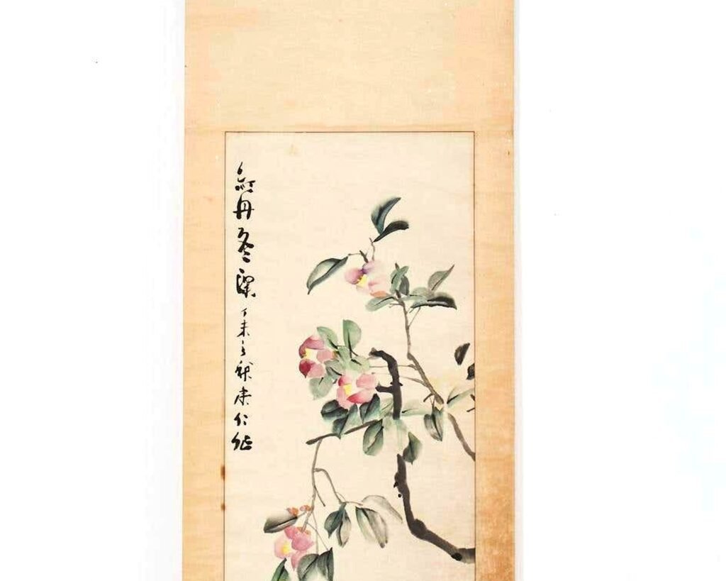
Traditional Chinese calligraphy comes on scrolls and honestly this is still my favorite way to display it but it’s not always practical. The scrolls usually have this silk brocade border which adds like three inches on each side, so measure your wall space before you fall in love with one.
I’ve mounted scrolls three ways:
Traditional hanging scroll with the wooden dowels top and bottom—looks amazing but you need decent ceiling height and a place where it won’t get bumped. My cat destroyed one of these by using the bottom dowel as a scratching post so just… be aware of your pets.
Framed behind glass—this protects the piece but you lose some of the texture and the three-dimensional quality of the silk borders. Better for high-traffic areas or if you have kids.
Mounted on a backing board without glass—middle ground option, you keep the texture visible but it’s more stable than a hanging scroll. This is what I do most often for client spaces.
The Frame Selection Problem
Oh and another thing, Western frames almost never look right with Chinese calligraphy unless you go really minimal. I’ve had the best luck with:
- Simple black lacquer frames with no matting
- Natural wood frames in darker finishes like walnut
- Floating frames where the piece sits slightly forward from the backing
- Or honestly just the traditional scroll format because it comes with its own “frame” basically
Do NOT put it in a distressed farmhouse frame or anything with ornate gold detailing. I watched someone do this once and my eye literally twitched.
Size and Placement Because This Is Where People Mess Up
Chinese calligraphy reads vertically, right to left traditionally. So you want tall narrow spaces or you want to plan for a horizontal piece that’s actually multiple vertical sections arranged side by side.
For a dragon specifically, I usually go big or go home. A tiny dragon looks weird—these are powerful mythological creatures, they need presence. I’m talking at least 24 inches in the longest dimension, preferably 36 or larger.
Best placements I’ve done:
Entry halls or foyers—sets the tone immediately, dragons are protective symbols so it makes sense near entrances
Above a console table—especially if you style the table with other Asian-inspired elements but don’t go overboard, like maybe one ceramic piece and some books
Dining rooms—there’s something about the formality of a dining space that works with the imperial association of dragons
Home offices—power and strength symbolism, plus calligraphy has this contemplative quality that’s nice when you’re working
Where it doesn’t work: bathrooms (moisture is bad for paper), above beds (feels heavy symbolically), kitchens (grease and steam are enemies of paper art).
The Authentication Question Nobody Wants to Ask
Okay so funny story, I thought I bought an antique calligraphy piece once from an estate sale, paid like two hundred dollars for it, felt very proud of myself. Took it to get appraised and it was from the 1980s and worth maybe fifty bucks. The appraiser was nice about it but I learned my lesson.
Unless you’re spending serious money (like over a thousand dollars), don’t worry too much about whether it’s “authentic” or “antique” or whatever. Focus on whether it’s well-executed and whether you actually like looking at it.
Red flags for fake antiques:
- The paper looks too white or too uniformly “aged”
- The red seal stamps look printed rather than stamped
- The seller has like fifty “antique” pieces all in similar condition
- It smells like coffee (yes really, people age paper with coffee)
But here’s the thing—a beautiful reproduction or contemporary piece is totally fine and often looks better than a mediocre antique. I’d rather have gorgeous modern calligraphy than a faded damaged old piece just for the sake of age.
Mixing Styles Without Looking Like a Confusion
You can absolutely put Chinese dragon calligraphy in a non-Asian-styled room. I’ve done this successfully many times. The key is treating it like the art piece it is rather than trying to make your whole room “match” it.
What works:
Modern minimalist spaces—the black ink on light paper fits perfectly with a minimal aesthetic
Maximalist eclectic rooms—if you already have lots going on, a dramatic dragon piece just adds to the intentional chaos
Traditional spaces with dark wood—there’s a natural harmony here
What gets tricky:
Scandinavian hygge everything-is-white situations—can work but the calligraphy might feel too bold
Coastal/beachy themes—the symbolism feels off, like dragons and seashells don’t really vibe
Industrial loft spaces—sometimes works, sometimes the calligraphy feels too delicate against all that metal and concrete
I will say though, I’ve broken these “rules” successfully when the specific piece and specific space just worked together. Interior design is like fifty percent guidelines and fifty percent trusting your gut.
The Supporting Cast
If you do want to add other elements that complement Chinese calligraphy without going full theme park:
- Ceramic ginger jars or simple vases
- Natural materials like bamboo, stone, dark wood
- Minimal metallic accents in brass or bronze
- Books on Asian art or philosophy on nearby shelves
- Maybe one other piece of Asian art but in a different medium—like a small sculpture
Don’t do: those mass-market “Asian inspired” throw pillows with random characters, plastic lucky cats, paper lanterns (unless you’re actually celebrating something), chopsticks as decor (just no).
Caring for Your Piece
This is important and most people don’t think about it until damage happens.
Keep it out of direct sunlight—the ink will fade and the paper will yellow unevenly. I had a client who ignored this advice and their beautiful piece looked washed out within a year.
Humidity is the enemy—paper absorbs moisture and can develop mold or waviness. Don’t hang it on exterior walls in humid climates if you can avoid it.
Dust it gently—use a soft brush or very gentle vacuum attachment, never spray anything directly on it.
If it’s behind glass you’re safer but the glass needs to be UV-protective or you’re still gonna get fading.
For scrolls specifically, if you’re storing them (some people rotate their art seasonally which I actually love), roll them loosely with the image facing outward, wrap in acid-free paper, store horizontally in a dry place.
Price Ranges Because You’re Probably Wondering
Contemporary prints: $30-150 depending on size and quality
Reproduction scrolls with nice mounting: $80-300
Original contemporary calligraphy by living artists: $200-2000+
Antique or vintage pieces: literally anywhere from $100 to tens of thousands depending on age, artist, condition
I spent about $180 on the piece in my hallway and it’s a contemporary hand-brushed work on rice paper, mounted as a scroll, about 48 inches tall. That feels like the sweet spot for getting something really nice without breaking the bank.
Custom Calligraphy Is Actually an Option
Wait I forgot to mention—you can commission custom calligraphy and it’s not as expensive as you’d think. I’ve worked with a calligrapher who charges $150-400 depending on size and complexity. You can request specific characters, specific styles, specific compositions.
The advantage is you get exactly what you want for your space. The disadvantage is you gotta wait usually 4-8 weeks and you need to trust the artist’s interpretation because unless you read Chinese you won’t know if they’ve written “chicken soup” instead of “prosperity” or whatever.
Get references, look at their portfolio, ask for progress photos if it’s a pricey commission.
This is gonna sound random but I was watching that show about the pottery competition while researching calligraphers online and I realized both art forms have this same kind of… you can’t fake the skill level. Either someone knows how to control a brush or they don’t, same as throwing a pot. You can see it immediately in the work.
Anyway yeah, Chinese dragon calligraphy can completely transform a space if you choose the right piece and place it thoughtfully. Just avoid the obvious tourist trap versions, pay attention to quality, and don’t overthink the “rules” about where it belongs. Art should make you happy when you look at it, that’s literally the only rule that actually matters.