Wall Art Guide, Wall Art Tutoriels
Sailboat Wall Art: Nautical Sailing Yacht Ocean Decor
Aug
So I’ve been knee-deep in sailboat art lately because three different clients asked for coastal vibes but like, NOT the typical beachy stuff with starfish everywhere, and honestly it’s made me kinda obsessed with figuring out what actually works versus what just looks good in online photos.
What Actually Makes Sailboat Art Look Good vs Cheap
Okay so first thing – and I learned this the hard way after ordering what looked like a gorgeous vintage sailboat print that arrived looking like a blurry poster from a college dorm – you gotta pay attention to the actual printing method. Canvas prints sound fancy but they’re literally everywhere now and half of them have this weird texture that makes the boat look fuzzy.
What I’ve found works better: look for giclée prints on textured watercolor paper or if you’re going canvas, make sure it specifically says “museum-grade” or “artist-grade canvas” because regular canvas is just… it’s giving office waiting room energy.
Wood prints though? Those have been my secret weapon lately. There’s something about a sailboat image printed directly on birch or cedar that just feels more intentional. My cat knocked one off the wall last month (long story, she’s dramatic) and it literally didn’t even get damaged, just a tiny corner ding.
Size Guidelines That Nobody Tells You
This is gonna sound weirdly specific but I’ve measured this out in like fifteen different rooms now. For sailboat art specifically:
- Above a couch: you want it to be roughly 2/3 the width of your sofa, so if you’ve got a standard 84-inch couch, aim for around 50-60 inches total (can be one piece or a triptych)
- Narrow hallways: go vertical with tall sailboat prints, like 24×36 or even 20×60 if you can find it – makes the ceiling feel higher
- Bedrooms: I actually prefer smaller pieces here, like 16×20 or 20×24, because huge sailboat art above your bed can feel kinda aggressive when you’re trying to sleep
- Bathrooms: nobody talks about this but 8×10 or 11×14 framed sailboat sketches in bathrooms are *chef’s kiss* – just make sure they’re actually sealed/protected from moisture
Oh and another thing – if you’re doing a gallery wall with multiple sailboat pieces, keep them all the same orientation. I tried mixing horizontal and vertical sailboat prints once and it looked like I just grabbed random stuff from HomeGoods without a plan.
The Color Situation
Here’s where people mess up constantly. They think nautical = navy blue and white, done. But like, have you actually looked at real sailboats and ocean scenes? There’s so much variation.
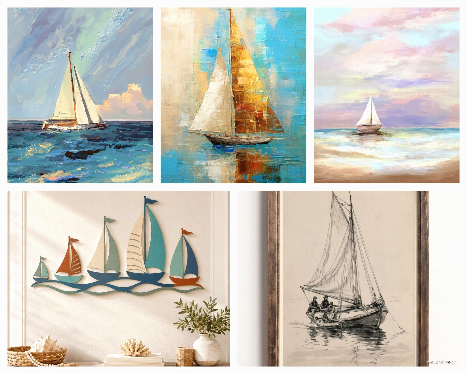
For modern spaces, I’ve been loving sailboat art that’s mostly grayscale with just one color accent – like black and white with a pop of teal on the water, or charcoal sketches with rust-colored sails. It feels less themed, more sophisticated.
If your room already has a lot going on (patterned rugs, colorful furniture, etc.), go for monochromatic sailboat prints. Just black ink on white, or sepia-toned vintage yacht photographs. They add the nautical element without competing with everything else.
Wait I forgot to mention – sunset sailboat scenes are tricky. They can look absolutely stunning or really kitschy depending on the color saturation. If the orange/pink is too intense, it reads as tacky. Look for muted sunset tones, almost dusty looking colors.
What Works With Different Design Styles
Minimalist/Scandinavian: line drawings of sailboats, simple black and white photography, maybe one large-scale piece rather than multiple small ones
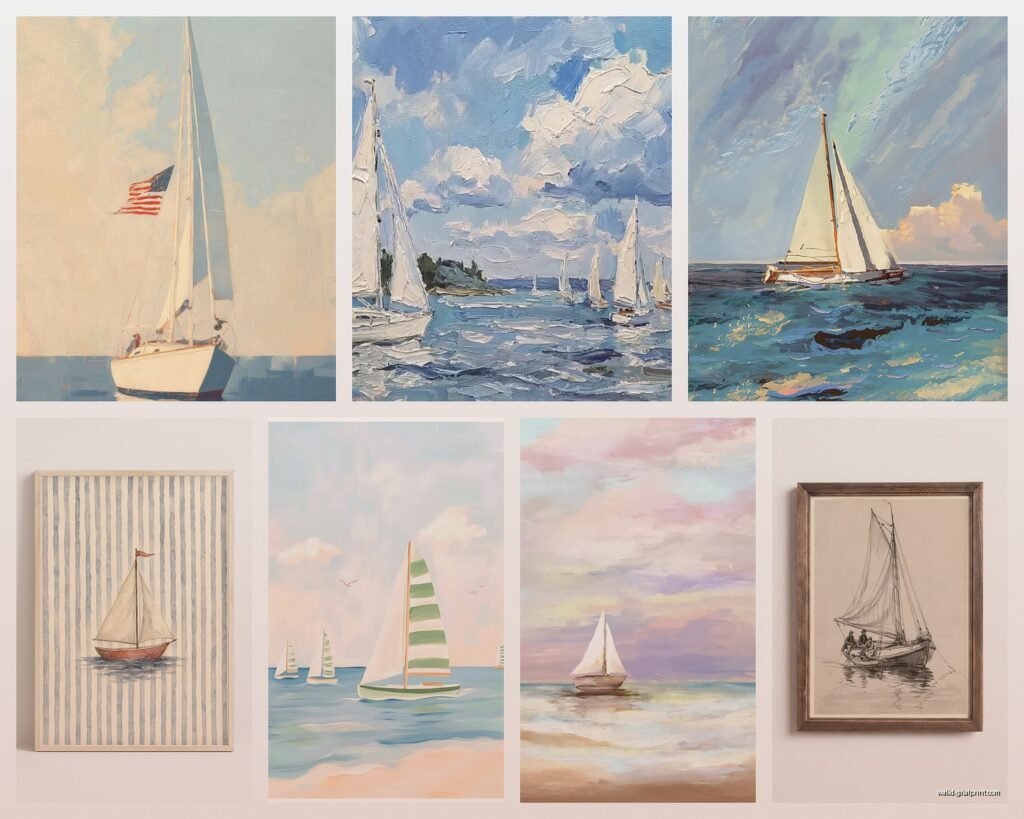
Coastal grandmother aesthetic (yes it’s a real thing my clients ask for): watercolor sailboats, vintage regatta posters, anything that looks slightly faded or weathered
Modern/contemporary: abstract sailboat interpretations, geometric yacht designs, high-contrast black and white, oversized single prints
Traditional/classic: oil painting reproductions of tall ships, detailed nautical charts with sailing routes, antique-looking yacht club prints
Industrial loft: sailboat blueprints and technical drawings are *so good* for this, also metal sailboat silhouettes instead of prints
Framing Options Because It Actually Matters
I spent like two hours at a frame shop last week (my client canceled so I had time to kill) comparing different frame styles with the same sailboat print and the difference is wild.
Thin black metal frames: make sailboat art feel modern and gallery-like, work great for contemporary spaces but can feel cold in traditional rooms
Natural wood frames: walnut or oak frames warm up sailboat prints nicely, especially if you’ve got other wood furniture – just match the tone (warm vs cool wood)
White frames: classic choice but honestly they can wash out lighter sailboat prints – better for high-contrast images
No frame/floating mount: this works surprisingly well for sailboat photography printed on thick paper stock, gives it an editorial look
This is gonna sound weird but I’ve also mounted sailboat prints on cork board backing before floating them in deep shadow boxes – adds dimension and the cork ties into the nautical theme subtly.
Where to Actually Find Good Stuff
Etsy is obvious but you gotta dig past the first three pages of results because that’s where everyone shops and you’ll end up with the same mass-produced prints as your neighbor. Search specific terms like “vintage yacht lithograph” or “sailboat charcoal drawing” instead of just “sailboat art.”
Estate sales and antique shops – I found this incredible set of 1960s sailing photography at an estate sale for like $30 total and they’re worth way more, plus they have actual character
Society6 and Minted: good for contemporary sailboat designs, lot of independent artists, quality is consistent
Local art fairs: if you live near the coast obviously, but even inland cities have marine artists because apparently everyone’s dad sailed at some point? You can often negotiate prices too.
Museum gift shops: reproduction prints of famous maritime paintings, usually really high quality printing, just more expensive
Hanging Tips That Aren’t Obvious
Eye level is supposedly 57-60 inches from the floor to the center of the artwork but honestly I hang sailboat art slightly higher than normal portrait art because boats naturally draw your eye upward? Like 60-63 inches feels better to me.
If you’re hanging above furniture, leave 6-8 inches between the furniture top and bottom of the frame. Less than that looks cramped, more looks disconnected.
For multiple sailboat prints in a row (like those trendy three-panel sets), keep them 2-3 inches apart. I’ve seen people do like 6 inches and it just looks like they couldn’t commit to a gallery wall or a single statement piece.
Oh and use proper hardware – those command strips are fine for lightweight prints under 5 pounds but anything substantial needs actual wall anchors or studs. I watched a beautiful sailboat canvas crash down during a dinner party once because someone used inadequate hardware and it was… traumatic for everyone involved.
Mixing Sailboat Art With Other Decor
You don’t need to go full nautical theme just because you have sailboat wall art. Actually please don’t unless you’re decorating a literal beach house.
What I usually do: pair sailboat art with natural textures like linen, jute, light wood, maybe some indoor plants. The sailing imagery becomes one element rather than THE theme.
Avoid: rope accents, anchor everything, striped pillows in navy and white, literal boat wheels, those wooden oar decorations – basically if you’re adding stuff that screams “I LOVE BOATS,” you’ve gone too far
Instead try: brass or copper accents (nautical without being obvious), maps or globes (plays into the travel/exploration aspect), books about sailing or ocean photography on your coffee table, subtle blue-green color palette in your textiles
One client mixed sailboat photography with modern abstract art and mid-century furniture and it looked SO much better than if she’d done a whole nautical theme situation.
Seasonal Rotation Thing I Started Doing
Okay so funny story, I was watching this organization show while rearranging my storage closet and realized I could rotate my sailboat art seasonally since I have way too much of it now.
Summer: bright, colorful sailboat scenes, regatta photography, anything that feels energetic
Fall/Winter: moody seascapes with sailboats in storms, black and white photography, vintage nautical charts
It keeps things interesting and you’re not staring at the same piece year-round. Plus you can store the off-season art way easier than storing like, seasonal furniture.
The Bathroom Exception
I mentioned this earlier but it deserves its own section – small sailboat prints in bathrooms are genuinely underrated. Just make sure:
- Frame is sealed or use acrylic instead of glass to prevent moisture damage
- Print is on water-resistant paper or you seal it with a spray fixative
- You’re not hanging it directly in the shower splash zone (seems obvious but I’ve seen it)
- Consider laminated vintage sailboat postcards or cards instead of expensive prints since bathroom humidity is rough on art
I did a whole powder room last year with just four small sailboat ink drawings in simple black frames and people ask about it constantly. Something about the intimate scale works.
DIY Options If You’re Crafty
You can print your own sailboat art if you find high-resolution images (check museum databases, many have free downloads now). Get them printed at a local print shop on nice paper stock – way cheaper than buying finished prints.
I’ve also transferred sailboat images onto fabric using gel medium and made custom throw pillows, which sounds complicated but took like 30 minutes once I figured it out.
Thrift store frames + new sailboat prints = instant upgrade for barely any money. Just spray paint ugly frames if needed.
Press real nautical charts or sailing maps under glass in vintage frames – you can find these at antique shops or online, they’re beautiful and unique.
What Doesn’t Work (Learn From My Mistakes)
Those metal sailboat sculptures that are supposed to be wall art – they’re bulky, they cast weird shadows, and they collect dust like crazy. Just get a print.
Sailboat art with cheesy inspirational quotes about smooth seas and steering your ship or whatever – it’s too literal, makes the whole room feel like a motivational poster
Really busy, detailed sailboat scenes with tons of rigging and people – they’re overwhelming on a wall, your eye doesn’t know where to focus
Matching sets that are TOO matchy – like three identical sailboat prints just in different colors feels very 2010 home decor catalog
Anything with dolphins or whales mixed in with the sailboats unless you’re genuinely going for aquarium gift shop vibes
Lighting Considerations
Direct sunlight will fade your sailboat prints over time, especially watercolors and photography. If you’ve got a sunny wall, either use UV-protective glass or expect to replace the art eventually.
Picture lights are great for larger sailboat paintings but can feel fussy for casual spaces. I usually just make sure there’s decent ambient lighting in the room.
Matte finishes on prints prevent glare way better than glossy, which matters if you’re hanging across from windows or lamps.
The thing nobody mentions: if your sailboat art has a lot of dark blues or blacks, it can disappear on a dark wall. You want some contrast – dark art on light walls, lighter sailboat prints can handle darker walls.
Anyway that’s basically everything I’ve figured out through trial and error and client projects and my own low-key obsession with making sailboat art not look like a TJ Maxx clearance section threw up on someone’s wall. Start with one good piece that you actually love, not just something that fills the space, and build from there if you want more.