
Wall Art Guide, Wall Art Tutoriels
Wall Art 3 Piece Set: Matching Triptych Collections
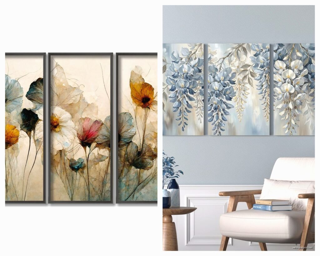
Aug
So I literally just finished hanging a three-piece set in my living room yesterday and my arms are still sore, which is probably why you’re texting me about this now because I posted that photo on Instagram. But okay, triptychs are actually way trickier than they look and I wish someone had told me half this stuff before I put like seventeen holes in my wall.
First Thing – Understanding What You’re Actually Getting
The whole matching triptych thing sounds fancy but it’s literally just three pieces of art designed to go together. They can be split images (like one panoramic photo divided into three), complementary designs, or just three pieces in the same color scheme. I’ve worked with all types and honestly the split panoramic ones are the HARDEST to hang because if you’re off by even half an inch it looks completely wrong.
When you’re shopping, you gotta figure out if the set comes with frames or if it’s just canvas. The canvas ones are easier imo because they’re lighter and you don’t have to worry about frame alignment being perfect. My friend Sarah bought this gorgeous abstract ocean set with heavy frames and needed like four hands to install it properly.
Measuring Your Wall Space (This Is Where Everyone Messes Up)
Okay so before you even buy anything, grab a tape measure. You need to know:
- Total wall width you want to fill
- Height from floor to where you want the center of your art
- What furniture is sitting below (if any)
- Ceiling height because proportion matters way more than people think
The standard rule is that three-piece sets should take up about two-thirds to three-quarters of your wall width. So if you have an 8-foot wall, you’re looking at roughly 64-72 inches total including the spacing between pieces. But also like…rules are meant to be broken if it looks good to your eye.
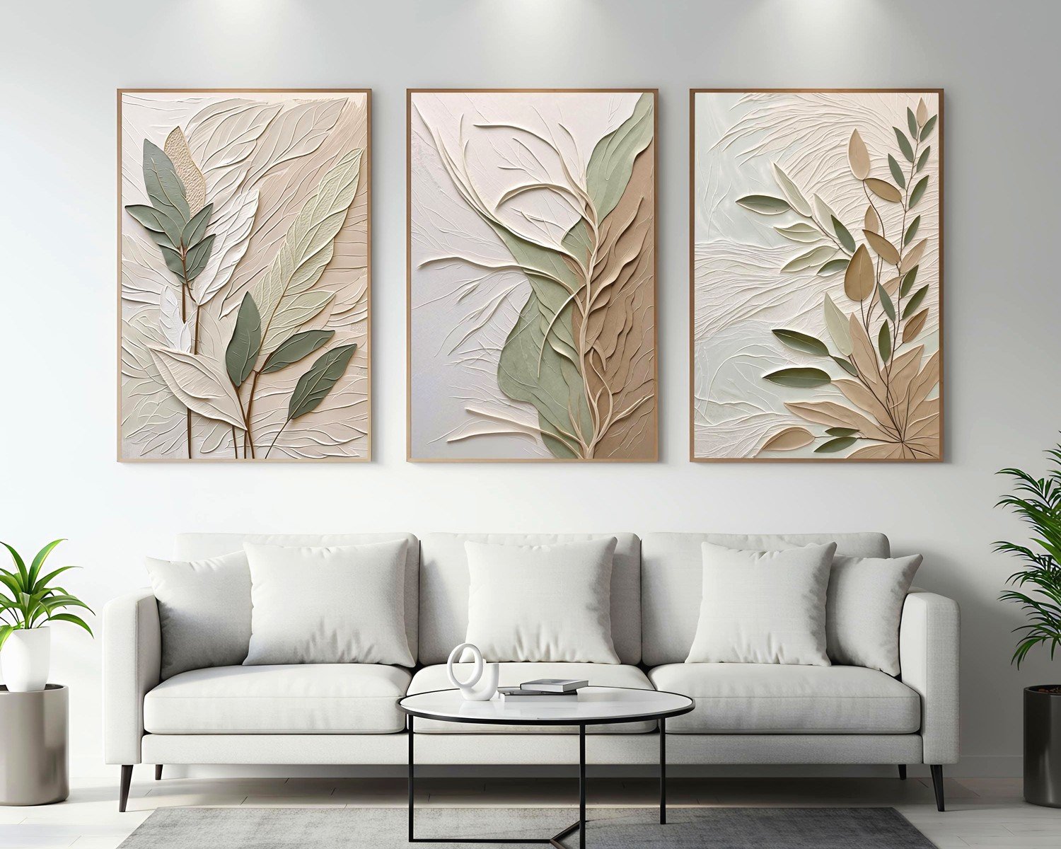
I hung a set above my couch last month and the general guideline is 6-8 inches above the furniture, but my ceilings are 9 feet so I went with 10 inches and it looks way better. You gotta consider the whole room height situation.
Spacing Between the Pieces
This is gonna sound weirdly specific but I’ve tested this SO many times with different clients – 2 to 4 inches between each piece is the sweet spot. Less than 2 inches and they look cramped, more than 4 inches and they start reading as separate pieces instead of a cohesive set. I usually go with 3 inches because it’s easy to measure and looks balanced.
My cat knocked over my level while I was measuring yesterday which was super helpful, not. But anyway, consistency is key here. If you do 3 inches between piece one and two, you need exactly 3 inches between piece two and three.
Choosing Your Style (Because There’s Like A Million Options)
The market is completely flooded right now with triptych sets and honestly most of them are pretty mediocre. Here’s what I’ve noticed actually works in real spaces:
Abstract designs are the safest bet if you’re not sure about your style yet. They work with basically any decor and you won’t get sick of them. I have this navy and gold abstract set in my bedroom that I bought three years ago and still love.
Black and white photography is having a moment and for good reason – it’s timeless and sophisticated without trying too hard. Works especially well in modern or minimalist spaces. Just make sure the photos are actually high quality because cheap prints look really obvious on a big wall.
Botanical prints are everywhere right now but they can look dated fast. If you go this route, stick with vintage-style botanical illustrations rather than the really trendy tropical leaf stuff that’s gonna feel very 2023 in like two years.
Landscape or nature scenes split across three panels can be absolutely stunning if done right. I curated a mountain landscape set for a client’s office and it completely transformed the space. The key is making sure the horizon line is consistent across all three pieces.
Color Considerations That Actually Matter
Your three-piece set should pull at least one or two colors from your existing room palette, but it doesn’t need to match exactly. Actually, exact matching can look really forced and catalog-y. I usually tell people to pick art that has their room’s accent color plus one or two new colors to add depth.
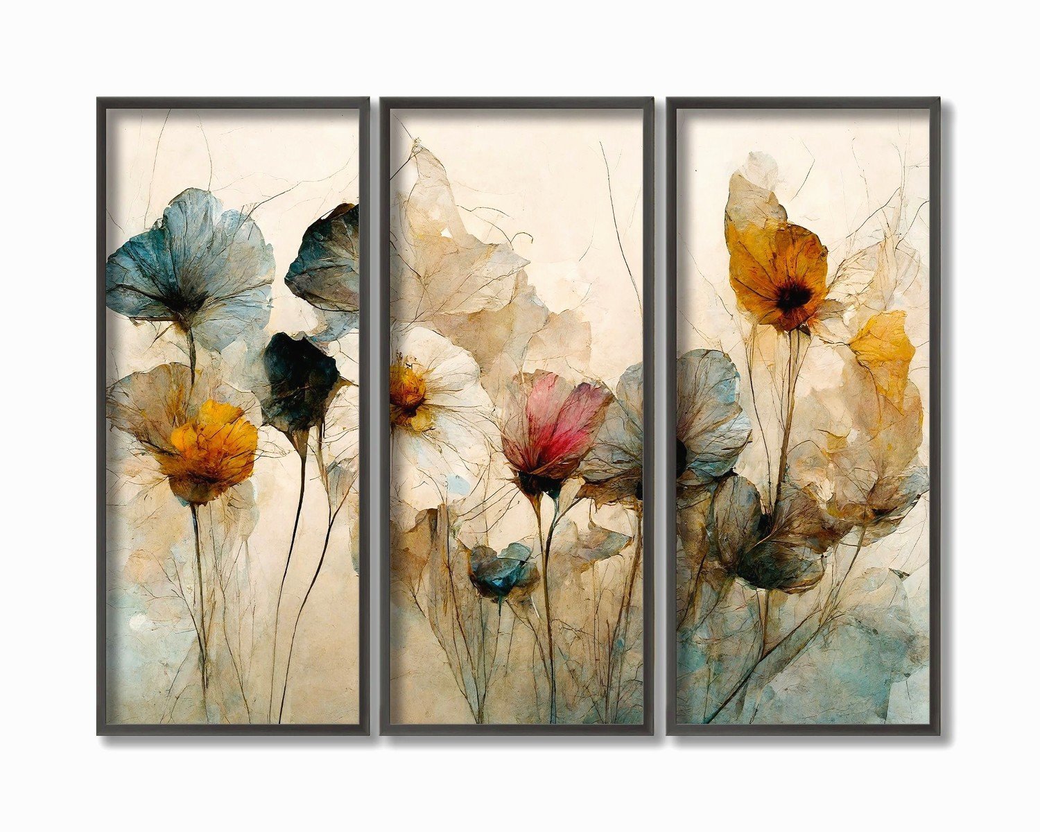
Oh and another thing – consider the undertones. If your room has warm undertones (beiges, creams, warm grays), cool-toned art (blues, purples, cool grays) can look really off. I learned this the hard way in my first apartment.
The Actual Hanging Process (Get Ready)
Okay so you bought your set and now you need to get it on the wall without losing your mind. Here’s my exact process:
Step 1: Lay everything out on the floor first in the exact arrangement you want. Take a photo from above. This is your reference point and you’ll look at it like fifty times during installation.
Step 2: Find your center point on the wall. For most rooms, eye level is around 57-60 inches from the floor to the center of your artwork. Mark this lightly with a pencil.
Step 3: The middle piece goes up first. Always. This is your anchor. Measure from the center point and mark where your hanger needs to go. If you’re using the wire on the back of a frame, pull the wire taut to see where it’ll actually hang from – it’s not gonna be the top of the frame.
Step 4: Use a level. I cannot stress this enough. Even if you think you have a good eye, you probably don’t. I’ve been doing this for years and I still use a level every single time.
Tools You Actually Need
- Tape measure (duh)
- Level – get a good one, the cheap ones lie
- Pencil
- Hammer or drill depending on your wall type
- Appropriate hangers (more on this in a sec)
- Painter’s tape for planning
- A second person if the pieces are heavy, seriously don’t be a hero
Wall Anchors and Hardware (This Part Is Important)
So the hardware that comes with most sets is complete garbage. Like genuinely terrible. I always buy my own hangers based on the actual wall type and weight.
For drywall with lightweight canvas pieces (under 10 lbs each), regular picture hangers work fine. For anything heavier or if you want it really secure, use wall anchors. I like the self-drilling anchors because they’re idiot-proof and hold a ton of weight.
If you’re hanging on plaster walls (older homes), you gotta be more careful. Plaster can crack easily so I use toggle bolts or find the studs. Stud finders are like $15 and worth every penny.
For concrete or brick, you’ll need masonry screws and a drill with a masonry bit. It’s more work but the installation is super solid once it’s done.
The Painter’s Tape Trick
Wait I forgot to mention this earlier but it’s a game-changer. Before you put any holes in the wall, use painter’s tape to outline where each piece will go. You can adjust and readjust until it looks perfect, then mark your nail holes through the tape. Peel it off and drill. This has saved me so many times from making stupid mistakes.
Common Layouts and What Works Where
The standard horizontal row is classic for a reason – it works above sofas, beds, console tables, basically anywhere. All three pieces at the same height, evenly spaced. This is what I did in my living room and it’s clean and balanced.
But you can also do a staggered or stepped arrangement where the middle piece is slightly higher or lower than the side pieces. This works really well in modern spaces or if you’re going for something more dynamic. I did this in a client’s office last year and it looked super editorial.
Vertical arrangements are trickier and really depend on your wall height. I’ve only done this once in a space with 12-foot ceilings and it looked amazing but it wouldn’t work in a standard 8-foot room.
Size Guidelines That Actually Help
This is gonna sound like math class but bear with me. For a standard sofa (around 84 inches), you want your total art width to be about 56-63 inches. That means each piece in your triptych should be roughly 16-18 inches wide with 3-inch spacing.
Above a queen bed, go bigger – think 60-70 inches total width. King bed, even bigger, like 70-80 inches total.
In a dining room, consider the table size. The art shouldn’t be wider than the table itself. I see people mess this up all the time and it throws off the whole room proportion.
When to Go Smaller or Larger
If your room is really busy with patterns and colors and stuff, smaller art can actually read better because it doesn’t compete. In minimalist spaces, you can go bigger and make the art the focal point.
Ceiling height matters too – I already mentioned this but like, really think about it. Low ceilings need smaller art or the room feels cramped. High ceilings can handle larger pieces and actually need them to fill the space appropriately.
Framing Options (If Your Set Doesn’t Come Framed)
Okay so if you bought unframed prints or canvases, you have options. Gallery-wrapped canvas (where the image wraps around the edges) doesn’t need framing and has that modern clean look. I personally love this for contemporary spaces.
If you’re framing, all three pieces need identical frames. Like exactly identical. Different frame styles will make it look like you just grabbed random pieces and stuck them together. Match the color, width, and style exactly.
Floating frames are really popular right now and they do look good with the right art. They’re basically frames where you can see a gap between the art and the frame edge. Works well with canvas or thick paper prints.
Maintenance and Adjustment
Things shift over time, especially if you slam doors or have kids running around. I check my wall art every few months and adjust as needed. It takes like two minutes and keeps everything looking crisp.
Dust builds up on frames and canvas edges. A microfiber cloth works great for this. Don’t use cleaning products unless you know they’re safe for your specific art type.
If you used command strips instead of nails (which I don’t usually recommend for triptychs but some people do), those lose adhesion over time. Check them periodically especially in humid environments.
Where to Actually Buy Decent Sets
I’ve ordered from probably twenty different places at this point. Etsy has some really unique options from independent artists but quality varies wildly so read reviews carefully. I found this amazing abstract set from a seller in Portland that I’m obsessed with.
For more affordable options, places like West Elm and CB2 have decent triptych collections that won’t break the bank. The quality is consistent even if the designs are sometimes a bit safe.
If you want something really special and have the budget, commissioning a local artist to create a custom three-piece set is incredible. I did this for my office and it’s my favorite thing in the whole room.
Online print services like Minted and Artfully Walls let you buy prints and then frame them yourself which can save money if you’re handy. Just make sure you’re getting high resolution prints that won’t look pixelated when blown up to size.
Oh wait, one more thing about buying – check the return policy before ordering. Some places make returns super difficult for multi-piece sets and you don’t wanna be stuck with something that doesn’t work in your space. I learned this after ordering a set that looked completely different in person than online and the return shipping was like $60.
The lighting in your room is gonna affect how the art looks too. Natural light vs artificial light can change colors dramatically. I always recommend looking at art in the actual lighting conditions of the room where it’ll hang if possible, but obviously that’s not always feasible when shopping online. Just something to keep in mind if the colors seem off when you first hang it – might just be the lighting situation.
