Wall Art Guide, Wall Art Tutoriels
Landscape Wall Art for Living Room: Nature Scenery Main Space
Nov
So I was literally just helping my neighbor pick landscape art for her living room last week and honestly, the whole thing is way less complicated than Pinterest makes it look. Like, you don’t need to overthink this.
Size Is Actually The First Thing You Gotta Figure Out
Okay so here’s what I learned after hanging like a million pieces in client spaces – measure your wall space first but then subtract way more than you think. Most people buy art that’s too small and it just floats there looking sad. For a living room, you’re usually looking at somewhere between 40-60 inches wide for above a sofa. I know that sounds huge but trust me on this.
The rule I actually use (and this works) is that your art should take up about 2/3 to 3/4 of your furniture width. So if your couch is 84 inches, you’re looking at around 56-63 inches of art. You can do one big piece or a gallery wall situation, but that’s the total width you want.
My cat knocked over my coffee while I was measuring for a client last month and I had this whole revelation – stand back like 10 feet from the wall. That’s where you’ll actually see the art from when you’re using the room. What looks big up close might disappear from your actual sitting position.
Picking The Right Type Of Landscape
This is where it gets fun because landscape art is this massive category. You’ve got mountains, forests, beaches, deserts, fields… and they all do different things to a space.
Mountains and dramatic landscapes work really well in rooms with modern or minimalist furniture. There’s something about that contrast – clean lines in your furniture, then BAM, this epic mountain range. I used an Ansel Adams style black and white mountain piece in a client’s space with all white furniture and gray walls, and it completely anchored the room.
Forests and trees are like the universal donor of landscape art. They work with almost everything and they don’t overwhelm. If you’ve got a smaller living room or you’re nervous about committing, go with trees. Birch trees are having a moment but honestly they’ve been having a moment for like 5 years now so… do with that what you will.
Beach scenes – okay so this is gonna sound weird but – beach art only really works if you commit to it. Like you can’t just throw up a beach scene in a room that has nothing coastal about it. It’ll look like a doctor’s office. But if you’ve got even subtle coastal vibes (light colors, natural textures, maybe some blue accents), then yeah, go for it.
What About Abstract Landscape Stuff
Oh and another thing – abstract landscapes are actually easier to work with than realistic photos. I know that sounds backwards but hear me out. An abstract interpretation of a landscape (like impressionist style or even just color-field paintings that suggest horizon lines) gives your eye something interesting but doesn’t demand attention the way a super detailed photograph does.
I’ve been watching this show about art forgers and it’s made me look at abstract stuff differently, but anyway – the point is that abstract landscape pieces play nice with other decor. You can mix patterns and textures more easily because the art itself isn’t competing with every detail.
Color Matching Without Making Yourself Crazy
Everyone gets stuck here. You’re sitting there with paint swatches and fabric samples trying to match everything perfectly and… don’t. Just don’t do that to yourself.
Instead, pull 2-3 colors from your existing room. Not all of them, just a few. Your landscape art should have at least one of those colors in it, but it can absolutely introduce new colors too. Actually, it should introduce new colors because that’s what makes a room feel layered instead of matchy-matchy.
I had this client with a beige and cream living room (I know, I know) and we added this landscape piece that had beige and cream but also brought in these gorgeous deep greens and touches of rust orange. Suddenly the room had depth. The art gave permission for throw pillows in those new colors, and the whole space came alive.
Wait I forgot to mention – if your walls are dark, you need art with some lighter elements or it’ll just disappear into the wall. And if your walls are light, you can go either way, but darker or more saturated landscapes will pop more.
Frame Choices That Actually Matter
Frames are weirdly important and also weirdly expensive. Here’s what I do:
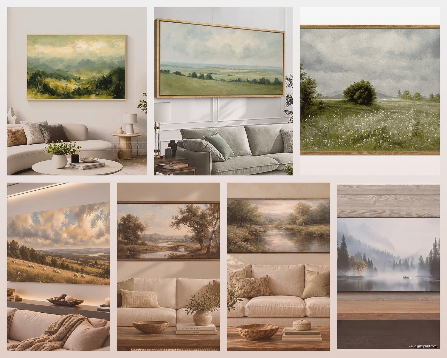
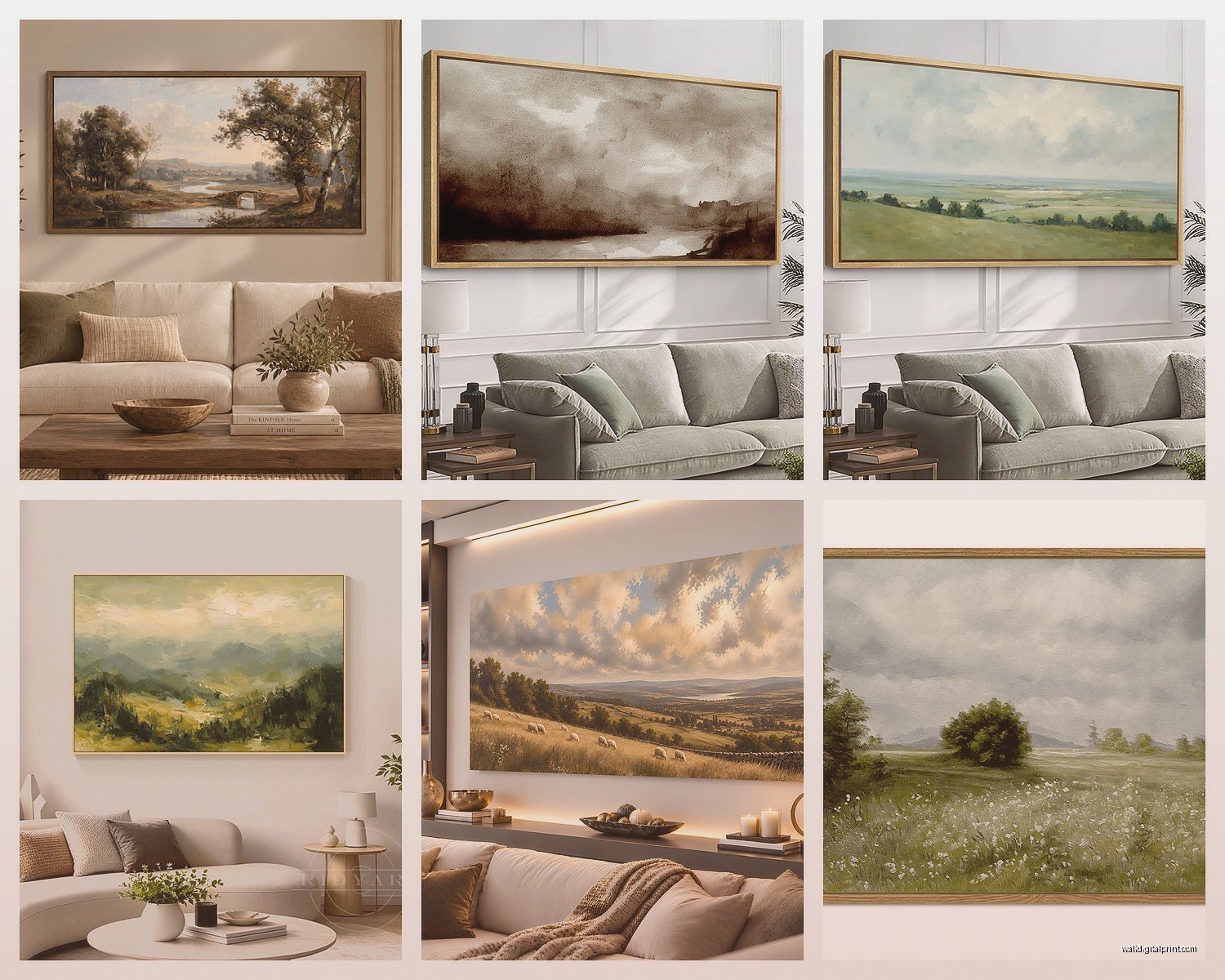
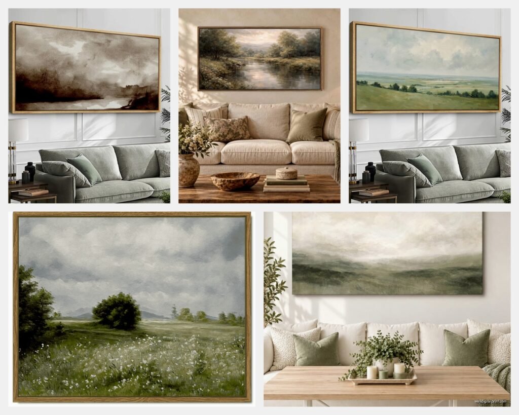
For modern spaces, go with a simple float frame (that’s where there’s a gap between the art and frame) or even no frame at all if it’s a canvas print. Black, white, or natural wood – pick based on other wood tones in your room.
For traditional spaces, you need some kind of frame with presence. Not necessarily ornate (unless that’s your thing), but something with dimension. Gilded frames can work with landscape art but they’re tricky – you gotta commit to that look throughout the room.
My personal favorite lately is the natural wood frame in a light finish. It works with basically everything and adds warmth without being too rustic or too modern. It’s like the Switzerland of frames.
Oh and this is gonna sound obvious but make sure your frame doesn’t overpower the actual art. I see this all the time – someone buys this beautiful subtle landscape and then puts it in this massive 4-inch ornate frame and all you see is the frame.
Canvas Prints Versus Framed Prints
So canvas prints (where the image wraps around the edges) are less formal and work great in casual living rooms. They’re also lighter and easier to hang by yourself. Framed prints under glass feel more finished and formal – better for traditional spaces or if you’re trying to make a room feel more sophisticated.
I usually suggest canvas for large pieces because framing something huge gets expensive fast. Like, really fast. But for smaller pieces or if you’re doing a gallery wall, framed prints can look more intentional.
Where To Actually Buy This Stuff
Okay so you probably want actual recommendations. I’ve bought from a bunch of places for clients and for my own space.
Society6 and Redbubble have tons of landscape photography and art from independent artists. The quality is pretty decent for the price, and you can usually get the same image in different sizes. Good if you’re on a budget but want something more unique than HomeGoods.
Etsy is hit or miss but when you find a good landscape photographer or artist there, it’s worth it. I’ve gotten some gorgeous mountain photography prints for like $40 plus framing. Just read reviews and check their other listings to make sure they’re legit.
For higher-end stuff, Minted and Artfully Walls have curated selections. More expensive but the quality is noticeably better. My friend just got this insane Pacific Northwest forest print from Minted and it’s… it’s really nice. Like investment piece nice.
If you want actual original art, local art fairs and galleries are where it’s at. You’ll pay more but you get something nobody else has. Plus you can meet the artist which is kinda cool if you’re into that.
Hanging Height And Placement
Standard rule is center of the art at 57-60 inches from the floor. That’s like gallery height or whatever. But in real life, you gotta adjust based on your furniture and ceiling height.
Above a sofa, leave 6-8 inches between the top of the sofa and the bottom of the frame. More than that and they start looking disconnected. Less than that and it feels crowded.
For high ceilings, you can go a bit higher with your placement, but don’t go crazy. I’ve seen people hang art at like 7 feet up because they have 12-foot ceilings and it just looks weird. Your art should still relate to the human scale of the room.
If you’re doing a gallery wall with multiple landscape pieces, lay them out on the floor first. Take a picture. Live with that picture for a day or two. I know it sounds extra but I’ve redone gallery walls because I didn’t do this step and it’s the worst.
Lighting Considerations
Natural light will fade your art over time, especially photographs. If you have a wall that gets direct sunlight for hours every day, either choose that wall for something else or invest in UV-protective glass. Or just accept that you might need to replace the print in 5-10 years.
Adding picture lights or using track lighting to highlight your landscape art makes such a difference at night. It creates this whole ambiance thing. But make sure the light is warm-toned (2700-3000K) unless you’re going for a gallery vibe, then cooler light works.
Mixing Landscape Art With Other Stuff
You don’t have to make your whole living room about landscape art. Actually, please don’t do that unless you’re really committed to a nature theme.
One large landscape piece can be your focal point, then mix in abstract art, family photos, or other subjects elsewhere in the room. The landscape grounds everything because it’s recognizable and relatable, then your other pieces can be more experimental.
I did this in my own living room – big mountain landscape above the sofa, then smaller abstract pieces and a vintage poster on other walls. It feels collected and personal instead of like I walked through a national park gift shop.
Wait, another thing – if you have a fireplace, the wall above it is prime real estate for landscape art. Something horizontal that echoes the horizontal line of the mantel. Just make sure it’s not too wide – you want some wall space visible on either side.
Seasonal Swapping
This might sound extra but stick with me. Some people like to swap their art seasonally. Like beach landscapes in summer, forest scenes in fall, snowy mountains in winter. You don’t have to do this, but if you get bored easily or you’re someone who redecorates a lot anyway, it’s an option.
I have a client who does this and she stores the off-season pieces in those flat storage bags under her bed. Works pretty well actually. Just make sure you’re not buying expensive pieces if you’re gonna rotate them out – stick with affordable prints.
Common Mistakes I See All The Time
Buying art before you paint or have your furniture figured out. Get your big stuff settled first, then add art.
Hanging everything too high. Seriously, lower than you think.
Choosing landscapes that don’t match the vibe of your actual life. If you live in the desert, a tropical beach scene might feel weird. Or maybe not, I don’t know your life, but think about it.
Going too matchy with colors. Your art should complement your space, not blend into it completely.
Buying really cheap canvas prints that arrive looking pixelated or with weird color casts. Spend a little more for decent print quality – the difference is noticeable.
Not considering the mood of the landscape. A stormy ocean scene creates a totally different feeling than a peaceful meadow. Think about how you want your living room to feel.
Okay I think that’s most of what I know about this. The main thing is just to pick something you actually like looking at, because you’re gonna be looking at it every day. Don’t get so caught up in rules and design principles that you forget it’s your space and you gotta live with it.