Wall Art Guide, Wall Art Tutoriels
Frida Wall Art: Kahlo Mexican Artist Self-Portrait Icon
Nov
So I’ve been completely obsessed with Frida Kahlo wall art lately and honestly it started because a client wanted to do this whole vibrant Mexican-inspired dining room and I went down such a rabbit hole. Like, I thought I’d just find one print and be done but there’s SO much out there and the quality difference is wild.
Finding Actual Good Quality Prints
Okay so first thing – you gotta decide if you want an actual art print or like, a canvas reproduction or one of those metal prints. I’ve tested all three in different rooms and they each have their vibe. The paper prints, if you get them from somewhere like Society6 or even Etsy from a seller who actually knows what they’re doing, can be gorgeous. But here’s the thing nobody tells you – you NEED to frame them properly. I made the mistake of putting a $45 Frida print in a cheap Amazon frame and it looked… bad. The colors were amazing but the frame made it look like dorm room art.
What worked way better was taking the print to a local frame shop. Yeah it cost me like $120 for custom framing but the difference was insane. They put it behind museum glass which doesn’t have that glare, and suddenly it looked like something you’d see in an actual gallery.
Canvas vs Paper Prints
Canvas is trickier because so many places just stretch a regular print over canvas and call it a day. The texture looks fake up close. What you want is a giclee print on actual artist-grade canvas. Icanvas does decent ones, and there’s this seller on Etsy called ArtPrintVogue or something similar who does really vibrant reproductions of Kahlo’s self-portraits. I got the one with the monkey and the colors are actually accurate to the original – I checked against museum catalog images because I’m that person apparently.
The canvas ones you can hang without a frame which is nice if you’re going for that more casual boho look. But honestly? I think they look better with at least a floating frame. Adds like $50 to the cost but makes it feel more intentional.
Which Self-Portrait Should You Actually Get
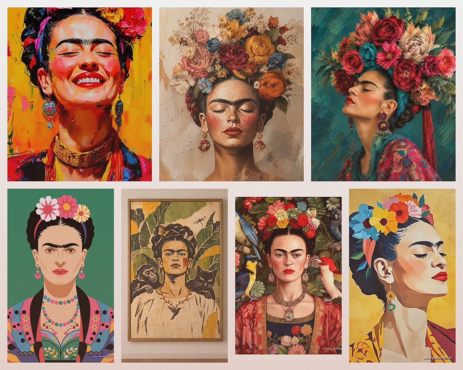
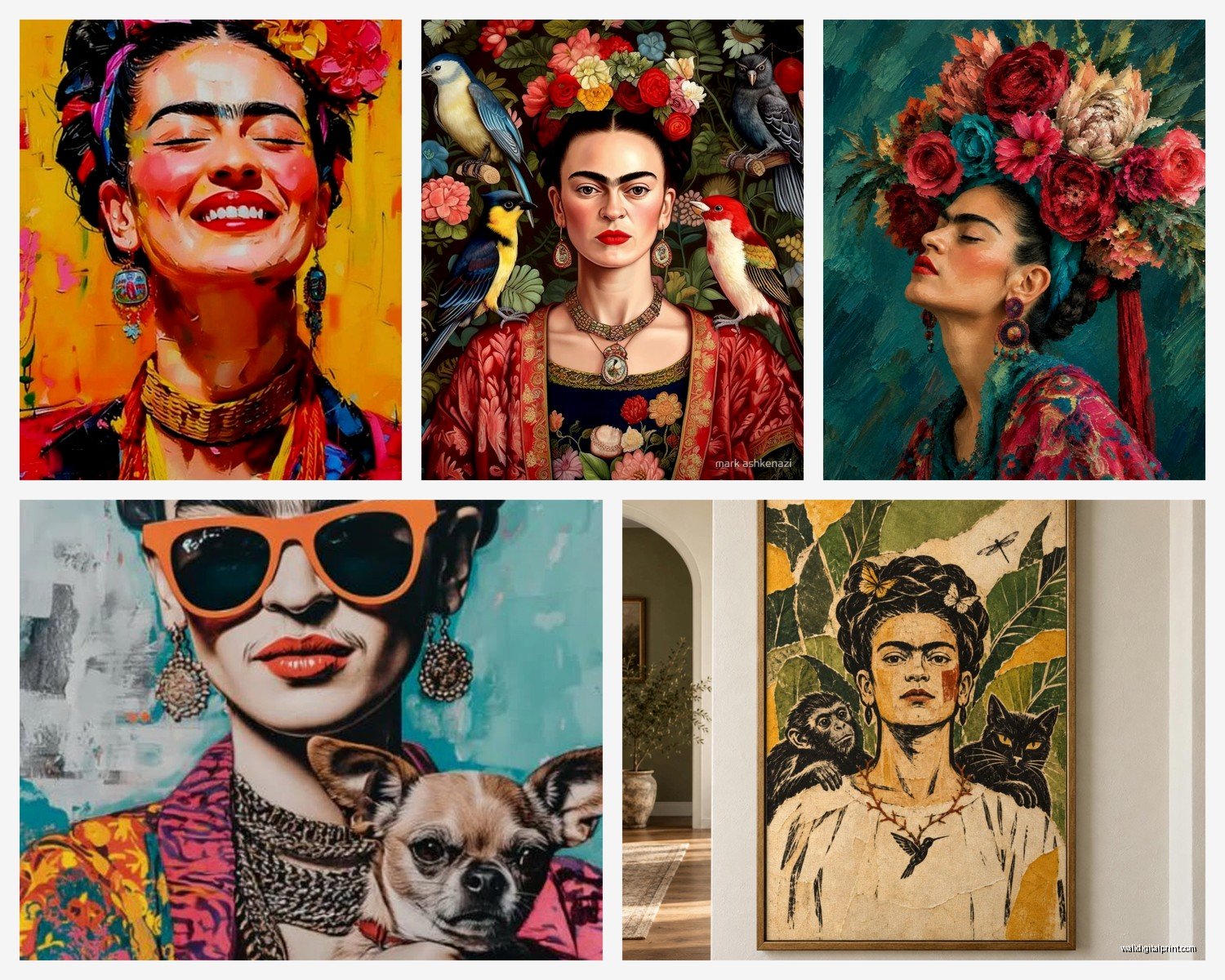
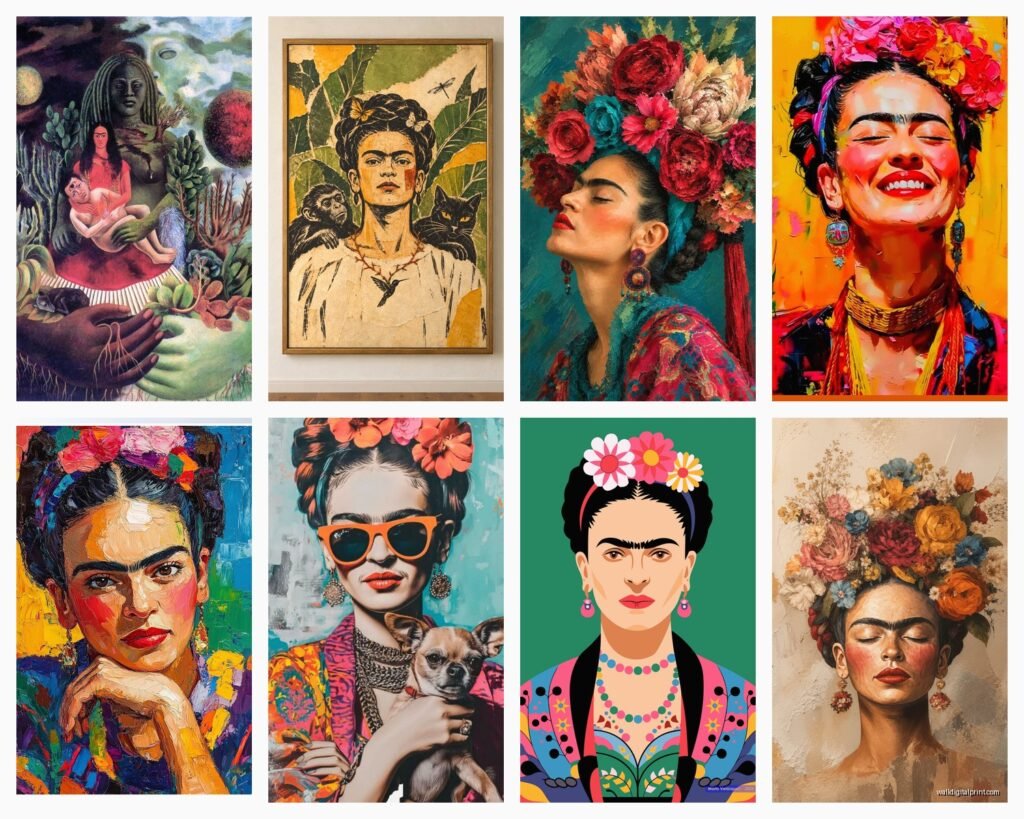
This is where it gets personal because Frida painted like 55 self-portraits and they’re all so different. The most iconic one is probably “Self-Portrait with Thorn Necklace and Hummingbird” – that’s the one with the black monkey and cat. It’s bold, it reads well from across a room, and it works in basically any space that can handle strong colors.
But wait I forgot to mention – if your walls are already busy or you have a lot of pattern going on, you might want one of her simpler portraits. There’s this one from 1940 where she’s wearing a purple shawl and the background is pretty minimal. I used that in a client’s bedroom that had this crazy floral wallpaper and it actually worked because the portrait itself wasn’t competing.
Size Matters More Than You Think
Okay so funny story – I ordered what I thought was a 24×36 print and it showed up as 16×20 because I didn’t read the listing properly. My cat knocked over my coffee while I was trying to figure out if I could make it work. Anyway, the point is that Frida’s paintings have so much detail that if you go too small, you lose impact.
For a living room or dining room, I’d say minimum 24×30 inches. Over a couch you could even go 36×48 if the wall can handle it. I did a 40×30 in my own space above this vintage credenza and it’s perfect – large enough to be a statement but not so huge that it overwhelms everything else.
For bedrooms or smaller spaces, 16×20 or 18×24 can work but you gotta place them carefully. I did a gallery wall situation with three smaller Frida prints mixed with some other Mexican folk art pieces and vintage photos, and that actually worked better than one small lonely print.
Color Matching Your Space
Here’s what nobody talks about – Frida’s palette is STRONG. Lots of deep greens, bright pinks, cobalt blues, earthy terracottas. If your space is all neutrals and you throw up a Frida portrait, it’s gonna be a moment. Which might be exactly what you want! But you gotta commit to it.
What I usually do is pull at least one color from the painting into the room somehow. Even just throw pillows or a blanket in that specific shade of turquoise or coral pink. I did this in a client’s space where we had a Frida print with lots of green foliage, and we added some actual plants in terracotta pots nearby, plus this green velvet chair. Suddenly it all felt cohesive instead of random.
The Neutral Wall Debate
White walls obviously make Frida pop the most, but I’ve also had success with warm terracotta walls, deep teal, and even this dusty pink color. The trick is making sure the wall color doesn’t fight with the dominant colors in the portrait you choose. I saw someone put the thorn necklace portrait (which has lots of green) on a sage green wall and it just… disappeared. Waste of a good print.
Legit Sources vs Sketchy Reproductions
Oh and another thing – copyright is complicated with Kahlo’s work. Technically a lot of it should be public domain by now but her estate is super protective. So when you’re buying, you’re usually getting licensed reproductions or “inspired by” pieces.
The Museum of Modern Art shop has officially licensed prints that are pricey but you know they’re color-accurate. I’ve bought from them and yeah, it’s like $75 for an unframed print, but the quality is there. The paper is thick, the printing is crisp, colors are spot-on.
Then there’s sites like Redbubble and Society6 where independent artists upload their own versions or digitally enhanced versions of public domain images. Quality varies wildly here. I’ve gotten some that were perfect and some where the colors were weirdly saturated or pixelated. Always check reviews and look for photos from actual buyers.
This is gonna sound weird but I also check if the seller shows close-up shots of the actual print texture. If they only have the digital mock-up image, that’s a red flag. You want to see what the finished product actually looks like.
Vintage Poster Reproductions
There’s a whole category of vintage exhibition posters from Frida shows over the years, and reproductions of those can be really cool. They have this retro graphic design vibe that’s different from just printing her paintings. I found one from a 1970s exhibition in Mexico City and the typography alone is worth it. These tend to be cheaper too, like $20-40 range unframed.
Styling Around Frida Art
Okay so you’ve got your print, now what. The easiest move is to embrace the Mexican folk art aesthetic fully. I’m talking Talavera pottery, woven textiles, maybe some papel picado if you’re feeling it. Brass or copper accents work really well – I did these copper wall sconces flanking a Frida portrait and it was *chef’s kiss*.
But you don’t have to go full maximalist if that’s not your thing. I’ve seen Frida portraits work beautifully in really minimal modern spaces where they’re like the ONE colorful element in an otherwise monochrome room. It’s dramatic and it works if you commit to it.
Plants are basically mandatory though. Frida loved plants and they were in like every painting, so having some greenery near your Frida art just makes sense. I put a big fiddle leaf fig next to mine and some trailing pothos on the shelf below. My client’s space we did monster deleras and snake plants. Doesn’t have to be fancy.
Lighting Makes or Breaks It
This is something I learned the hard way – if your Frida print is in a dark corner or poorly lit spot, all those amazing colors turn muddy. You need either good natural light or dedicated picture lighting. I installed these battery-operated LED picture lights from Cocoweb (I think? might be a different brand) that just clip onto the frame and wow, what a difference.
If you’re hanging it opposite a window, watch out for direct sunlight though. UV rays will fade even good quality prints over time. I learned this when a client’s gorgeous print started looking washed out after like 8 months of afternoon sun. Now I always recommend UV-protective glass if it’s gonna be in bright light.
Gallery Wall Ideas
I keep coming back to gallery walls because they’re such a good way to include Frida without making it feel like a shrine. Mix her in with other stuff – vintage family photos, other artwork, maybe some pressed flowers or embroidery. Keep the frames cohesive though. I usually do all black frames or all natural wood, not a mix.
The layout matters too. I use that trick where you lay everything out on the floor first and take a photo from above so you can see how it’ll look. Then I make a paper template of each frame and tape them to the wall before actually hammering anything. Sounds tedious but it saves you from having a wall full of extra holes.
One layout I love is putting the Frida portrait as the central anchor piece, slightly larger than everything else, and building around it symmetrically. Or go totally asymmetric and scatter smaller pieces around it – both work depending on your vibe.
Mixing Frida with Other Artists
This might be controversial but you can totally mix Frida with other art styles. I did a wall where we had a Frida portrait, a vintage botanical print, and an abstract piece in similar colors. The key is having some connecting element – either color palette or theme or frame style.
I’ve also seen people pair Frida with Diego Rivera’s work which makes sense historically, but honestly his style is so different (more muralist, political) that they don’t always vibe together visually. Just something to consider.
Unconventional Frida Art Options
Okay so beyond standard prints, there’s some interesting stuff out there. I found this company that does embroidered portraits and they have a Frida one that’s absolutely stunning. It’s more expensive, like $200+, but it’s actual textile art. The texture and dimension you get from embroidery is so different from a flat print.
There’s also metal prints where the image is infused onto aluminum. These have this super vibrant, almost glowing quality. I was watching some show about modern art displays while researching these and got distracted but anyway – they’re waterproof and don’t need glass, so they’re good for bathrooms or kitchens if you wanna do something unexpected.
And then there’s original art “inspired by” Frida rather than reproductions of her actual paintings. Local artists doing their own interpretations. I’ve commissioned a few of these for clients who wanted something unique. Check Instagram for artists in your area doing figurative work with that colorful folk art influence.
Budget Breakdown
Since you’re probably wondering about actual costs:
- Cheap poster print: $15-30 (fine for temporary or casual spaces)
- Quality art print from museum shop or established seller: $50-150
- Canvas giclee reproduction: $80-250 depending on size
- Custom framing: $75-300 depending on size and materials
- Ready-made frame: $20-80 (IKEA to mid-range)
- Picture lighting: $30-100
So realistically you’re looking at $100-400 total for a good setup. I know that seems like a lot but this is gonna be on your wall for years hopefully, so it’s worth getting something that actually looks good.
Common Mistakes I’ve Seen
Hanging it too high – the center of the artwork should be at eye level, which is usually around 57-60 inches from the floor. I see so many Frida prints hung way too high and you end up craning your neck to see them properly.
Buying the first one you see without comparing – I spent like three weeks looking at different versions of the same portrait before deciding. The color variations between sellers are huge.
Not considering your existing furniture – that bright red couch might clash with the colors in certain Frida portraits. Just think about it before you buy.
Anyway I think that covers most of what I’ve learned through way too much trial and error. The main thing is just get something that actually speaks to you and don’t cheap out too much on the printing quality or framing because you’ll just end up replacing it later.