Wall Art Guide, Wall Art Tutoriels
Blue Floral Wall Art: Ocean Sky Flower Botanical Designs
Aug
So I’ve been totally obsessed with blue floral wall art lately and honestly it started because a client wanted to redo their bedroom with this whole ocean-inspired thing but didn’t want it to be too literal, you know? Like no anchors or whatever. Anyway, I fell down this rabbit hole of botanical prints in blues and now I’m gonna tell you everything I figured out.
Why Blue Florals Actually Work When Other Colors Don’t
Okay so here’s the thing about blue flowers in art—they’re kind of a cheat code for making a room feel calm without being boring. I tested this theory in my own living room last month (my cat knocked down my old art anyway so it was time) and the difference is wild. Regular florals can feel too cottagey or grandmother-ish, but when you go with blues, especially those ocean sky tones, it reads more contemporary somehow.
The trick is understanding which blues you’re working with. Ocean blues are different from navy, different from powder blue. What you want for that botanical vibe is usually:
- Cerulean and sky blues for that airy feel
- Teal and turquoise when you want more energy
- Deeper prussian or indigo for drama without going dark
- Soft periwinkle for bedrooms where you actually want to sleep
Where to Actually Find Good Pieces
I’m not gonna lie, I wasted so much money on Etsy prints that looked amazing online and showed up looking like someone printed them at a UPS store. Here’s what actually works:
Online Sources That Won’t Disappoint You
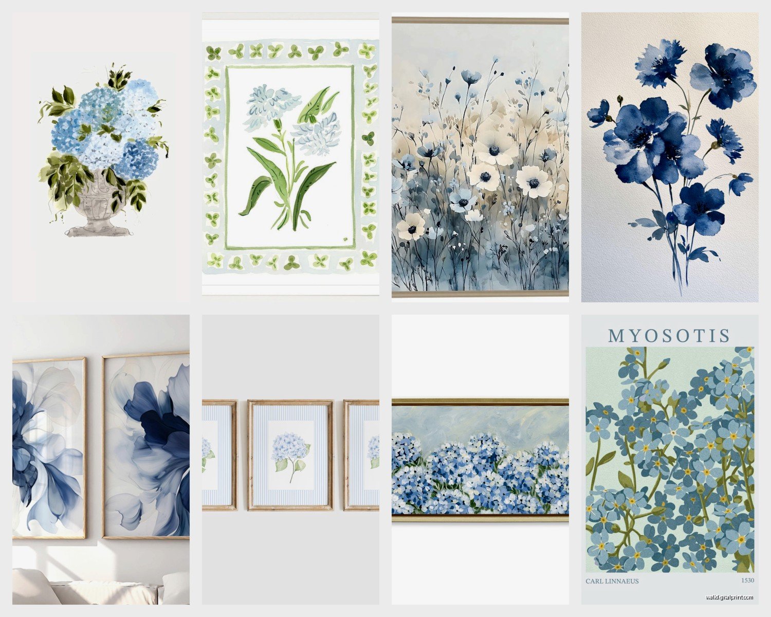
Minted has been surprisingly consistent for me. Their artists actually understand color calibration and the paper quality is decent. I got this set of three blue hydrangea prints for a client’s bathroom and they still look good two years later, no fading. They’re pricier but you’re paying for quality control.
Society6 is hit or miss—I order samples now before committing to large pieces. Their blue delphinium prints are gorgeous but size up because they tend to run smaller than you think. Oh and another thing, their frames are trash. Just get the print and frame it yourself.
Artfully Walls does these vintage botanical reproductions that are *chef’s kiss* for blue florals. They have actual antique botanical illustrations that they’ve restored and the blues are just… they’re that faded vintage blue that looks expensive? I used their morning glory set in a dining room and people always ask about it.
The IRL Shopping Strategy
HomeGoods and TJ Maxx actually have decent blue floral art sometimes but you gotta go weekly because it moves fast. I found this massive blue peony canvas there for like $40 that would’ve been $200+ anywhere else. The catch is you can’t be picky about the exact flower or shade—you take what you find.
Local art fairs are where I’ve found my favorite pieces though. Artists who do watercolor botanicals in blues often sell prints of their originals for reasonable prices. Plus you can see the actual colors in person which is huge.
Sizing This Stuff Correctly Because Everyone Gets This Wrong
Wait I forgot to mention—the biggest mistake I see is people buying art that’s too small for their wall. Your blue floral piece should take up roughly two-thirds to three-quarters of the furniture width below it. So if you’ve got a queen bed that’s 60 inches wide, you want art that’s at least 40 inches across.
For gallery walls with multiple blue botanical prints, I do this thing where I cut out paper templates in the sizes I’m considering and tape them up first. Sounds extra but I’ve saved myself so many times from buying the wrong sizes.
Single large statement pieces work best over:
- Beds (obviously)
- Sofas where you want a focal point
- In entryways to set the tone
Multiple smaller pieces in a grid or gallery wall work better:
- In hallways
- Above console tables
- In bathrooms where one big piece feels weird
Mixing Blue Florals With Your Existing Stuff
This is gonna sound weird but blue floral art works with basically any color scheme if you pick the right shade of blue. I’ve put ocean-blue botanicals in rooms with:
Warm wood tones—the contrast is actually amazing. Cool blues make warm woods look richer somehow.
Gray walls—but you gotta make sure your blue has enough saturation or it’ll just disappear. Go for deeper teals or bright sky blues.
White walls—this is easy mode, everything works.
Beige or tan—okay so funny story, I thought this would look terrible but I did a client’s bedroom with blue delphinium prints over a tan upholstered bed and it’s one of my favorite projects ever. The blue makes the beige look intentional instead of boring.
The Actual Flowers That Look Best in Blue
Not all flowers look good illustrated in blue, even if they exist in blue varieties IRL. Through trial and error (so much error), here’s what actually works:
Top tier choices:
- Hydrangeas—they’re naturally blue sometimes so it looks believable
- Delphiniums—tall and dramatic, perfect for vertical spaces
- Morning glories—give you that vintage botanical illustration vibe
- Irises—elegant without being fussy
- Forget-me-nots—great for smaller prints or details
- Cornflowers—underrated, very cottage-meets-contemporary
Surprisingly good:
- Peonies in blue—shouldn’t work but does if the artist is good
- Anemones—the dark centers contrast nicely with blue petals
- Cherry blossoms in blue tones—very Japanese woodblock print energy
Skip roses in blue unless you’re going for a really stylized look. They tend to look artificial or like someone just changed the color in Photoshop.
Framing Without Spending Your Entire Paycheck
Custom framing is insanely expensive. I’m talking $300+ for a single piece sometimes. Here’s how I get around it:
Buy standard size prints (8×10, 11×14, 16×20, 24×36) so you can use ready-made frames. Michael’s and Hobby Lobby have decent frames if you catch them on sale—and they’re literally always on sale, just wait.
For that expensive gallery look, go with simple frames. White or natural wood for a light airy feel, black for more drama. The art should be the star, not the frame.
Mat your prints if they’re smaller—it makes a cheap print look way more expensive. A $15 print in a $25 frame with a mat can look like a $200 piece if you do it right.
Framebridge is good for when you actually need custom sizing and don’t wanna deal with a local framer. Not cheap but cheaper than most frame shops and they do a nice job.
Creating Sets That Actually Look Cohesive
My client canceled last week so I spent like an hour comparing different approaches to this. If you want multiple blue floral pieces that look like they belong together:
Option 1: Same artist, different flowers
This is the easiest route. Find an artist whose style you like and get multiple pieces from them. The consistency in technique makes everything look intentional.
Option 2: Same flower, different blues
Get three prints of hydrangeas for example, but in different shades—light sky blue, medium ocean blue, deep teal. Hang them in a row.
Option 3: Vintage botanical illustration set
Those old-school botanical drawings with the Latin names and everything. You can find sets of 4, 6, or 8 that are meant to go together. Very library-chic.
Option 4: Mix blue florals with neutral botanicals
This is what I do most often actually. Combine blue flower prints with black and white or sepia botanical illustrations. The blue pieces become accents and you can change them out seasonally if you want.
Placement Tips That Actually Matter
Height-wise, center your art at 57-60 inches from the floor. This is “gallery height” and it really does look better than just eyeballing it. I use a laser level now because I got tired of rehanging things.
In bedrooms, leave at least 6-8 inches between the top of your headboard and the bottom of your art. More if your headboard is really tall.
Don’t hang art where it’ll get direct sunlight for hours every day. Blues fade faster than you’d think, especially in cheaper prints. I learned this the hard way with a piece in my breakfast nook—had to replace it after a year.
Group odd numbers of pieces (3, 5, 7) rather than even numbers. It’s more visually interesting for some reason, our brains like it better.
Styles to Consider Beyond Basic Prints
Watercolor Blue Florals
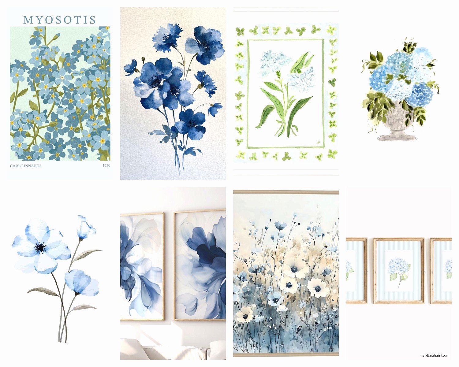
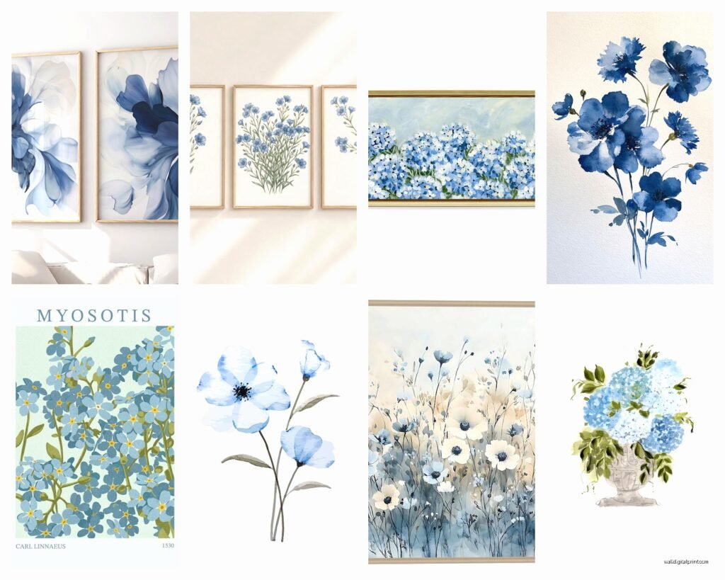
These have that soft, organic feel. Great for bedrooms or spaces where you want calm energy. The colors bleed into each other which gives you movement without being busy.
Vintage Botanical Illustrations
More structured, scientific-looking. Perfect for offices, libraries, or if you’re going for that dark academia aesthetic everyone’s into.
Abstract Blue Florals
When you want the idea of flowers without literal petals and stems. These read more as modern art and work in contemporary spaces.
Photography of Blue Flowers
Can be stunning but make sure it’s actually good photography. Bad flower photography just looks like someone’s Instagram from 2012.
Pressed Flower Art in Blues
Real preserved flowers under glass. More delicate and precious-feeling. I use these in smaller spaces like powder rooms.
Common Problems and How to Fix Them
Problem: Your blue floral art looks washed out on the wall
Your wall color is probably too close in value to the art. Either go with darker/richer blues in your art or change your wall color. Or add a dark mat to create separation.
Problem: It looks too feminine or traditional
Mix it with modern elements—geometric furniture, metal accents, concrete or stone textures. Or choose more abstract/stylized blue florals instead of realistic ones.
Problem: The room feels cold now
Add warm wood tones, brass or gold accents, and warm-toned textiles. Blues need warm elements to balance them out unless you’re specifically going for that cool Scandinavian thing.
Problem: You bought it and now you hate it
This happens to everyone, don’t feel bad. Try it in a different room before giving up on it. I’ve had pieces that looked terrible in a living room but perfect in a bathroom. Different lighting changes everything.
Budget Breakdown for Different Approaches
If you’ve got like $50 total: Hit up printable art on Etsy, print at a local print shop on good paper, frame from Target or Ikea. Done.
$100-200 range: Society6 or Minted print plus a decent frame. Or one larger vintage botanical reproduction.
$200-500: Multiple quality prints professionally framed, or one really nice original watercolor from a local artist.
Over $500: Original art, custom framing, or a curated gallery wall with mixed mediums and sizes.
I usually tell people to start small—get one piece you really love and live with it before committing to a whole wall. Your taste might change, or you might realize you actually wanted teal instead of sky blue or whatever.
Oh and one more thing—take pics of your wall and the space before you shop. I cannot tell you how many times I’ve bought art thinking it would work and gotten home to realize the proportions are all wrong. Having reference photos on your phone saves so much hassle.