
Wall Art Guide, Wall Art Tutoriels
Wall Art for Men’s Apartment: Masculine Single Guy Space
Aug
So I just spent like three hours helping my friend Mike transform his apartment from looking like a college dorm into something actually decent, and honestly the wall art made the biggest difference. He kept saying “I don’t want it to look too decorated” which is such a guy thing to say but I get it.
Start with Scale Because Most Guys Go Too Small
Okay so the biggest mistake I see is buying art that’s way too small for the wall. Like you’ve got this massive blank wall above your couch and you hang one 16×20 print and it just looks sad and lost up there. You want your main piece to take up about two-thirds to three-quarters of the furniture width below it. So if your couch is 84 inches, you’re looking at something around 50-60 inches wide minimum.
I usually tell people to tape out the dimensions with painter’s tape first because it sounds annoying but you’ll actually see what works. Did this with my brother’s place and he was gonna buy something way smaller until we taped it out.
The Black and White Photography Route
This is probably the easiest way to go and doesn’t look like you’re trying too hard. Black and white photography just works in masculine spaces. I’m talking:
- Architectural shots of cities or buildings
- Vintage cars or motorcycles
- Mountain ranges or dramatic landscapes
- Abstract close-ups of materials like wood grain or metal
- Sports photography if you’re into that
The trick is getting them printed large and in actual frames, not those cheap poster frames from Target. I know frames are expensive but they make such a difference. Black metal frames or natural wood both work great for this vibe.
Abstract Art That Doesn’t Look Feminine
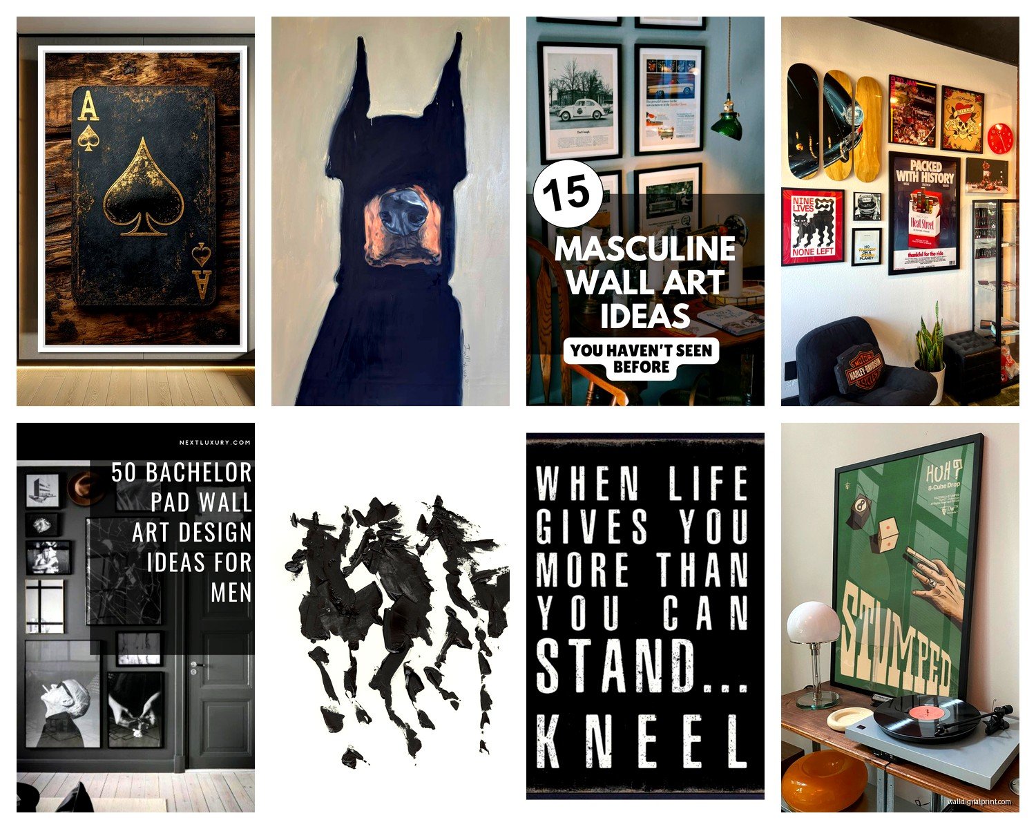
Wait I forgot to mention this earlier but abstract art is actually perfect for guys who don’t want anything too literal. You want pieces with darker colors or neutrals, geometric shapes rather than flowing organic ones. Think navy, charcoal, rust, deep green, black, white, maybe some gold or copper accents.
I found this one piece at an estate sale last month while my dog was at the groomer and it was all layered grays and blacks with texture, looked almost industrial. That’s the vibe you’re going for. Stay away from anything with too much pink, purple, or those watery pastel colors unless that’s genuinely your thing.
Where to Actually Buy This Stuff
Okay so here’s what I’ve learned from decorating like dozens of bachelor pads at this point:
Etsy is actually great for downloadable prints that you can get printed at Costco or a local print shop for cheap. Search for “masculine wall art” or “industrial abstract” or “black and white architecture.” You can get a digital file for like $5-15 and print it huge for another $20-30.
Society6 and Minted have tons of options and they do the printing and framing for you. More expensive but less hassle. Their sales are actually good though so wait for like 20% off.
Local art fairs and markets if you want something unique. I know it sounds like effort but you can find really cool stuff and usually negotiate prices. Plus then you have a story about where you got it which people always ask about.
Vintage stores and estate sales for maps, blueprints, old advertisements, botanical prints. These look sophisticated without being too precious.
Maps and Vintage Prints
Oh and another thing, maps are incredibly underrated for masculine spaces. Old nautical charts, vintage city maps, topographical maps, star charts. They add visual interest without being too decorative and they’re conversation starters. You can frame an old map of your city or somewhere meaningful to you.
Same with vintage patent drawings or blueprints. There’s something inherently masculine about technical drawings and they look really sharp in simple black frames. You can find prints of old car patents, airplane designs, architectural blueprints, whatever matches your interests.
The Gallery Wall Approach
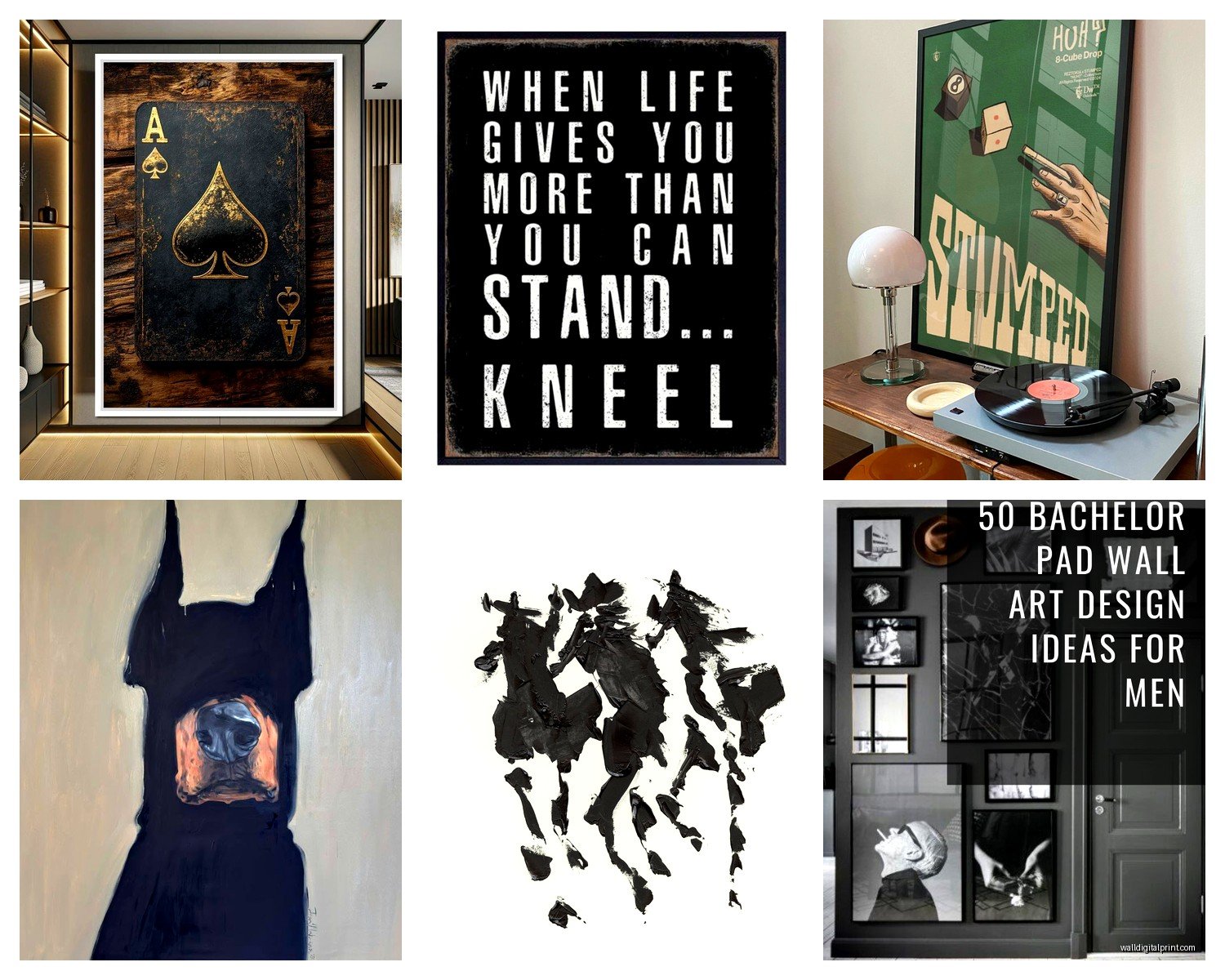
This is gonna sound weird but gallery walls are actually easier than finding one perfect large piece. You can mix different sizes and it looks intentional. The key is keeping a consistent color palette and frame style.
Here’s how I usually set them up:
- Lay everything out on the floor first and take a picture
- Keep 2-3 inches between frames
- Mix horizontal and vertical orientations
- Put your largest piece slightly off-center as an anchor
- Don’t make it too symmetrical or it looks corporate
I literally spent my entire Saturday doing this for a client and we used all black frames with a mix of black and white photos, one charcoal abstract piece, and a vintage motorcycle advertisement. Looked really cohesive but not matchy-matchy.
Subject Matter That Works
Okay so beyond just style, what should actually be in the art. Based on what I’ve seen work well:
Nature but make it dramatic. Not like cute watercolor flowers but mountains, forests shot in black and white, ocean waves, desert landscapes. Ansel Adams style stuff. Makes a space feel grounded without being too soft.
Urban and industrial scenes. City skylines, bridges, old factories, street photography. Adds energy and edge to a space.
Your actual hobbies. If you surf, get surf photography. Into music, vintage concert posters or album covers look great blown up and framed. Rock climbing, mountain photography. This sounds obvious but so many guys just buy generic art when they could showcase what they actually care about.
Minimalist line art. Simple line drawings of faces, bodies, objects. Very modern and sophisticated looking. Just don’t go overboard or it starts looking like every Instagram apartment.
Avoiding the Typical Bachelor Pad Cliches
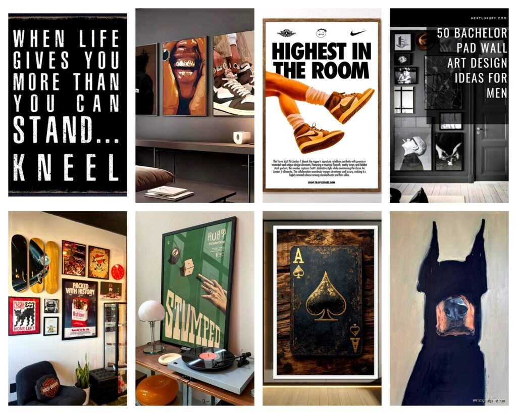
Look I’m gonna be honest with you, some things are just overdone. The Scarface poster, Bob Marley, Fight Club, those motivational quote prints. If you genuinely love them fine but they don’t really elevate a space.
Same with those mass-produced “canvas prints” from HomeGoods that everyone has. You know the ones, like a dandelion or the Eiffel Tower or “Live Laugh Love” type stuff. They read as trying to fill space rather than actual decorating.
Sports jerseys can work but frame them properly. Don’t just thumbtack them to the wall. Get them professionally framed with matting and suddenly they look like actual art pieces.
Texture and Dimension
Wait I forgot to mention that not everything needs to be flat. Three-dimensional wall art adds so much interest. Metal wall sculptures, wooden pieces, woven wall hangings in neutral colors, floating shelves with objects on them.
I found this cool metal geometric wall sculpture at West Elm last month and it completely transformed my client’s dining room wall. Added depth and caught the light in interesting ways. You can find similar stuff on Etsy or even make your own if you’re handy.
Floating shelves with a few carefully chosen objects can act as art. Stack some books, add a small plant, maybe a vintage camera or interesting rock. It’s functional and decorative.
Color Coordination Without Being Weird About It
You don’t need everything to match perfectly but having a general color story helps. If your couch is gray and you’ve got navy accents, look for art with those tones. Doesn’t mean every piece needs navy in it, just that the overall palette feels cohesive.
Earth tones work great in masculine spaces. Think rust, olive green, tan, brown, charcoal, navy, black, white, maybe some burnt orange or deep red as accents. Metallics like gold, copper, and bronze add warmth without being feminine.
Installation Tips That Actually Matter
Okay so you’ve got your art, now you gotta hang it properly. Eye level is around 57-60 inches from the floor to the center of the artwork. For stuff above furniture, leave 6-8 inches between the furniture top and the bottom of the frame.
Use proper hanging hardware. Those little sawtooth hangers that come with cheap frames are terrible. Get D-rings and picture wire or use heavy-duty picture hangers. Nothing worse than art crashing down at 2am because you used a pushpin or whatever.
Command strips work for lighter pieces but check the weight limit. I’ve had mixed results with them honestly. They’re great for renters who can’t put holes in walls but make sure you’re following the instructions exactly.
Lighting Makes a Huge Difference
This is gonna sound extra but adding lighting to your art elevates everything. Picture lights above large pieces, track lighting, even just positioning a floor lamp to wash light across a wall. It makes your art look intentional and gallery-like.
My apartment has terrible overhead lighting so I added some clip lights above my favorite pieces and it completely changed how the room feels at night. You can get battery-operated picture lights now too which is pretty convenient.
Budget-Friendly Options
Look you don’t need to spend thousands on art. Some of my favorite solutions are basically free:
- Print your own photography if you take decent photos
- Frame pages from old books or vintage magazines
- Use fabric or tapestries as wall hangings
- Make your own abstract art with paint and canvas from the craft store
- Frame interesting paper like old maps, sheet music, or architectural drawings
I literally made three abstract pieces for my brother’s apartment using black and white acrylic paint, some metallic gold, and cheap canvases from Michael’s during a sale. Took maybe two hours total and they look like something from West Elm. Just layer paint, add texture with a palette knife, don’t overthink it.
The One Splurge Piece Approach
If you’re gonna spend money on one thing, make it a large statement piece for your main living area. Something over the couch or the bed. Everything else can be more budget-friendly but that one piece sets the tone for your whole space.
I usually recommend spending $200-500 on this piece if you can swing it. Sounds like a lot but it’s furniture-level impact for way less than buying a new couch or whatever.
Common Mistakes I See All the Time
Hanging everything too high. Seriously this is epidemic. People hang art way above eye level and it makes the room feel weird. When in doubt, go lower than you think.
Not committing to a style. Mixing styles can work but you need some thread connecting everything. All the same frames, or all the same color palette, or all photography, something.
Filling every wall. Negative space is important. You don’t need art on every single wall. Sometimes a blank wall next to a decorated one creates nice balance.
Buying art that’s too trendy. Those word art prints were everywhere five years ago and now they feel dated. Same with some of the geometric stuff that was huge for a while. Classic photography and abstract pieces age better.
Okay so I think that covers most of what I’ve learned from doing this for years. The main thing is just to pick stuff you actually like and not worry too much about rules. Your space should feel like you, not like a catalog. But yeah, go bigger than you think, frame stuff properly, and you’re gonna be fine.
