Wall Art Guide, Wall Art Tutoriels
Kitchen Wall Art Modern: Contemporary Cooking Space Designs
Aug
So I’ve been obsessing over kitchen wall art lately because my own space looked so sterile and honestly kinda sad, and I figured out some stuff that actually works without making your kitchen look like a TJ Maxx exploded in there.
The Scale Thing Nobody Tells You About
Okay so here’s what I learned the hard way – that cute 8×10 print you love? It’s gonna look like a postage stamp on your kitchen wall. I hung this adorable abstract piece above my coffee station and had to redo it like three days later because it just… disappeared. Kitchen walls are huge, especially that space above your table or the blank wall near your stove, and you need art that can hold its own against all the cabinets and appliances.
Go for at least 24×36 if you’re doing a single piece. Or do a gallery wall with multiple pieces, but we’ll get to that in a sec because there’s a whole thing about humidity and grease that’ll make you rethink your choices.
Materials That Won’t Get Gross
This is gonna sound weird but I learned this after watching a client’s beautiful canvas print get this weird film on it after six months. Kitchens are basically hostile environments for art – you’ve got steam, grease particles floating around, temperature changes, and if you cook as much as I do (which honestly isn’t that much but still), everything gets this layer of… stuff.
What actually works:
- Acrylic prints or art behind glass – the grease just wipes off
- Metal prints – these are amazing and super modern looking, plus they’re waterproof
- Framed prints with glass covering – but make sure the frame is sealed well
- Ceramic or tile art pieces – actually perfect for kitchens when you think about it
What I’d avoid:
- Raw canvas unless it’s far from your cooking area
- Fabric wall hangings – they’re dust and grease magnets
- Anything with a lot of texture that’ll trap gunk
I have this metal print of abstract vegetables (I know, sounds cheesy but it’s actually cool) right near my stove and it’s been there for like two years. I just wipe it down when I clean and it still looks new.
The Color Situation
So everyone says to match your art to your kitchen colors but that’s only half right. What actually matters is contrast and mood. My kitchen is all white and light wood – super minimalist – and I initially tried to keep everything neutral. Looked boring as hell.
Then I added this massive black and white geometric piece with just a pop of terracotta, and suddenly the whole space felt intentional instead of just… empty. The key is picking one or two accent colors from your art that either match OR deliberately contrast with your kitchen.
If you’ve got a neutral kitchen like mine, you can go bold with your art. If your kitchen already has color – like colorful cabinets or a bright backsplash – stick with more subdued art so it doesn’t get chaotic.
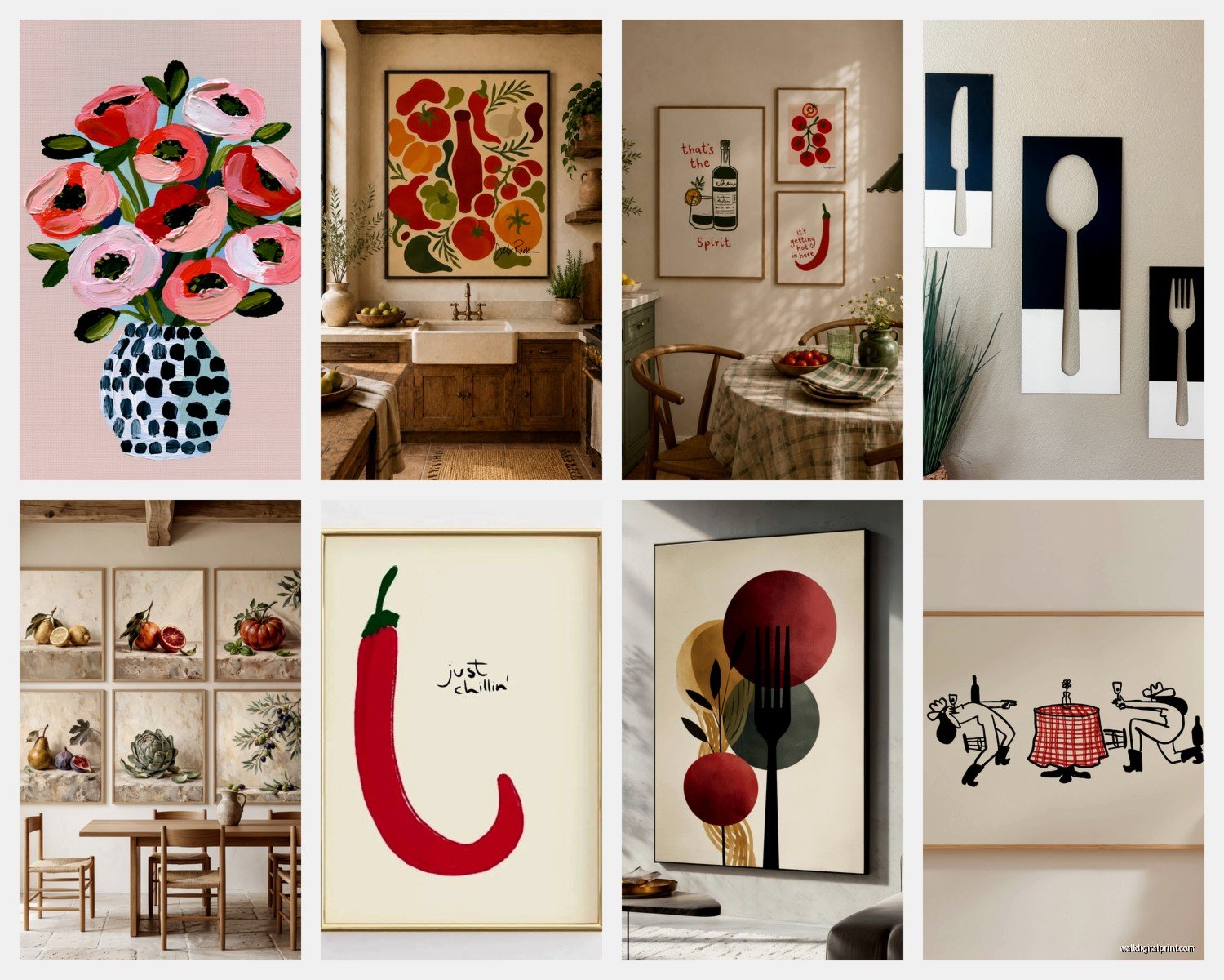
Oh and another thing, metallics are your friend in modern kitchens. Gold, copper, brass accents in your art tie in beautifully with hardware and fixtures. I found this abstract piece with gold leaf details at a local gallery and it picks up the brass handles on my cabinets perfectly.
Gallery Walls vs Single Statement Pieces
Okay so I flip-flop on this constantly. Gallery walls look amazing on Instagram but they’re kinda high maintenance in kitchens? Here’s why – you need to clean each piece individually, and if one piece gets damaged or you hate it later, you’ve got this whole composition to rethink.
That said, I did a gallery wall in my breakfast nook and it works because it’s away from the actual cooking area. I used all matching black frames with different modern food photography – close-ups of coffee beans, pasta shapes, olive oil bottles, that kind of thing. Very monochromatic and graphic.
For gallery walls in kitchens:
- Keep frames consistent – all black, all white, or all natural wood
- Stick to a theme (all food-related, all abstract, all line drawings)
- Use a grid layout instead of the organic salon-style thing – kitchens need structure
- Plan it on the floor first because patching holes in kitchen walls is annoying
But honestly? If you want low-maintenance modern, one large statement piece is the way to go. I’m talking 40×60 or bigger if your wall can handle it.
What Actually Looks Modern
This is subjective but after styling probably thirty kitchens at this point, here’s what reads as contemporary and not trying-too-hard:
Abstract geometric shapes – clean lines, bold colors or black and white, nothing too busy. I love anything with circles, arches, or architectural elements.
Line drawings – super minimalist single-line illustrations of vegetables, herbs, kitchen tools. There’s this one artist I follow who does continuous line drawings of cooking scenes and they’re perfect.
Oversized food photography – but make it editorial, not cutesy. Think a dramatic black and white shot of a single lemon, not a cartoon cupcake with a smiley face.
Typography prints – controversial maybe but a well-designed text piece can work. I have “SALT FAT ACID HEAT” in this gorgeous modern typeface and people always comment on it.
Abstract expressionism vibes – bold brushstrokes, interesting color combinations, movement. Adds energy without being literal.
What doesn’t work? Those “EAT” signs, anything with fake vintage advertising, roosters (sorry if you love roosters), anything too country farmhouse unless that’s your whole vibe.
Placement That Makes Sense
So placement is where people mess up constantly. Just because there’s a wall doesn’t mean art should go there.
Above the dining table – this is prime real estate. Center your piece or gallery wall above the table, and the bottom of the frame should be about 8-10 inches above the table surface if you’re not using a chandelier.
On the wall opposite your sink – you stare at this wall constantly while doing dishes, might as well make it interesting. I put a triptych here (three connected panels) and it makes cleanup less boring.
Above open shelving – if you have that trendy open shelving situation, a piece of art above it creates a focal point and draws the eye up.
That weird narrow wall next to the fridge – perfect for a tall vertical piece or a series of small prints stacked vertically.
Wait I forgot to mention – measure everything before you buy. I cannot stress this enough. I’ve bought art that seemed perfect and then got it home and it was completely wrong for the space. Take actual measurements, and use painter’s tape to mark out the dimensions on your wall before committing.
Budget Reality Check
You don’t need to spend a fortune but you also can’t just print something from Google Images and expect it to look high-end. My cat knocked over my coffee while I was researching this earlier so now my notes are stained but whatever.
Affordable sources that don’t look cheap:
- Minted – their art prints are actually good quality and they have modern options
- Etsy – search for “modern kitchen art print” and filter by digital download, then get it printed at a local print shop on good paper
- Society6 – hit or miss but they have sales constantly
- Local art fairs – you can find original pieces for reasonable prices
- Your own photography – seriously, if you take a good photo, blow it up
I spent maybe $150 on my main kitchen art piece (a large acrylic print) and under $50 each for the smaller ones. Frame costs add up though – budget for that separately. IKEA frames are fine for behind-glass prints but invest in better frames for your statement pieces.
The Frame Thing
Frames totally make or break the modern look. Thin black metal frames are having a moment and they work beautifully in contemporary kitchens. Natural wood frames in light oak or walnut are good too – they add warmth without going rustic.
Avoid ornate frames, thick white matting (unless you’re going for gallery vibes), and anything with distressing or antiquing. Clean and simple is the move.
Lighting Considerations Nobody Talks About
Okay so this might seem extra but lighting affects how your art looks SO much. If you have a piece you really love, consider adding a picture light or positioning it where natural light hits during the day. I added an LED strip light above my main piece and it completely transformed how it looked at night.
Also be careful about direct sunlight – it’ll fade your prints over time. I learned this the hard way with a print in my breakfast nook that gets morning sun. Now I use UV-protective glass for anything in sunny spots.
Themes That Work Without Being Cheesy
The food theme is obvious but it can go wrong fast. If you’re gonna do food-related art, make it artistic. Think:
- Botanical prints of herbs in a modern style
- Abstract interpretations of ingredients
- Vintage-style botanical drawings (not cutesy, actual scientific illustration style)
- Coffee or wine-themed art if that’s your thing, but make it sophisticated
Or skip food entirely and go with:
- Abstract art in colors you love
- Black and white photography of architecture or nature
- Minimalist landscapes
- Geometric patterns that add visual interest
I actually have zero food-related art in my kitchen now and it works better. I have this abstract piece with ochre and navy that just makes me happy every time I see it, and that matters more than being literally kitchen-themed.
Installation Tips So You Don’t Screw Up Your Walls
Use proper hardware – those command strips are fine for lighter pieces but anything substantial needs actual picture hanging hardware. I use D-rings and picture wire for most things, or sawtooth hangers for smaller frames.
For heavy pieces like metal prints or large canvases, find the studs. Use a stud finder (they’re like $10) and mark them with pencil. If you can’t hit a stud, use proper drywall anchors rated for the weight.
Level is crucial in kitchens because you have so many horizontal lines – counters, cabinets, shelves – that’ll make a crooked piece super obvious. Use a level, not your eyeballs.
Mixing Styles Without Looking Confused
So I see people trying to match every single piece perfectly and it ends up looking sterile. You can mix different styles as long as there’s a connecting thread – similar colors, similar frames, similar mood, whatever.
In my kitchen I have that abstract piece I mentioned, plus three smaller line drawings in the same color family, and it works because the frames match and the overall vibe is minimalist even though the styles are different.
Just don’t mix too many competing focal points. If you have a bold backsplash, tone down the art. If your art is bold, keep everything else simple.
Maintenance Real Talk
You’re gonna need to clean your kitchen art. Just accept it. I wipe down my pieces maybe once a month with a slightly damp microfiber cloth. For glass-covered art, regular glass cleaner works. For metal prints, just water is fine.
If you notice grease buildup, deal with it immediately because it gets harder to remove over time. This is why I’m such a fan of wipeable surfaces for kitchen art – it’s just practical.
Also rotate your art seasonally if you want to keep things fresh. I have a few pieces I swap out and it makes the space feel new without spending money. Store the extras properly wrapped in a closet.
Anyway that’s basically everything I’ve figured out through trial and error and watching what actually holds up in real kitchens versus what just looks good in staged photos. Start with one piece you genuinely love and build from there instead of trying to do everything at once.