Wall Art Guide, Wall Art Tutoriels
Over Couch Wall Art: Above Sofa Living Room Focal Point
Aug
So I was literally just helping my sister hang art above her new sectional last weekend and oh my god, the amount of times we remeasured everything because she kept second-guessing the height. But okay, let me walk you through what actually works because I’ve done this probably like fifty times at this point between client homes and redoing my own living room twice.
The Whole Size Thing Everyone Gets Wrong
First thing – and I cannot stress this enough – your art needs to be big enough. Like, way bigger than you think. I see so many people hang these tiny little pieces above a massive sofa and it just looks lost. The general rule I follow is that your art (or gallery wall) should take up about two-thirds to three-quarters of your sofa’s width. So if you’ve got an 84-inch couch, you’re looking at something in the 56 to 63-inch range width-wise.
Single large pieces work amazing if you want that dramatic look. I’m talking like 40×60 inches or bigger. My client last month went with this massive abstract canvas that was 48×72 and it completely transformed her bland beige living room. She was terrified it would be too much but honestly it’s the first thing everyone comments on now.
Gallery Wall vs Single Piece
Okay so here’s where it gets tricky. Gallery walls are having a moment and they can look incredible but they’re also way harder to execute. If you’re not super confident with spacing and arranging, start with a single large piece or maybe a diptych or triptych situation.
For gallery walls above the couch, I usually map everything out on the floor first. Like literally arrange all your frames on the ground in the configuration you want, then measure the outer dimensions of the whole arrangement. That total size should still follow that two-thirds rule I mentioned.
Height Is Where Everyone Screws Up
The bottom of your frame should be 6 to 12 inches above the back of your sofa. Not the seat cushions, the actual back. I usually aim for 8 inches because it looks balanced without feeling floaty. My sister wanted to go higher because she was worried about her kids touching it and I had to literally show her photos of how weird it would look.
Here’s the thing though – if you have really high ceilings, you might need to adjust. The center of your artwork should ideally be at eye level, which is around 57 to 60 inches from the floor. So you gotta find that sweet spot between the 8-inch-above-couch rule and the eye-level rule. Sometimes they conflict and you just have to use your gut.
What If You Have Tall Ceilings
Oh and another thing – in rooms with like 10+ foot ceilings, you can go taller with your art too. Think vertical pieces or stack smaller frames vertically to draw the eye up. I did this in a client’s brownstone and we used three stacked canvases that went up about 6 feet total. Looked insane in the best way.
Actual Art Styles That Work
So what you hang obviously depends on your vibe but let me tell you what I’ve seen work consistently:
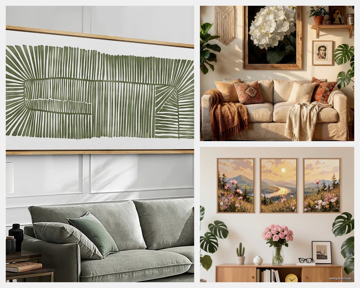
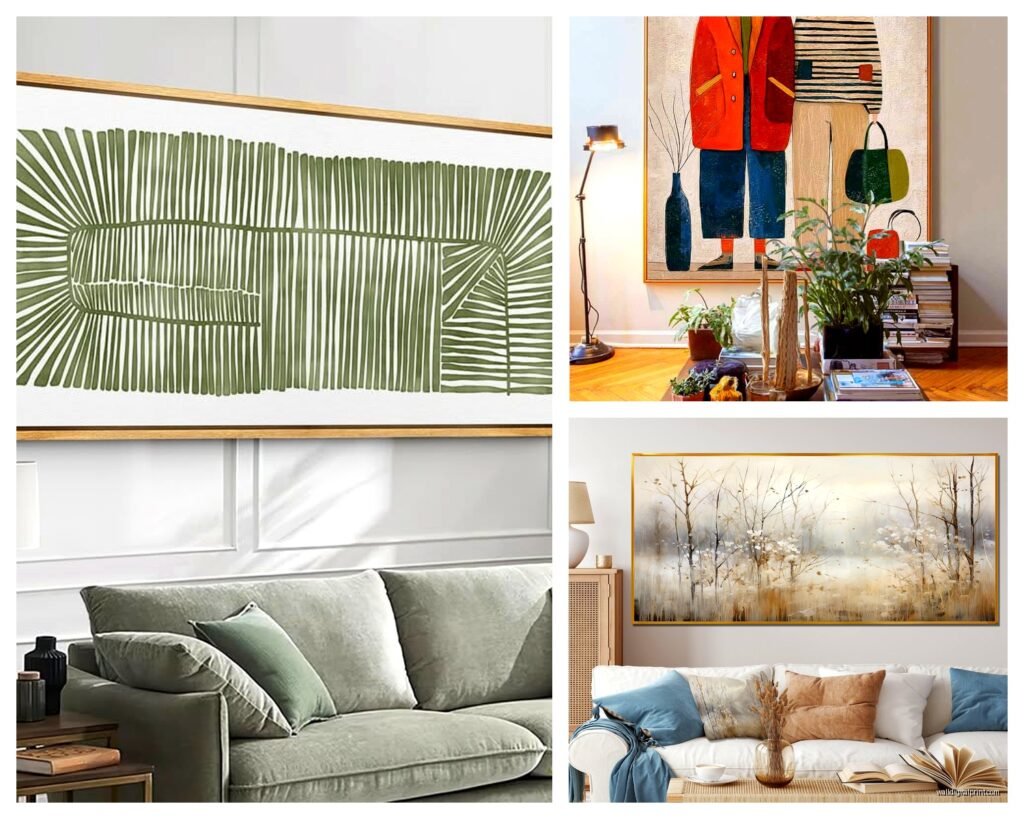
- Large abstract pieces – these are like foolproof honestly, they add color and interest without being too specific
- Black and white photography in oversized prints – super sophisticated and works with literally any color scheme
- Botanical prints or nature scenes – if you want something calming, this is it
- Geometric or line art – great for modern spaces
- Vintage maps or architectural drawings – adds character without being too personal
What I tell people to avoid: family photos above the couch unless they’re done really artfully. Like you can do a black and white family portrait that’s more editorial-style, but the typical family photo collage reads more as a hallway thing than a focal point situation.
Color Coordination Without Being Matchy-Matchy
This is gonna sound weird but I actually don’t think your art needs to match your pillows or whatever. It should complement the room but in a way that feels natural. Pull one or two colors from your existing palette and look for art that incorporates those, but don’t stress if there’s other colors in there too.
My own living room has mostly neutral furniture with navy accents, and I hung this massive piece that has navy, rust orange, and cream. The orange wasn’t in my room at all before but now it ties everything together and gave me an excuse to add some terracotta accessories.
Frames Matter More Than You Think
Okay so funny story – I once spent three hours at a framing shop because I couldn’t decide between black and natural wood frames. The frame can completely change how art reads in a space.
For modern or contemporary spaces, go with simple frames – thin black metal, natural wood, or even no frame if it’s a canvas. For traditional rooms, you can do chunkier frames with more detail. White frames work great in coastal or farmhouse-style spaces.
If you’re doing a gallery wall, I actually think mixing frame styles can look really good as long as there’s some unifying element. Like all black frames in different styles, or all wood tones but different finishes.
The Actual Hanging Process
Right so you’ve got your art, now you gotta hang it without losing your mind. Here’s my process:
First, measure your sofa width and mark the center point on the wall with a light pencil mark. Then measure your art and find its center. These two centers should align.
Wait I forgot to mention – use a level. Like a real level, not the app on your phone. I’ve been burned by phone levels too many times. They’re just not accurate enough when you’re dealing with large pieces.
For heavy pieces over like 20 pounds, you need proper anchors. Drywall anchors for drywall, or if you can hit a stud, even better. I carry a stud finder in my car at all times now because of how often I need it.
The Two-Nail Trick
For larger pieces, use two nails or hooks instead of one. It keeps things from tilting and is way more secure. Space them apart evenly based on the hardware on your frame. This was a game-changer when I learned it because I used to have this one piece that would go crooked every time someone walked heavily through the room.
Lighting Changes Everything
Something people don’t think about enough – how is your art lit? Natural light is great during the day but what about evening? I usually recommend adding either picture lights or adjusting existing lighting to highlight the artwork.
Track lighting or adjustable can lights work great if you have them. Aim the light at about a 30-degree angle to avoid glare. If you don’t have built-in options, battery-operated picture lights have gotten really good. I installed some for a client who was renting and couldn’t do any electrical work.
Budget-Friendly Options That Don’t Look Cheap
Let’s be real, original art is expensive. Here’s what I do when budget is tight:
- Print shops like Minted or Artfully Walls have really good prints that look way more expensive than they are
- Etsy has tons of downloadable prints you can get printed at a local print shop for cheap
- Thrift stores sometimes have amazing frames you can repaint and put new art in
- Create your own abstract art – I’m serious, some of the best pieces I’ve seen are DIY abstracts
My own above-couch piece is actually a print I got on Etsy for like $40 and had printed at a local place for another $60, then framed at Michael’s with a coupon for $80. Total cost under $200 for something that looks like it cost way more.
What About Shelves Instead
Oh wait, you could also do floating shelves instead of traditional hanging art. This gives you flexibility to change things up and add dimension. I did this in my last apartment and it was perfect because I could switch out art and objects seasonally without putting new holes in the wall.
If you go this route, install sturdy floating shelves about 8-10 inches above the sofa back. Then lean art on them and add some objects like small plants, books, or sculptural pieces. Just make sure everything is secure – you don’t want things falling on people’s heads.
Common Mistakes I See All The Time
- Hanging things too high – creates this weird floating effect
- Going too small with the art – looks like an afterthought
- Not considering the sofa’s style – ornate gold frames don’t really work above a modern leather sectional
- Forgetting about the TV if you have one nearby – make sure your art placement makes sense with your whole wall layout
- Using command strips for heavy art – they have weight limits for a reason
The TV Situation
Speaking of TVs, if you have your TV on the same wall as your sofa… okay that’s a different layout obviously. But if your TV is across from your sofa and you’re worried about the art competing with it, don’t stress. They serve different purposes. Just make sure your art is interesting enough to hold its own when the TV is off.
Switching Things Up Over Time
One thing I love about above-couch art is that it’s relatively easy to change out if you get bored. I swap mine every couple years or when I redecorate. The nail holes are easy to patch and repaint.
My cat knocked over a plant onto my last piece and ruined it, which was actually kind of a blessing because I was ready for something new anyway. Now I have a rule about no plants on the same wall as art after that disaster.
Quick Measurement Cheat Sheet
Since I just helped my sister with this, here’s what I texted her to reference:
- Art width: 2/3 to 3/4 of sofa width
- Height above sofa: 6-12 inches, aim for 8 inches
- Center of art: around 57-60 inches from floor
- For gallery walls: treat the entire arrangement as one piece for sizing
- Spacing between multiple pieces: 2-3 inches usually looks good
The most important thing honestly is just to commit. I see people leave walls blank for months because they’re overthinking it. Get something up there, live with it for a bit, adjust if needed. It’s not surgery, you can always change it.
And seriously, measure twice, nail once. Or in my sister’s case, measure five times because she’s paranoid, but whatever works. She’s happy with how it turned out now even though she stressed about it for like three weeks beforehand.