Wall Art Guide, Wall Art Tutoriels
Wall Art Modern Living Room: Contemporary Main Space Styling
Sep
So I just spent like three hours rearranging my client’s living room art and honestly it got me thinking about how weirdly complicated this whole modern wall art thing is when it really shouldn’t be, you know?
Start With Your Actual Wall Space Not Pinterest
Okay first thing – measure your wall. I know, boring, but I watched someone buy this massive abstract piece last month and it literally covered their window trim. The rule I use is your art should take up about 60-75% of your furniture width below it. So if your sofa is 90 inches, you’re looking at something around 54-68 inches wide. Or a gallery wall that fills that space.
But here’s where it gets tricky with modern pieces – a lot of contemporary art is MEANT to have breathing room. Like those minimalist line drawings everyone’s obsessed with? They actually look better smaller than you’d think because the negative space around them becomes part of the whole vibe.
The Height Thing That Everyone Gets Wrong
Mount your art so the center sits at 57-60 inches from the floor. That’s basically eye level for most people. But – and this matters for modern living rooms – if you’ve got one of those low-profile sectionals that everyone has now, you might wanna go slightly lower, maybe 55 inches, because you’re viewing it while sitting more than standing.
I had this whole debate with myself about a geometric piece in my own space last year and kept moving it up and down until my partner was like “please just pick one” and honestly the lower placement won.
Gallery Walls Are Harder Than They Look
Gonna be real with you, gallery walls stress me out sometimes even though I do them professionally. For modern spaces, I’ve found the easiest approach is actually the grid layout. Same-size frames, consistent spacing (I use 2-3 inches between frames), and you’re done.
The “organic” gallery walls with mixed sizes? Those take forever. You gotta lay everything out on the floor first, trace each frame on kraft paper, tape the paper to the wall to see if it works, then actually hang it. It’s a whole Sunday project.
What Actually Works in Modern Living Rooms
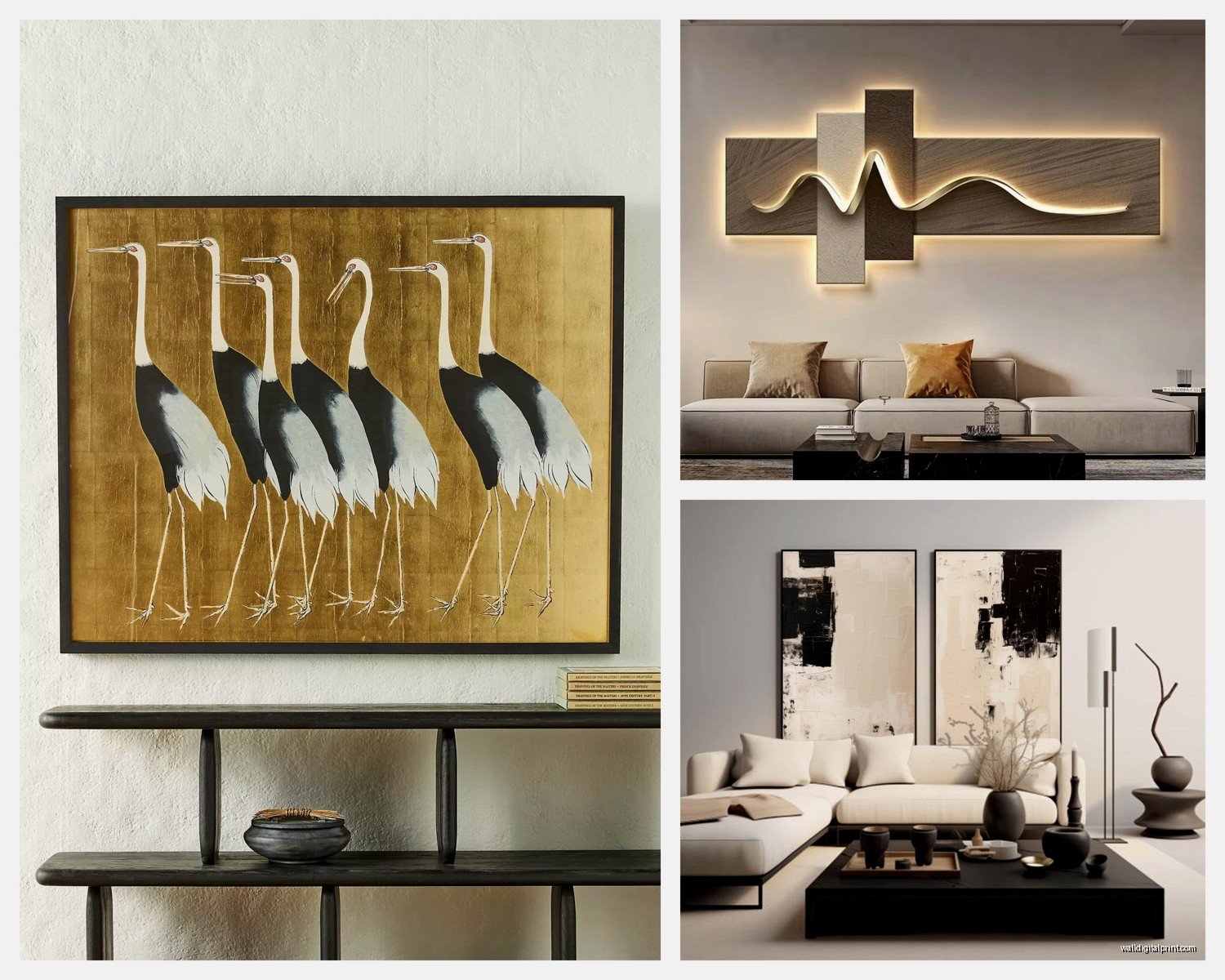
Abstract pieces are the obvious choice but they’re also kinda… safe? I’ve been mixing in photography lately and it’s working really well. Black and white architectural photography especially – there’s something about clean lines in the photo that echoes the modern furniture lines.
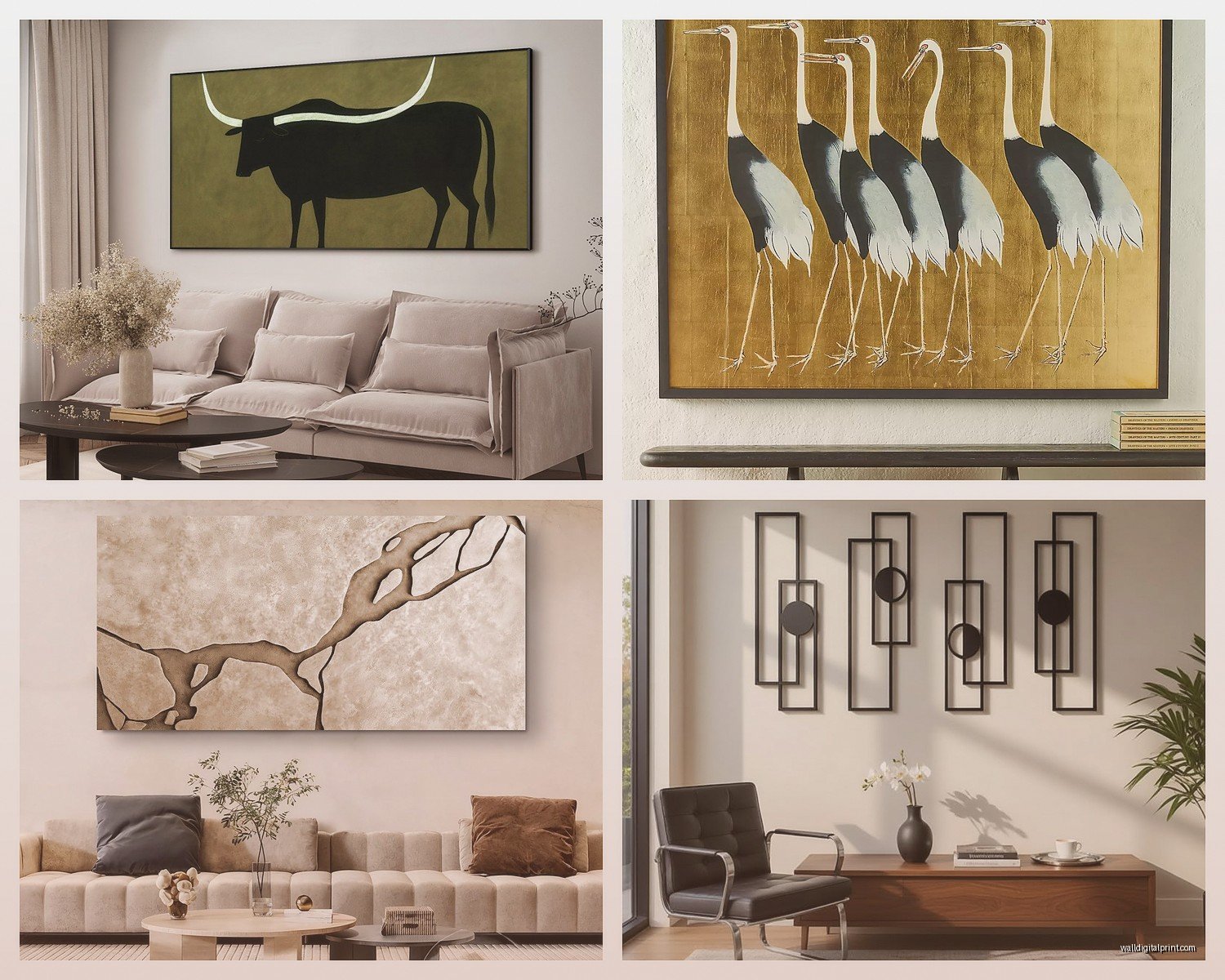
Oh and another thing, oversized single pieces are having a moment again. Like one massive canvas instead of multiple smaller ones. It’s actually easier to pull off than gallery walls and makes a huge impact. I just installed a 48×72 inch abstract in someone’s living room last week and the whole space suddenly felt more expensive? If that makes sense.
Color Matching Without Making It Boring
You don’t have to match your art colors exactly to your pillows or whatever. That’s actually kinda dated. What works better is picking one accent color from your art and echoing it somewhere in the room – but not everywhere.
Like if you’ve got a piece with a pop of terracotta, maybe your throw blanket has some terracotta in it. Done. You don’t need terracotta pillows AND a terracotta vase AND terracotta candles. That’s overkill.
For modern spaces specifically, I’m really into art that has mostly neutrals with ONE bright color. It keeps that clean contemporary feel but adds personality. My cat knocked over my coffee while I was writing this, great.
The Practical Stuff Nobody Talks About
Lighting matters SO much and people just forget about it. If you’ve got a piece you love but it’s on a dark wall, get a picture light or even just angle a floor lamp toward it. Modern art especially – a lot of it has texture or layering that you completely miss without proper lighting.
I use LED picture lights now instead of the old halogen ones because they don’t heat up and damage the art over time. They’re like $40-60 on Amazon and honestly worth it for anything you spent real money on.
Hanging Methods That Won’t Destroy Your Walls
For anything under 20 pounds, those 3M Command strips actually work. I was skeptical for YEARS but they’ve held up in multiple apartments and houses. The velcro ones, not the nail ones.
Heavier pieces need actual wall anchors or studs. I use these monkey hooks for medium-weight stuff (like 30-40 pounds) and they’re pretty foolproof. They just twist into drywall and hold way more than you’d expect.
Wait I forgot to mention – if you’re hanging something really heavy or valuable, just use two hooks instead of one even if the frame only has one wire. You can use two hooks on the wire itself. It distributes weight better and I’ve never had anything fall doing it this way.
Where to Actually Buy Modern Wall Art
This is gonna sound weird but I find some of my favorite pieces on Etsy from independent artists. You can get original work or high-quality prints for way less than galleries. Search for “abstract minimalist art” or “line drawing print” and you’ll find tons.
Minted is good for more curated stuff. Slightly pricier but the quality is consistent. Framebridge if you need custom framing, though honestly IKEA frames work fine for most modern prints since you want simple frames anyway.
I’ve bought from Society6 and the quality is hit or miss depending on what product you choose. Their framed prints are decent. The canvas prints can look cheap in person, especially in bright light.
Frame Selection for Contemporary Spaces
Thin black frames. Thin wood frames. Thin brass frames if you wanna get fancy. That’s basically it for modern spaces.
Those thick ornate frames? Wrong vibe entirely. You want the frame to disappear and let the art do the talking. I use these thin aluminum frames from Amazon (the ones by Americanflat) constantly because they’re like $25 and look way more expensive.
Floating frames are also really good for modern spaces – where the art sits inside the frame with space around it. Creates this cool layered effect. Little tricky to put together but the result is worth it.
Common Mistakes I See All The Time
Hanging art too high is number one. I swear everyone does this. Your art should relate to your furniture, not your ceiling.
Buying art that’s too small. When in doubt, go bigger. A tiny piece on a big wall just looks sad and unintentional. If budget is an issue, one large piece beats three small ones every time.
Matching your art too perfectly to one photo you saw online. Your space is different. Your light is different. Your furniture is different. Use inspo pics as a starting point but don’t try to recreate them exactly.
The Gallery Wall Spacing Formula
Okay so if you’re doing a gallery wall, here’s what actually works: lay everything on the floor first in different arrangements. Take photos of each option. Live with the photos for a day or two and see which one you keep coming back to.
Then measure your wall, find the center point, and work outward from there. Start with your central/largest piece and build around it. Keep 2-3 inches between frames consistently.
Use painters tape on the wall to mark where frames will go before you start hammering. Saves so many mistakes.
Mixing Art Styles Without It Looking Chaotic
You can totally mix different art styles in a modern living room but you need a common thread. Same color palette. Same frame style. Same general mood (all calm pieces or all energetic pieces, not mixed).
I’ve got abstract paintings mixed with photography in my living room and it works because everything’s in black, white, and navy. The frames are all thin black metal. The consistency in those two elements makes the different art styles feel intentional.
This is gonna sound overly specific but I watched like four episodes of that design show while installing a gallery wall last month and they kept saying “cohesion through repetition” and honestly yeah, that’s it.
Seasonal Switching and Rental Hacks
If you rent or just like changing things up, lean art instead of hanging it. Get a picture ledge shelf (IKEA makes good ones for $10-15) and just prop your art on it. You can switch pieces whenever you want and no holes in walls.
I do this in my own bedroom and change the art every few months. Way easier than rehanging everything and it gives you freedom to experiment.
For renters, those damage-free hooks are your best friend. Also consider large-scale removable wallpaper as “art” – companies like Tempaper make really cool modern designs that function as statement pieces.
Budget Breakdown That’s Actually Realistic
You can do a really good modern living room art situation for like $200-400 total if you’re strategic. Two large prints from independent Etsy artists ($60-100 each), simple frames ($25-40 each), some Command strips ($15), done.
If you wanna splurge on one original piece, save up for something in the $400-800 range from an emerging artist. It’ll mean more and appreciate potentially. I bought a piece for $500 three years ago and the artist is way more known now, probably worth double.
Don’t spend money on “art” from HomeGoods or Target unless it genuinely speaks to you. A lot of that stuff is mass-produced and looks it. Better to save up for something special than fill your walls with placeholder art.
The Texture Element People Forget
Modern spaces can feel cold if everything’s flat. Add some dimensional art – woven wall hangings, sculptural pieces, even floating shelves with small objects become art installations.
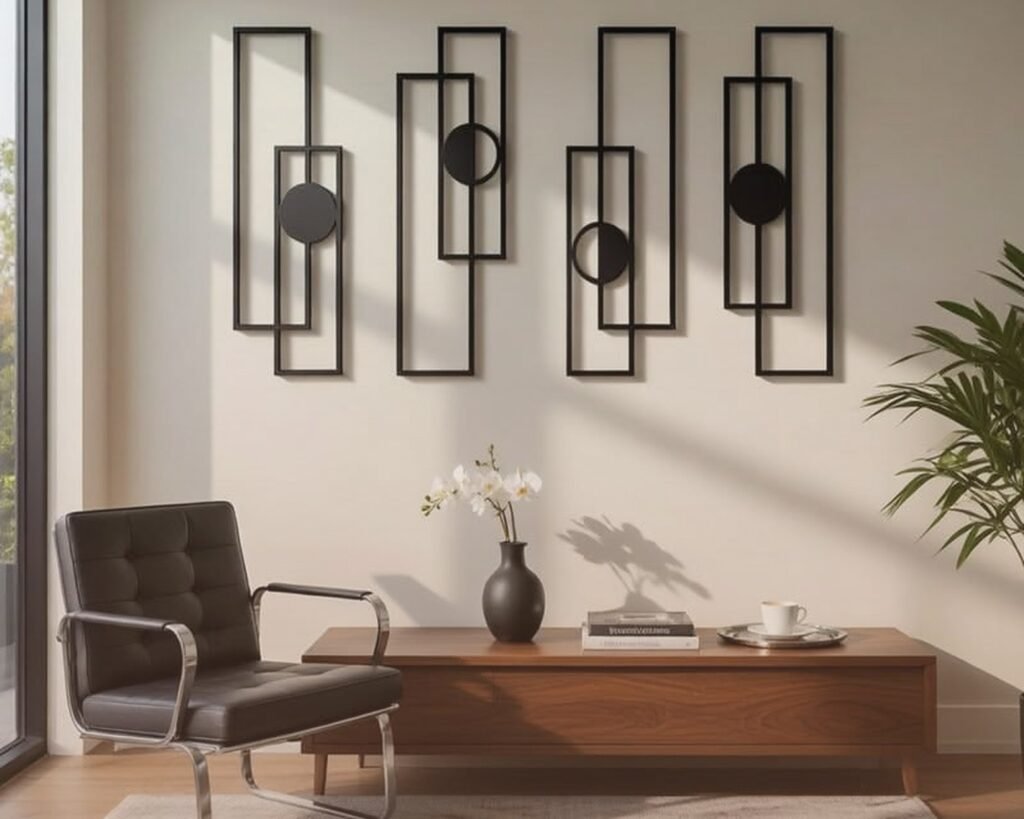
I’m really into those wood wall sculptures right now, the ones with geometric shapes in different depths. They cast cool shadows and add warmth to contemporary spaces without feeling rustic or farmhouse-y.
Oh and plants. A large plant in a corner can honestly function as living art. Fiddle leaf figs are overdone but they’re overdone because they WORK in modern spaces. Or a tall snake plant if you’re lazy about watering like I definitely am.
Making It Feel Personal Not Showroom
Mix in some personal stuff. Travel photos you took and framed nicely. A vintage piece you inherited. Something your kid made if you’ve got kids. Modern doesn’t mean sterile.
The best modern living rooms I’ve styled have like 80% carefully curated art and 20% personal unexpected stuff. That’s what makes it feel like someone actually lives there instead of a furniture store display.
Just make sure your personal pieces fit the general aesthetic – maybe black and white photos instead of color if everything else is minimal, or frame kids art in those same thin modern frames instead of construction paper and macaroni glory.
Anyway that’s basically everything I know about modern living room art from doing this for way too long. The main thing is just start somewhere and adjust as you go. Nothing has to be permanent and honestly your taste will probably change anyway so don’t stress too much about finding the “perfect” piece right away.