Wall Art Guide, Wall Art Tutoriels
Red Wall Art for Bedroom: Bold Crimson Sleep Space Accents
Sep
So I’ve been working with red wall art in bedrooms for years now and honestly it’s one of those things that sounds scary but ends up being so much easier than people think. Like, everyone gets nervous about red but if you know what you’re doing it’s actually pretty forgiving.
The Whole “Red is Too Intense” Thing
Okay so first thing, you gotta stop thinking of red as this one massive color. There’s like burgundy, crimson, rust, coral-ish reds, deep wine colors… they all do completely different things in a bedroom. I had this client last month who was absolutely terrified of red and I showed her a terracotta red piece and she was like “oh that’s not what I thought red was.” Exactly.
The trick is matching the red intensity to your bedroom’s natural light. North-facing bedroom with not much sun? Go deeper, richer reds because they’ll actually feel cozy instead of dark. South-facing with tons of light? You can do brighter crimsons and they won’t overwhelm the space. My own bedroom gets western light so I went with a burnt sienna kind of red and it looks completely different at 3pm versus 8pm.
Where to Actually Put Red Art
Above the bed is obvious but it’s not always the best spot honestly. I usually look at the room and figure out where your eye goes when you walk in. Sometimes that’s the bed wall, sometimes it’s the wall opposite the door, sometimes it’s this weird corner that needs something.
- Above the headboard works if the piece is roughly two-thirds the width of your bed
- Opposite the bed is actually my favorite because you see it right when you wake up
- On the wall perpendicular to the bed if you’ve got a reading chair situation
- Leaning on a dresser or console if you’re commitment-phobic about hanging stuff
The leaning thing is gonna sound lazy but it’s actually super practical for testing. I do this all the time, I’ll lean a piece somewhere for like two weeks and just… live with it. See how it feels at different times of day. My cat knocked over a canvas I was testing once and honestly that told me it wasn’t the right spot anyway.
Size Matters More Than You Think
Everyone buys art that’s too small. Like, consistently. You want your main piece to be substantial enough that it anchors the wall. For over a queen bed I’m usually looking at something 40-60 inches wide. King bed, go bigger, maybe 50-70 inches.
But here’s where it gets interesting, you can do a gallery wall of smaller red pieces instead of one big one. I did this in my guest room with like seven different red abstract pieces from different artists, different shades of red, and it reads as one cohesive thing but with way more visual interest. The key is keeping the frames similar, either all black or all natural wood or whatever.
Wait I forgot to mention, you can also do diptychs or triptychs which is just fancy words for art that comes in 2 or 3 panels. These work really well for red because you can spread the color across the wall without it being one massive red rectangle staring at you.
What Kind of Red Art Actually Works
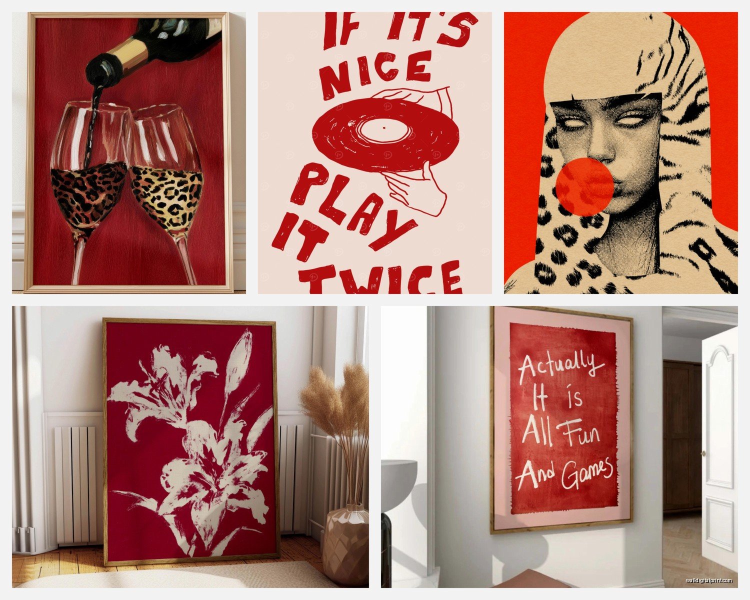
Abstract is easiest honestly. Geometric patterns, organic shapes, textural stuff, it all works because you’re not trying to match reality, you’re just adding color and movement. I’ve got this textured piece in my bedroom that’s mostly crimson with some gold leaf and the texture makes it feel less flat and intense.
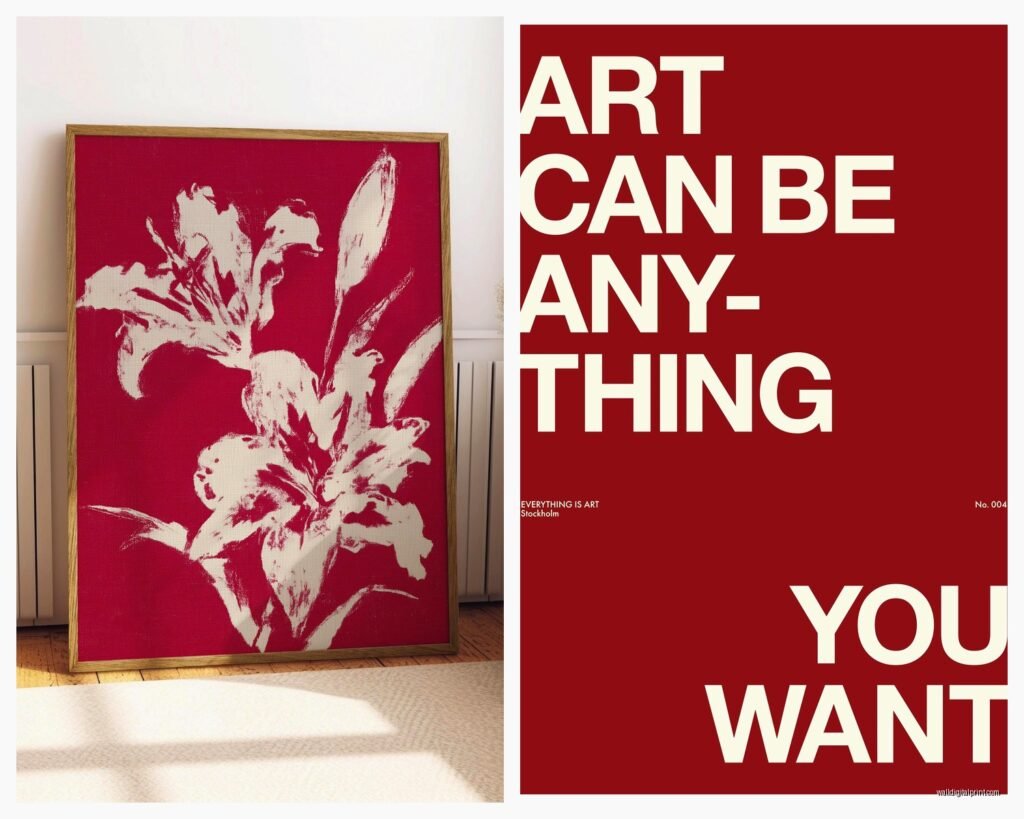
Floral art in red tones is having a moment right now. Poppies obviously, but also like abstract florals where it’s more about the color than the actual flower. Less grandma’s house, more moody and modern.
Photography can work but it’s trickier. Red architectural details, close-ups of red objects, abstract red compositions. I saw this amazing series of photos at a gallery last year that was just red doors from around the world and I immediately thought “bedroom art.”
Vintage posters if you’re into that vibe. Old travel posters, concert posters, anything with that aged red quality instead of bright fresh red.
Mixing Red with Other Colors in the Art
Pure red art is actually pretty rare and usually too much. Most good red pieces have other colors worked in. Here’s what I’ve seen work really well:
- Red with navy or deep blue, super sophisticated
- Red with gold or brass tones, adds warmth without being overwhelming
- Red with gray or charcoal, very modern and calming somehow
- Red with cream or ivory, softens everything
- Red with black, dramatic but you gotta commit to it
The worst combo I’ve seen is red with bright purple. Just don’t. I had a staging project where the homeowner insisted and it looked like a Halloween store threw up in there.
Frame Choices That Don’t Mess It Up
Black frames are your safest bet with red art. They contain the color and make it feel intentional. Natural wood frames work if your bedroom has warm tones already, but avoid orange-toned wood with red, it gets muddy looking.
White or cream frames can work but only if the red in the art is softer, like a coral or dusty rose situation. Bright red in a white frame can look too craft-store unless that’s specifically the vibe you want.
Metal frames, especially brass or gold, are really good with deep reds. Oil-rubbed bronze frames with crimson art is *chef’s kiss* if you’re going for moody and romantic.
No frame at all, just canvas, works for modern spaces. I’ve got a frameless red abstract in my bedroom and it feels more like part of the wall than a separate object hanging there.
The Bedroom Colors That Work With Red Art
This is where people get really worried but honestly red is more flexible than you think.
White or cream walls are the easiest. The red becomes your pop of color and everything else stays neutral. This is what I usually recommend if someone’s nervous.
Gray walls with red art is one of my favorite combinations. The gray cools down the red just enough that it doesn’t feel aggressive. Light gray, dark gray, doesn’t really matter as long as you’re not doing that weird purple-gray that was trendy in 2015.
Navy or deep blue walls with red art is bold but so good. Very jewel-box bedroom vibes. You need good lighting though or it gets cave-like.
Beige or tan walls work if the red has warm undertones. Cool-toned red on beige walls can look weird and disconnected.
Oh and another thing, if your bedding is patterned, make sure the red art doesn’t fight with it. Either pull one of the colors from your bedding into the art choice, or keep the art simpler if the bedding is busy.
Lighting Makes or Breaks It
You can have the perfect red art piece and completely ruin it with bad lighting. I learned this the hard way in my first apartment where I hung this gorgeous burgundy abstract and it just looked brown until I fixed the lighting.
Picture lights are worth it for larger pieces. Those little brass or black lights that mount above the frame. They make the art glow and bring out the red tones properly.
If you’ve got overhead lighting, make sure it’s warm white bulbs, not cool white. Cool white makes red look harsh and almost neon. Warm white (2700-3000K) makes red look rich and inviting.
Side table lamps help too. The indirect light bouncing around the room will hit your red art from different angles throughout the evening. I’m watching this show right now where they’re renovating houses and the lighting is always their biggest mistake, people just don’t think about it enough.
Natural Light Considerations
Direct sunlight will fade red art over time, especially prints and photographs. If your red art is on a wall that gets blasted with afternoon sun, either invest in UV-protective glass or accept that you might need to replace it in a few years.
Morning light makes red art look more orange-toned, evening light makes it look deeper and more purple-ish. This isn’t good or bad, just something to be aware of when you’re choosing placement.
Budget Options That Don’t Look Cheap
Look, not everyone can drop $500 on original art. I get it. Here’s what actually works without looking like you printed something from the internet.
Society6 and similar sites have decent quality if you go for their larger sizes. The small prints look cheap but their large canvas or framed prints are pretty solid. I’ve used them for client projects and staging homes.
Etsy has tons of independent artists selling red abstracts and digital prints. You download the file and get it printed at a local print shop, usually way cheaper than buying a finished piece. Just make sure you’re downloading a high-resolution file, nothing under 300 DPI.
HomeGoods and TJ Maxx actually have some good finds if you’re patient. I check mine every couple weeks and occasionally there’s something great. Found a massive red and gold abstract there last year for like $80 that looked way more expensive.
Thrift stores and estate sales for vintage pieces. Old oil paintings with red tones, vintage posters, framed textiles. These need some hunting but the payoff is worth it.
DIY if you’re remotely artistic. I’m serious, abstract red art is very forgiving. Get a canvas, some acrylic paints in different red tones, and just… make something textural. Nobody knows if it’s “good” or not because it’s abstract.
Common Mistakes I See All the Time
Hanging it too high. The center of your art should be at eye level, which is roughly 57-60 inches from the floor. Over a bed you’ve got more flexibility but don’t put it so high that it’s floating near the ceiling.
Choosing red art and then adding red throw pillows and red curtains and red everything. Too much. The art should be your main red element, then maybe one or two small red accessories. That’s it.
Buying art online without checking the return policy. Colors look SO different in person. I always tell people to order from places with easy returns for the first piece or two until you figure out what works in your space.
Not considering the art style with your bedroom furniture style. Like, a ultra-modern geometric red piece looks weird with a traditional four-poster bed. There needs to be some style continuity.
Getting too literal with themes. You don’t need to match your red art to your red comforter. In fact, please don’t. It looks too matchy and planned.
Making It Work Long-Term
The thing about red art is you gotta really commit to it. It’s not a neutral that disappears into the background. But that’s also what makes it interesting, your bedroom has personality and intention.
If you get sick of it (which honestly might happen, red is strong), you can always swap it to another room. That red abstract that’s too much for the bedroom might be perfect in your dining room or home office or entryway.
I rotate my bedroom art seasonally sometimes. The red piece goes up in fall and winter because it feels cozy, then I swap to something cooler-toned for spring and summer. Not saying you need to do this but it’s an option if you like changing things up.
Also consider having dimmer switches installed if you don’t already. Being able to control your lighting intensity means you can control how prominent that red art feels at different times. Bright lights, the red is vibrant and energizing. Dimmed lights, it becomes moodier and more intimate.
The biggest thing is just trusting your gut. If you bring home a red piece and it makes you happy every time you walk into your bedroom, that’s the right piece. Doesn’t matter what design rules say or what’s trending or whatever. Your bedroom should feel like yours, and if that includes bold crimson accents, then go for it.