Wall Art Guide, Wall Art Tutoriels
Colorful Wall Art for Bedroom: Vibrant Sleep Space Designs
Sep
So I’ve been obsessing over bedroom wall art lately and honestly it’s kinda taken over my life because I just finished three client bedrooms back-to-back and my brain is still in that mode where I see blank walls and immediately start planning gallery configurations…
The thing nobody tells you about colorful wall art in bedrooms is that it’s actually way easier to pull off than those boring beige rooms everyone defaults to. Like, you’d think adding vibrant art would make a space feel chaotic but I’ve found the opposite is true if you know what you’re doing.
Starting With What You Actually Have
Okay so first thing – and I know this sounds backwards – look at your bedding and curtains before you buy a single piece of art. I made this mistake in my own bedroom like three years ago, bought this gorgeous abstract piece with coral and turquoise, then realized my duvet was burgundy and gray. Looked absolutely terrible together. Had to return the art which was a whole thing because the frame got dinged in shipping back.
Your wall art should pull colors from what’s already in the room but not match exactly. That’s the key. If you’ve got navy bedding, maybe look for art that has navy as an accent color but leads with something else – yellow, blush pink, even a bright green. This creates what I call a “color conversation” instead of just repeating the same note over and over.
The Three-Color Rule Thing
I generally stick to art that has max three dominant colors. More than that and it starts competing with itself, especially in a bedroom where you want things to feel somewhat restful even if they’re vibrant. My client last month wanted this seven-color rainbow piece above her bed and I had to gently redirect her because it would’ve been like trying to sleep under a carnival.
That said, if the art has like ten colors but three are dominant and the rest are accents, that totally works. There’s this abstract artist I follow – can’t remember her name right now, it’s on my laptop somewhere – who does these pieces that look super colorful from far away but when you get close it’s really just variations of three main hues.
Size Actually Matters More Than You Think
This is gonna sound weird but I measure everything with painters tape before buying art. Like, I’ll tape out the dimensions on the wall and live with it for a few days. Sounds excessive but I’ve saved myself from so many bad purchases this way.
For over the bed, you want your art or gallery wall to take up about two-thirds to three-quarters the width of your bed. Smaller looks dinky and unintentional, bigger overwhelms the bed itself. I usually aim for something that’s at least 24 inches wide for a twin bed, 36-48 inches for a queen, and 48-60 inches for a king.
Oh and another thing – height placement. The center of your art should be at eye level when you’re standing, which is usually around 57-60 inches from the floor. But if it’s going over a bed or dresser, you want the bottom of the frame to be 6-8 inches above the furniture. My cat knocked over a vase last week while I was measuring this in a client’s room and I had to explain why there was water all over their nightstand…
Types of Colorful Art That Actually Work in Bedrooms
Abstract Pieces
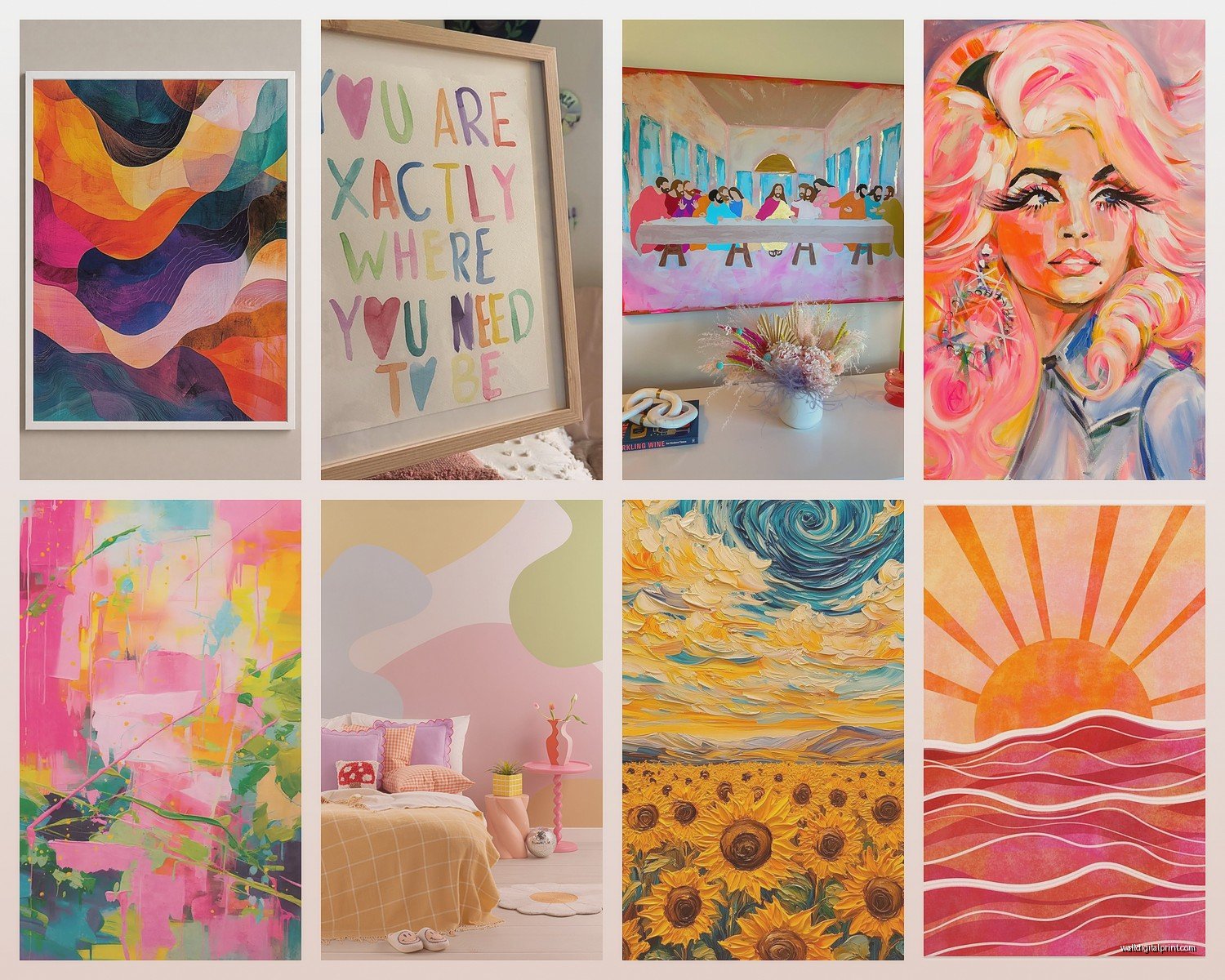
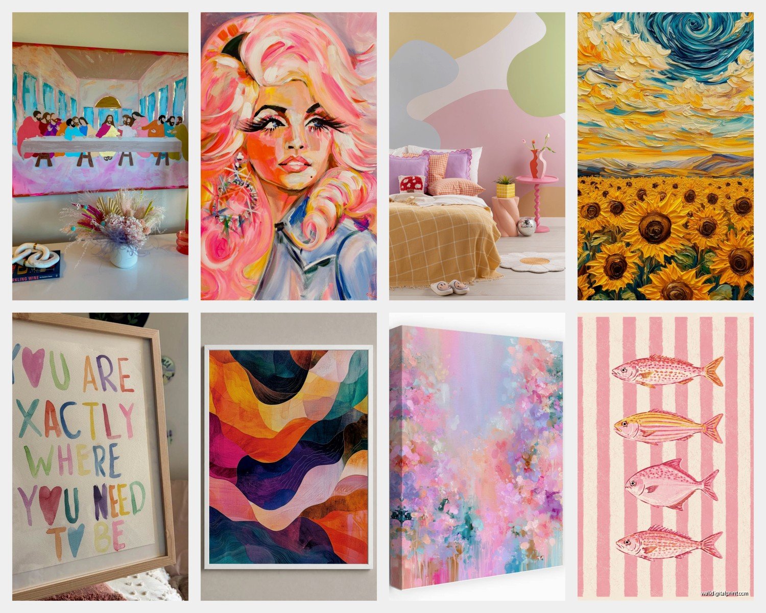
These are my go-to recommendation because they’re versatile and you can interpret them however you want. A good abstract in jewel tones – emerald, sapphire, ruby – adds richness without being too literal or distracting when you’re trying to wind down.
I’ve noticed that abstract art with visible brushstrokes or texture adds warmth that perfectly flat prints sometimes lack. There’s something about seeing the physical creation of the piece that makes a bedroom feel more personal.
Botanical and Nature Prints
Okay so this might be controversial but I think we’ve done the minimalist line-drawing leaf thing to death. If you’re going botanical, go BOLD with it. Oversized tropical leaves in saturated greens and pinks, vintage-style floral prints with deep backgrounds, even those dramatic mushroom illustrations that are having a moment right now.
I just finished a bedroom with this massive bird of paradise print that had oranges and purples and this specific shade of teal that shouldn’t have worked but totally did. The client was worried it would be too much but now she sends me photos of it like every week because she’s obsessed.
Geometric and Mid-Century Inspired
If you want colorful but structured, geometric art is your friend. Think overlapping circles in sunset colors, angular shapes in complementary hues, or those retro-inspired pieces with the mustard yellow and burnt orange and olive green combo that’s everywhere right now.
The cool thing about geometric art is it reads as energetic from far away but because the shapes are organized and predictable, it doesn’t create visual chaos that keeps you awake. Unlike my neighbor’s wind chimes which is a whole different problem I can’t solve with interior design.
Gallery Walls vs Single Statement Pieces
I go back and forth on this constantly. A single large piece is easier to hang and creates instant impact. You’re done in ten minutes and it looks intentional. Gallery walls take planning and like seventeen nail holes to get right, but they let you incorporate way more color variation and personal items.
If You’re Doing a Gallery Wall
Start with your largest piece and build around it. I usually put the biggest piece slightly off-center or in the upper third of the arrangement – not dead center because that feels too formal for a bedroom.
Mix frame colors but keep the style consistent. All modern frames or all ornate vintage, but mixing metallic gold with rustic wood with sleek black usually looks chaotic. Unless you’re specifically going for eclectic maximalist, which is valid but requires committing fully to the bit.
Wait I forgot to mention – lay everything out on the floor first. Take a photo from above. This has saved me so many times because what looks good on the floor might look totally different vertical on a wall.
For colorful gallery walls, I like having one or two pieces that are more neutral to give your eye a place to rest. Maybe a black and white photo or a cream-colored print among all the vibrant stuff. Creates rhythm.
Where to Actually Buy This Stuff
Society6 and Minted are my usual starting points for prints because you can filter by color and they have tons of independent artists. The quality is pretty consistent and they often have sales. I got this incredible abstract piece during a Memorial Day sale for like 40% off.
Etsy is great for original work and vintage finds but you gotta be careful about print quality. Always read reviews and message sellers about paper type and printing method. Learned that the hard way with a print that arrived looking super washed out compared to the listing photo.
For original paintings if you’ve got the budget, Instagram is honestly where I find most emerging artists now. Search hashtags like #abstractartist #colorfulart #bedroomart and you’ll fall down a rabbit hole. Just make sure to discuss shipping carefully because original work needs proper packaging.
Target and West Elm do surprisingly good colorful art for the price point. Not groundbreaking but totally serviceable if you need something quickly. I furnished a whole Airbnb bedroom with Target art last year and it looked great.
Custom and DIY Options
If you’ve got a specific color scheme that’s hard to match, commissioning something isn’t as expensive as you’d think. I’ve worked with artists who’ll do custom 16×20 abstracts for around $150-200. You send them your color palette and they create something unique.
Or honestly, painting your own abstract art is totally doable. Get some canvases from the craft store, some acrylic paints in your colors, and just go for it. My client did this last month – had never painted before – and created three pieces that look legitimately good in her guest bedroom. The imperfection actually adds to the charm.
Color Psychology Stuff You Might Care About
Okay so there’s all this research about colors affecting sleep and mood and some of it’s legit and some is probably overblown but here’s what I’ve noticed actually matters:
Blues and greens genuinely do feel more calming. If you’re someone who struggles with sleep, leading with these colors in your art and adding pops of warmer tones as accents tends to work better than going heavy on reds and oranges.
That said, I have a client who sleeps great with this predominantly coral and pink art situation above her bed, so like, know yourself. If warm colors make you happy, that relaxed feeling might matter more than the supposed “stimulating” effect.
Jewel tones – emerald, sapphire, amethyst – add richness without being as intense as primary colors. They work especially well in bedrooms that don’t get tons of natural light because they create depth.
Lighting Considerations Nobody Talks About
Your colorful art is gonna look completely different depending on your lighting and this is something I see people forget all the time. That vibrant piece you loved in the store might look muddy in your bedroom if you only have warm-toned lamps.
If possible, look at art in lighting similar to your bedroom. Or at least check it in both bright light and dim light before committing. Colors shift dramatically.
I usually recommend having multiple light sources in a bedroom anyway – overhead, bedside lamps, maybe an accent light – because it lets you control the mood and also affects how your art reads throughout the day. This is gonna sound extra but I sometimes put a small picture light above really special pieces in client bedrooms.
Arranging Multiple Pieces on Different Walls
You don’t have to put all your art above the bed. Actually, distributing colorful pieces around the room can make the whole space feel more cohesive. Maybe a large piece over the bed, a smaller piece above a dresser, something on the wall opposite the bed that you see when you wake up.
Just make sure they share a color story. They don’t need to match but there should be some thread connecting them. Pull one or two colors through all the pieces so your eye travels around the room smoothly.
I’m currently watching this show about art thieves and it’s making me paranoid about hanging expensive pieces but anyway…
Practical Hanging Tips
Use proper anchors if you’re hanging anything heavy. Drywall alone won’t support much weight. I like the self-drilling anchors that you just screw in – way easier than the plastic anchor and screw combo.
Level everything. Seriously. Even slightly crooked art will bug you every single time you look at it. I use a laser level now instead of the bubble kind because it’s faster and more accurate.
For gallery walls, make a template. Trace each frame on kraft paper or newspaper, cut them out, tape them to the wall in your arrangement, then nail through the paper where the hangers go. Remove the paper and hang the actual pieces. This method has literally never failed me.
Mixing Colorful Art with Other Bedroom Elements
Your art doesn’t exist in a vacuum so think about how it plays with everything else. If you’ve got a colorful rug, your art should complement it without competing. If your furniture is bold, maybe let the art be the main color moment and keep other textiles more neutral.
I love pulling one accent color from the art into throw pillows or a blanket. Creates that designed look without being matchy-matchy. Like if your art has this gorgeous mustard yellow in it, a couple mustard pillows on the bed ties everything together.
Plants also interact with colorful art in interesting ways. The green adds another color dimension and the organic shapes contrast nicely with geometric art or complement botanical prints.
When to Actually Replace or Rotate Art
Hot take: you don’t have to keep the same art forever. I rotate my bedroom art seasonally sometimes because why not. Lighter, brighter pieces in summer, deeper jewel tones in winter. It’s an easy way to refresh your space without buying new furniture.
If you’re bored with a piece after six months, that’s fine. Sell it, move it to another room, whatever. Your bedroom should make you happy and sometimes that means changing things up. I’ve definitely bought art I loved that just didn’t work longterm and there’s no shame in admitting that and moving on.
Anyway that’s basically everything I’ve learned about colorful bedroom art through way too many client projects and my own trial and error. The main thing is just to pick colors that make you feel good and not overthink it too much because you can always change it later if it doesn’t work out.