Wall Art Guide, Wall Art Tutoriels
Wall Art for Over Couch: Above Sofa Sizing Guide
Sep
So I was literally hanging a massive canvas above my own sofa last week and my neighbor walked in and was like “isn’t that too big?” and I had to laugh because honestly, most people get this SO wrong. They go way too small and it looks like you just stuck a postage stamp on the wall.
Here’s the thing about sizing art over a couch – there’s this rule everyone throws around about the art being two-thirds to three-quarters the width of your sofa. And yeah, that’s… mostly right? But I’ve found through probably way too many client projects (and my own obsessive rearranging) that it’s more nuanced than that.
The Basic Math That Actually Works
Okay so measure your couch width first. Like actually measure it, don’t just eyeball it because I’ve definitely done that and been off by like a foot. Let’s say you have a standard 84-inch sofa, which is pretty common. You want your art or gallery wall situation to be somewhere between 56-63 inches wide. That’s the sweet spot where it looks intentional and balanced without overwhelming everything.
But here’s where I deviate from the standard advice – if your ceilings are really high, like 10 feet or more, you can push that ratio a bit. I did this in a loft space last year where we went almost equal width to the sofa because the vertical space could handle it. Looked amazing, very gallery-like.
Height Placement Is Where Everyone Messes Up
The center of your artwork should be at eye level, which is typically 57-60 inches from the floor. BUT and this is a big but, when you’re placing art over furniture, you gotta account for the sofa back. I usually do 6-8 inches above the top of the couch back. Any lower and it feels like the art is sitting ON the furniture (weird energy), any higher and you’ve got this awkward dead zone.
My cat knocked over my coffee while I was measuring this on my own wall last week, so now I have this whole system where I use painter’s tape to map everything out first. Game changer honestly.
Single Large Piece vs Gallery Wall
This is where people get really stuck. I have like fifteen DMs a week asking which route to go.
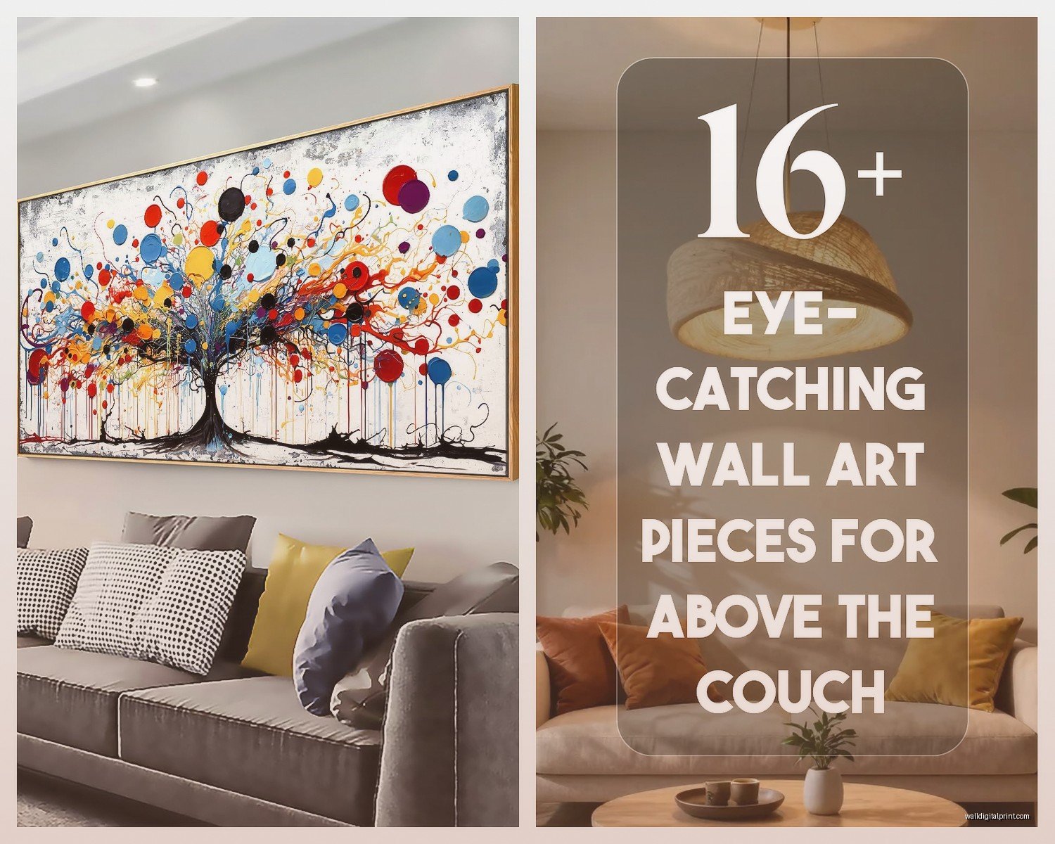
Single large piece is cleaner, more modern, easier to hang (thank god). You want to aim for something that’s at least 40 inches wide for a standard couch. I’ve used pieces up to 60 inches wide and they look incredible. The key is making sure the piece has enough visual weight – not just physical size but like, presence. A wishy-washy watercolor in pale colors won’t have the same impact as a bold abstract even if they’re the same dimensions.
Gallery walls are trickier but they let you be more creative and honestly they’re better if you’re on a budget because you can mix expensive pieces with cheaper finds. The overall dimensions of the gallery should follow that same two-thirds rule, but within that space you’ve got freedom.
My Gallery Wall Formula That Doesn’t Suck
Start with your largest piece and work outward. I know everyone says to lay it out on the floor first, and yeah, do that, but also… I’ve found that taking a photo of your floor arrangement and then using markup on your phone to see if the spacing looks even actually helps more than staring at it in person.
Keep your spacing consistent – I use 2-3 inches between frames. Any more and it looks disconnected, any less and it feels cluttered. I learned this the hard way in my own living room where I did like 5-inch gaps and it just looked… unfinished? Like I ran out of art?
Actual Dimensions That Work For Different Sofa Sizes
Okay gonna break this down by common couch sizes because this is what people actually need:
Small apartment sofa (72 inches): Go for 48-54 inches of art width. Single piece around 40×30 inches works great, or a gallery wall in that 48-54 inch footprint.
Standard sofa (84-90 inches): This is where you want 56-68 inches. A single piece at 48×36 inches or larger looks good. Or do a gallery wall with maybe 5-7 medium pieces arranged in that width.
Sectional or long sofa (96+ inches): Here’s where it gets fun. You can go 64-72 inches wide, or even do TWO separate art arrangements to break up the space. I did this for a client with a huge sectional and we did two 36-inch square pieces with about 12 inches between them. Looked so much better than trying to find one massive piece.
What About Vertical Space Though
This is gonna sound weird but I think about the vertical dimension in thirds. Bottom third is your sofa, middle third is where your art lives, top third is breathing room to the ceiling. Obviously this shifts depending on your ceiling height, but when I’m looking at a space I mentally divide it up like this.
For standard 8-foot ceilings, your art should be roughly 24-36 inches tall. For 9-10 foot ceilings, you can go 36-48 inches. I’ve pushed it to 60 inches tall in really tall spaces and it works if the room can handle it.
Oh and another thing – consider what’s happening below the sofa too. If you have a really low-profile modern couch, you might want taller art to compensate. If it’s a big chunky traditional sofa with tall arms, maybe go wider than taller.
The Awkward In-Between Sizes
Sometimes you find a piece you love but it’s like 38 inches wide and your math says you need 56 inches. This is where I tell people to either commit to finding the right size or get creative with matting and framing. A good framer can add 4-6 inches total with a wide mat and frame, which might be enough to make it work.
Or honestly? Sometimes I’ll do a smaller piece if it’s REALLY special and just accept that it’s gonna look a bit minimalist. Not everything has to follow the rules exactly if it brings you joy or whatever. I watched too much Marie Kondo last month apparently.
Common Mistakes I See Literally All The Time
Going too small is number one. People are scared of commitment and they end up with this tiny 16×20 print floating above their massive couch and it just looks sad.
Hanging it too high. I’ve walked into so many homes where the art is like 15 inches above the sofa and you have to crane your neck to see it. Why? Just… why?
Not considering the frame. Your frame adds to the overall dimensions. If you need 50 inches of visual width, a 40-inch canvas in a 2-inch frame gives you 44 inches. Do the math with the frame included.
Ignoring the sofa style. A formal traditional sofa can handle ornate frames and classic art. A modern minimalist couch needs simpler, more contemporary pieces. I mean you CAN mix styles intentionally but that’s a whole other conversation.
What If You’re Renting
I get this question constantly. You don’t wanna put a million holes in the wall, I get it. Large-scale removable wallpaper or decals can create the same visual impact behind a sofa without traditional art. Or do a leaning gallery – oversized pieces that lean against the wall on a console table behind the sofa. Technically not “over” the couch but achieves the same decorative goal without holes.
Command strips work for lighter pieces (under 15 pounds usually), but test them first because I’ve had some spectacular failures. My client’s print crashed down in the middle of the night once and scared the hell out of everyone.
Multiple Pieces Arrangements
If you’re doing a diptych or triptych (two or three matching pieces), the total width of all pieces PLUS the space between them should hit that two-thirds ratio. So if you need 60 inches total and you want three pieces, maybe do three 16-inch pieces with 4 inches between each. That gives you 56 inches total which is close enough.
I usually keep 2-4 inches between panels for a cohesive look. Any more and they read as separate artworks instead of a set.
Wait I forgot to mention – symmetry matters more with multiple matching pieces. Use a level and measure from the center point of your sofa to make sure everything’s balanced. Asymmetrical gallery walls can handle being slightly off-center, but matching pieces need to be precise or it’ll drive you crazy.
Testing Before You Commit
Cut out paper templates in the sizes you’re considering and tape them up. Live with it for a few days. Sit on your couch and watch TV or whatever you normally do and see if the proportions feel right. I know it sounds extra but it’s way better than putting holes in your wall and then hating it.
Take photos from different angles. Sometimes what looks good in person photographs weird, and vice versa. If you’re sharing your space on social media (which like, who isn’t these days), this matters.
The Stuff Nobody Tells You
Lighting changes everything. Art that looks perfect in daylight might disappear at night if you don’t have good lighting. Consider picture lights or adjustable wall sconces.
Your wall color affects perceived size. Art looks larger on a dark wall, smaller on a light wall. I don’t know the science behind it but I’ve seen it play out in probably a hundred projects.
Texture matters as much as size sometimes. A heavily textured piece or something three-dimensional has more presence than a flat print even at the same dimensions.
The rest of your room affects what size works. If you have a ton of other visual elements – patterned rugs, lots of furniture, busy curtains – you might want simpler, larger art. If your space is minimal, you can go more complex with a gallery wall.
Honestly after doing this for like fifteen years, I still sometimes get it wrong on the first try. The painter’s tape method has saved me so many times. Just map it out, live with it, adjust before you commit to hanging anything heavy.