
Wall Art Guide, Wall Art Tutoriels
Turquoise Wall Art for Living Room: Aqua Blue Main Space
Sep
So I’ve been obsessing over turquoise wall art lately because like three of my clients this month asked for it and honestly? It’s trickier than you’d think to get right. The shade matters SO much more than people realize.
The Whole Shade Situation Nobody Talks About
Okay first thing – turquoise isn’t just turquoise. I learned this the hard way when I ordered what I thought was a perfect piece online and it showed up looking like toothpaste blue. There’s actual turquoise (more green-leaning), aqua (lighter, more cyan), teal (darker, moodier), and then whatever companies decide to call “ocean blue” which could be literally anything.
For a living room you’re gonna want to figure out your undertones first. Look at your existing furniture and walls in natural light – not at night because artificial lighting lies to you. If your space has warm undertones (beige, cream, golden wood), go for turquoise that leans slightly green. If you’ve got cool grays and whites, the bluer aquas work better.
I spent like an hour last Tuesday just holding paint swatches next to my laptop screen trying to match a client’s wall color to online art listings and my cat kept sitting on the swatches but anyway – the point is you gotta do this matching thing.
Size and Scale Without Making It Weird
People always go too small. Always. Your wall art should take up about two-thirds to three-quarters of your furniture width below it. So if you’ve got a sofa that’s 84 inches, you’re looking at roughly 56-63 inches of art width. You can do one large piece or a gallery wall that adds up to that.
I did a gallery wall in my own living room last year with five pieces – three larger turquoise abstract prints and two smaller coral ones for contrast. The whole arrangement was about 60 inches wide and 36 inches tall. Took me three tries and way too many nail holes but it works.
Single large pieces are honestly easier though. Less math, less measuring, fewer holes in your wall. I’m seeing really good options in the 40×60 inch range for standard living rooms. Anything smaller than 24×36 is gonna look like you’re decorating a bathroom instead unless you’re doing a whole gallery situation.
Height Placement That Actually Makes Sense
Center of the artwork should be at 57-60 inches from the floor. This is eye level for most people. If you’re hanging above a sofa, leave 6-8 inches between the furniture top and the bottom of your frame. Not 12 inches, not 4 inches – that sweet spot matters for visual balance.
Oh and another thing – if you have vaulted ceilings or that weird half-wall situation some living rooms have, ignore all those rules and just center it on the available wall space. I had a client with a cathedral ceiling and we hung the art way higher than normal because following the standard rule made it look like it was falling off the wall.
What Actually Works Style-Wise
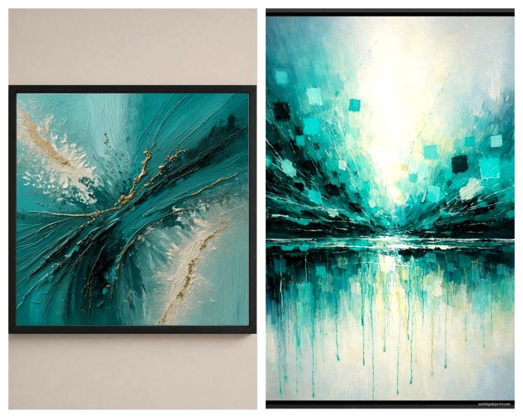
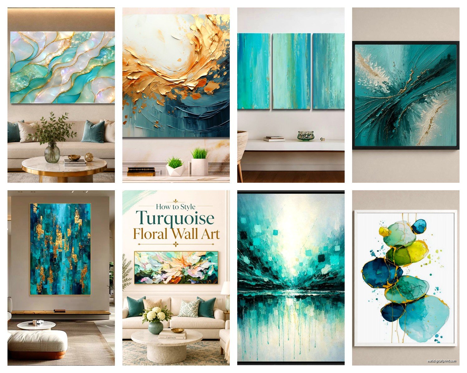
Abstract turquoise art is the easiest to work with because it doesn’t compete with your other decor. Geometric patterns, watercolor effects, those trendy resin-look pieces – they all play nice with most furniture styles.
I’m really into the abstract ocean stuff right now, the pieces that look like aerial beach photography but are actually paintings. They’ve got multiple shades of turquoise plus sand colors and white, which gives you more flexibility with your other room colors. Saw one at a local gallery last month that had gold leaf accents and I’m still thinking about it but it was like $800 which seems insane for my budget.
If you’ve got a modern minimalist thing going, look for pieces with clean lines and solid color blocks. Mid-century modern spaces look amazing with retro-style turquoise prints – think Palm Springs vibes with geometric shapes.
For traditional or transitional rooms, you want something a bit softer. Watercolor-style turquoise art, botanical prints with turquoise backgrounds, or those pretty agate slice designs work better than harsh abstracts.
The Texture Question
Okay so funny story – I bought this flat canvas print once and it just looked cheap no matter what I did with it. Texture makes a huge difference. Look for:
- Canvas prints with gel coating that adds dimension
- Hand-embellished pieces where artists add actual paint over prints
- Textured paper prints under glass
- Mixed media with raised elements
Even if you’re buying affordable art, the texture tricks your eye into thinking it’s more expensive. I’ve gotten compliments on $60 pieces that people assumed cost hundreds just because they had good texture.
Framing Choices That Don’t Suck
White or light wood frames keep things airy and beachy with turquoise art. Black frames make it more dramatic and modern – really good if you have other black accents in the room like light fixtures or furniture legs. Gold frames can work but they’re risky… you gotta have other gold elements or it looks random.
Floating frames are my current obsession. They’re those ones where the canvas appears to float inside the frame with a gap around the edges. Super contemporary look and they make even affordable art look gallery-quality.
Wait I forgot to mention – frameless canvas wraps are fine if the image extends around the edges nicely. If you can see staples or white canvas on the sides, hard pass. Always check the product photos for side views.
Where to Actually Buy This Stuff
I’ve tested like every site at this point because my client last month wanted turquoise art but had a $200 budget which is… challenging.
Etsy has independent artists and you can often find original pieces or high-quality prints. Search “turquoise abstract canvas” or “aqua blue wall art” and filter by size. Read the reviews carefully – some sellers use misleading photos.
Society6 and Redbubble let artists upload designs that get printed on demand. Quality is consistent, prices are reasonable, and you can get the same design in different sizes. I bought a turquoise and gold abstract from Society6 for my office and the print quality is actually really good.
West Elm and CB2 if you’ve got more budget. Their stuff is pricey but the framing is usually excellent and you can see it in person first.
HomeGoods and TJ Maxx are hit or miss but I’ve found incredible turquoise pieces there for like $40. You gotta go regularly though because inventory changes constantly. I check every time I’m near one which my husband thinks is excessive but whatever.
Minted for really beautiful curated art from independent artists. They do sales pretty often – wait for 20% off if you can.
Local art fairs and Instagram artists are underrated options. I found this amazing artist on Instagram who does custom abstract pieces and got a 36×48 turquoise painting for $350 which is honestly reasonable for original art.
Print Quality Things to Check
If buying online, make sure it’s:
- Giclée printing (archival quality, won’t fade)
- On actual canvas or high-quality paper, not poster paper
- Has reviews with customer photos
- Shows the actual colors accurately (read reviews about color accuracy)
Making It Work With Your Existing Stuff
Turquoise plays well with a lot of colors but you gotta be intentional. Here’s what I’ve seen work in actual living rooms:
Turquoise + white + natural wood is the coastal vibe everyone wants. Add some texture with jute or rattan and you’re set.
Turquoise + gray + yellow is more contemporary. The yellow adds energy without being overwhelming. I did this in a client’s apartment and used turquoise art, gray sofa, and yellow throw pillows and it’s chef’s kiss.
Turquoise + coral + cream is beachy but not too literal. Feels more sophisticated than straight-up nautical theme.
Turquoise + navy + gold if you want something richer and more elegant. Works great in traditional spaces.
Turquoise + terracotta + white has that Southwestern modern thing happening. Really pretty if you have warm wood tones.
This is gonna sound weird but I always tell people to pull one accent color from their turquoise art and repeat it in three places around the room. So if your art has hints of coral, get coral pillows, a coral vase, and maybe a coral spine book on the coffee table. It makes the whole room feel intentional instead of like you just randomly bought turquoise art.
The Gallery Wall Approach
If you’re doing multiple pieces, odd numbers work better visually – three, five, or seven pieces. I usually do a mix of sizes but keep them all in the same color family with maybe one accent color.
Layout options that actually work:
Grid style with same-size frames in rows and columns – very clean and modern
Salon style with different sizes arranged organically – more eclectic and collected-looking
Linear with three pieces in a horizontal row – easiest option honestly
I always lay the arrangement out on the floor first and take a photo so I remember what it looked like. Then I trace the frames on kraft paper, tape the paper to the wall, and nail through the paper. Remove the paper and hang the actual art. Saves so many mistakes.
Mixing Art Styles in Gallery Walls
You can mix photography with paintings, abstracts with prints, whatever. Just keep the color scheme consistent. All your pieces should have turquoise as either the dominant color or a significant accent. Varying the shades of turquoise actually looks good – not everything has to match exactly.
Lighting Your Turquoise Art
Nobody thinks about this but lighting changes everything. Turquoise can look completely different under warm vs cool light bulbs.
If your living room has warm lighting (those yellow-toned bulbs), your turquoise art might look more green than you expect. Cool white bulbs will make it look bluer and more vibrant.
I usually recommend 3000K bulbs for living rooms because they’re warm enough to be cozy but not so warm that they muddy colors. If you really want your art to pop, add a picture light above it or use an adjustable spotlight from the ceiling.
Natural light is obviously ideal. If your art will be across from a window, consider how it looks in different lighting throughout the day. That piece that looks perfect at noon might look washed out at 5pm.
Budget Breakdown Reality Check
Here’s what you’re actually looking at price-wise:
- Large canvas print (40×60): $80-$200
- Framed print from major retailer: $150-$400
- Original small painting from emerging artist: $200-$600
- Gallery-quality large piece: $500-$2000+
- Custom commissioned work: $300-$1500 depending on size and artist
I always tell people to buy the biggest piece you can afford rather than multiple small cheap ones. One statement piece looks more intentional than three mediocre pieces.
Common Mistakes I Keep Seeing
Hanging art too high is the biggest one. Seriously, measure that 57-60 inch thing.
Buying turquoise that doesn’t match your room’s temperature. A warm beige room with cool cyan art looks wrong.
Going too literal with beach themes. You don’t need starfish and anchors just because you have turquoise art. Let the color be enough.
Forgetting about scale. Tiny art on a big wall looks sad and lost.
Not considering your ceiling height. Standard rules don’t always apply in rooms with really high or really low ceilings.
Okay I think that covers most of it? The main thing is to not overthink it too much but also definitely think about it enough to avoid the obvious mistakes which I know is contradictory advice but that’s decorating for you. Start with one good piece, live with it for a bit, and build from there if you want more.
