
Wall Art Guide, Wall Art Tutoriels
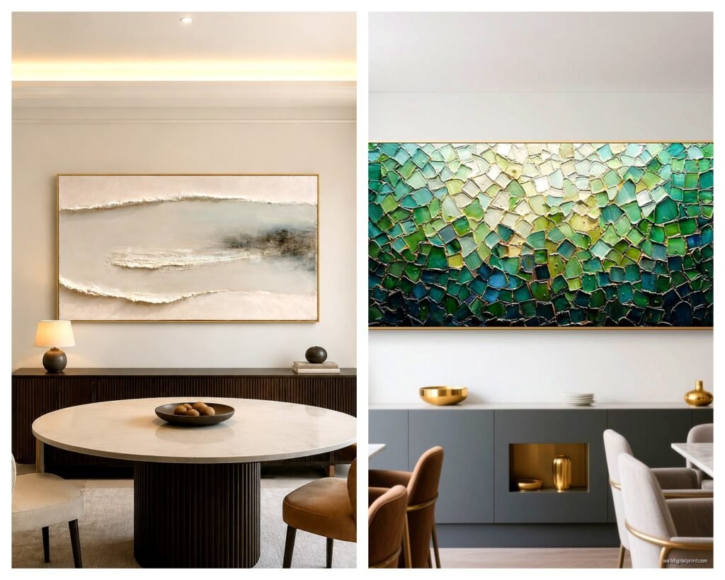
Abstract Wall Art for Dining Room: Modern Eating Space Designs
Sep
So I’ve been dealing with abstract art in dining rooms for like three years now and honestly it’s the one space where people either totally nail it or make it super awkward, there’s no in between.
Size Is Everything and Everyone Gets It Wrong
Okay first thing, and I cannot stress this enough, you need to measure your wall space before you even start scrolling through art sites. I had this whole situation last month where a client bought this gorgeous abstract piece, like $800, and it was literally the size of a placemat on their dining room wall. We ended up returning it which was a whole thing.
The rule I use is your art should take up about two-thirds to three-quarters of your wall space above the dining table or sideboard. So if you’ve got a 6-foot table, you’re looking at art that’s around 48 to 54 inches wide. Sometimes I go a bit smaller if we’re doing a gallery wall situation, but as a single statement piece, bigger is almost always better.
Height matters too but people forget this. You want the center of your artwork at eye level when you’re standing, which is usually around 57 to 60 inches from the floor. But here’s where it gets tricky in dining rooms specifically… you’re sitting most of the time, right? So I actually cheat it down a few inches, maybe to like 54 or 55 inches center height, so it looks good when you’re actually eating.
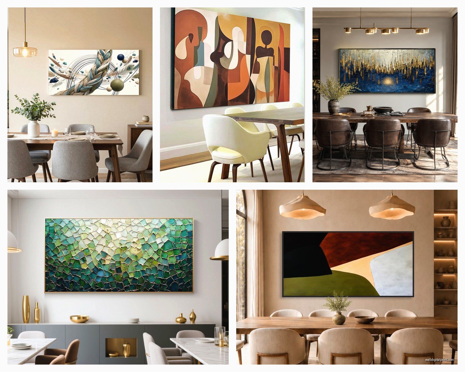
Color Coordination Without Being Matchy-Matchy
This is gonna sound weird but I actually take photos of my dining room in different lighting before I start looking at art. Morning light, evening light, overhead lights on, candles going, whatever. Abstract art looks completely different depending on the light and you don’t want a piece that’s gorgeous at 2pm but looks muddy during dinner.
For color selection, you’ve got two approaches that actually work. You can either pull colors that are already in your space, like if you’ve got navy dining chairs, finding an abstract piece with some navy elements ties everything together. Or you go completely opposite and use the art to introduce a new accent color. I did this in my own place, actually, had all these warm wood tones and cream walls, brought in an abstract with coral and rust tones and it totally changed the vibe.
What doesn’t work is trying to match exactly. Like don’t go hunting for the exact shade of teal that’s in your curtains because you’ll never find it and you’ll drive yourself crazy. Trust me on this one.
The Undertone Thing Nobody Talks About
Your dining room has an undertone, warm or cool, and your abstract art needs to work with that. Warm undertones are yellows, oranges, reds, golden browns. Cool undertones are blues, greens, purples, grays. Most abstract art leans one way or the other even if it’s got multiple colors.
I learned this the hard way when I put a cool-toned abstract (lots of blues and grays) in a dining room with warm oak furniture and brass fixtures. It just felt… off. Not terrible, just not right. Swapped it for something with warm undertones and suddenly everything clicked.
Style Matching Your Furniture
If you’ve got modern furniture, like clean lines, minimal details, you can go wild with your abstract art. Bold colors, geometric shapes, even really chaotic expressionist stuff works because the furniture grounds it. My favorite combo right now is super minimalist Scandinavian dining furniture with really bold, colorful abstract expressionism art. The contrast is chef’s kiss.
Traditional or transitional furniture is trickier. You can still do abstract but I’d lean toward softer abstracts, maybe with more organic shapes rather than hard geometric ones. Watercolor-style abstracts work really well here, or abstract landscapes that have some recognizable elements but are still loose and artistic.
Mid-century modern furniture, which like everyone has now, is probably the easiest. Pretty much any abstract style works. Geometric, organic, bold, subtle, whatever. Mid-century was all about mixing styles anyway so you’ve got freedom here.
Where to Actually Buy This Stuff
Okay so I’m gonna be real with you, I’ve bought from everywhere at this point. Etsy is great if you want original pieces or prints from independent artists, and the price range is huge. You can find prints for like $50 or original paintings for thousands. The search function is kinda annoying though, you have to get specific with your keywords.
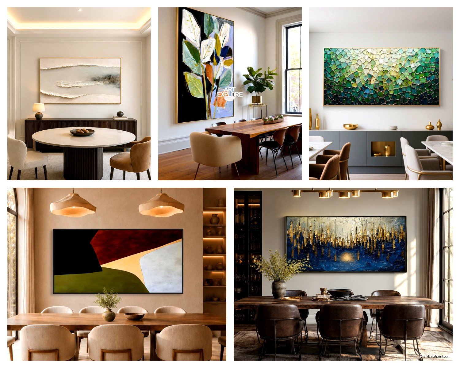
Minted has really good quality prints and their framing options are solid. I use them a lot for clients who want something nice but don’t wanna spend original art money. Their abstracts tend to be more… polished? Like less raw artist energy, more designed, if that makes sense.
Society6 and Redbubble are hit or miss. Some really cool stuff, some pretty generic. The quality can vary depending on what you order. I’ve had good luck with their framed prints but their canvas prints are just okay.
If you want original art and have the budget, Saatchi Art is where I go. They’ve got emerging artists and established ones, prices all over the place. You can actually talk to the artists sometimes which is cool for custom sizing.
Oh and another thing, local art fairs and open studios. I found my favorite dining room piece at a random studio tour, and it was way cheaper than buying through a gallery. Plus you meet the artist which is kinda fun.
Frame or No Frame
Canvas abstracts look good without frames if they’re gallery-wrapped, where the image continues around the sides. This works especially well for modern and contemporary spaces. Just make sure the sides are actually painted or printed, not stapled canvas showing.
Framing adds formality and also protection. If your dining room is more traditional or you want the art to feel more finished, frame it. I usually do thin black frames for modern spaces, natural wood for warm/organic spaces, and white or gold for traditional.
For paper prints you gotta frame them, obviously. Use a mat though, like a 2 to 3 inch mat, it makes even inexpensive prints look way more expensive. White mats are safe, but I’ve been doing colored mats lately and when you get it right it’s really good.
Acrylic Versus Glass
Museum glass is incredible but expensive. It’s basically invisible and protects against UV. If you’re spending serious money on original art, it’s worth it.
Regular glass is fine for most situations. Acrylic is lighter and won’t shatter which matters if you have kids or live somewhere with earthquakes, but it scratches easier and can have glare issues.
Lighting Makes or Breaks Everything
I cannot tell you how many times I’ve hung perfect art that looked terrible because the lighting was wrong. You need to light your art intentionally, not just hope your overhead fixture does the job.
Picture lights are the classic solution. Those little lights that mount above the frame. They work great for traditional spaces but can look fussy in modern dining rooms.
Track lighting or adjustable recessed lights are what I use most often now. You can aim them right at the art and adjust as needed. LED bulbs, warm white, around 2700 to 3000K so your colors don’t look weird.
Natural light is tricky because UV fades art over time. If your dining room has big windows and gets direct sun, either use UV-protective glass in your frame or position the art on a wall that doesn’t get blasted. I’ve seen beautiful pieces completely washed out from sun exposure and it’s heartbreaking.
The Actual Hanging Process
Okay so you need a level, a pencil, measuring tape, and the right hardware. For anything over like 20 pounds, use wall anchors or hit a stud. Drywall alone won’t hold heavy art securely and you don’t want it crashing down during dinner.
I use a paper template method that sounds fussy but saves so much hassle. Trace your frame on paper, cut it out, tape it to the wall where you think you want it. Live with it for a day or two, see how it feels. Move it around. Once you’re sure, mark your hanging points through the paper, take it down, and install your hardware.
D-rings and wire are standard but I actually prefer hanging from two points (two D-rings or French cleats) for larger pieces because they’re more stable and won’t tilt over time.
Multiple Pieces Versus One Statement Piece
One large abstract is easier to get right, honestly. It’s bold, it makes a statement, and you don’t have to worry about composition between multiple pieces.
But if you wanna do multiple pieces, my cat literally just jumped on my keyboard sorry, anyway if you’re doing multiple abstracts the key is creating relationships between them. Either go matchy with the same size frames and similar color palettes, or go totally eclectic with different sizes and styles but keep them in the same general color family.
I did a dining room last year with five different abstract pieces, all different sizes, arranged salon-style. It looked chaotic in the best way, but we spent like three hours arranging and rearranging on the floor first. Start with your largest piece slightly off-center, build around it, keep spacing between frames consistent, around 2 to 3 inches.
Common Mistakes I See Constantly
Hanging art too high. Like way too high. I don’t know why people do this but they do. Your art should relate to your furniture, not float up near the ceiling.
Choosing art that matches the wall color too closely. If you have gray walls and get a predominantly gray abstract, it just disappears. You need contrast.
Going too safe. Abstract art in dining rooms should have some personality. Don’t pick something just because it won’t offend anyone. Pick something you actually like looking at.
Forgetting about scale in relation to furniture. Your art needs to relate to your table and chairs in size. Tiny art above a massive table looks ridiculous.
Not considering the view from the table. You’re gonna be looking at this art while you eat, so sit in your dining chairs and make sure the composition works from that angle, not just standing in the doorway.
Budget Realistic Expectations
Prints start around $30 to $50 for basic ones, up to $200 to $300 for high-quality giclée prints from good artists. Add another $100 to $300 for decent framing.
Original paintings, you’re looking at minimum $300 to $500 for smaller pieces from emerging artists, up to thousands for established artists or large-scale work. I’ve spent $3000 on a single dining room piece for a client and I’ve also found amazing originals for $400.
Canvas prints are usually cheaper than framed prints, like $80 to $150 for a decent size, and they’re ready to hang.
Don’t cheap out on framing if you’re getting something framed. Bad framing makes even expensive art look cheap. Good framing makes affordable art look expensive. It’s worth the investment.
Seasonal Switching
Some people switch their dining room art seasonally and honestly it’s extra but also kinda fun? I have a client who does warm-toned abstracts in fall/winter and cool-toned in spring/summer. It’s not necessary but if you like changing things up and have the storage space, why not.
More practical is just having art you can live with year-round. Neutrals with one or two accent colors tend to work across seasons without feeling dated or too specific.
Anyway I think that covers most of it, there’s probably stuff I’m forgetting but this is the main stuff that actually matters when you’re trying to pick abstract art for a dining room without making it weird or spending a fortune on something that doesn’t work.
