Wall Art Guide, Wall Art Tutoriels
Burgundy Wall Art for Bedroom: Wine Red Sleep Space Accents
Sep
So I’ve been working with burgundy wall art in bedrooms for like three years now and honestly it’s one of those colors that either transforms a space completely or makes it look like a weird vampire lair, there’s not much in between.
Why Burgundy Actually Works in Bedrooms
Okay so here’s the thing about wine red tones – they’re supposed to be these moody sophisticated colors but most people hang one piece and then panic because it feels too dark. The trick is you gotta commit or go really minimal. I had a client last month who bought this massive burgundy abstract piece and then surrounded it with like seven other colorful prints and it was a disaster. We stripped everything back and suddenly the room felt expensive instead of chaotic.
The color itself is basically red’s grown-up cousin. It doesn’t scream for attention like fire engine red but it’s not boring like brown. Works especially well if your bedroom gets decent natural light because the color shifts throughout the day – looks almost purple in morning light and deeper wine at night.
What Actually Looks Good
Abstract Pieces
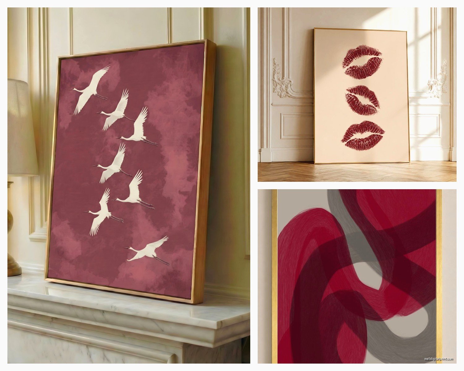
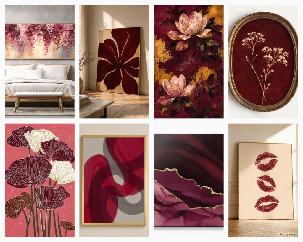
These are gonna be your safest bet honestly. I’m talking about pieces with burgundy as the dominant color mixed with gold, cream, or even navy. There’s this one print I keep recommending – it’s got these organic flowing shapes in burgundy and blush pink. Sounds weird but it softens the whole vibe. You want something that has movement without being too busy.
The size matters more than people think. For above a queen bed you need at least 40 inches wide, preferably closer to 60. Anything smaller looks like you just grabbed whatever fit in your car. I learned this the hard way in my own bedroom actually – had this 24×24 piece above my king bed for like six months before I finally admitted it looked ridiculous.
Floral and Botanical Prints
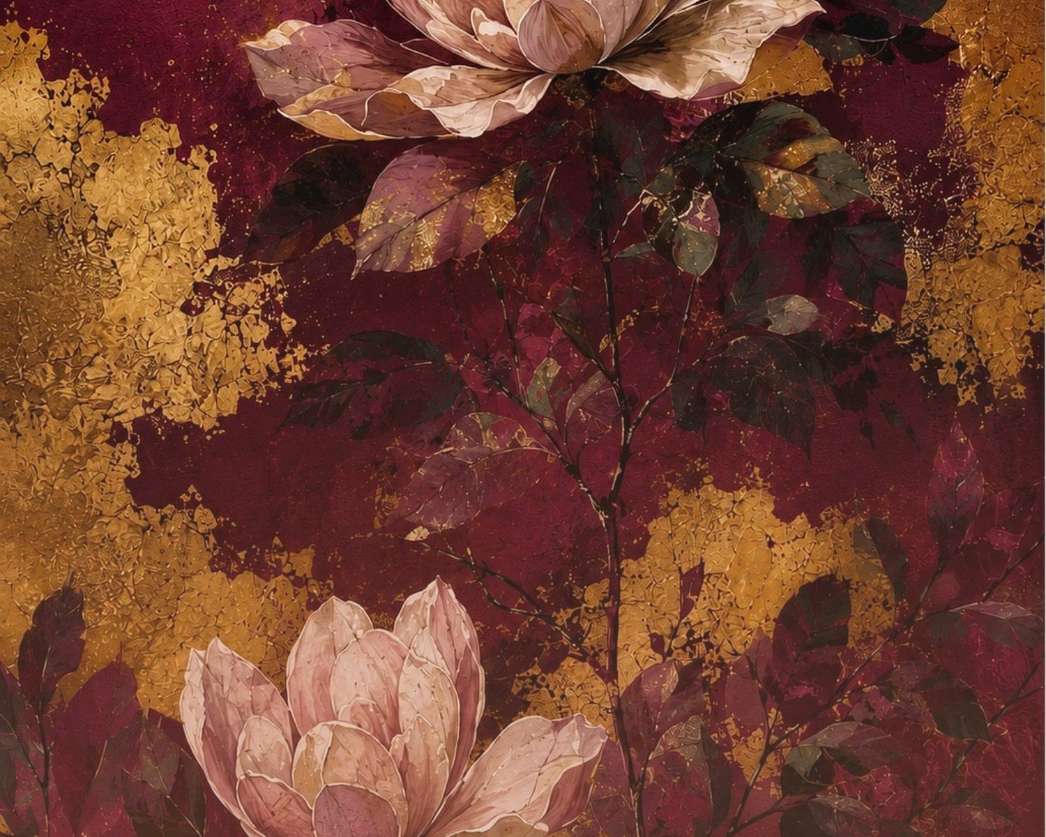
This is where burgundy gets interesting. Deep red roses, peonies, or even those moody dried flower arrangements. But not the grandma floral stuff – I’m talking about modern interpretations. There’s a style right now that’s like… almost gothic botanical? Dark backgrounds with burgundy flowers that look slightly vintage but clean lines.
My friend Sarah just hung three burgundy poppy prints in her bedroom and paired them with white linen everything and it’s honestly stunning. The contrast is what makes it work. If you go burgundy walls AND burgundy florals you’re gonna feel like you’re sleeping in a funeral home.
Geometric and Line Art
Wait I forgot to mention – geometric stuff in burgundy is having a moment. Think simple line drawings, architectural prints, or those trendy one-line face drawings but in wine red instead of black. These work really well if the rest of your room is super minimal. Like if you’ve got that whole Scandinavian thing going but want to add some warmth.
I curated a collection last year that was all burgundy line art and people went crazy for it. The key is the lines need to be thick enough to actually read as burgundy from across the room. Thin delicate lines just look muddy.
How to Actually Hang This Stuff
Okay so funny story – I once hung a huge burgundy canvas at like 10pm because I couldn’t sleep and ended up putting it way too high. Spent the next morning redoing it. The rule is center of the artwork should be at 57 inches from the floor. But honestly in bedrooms I go slightly lower, especially above beds, because you’re viewing it from a reclined position half the time.
If you’re doing a gallery wall with burgundy pieces, don’t make them all burgundy. That’s too much. Mix in maybe 40% burgundy, rest should be neutrals or complementary colors. I usually do burgundy, cream, and maybe one piece with gold accents. Lay everything out on the floor first – I cannot stress this enough. Take a picture from above and look at the balance.
The Spacing Thing
Keep 2-3 inches between frames in a gallery wall. More than that looks disconnected, less looks crowded. And please use a level. I don’t care if you think you have a good eye, you don’t. Nobody does. My cat knocked over my level last week and I had to use a measuring tape and it was horrible.
What Colors to Pair With Burgundy
This is where people mess up constantly. They think burgundy is versatile but it’s actually pretty specific about its friends.
Cream and ivory – Your best option. Creates this elegant contrast without being stark. All my favorite burgundy bedrooms have cream bedding and the art just pops.
Gold and brass – Yes. Frames, accents, whatever. The warm metallics make burgundy look rich instead of flat. Silver and chrome make it look cold and weird.
Navy and deep blue – Works better than you’d think. There’s something about jewel tones together that just clicks. Had a client do burgundy art with navy accent pillows and it was chef’s kiss.
Blush and dusty pink – Softens everything. Good if you’re worried about the room feeling too masculine or heavy.
What doesn’t work: Bright white makes burgundy look muddy. Orange is a disaster. Bright red is redundant. Lime green… why would you even consider this but I’ve seen it attempted.
Actual Product Recommendations
Look, I’m gonna be real with you – most of the good burgundy wall art I find is either from independent artists on Etsy or from a few specific home decor retailers. The mass market stuff at like HomeGoods is hit or miss, mostly miss.
Canvas vs Framed Prints
Canvas is easier because you don’t have to worry about framing costs. But honestly? Framed prints look more expensive. If you’re going canvas, make sure it’s thick enough that you can’t see the wooden frame through the fabric. Cheap canvases look cheap, period.
For frames with burgundy art, I almost always recommend gold, natural wood, or black. White frames can work but only if the print has white elements in it. The thin metal frames that are trendy right now – hit or miss with burgundy. Sometimes they make it look more modern, sometimes they just disappear and the art looks like it’s floating awkwardly.
Size and Scale Guidelines
Above bed: 2/3 the width of your bed minimum. So for a 60-inch wide queen, you want at least 40 inches of art width. Can be one piece or a grouping but that’s your minimum.
Side walls: Depends on your furniture but generally 24×36 or larger. Anything smaller feels like an afterthought unless you’re doing a bigger gallery wall situation.
I had this tiny bedroom last month where we did one large burgundy piece instead of trying to fill multiple walls and it made the room feel bigger somehow. Sometimes less really is more, which sounds like design BS but it’s true.
The Gallery Wall Approach
If you’re gonna do multiple pieces, odd numbers work better. Three or five pieces, not four or six. And vary the sizes – all same size looks like a hotel. I usually do one large focal piece (maybe 24×36) and then smaller pieces around it (like 11×14 or 16×20).
Oh and another thing – keep the style consistent even if you’re mixing subjects. All modern, all vintage, all abstract, whatever. Mixing styles with a strong color like burgundy gets messy fast.
Lighting Considerations
This is gonna sound weird but burgundy art needs good lighting or it just looks like a dark blob on your wall. If your bedroom doesn’t get much natural light, consider adding a picture light above the art or positioning it where a lamp can illuminate it.
I was watching this home renovation show the other night and they put burgundy art on the darkest wall with no light source and I was yelling at the TV. My dog thought I was mad at him, it was a whole thing.
Warm bulbs only. Cool LED lighting makes burgundy look purple-ish and weird. You want 2700K-3000K bulbs. Yeah I know that’s specific but it matters.
Common Mistakes to Avoid
Matching your burgundy art exactly to your burgundy throw pillows. Don’t do this. It looks matchy-matchy in the bad way. Coordinate, don’t match. Different shades, different textures.
Hanging art too high. I already said this but people keep doing it. Eye level means eye level, not ceiling level.
Buying art that’s too small because it’s cheaper. Save up and get the right size. A properly sized piece makes a bigger impact than three small ones.
Ignoring the undertones. Some burgundy leans purple, some leans brown, some is true wine red. Make sure it works with your existing colors. I learned this when I bought what I thought was burgundy art and it was basically maroon with blue undertones and clashed with everything.
Budget Options That Don’t Look Cheap
Printable art is your friend. Buy a high-res digital file, get it printed at a local print shop on nice paper, frame it yourself. Costs like $50 total versus $200+ for pre-made.
Thrift stores sometimes have great frames. Buy ugly art in good frames, remove the art, insert your own. I do this constantly.
DIY abstract art is actually doable with burgundy. Get a canvas, some acrylic paint in burgundy plus complementary colors, watch one YouTube tutorial. Even if you think you’re not artistic, abstract is forgiving. My first attempt looked terrible but my second one is hanging in my hallway and people ask where I bought it.
Maintenance and Longevity
Canvas pieces collect dust. Use a soft brush or microfiber cloth every few months. Don’t use cleaning products, just dry dust.
Keep burgundy art out of direct sunlight. The color fades faster than lighter colors. I had a print above a west-facing window and within a year it looked washed out.
If you’re renting and can’t patch holes, command strips actually work for lighter pieces. Just make sure you get the right weight rating. I’ve had one fall at 3am and nearly had a heart attack.
Okay I think that’s everything I’ve learned from multiple burgundy bedroom projects. The main thing is don’t be scared of the color but also don’t go overboard. It’s dramatic enough on its own without you trying to make it more dramatic. Start with one good piece and build from there if you want. And honestly measure twice, hang once, because spackle is annoying.