Wall Art Guide, Wall Art Tutoriels
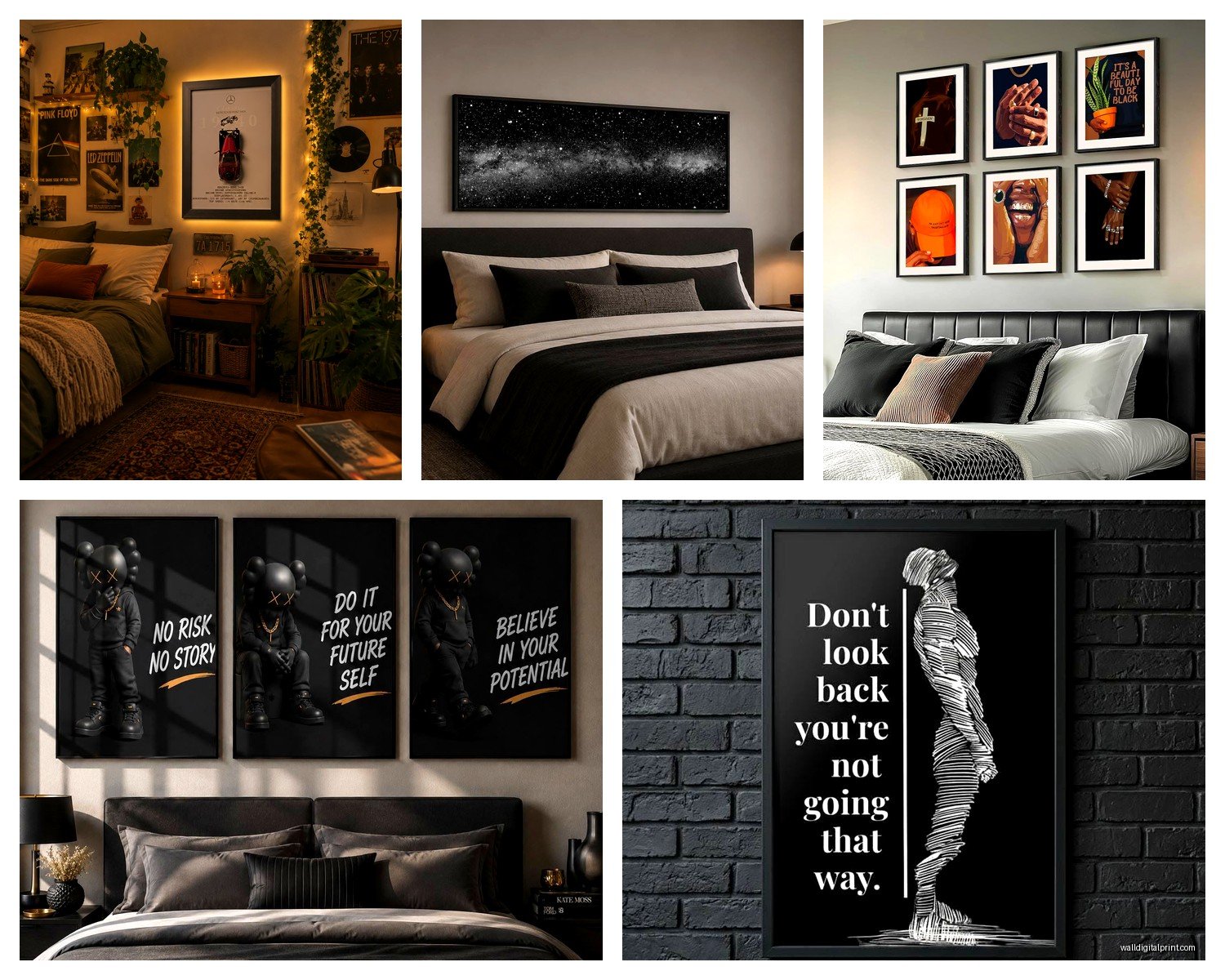
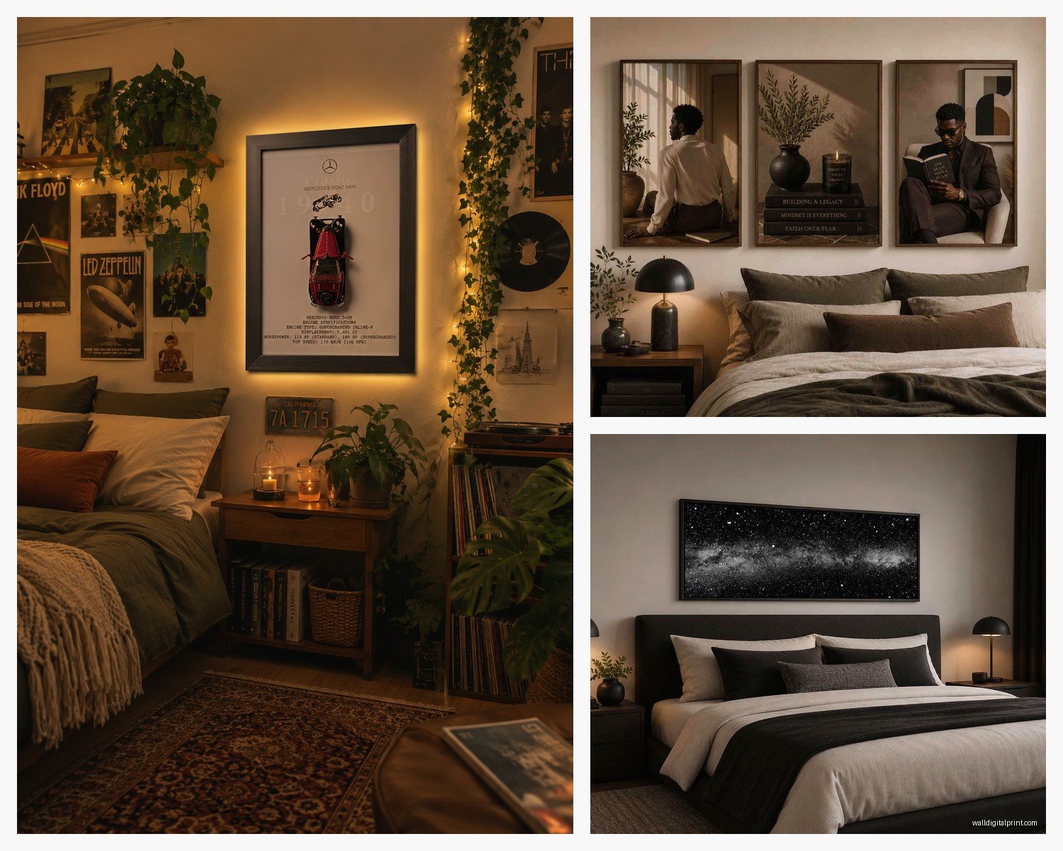
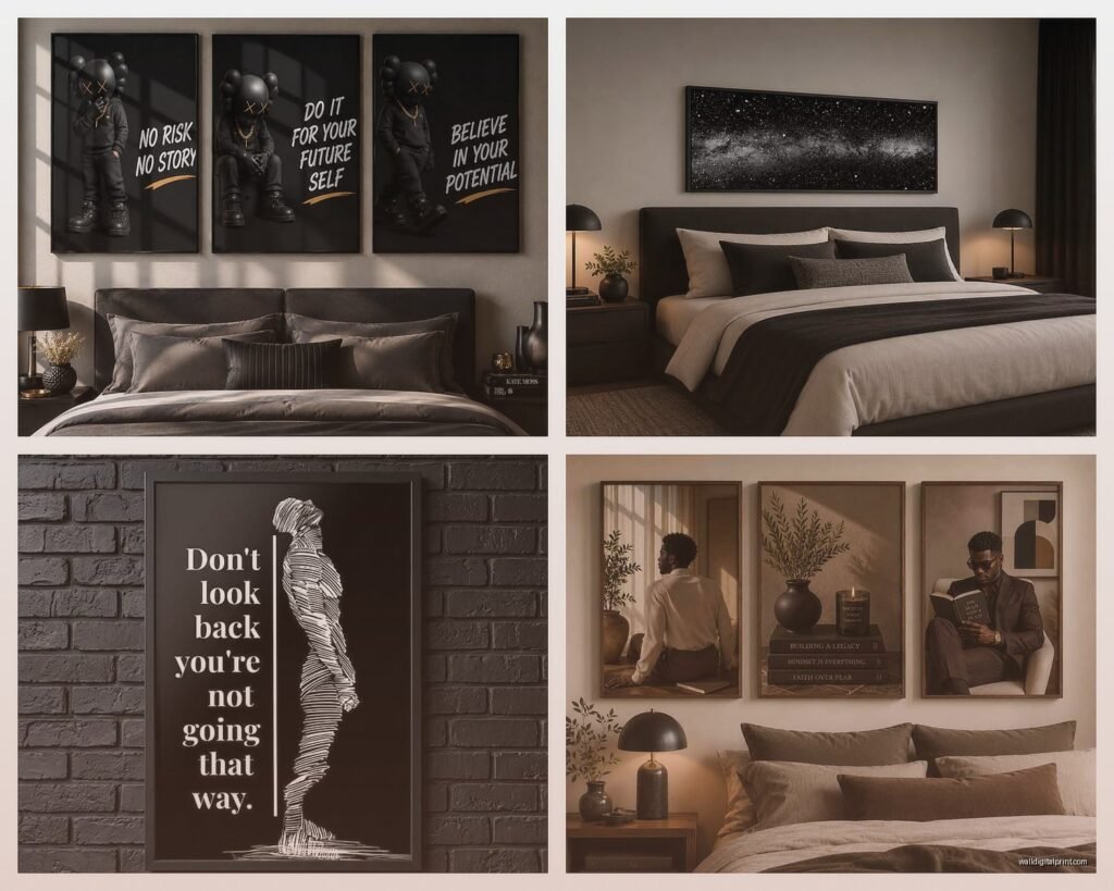
Wall Art for Man’s Bedroom: Masculine Sleep Space Decor
Sep
So I just finished redoing my brother’s bedroom last month and honestly, the wall art situation for guys is way easier than people make it out to be, but also there are like a million ways to totally mess it up.
Start With the Vibe You’re Actually Going For
Okay so first thing – you gotta figure out if you want industrial, minimalist, urban, or that whole moody dark academia thing that’s everywhere right now. I had this client who kept saying “masculine” but then showed me Pinterest boards that were all over the place. We wasted like three weeks because he couldn’t commit to a direction.
The easiest route honestly? Black and white photography. I know that sounds boring but hear me out – architectural shots, vintage cars, cityscapes at night. There’s this company called Desenio that I use constantly because their frames are actually decent quality and you’re not gonna spend like $400 on one piece. I got a set of three black and white urban photographs for my brother’s place, the large ones, and they were maybe $150 total with frames.
Size Actually Matters More Than You Think
Here’s where most guys screw up – they buy art that’s way too small. If you’ve got a wall behind your bed, you need something that’s at least two-thirds the width of your bed frame. So if you have a queen bed, that’s 60 inches wide, which means your art should be around 40 inches minimum. I see so many bedrooms with these tiny little 16×20 prints that just look sad and floating.
My dog knocked over my coffee while I was measuring this stuff yesterday, complete mess, but anyway – you can go a few directions here:
- One large statement piece (like 40×60 inches or bigger)
- A diptych or triptych set that spans the same width
- A gallery wall, but this is harder to pull off without it looking cluttered
What Actually Looks Good in a Guy’s Bedroom
Alright so from testing this across probably 30+ bedroom projects, here’s what consistently works:
Abstract geometric art – Think bold lines, neutral colors, maybe some navy or dark green. Not the colorful stuff, more like textured canvas with black, white, gray, charcoal. There’s an artist on Etsy called MinimalInstinct who does these massive abstract pieces that are actually affordable. I’ve ordered from them like four times.
Vintage maps – But not the cheesy ones from HomeGoods. I mean actual vintage-style topographical maps or nautical charts. Frame them in simple black frames. My brother’s bedroom has this huge map of the Pacific Northwest where he grew up and it’s genuinely cool, not trying-too-hard cool.
Music stuff if you’re into it – Vinyl records framed on the wall, vintage concert posters, but again, it’s gotta be authentic to what you actually like. Don’t put up a Beatles poster if you listen to electronic music, you know?
Automotive or aviation – Patent prints of vintage cars, blueprint-style drawings of motorcycles or planes. These work surprisingly well in a minimalist space.
The Typography Trap
Okay so funny story – I ordered this “Stay Focused” typography print for a client’s home office and he wanted to move it to his bedroom. Typography art in bedrooms is tricky because it can feel either motivational-poster-gym or like you’re trying to manifest something. The only typography that works is either really artistic where the letters are part of a larger design, or it’s something genuinely meaningful and subtle. Skip the “Rise and Grind” stuff unless you want your bedroom to feel like a LinkedIn post.
Colors That Don’t Make It Feel Like a Teen’s Room
Stick with a pretty limited palette. The masculine bedroom thing really thrives on restraint which sounds pretentious but it’s true.
Safe colors for wall art:
- Black, white, gray (obviously)
- Navy blue
- Deep forest green
- Rust or burnt orange as an accent
- Charcoal and cream together
- Deep burgundy if the room is moody
What to avoid – bright yellows, most pinks, anything that’s described as “vibrant” or “cheerful” in the product description. Unless that’s your thing, then go for it, but you asked about masculine spaces specifically.
Where to Actually Hang This Stuff
The math is annoying but important. Center of the artwork should be at 57-60 inches from the floor – that’s standard gallery height. But if you’re hanging above furniture, the bottom of the frame should be 6-8 inches above the headboard or dresser.
I literally keep a laser level in my car now because eyeballing it is how you end up with crooked art that bugs you every single night. Command strips are fine for lightweight stuff under 5 pounds, but anything substantial needs actual picture hanging hardware. I’ve had too many 2am texts from clients whose art fell and scared the crap out of them.
The Gallery Wall Debate
Gallery walls can look amazing but they’re also easy to mess up in a bedroom. If you’re gonna do it, here’s what I’ve learned actually works:
Keep it to one wall, probably not the wall you see right when you wake up because it can be visually overwhelming first thing in the morning. I did a gallery wall in my own bedroom once and moved it within a month because it was too much stimulation.
Use matching frames – all black or all natural wood. Mixing frame styles in a bedroom reads as chaotic rather than curated. Save that for living rooms.
Lay it out on the floor first and take a picture. Move stuff around digitally before you start punching holes in your wall. There are also these gallery wall templates you can buy on Amazon for like $15 that are basically paper templates you tape to the wall first.
Actual Pieces I Keep Recommending
Wait I forgot to mention – texture matters as much as the image itself. A canvas print feels more finished than a paper print, generally speaking. But also those wooden slat art pieces or metal wall sculptures can break up the flatness.
I just used this oversized black and white photograph of Joshua Tree printed on aluminum for a client’s bedroom and it looks expensive but was like $200 from Artifact Uprising. The metal gives it this really clean, modern edge.
For budget-friendly options that don’t look cheap:
- Society6 – hit or miss but their large canvas prints are decent
- Minted – better quality, more expensive, good for photography
- Etsy shops that do digital downloads – you download and print at a local print shop, way cheaper
- Framebridge – if you have a photo or print you love and need it framed well
The Three-Piece Rule
If you’re totally overwhelmed, here’s the formula I use: three pieces of wall art total in a bedroom. One large piece above the bed, and two smaller complementary pieces elsewhere – maybe above a dresser and near the door or window. This keeps it from feeling empty but not cluttered.
My brother’s room has the three black and white prints above his bed, a vintage bicycle patent print above his dresser, and a small shelf with a framed photo. That’s it. Looks pulled together, took maybe an hour to hang everything.
Avoiding the Bachelor Pad Cliché
There are certain things that just scream “I decorated this in 2015 and haven’t updated” – the black and white photo of a woman’s back, the Scarface poster, anything with a wolf or lion trying to look fierce, generic “wanderlust” mountain photos, and those multi-panel canvas prints of literally anything.
If you saw it in a hotel room or a dorm room, probably skip it for your actual bedroom.
Personal Photos Work Better Than You Think
Guys tend to avoid personal photos on bedroom walls but honestly, a really well-shot photo from a trip or a meaningful place, printed large and framed simply, beats generic art every time. I had a client who surfed and we printed this huge photo he took of a wave in Costa Rica. Got it printed at a local print shop on matte paper, simple black frame, looks like something from a gallery.
Just make sure the photo is high resolution enough to print large. Your iPhone photo might look great on your phone but pixelated at 30×40 inches.
Lighting Your Wall Art
This is gonna sound extra but picture lights or wall sconces above your art make such a difference. Those little LED picture lights from Amazon are like $30 and they make whatever you hang look ten times more intentional. I installed some in my brother’s room on a dimmer switch and now his bedroom actually has ambiance instead of just overhead lighting.
When to Break the Rules
Look, if you’re really into something specific – comic book art, sports memorabilia, whatever – just commit to it fully and frame it well. I’ve seen vintage skateboard decks mounted on walls that look incredible because the person actually cared about it and presented it nicely. It’s the half-commitment that looks bad.
One of my favorite bedrooms I’ve done was for a guy who collected vintage National Park posters. We framed like eight of them in matching frames and did a whole gallery situation. It worked because it was genuine and cohesive.
Quick Fixes If Your Room Feels Off
Sometimes the art itself is fine but something still feels wrong. Usually it’s one of these issues:
The frame is too ornate or doesn’t match the room’s style. Swap it for something simpler.
The art is competing with busy bedding or wallpaper. Either simplify the art or simplify the other stuff.
There’s too much going on. Remove pieces until it feels calmer.
Everything is the same size. Mix sizes – small, medium, large.
My cat just knocked something over, gotta go check on that real quick… okay false alarm, she’s just being dramatic.
Final Random Tips
Get art before you paint if you’re doing a room refresh. It’s easier to pick paint colors to match art than the other way around.
Command strips damage less paint than you’d think if you remove them properly. Pull down, not out.
Measure twice, hang once. Seriously, write down your measurements.
If you’re renting, those 3M hooks rated for heavy pictures are your friend. I’ve hung 20-pound frames on them without issues.
Don’t buy art from the same place you buy your furniture. It ends up looking too matchy-matchy, like a showroom.
And honestly? Live with empty walls for a week or two first. See where your eye naturally goes, what feels empty. Sometimes the obvious spot isn’t actually the right spot. I’ve changed my mind on art placement so many times after living with a space for a bit.
The whole point is your bedroom should feel like it’s yours, not like you copied a hotel room or an Instagram photo. The art should make you feel something or at minimum not annoy you when you look at it every day.