
Wall Art Guide, Wall Art Tutoriels
Country Wall Art: Rural Farmhouse Rustic Barn Decor
Sep
So I’ve been helping clients figure out this country wall art thing for years now and honestly it’s way less complicated than Pinterest makes it look but also there are some real tricks nobody talks about.
Start With What You Actually Have Space For
Okay first thing – measure your wall. I know everyone says this but like actually do it because I watched my sister buy this gorgeous barn landscape that was 60 inches wide and her wall space was 48 inches and it was a whole thing. Get your tape measure and write it down in your phone notes because you’ll forget by the time you’re scrolling Etsy at midnight.
For country wall art the scale is weirdly important. Too small and it looks like you just stuck something up there to fill space, too big and it overwhelms the whole farmhouse vibe you’re going for. My general rule is your art should take up about 60-75% of the wall space width-wise. So if you’ve got a 6-foot wide wall section, you’re looking at art that’s roughly 43-54 inches wide.
The Three Main Categories That Actually Work
After curating like a million farmhouse spaces I’ve noticed country wall art really falls into three camps and knowing which one you want saves so much time:
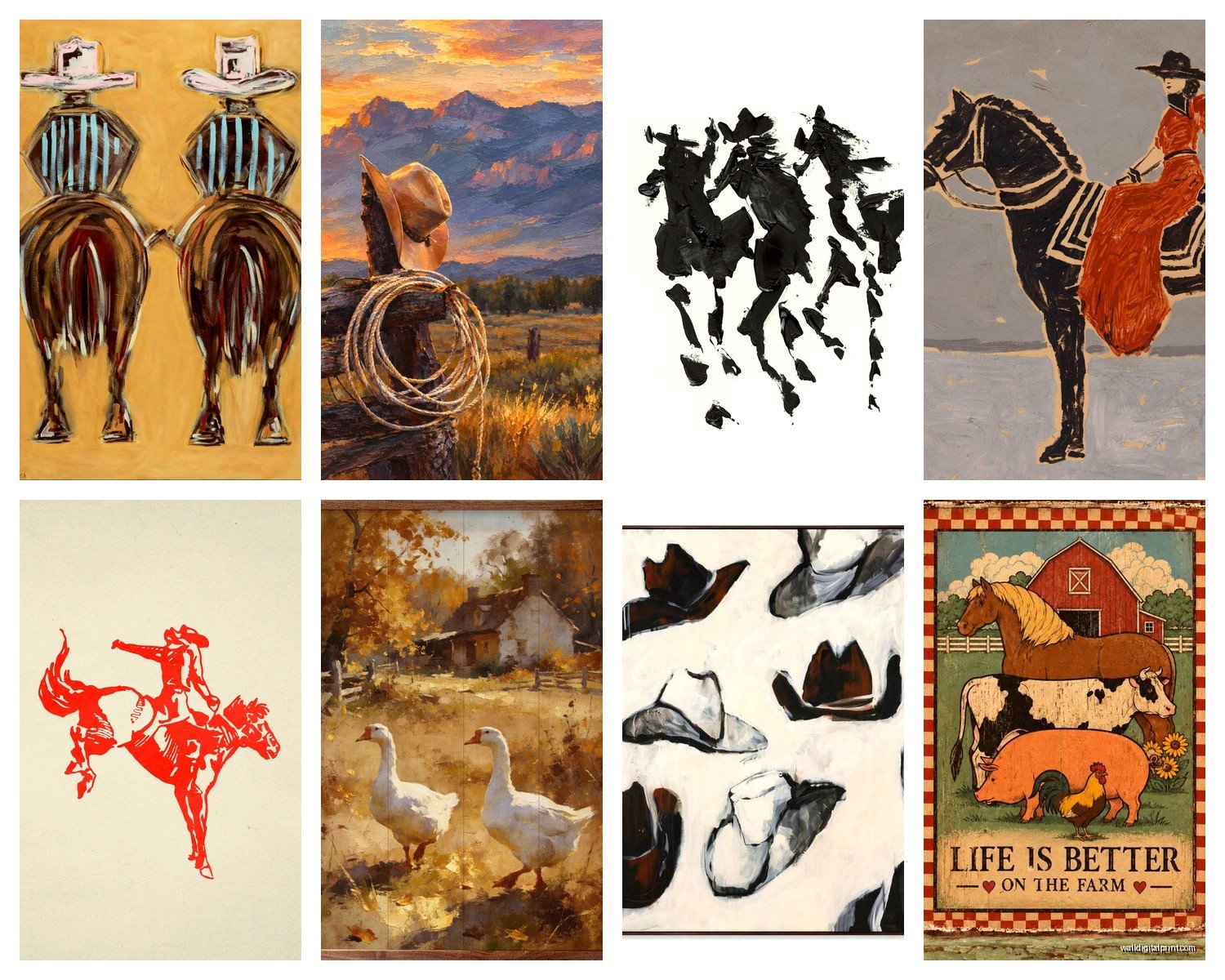
Vintage Farm Animal Prints
These are the cows, chickens, pigs, horses – usually in a really neutral washed out palette. They work because they’re recognizable but not too literal. I’ve found the best ones have this aged look, almost like they’re old livestock auction posters or something. You want them to look like they’ve been hanging in a barn office since 1952.
The trick here is don’t go too cute. Like no cartoon cows with eyelashes unless you’re doing a kids room. You want that authentic agricultural vibe. I usually tell people to look for prints that say “Hereford” or “Angus” or have breed information on them – that vintage livestock catalog aesthetic is chef’s kiss.
Barn and Landscape Photography
This is probably the most popular category and also where people mess up the most. Not all barn photos are created equal. You want ones with good contrast and interesting weather – dramatic skies, golden hour lighting, maybe some fog. A barn in flat midday lighting is just gonna look blah on your wall.
I actually spent like three hours last month comparing canvas prints of barns because my own dining room needed something and the difference in quality is WILD. The cheap ones look washed out and you can see the canvas texture too much. You want a print where the blacks are actually black and the image has depth.
Typography and Sayings
Okay so this category can go really wrong really fast but when done right it’s perfect. Skip anything too wordy or cutesy. “Farmhouse Rules: Wake Up Early, Work Hard, Eat Good Food” type stuff usually reads as trying too hard. Instead look for single words like “Gather” or “Farm Fresh” or “Established [year]” with simple typography.
The font matters more than you’d think. You want something that feels hand-painted or weathered, not like someone just typed it in Arial. Distressed lettering on painted wood backgrounds works really well.
Materials and Finishes That Don’t Look Cheap
This is where I see people waste money all the time. Not all rustic wall art is actually rustic if that makes sense.
Canvas prints can work but they need to be gallery wrapped (where the image continues around the edges) and at least 1.5 inches deep. Those thin canvases that are like half an inch thick look cheap no matter what’s printed on them. I learned this the hard way with a client’s living room where we had to redo everything because the canvases looked like they came from a hotel liquidation sale.
Wood signs are having a moment but quality varies SO much. Real wood with actual painted or stained designs beats printed-on-wood every time. You should be able to see wood grain and texture. If it looks too perfect it’s probably just a print on MDF with a wood frame and it won’t have that authentic feel.
Metal prints are surprisingly good for barn photography. They give this slight sheen that makes landscapes pop and they’re super durable. My dog knocked one off the wall once (long story, there was a squirrel outside) and it was totally fine.
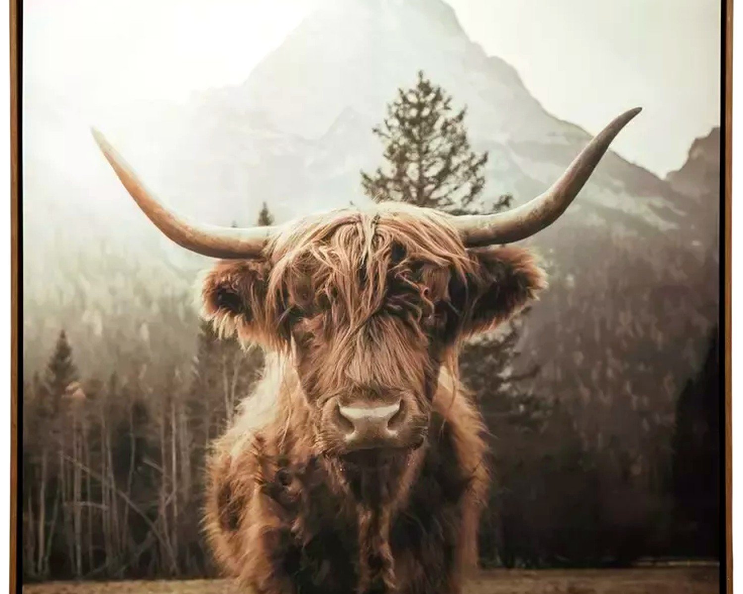
Framed prints under glass – make sure the frame is actually wood not plastic made to look like wood. Run your finger along the edge and you can usually tell. Real wood has slight variations and warmth to it.
The Color Palette Thing Nobody Explains Right
Country wall art works best in this really specific color range and it’s not what you might think. Everyone assumes it’s all browns and beiges but the best spaces I’ve styled have more going on.
Your base should be neutrals – grays, taupes, cream, weathered white. But then you need one accent color and this is key: muted blue-gray (like old barn paint), olive green, or rust orange. Not bright versions, the faded dusty versions. This gives you that authentic rural feel without being boring.
Black and white photography works surprisingly well in farmhouse spaces. I was skeptical for years but a really contrasty black and white barn photo against white shiplap is stunning. Just make sure it has true blacks not wishy-washy grays.
Arrangement Patterns That Actually Look Good
Okay so you’ve got your art picked out now you gotta hang it and this is where people freeze up.
Single large statement piece: Easiest option. Center it on your wall, hang it at eye level (which is 57-60 inches to the center of the artwork). Done. This works great over sofas, beds, console tables.
Gallery wall of similar sized pieces: This looks more complicated than it is. Get 4-6 pieces in the same size, arrange them in a grid with even spacing (I use 2-3 inches between frames). The trick is keeping everything aligned – use painters tape to mark your layout on the wall first. I learned this after hanging things wrong approximately eight thousand times.
Asymmetrical grouping: This is the “collected over time” look. Mix sizes but keep them in the same color family. Start with your largest piece and build around it. Nothing should be floating in space – each piece should relate to at least one other piece near it. I usually sketch this out on paper first with rough rectangles.
Wait I forgot to mention – if you’re hanging over furniture leave 6-8 inches between the furniture and the bottom of your art. Too high and it looks disconnected, too low and someone’s gonna bonk their head.
The Lean Method
This is gonna sound weird but sometimes the best approach is not hanging things at all. Leaning art on floating shelves or mantels gives this really relaxed farmhouse vibe. You can layer pieces, switch them out easily, and there are no nail holes. I do this in my own house because I change my mind about stuff constantly and my walls were starting to look like Swiss cheese.
Where to Actually Buy This Stuff
Real talk about shopping because there’s so much garbage out there mixed in with the good stuff.
Etsy is hit or miss. Look for shops that show actual photos of their products in real homes, not just mockups. Read reviews that mention quality and shipping. I’ve found some amazing vintage farm prints on Etsy but I’ve also received things that looked nothing like the listing photo.
Wayfair has a huge selection and their photos are usually accurate but the quality is middle-of-the-road. Good for filling space on a budget but don’t expect heirloom pieces.
Hobby Lobby and Kirklands rotate their farmhouse stuff seasonally. I check these places every few months because when they clearance things out you can get really good deals. Just bought a metal windmill wall piece for like 40% off last week.
Antique stores and flea markets for real vintage stuff – old farm signs, livestock photos, agricultural advertisements. These are one-of-a-kind and have actual history. They cost more but the authenticity is worth it if you’re going for that real deal farmhouse look.
Target’s Hearth and Hand line has some decent options that don’t look super mass-produced. Their wood framed prints are surprisingly solid for the price.
Mixing Textures and Dimensions
Flat art is fine but the spaces that really nail the rustic barn aesthetic have dimensional elements. I’m talking about mixing your framed prints with things like:
- Metal windmills or farm equipment silhouettes
- Wooden architectural pieces like old window frames
- Woven baskets hung on the wall
- Vintage tools as art
- Cotton stems or wheat in wall-mounted vases
The key is not going overboard. Pick like one or two dimensional elements max per wall. My client last month wanted to hang everything including an actual chicken coop door and we had to have a conversation about restraint.
Lighting Makes or Breaks It
Something nobody talks about enough – your wall art needs proper lighting or it just disappears into the wall. I was watching this renovation show the other night and they did this whole farmhouse makeover but had terrible lighting and everything looked flat.
If you can, add picture lights or track lighting aimed at your art. Makes such a difference especially with darker barn photography. Even just making sure you have good ambient lighting in the room helps. I’ve used those battery-operated LED picture lights when wiring wasn’t an option and they work surprisingly well.
Common Mistakes I See All the Time
Going too matchy-matchy. Your country wall art doesn’t need to coordinate perfectly with your throw pillows. Some contrast is good.
Buying everything from one store in one shopping trip. The best farmhouse walls look collected and curated. Mix sources, mix time periods, mix styles slightly.
Hanging things too high. I mentioned this before but seriously this is the number one mistake. Eye level people. Fifty-seven to sixty inches to the center.
Forgetting about the negative space. You don’t need to fill every inch of wall. Sometimes a single piece with lots of breathing room around it has more impact than a cluttered gallery wall.
Choosing art that doesn’t fit your actual lifestyle. If you live in suburban Arizona maybe don’t cover your walls with Vermont dairy farm imagery. Pick landscapes and barn styles that at least loosely relate to your region – it’ll feel more authentic.
The Budget Reality Check
You can totally do this on a budget but you gotta be strategic. Spend more on your largest statement pieces and save on smaller accent pieces. A really good quality large barn photograph as your focal point plus some inexpensive smaller prints around it works way better than all medium-quality pieces.
DIY options that don’t look DIY: Print your own photos at a professional print shop and frame them in wood frames from thrift stores that you’ve painted or stained. I’ve done this for clients working with tight budgets and if you choose good photos the results are legit.
Sales are your friend. Most home decor stores do major sales around holidays. I keep a running list in my phone of pieces I’m watching and wait for them to go on sale. Patience saves money.
Keeping It From Looking Like a Cracker Barrel
This is the fine line right? You want country farmhouse rustic vibes but not theme restaurant vibes. The difference is restraint and authenticity.
Stick to a cohesive but not identical color palette. Everything shouldn’t be the exact same shade of barn wood brown.
Mix in some modern elements. A rustic barn print in a sleek black metal frame keeps it from feeling too country kitsch.
Avoid anything with roosters crowing at sunrise unless you’re really committing to that specific aesthetic. Some farmhouse imagery is more cliché than others.
Quality over quantity always. Three really good pieces beat ten mediocre ones every single time.
Alright I think that covers most of it? The main thing is just start with one piece you really love and build from there. Don’t try to do your whole house in one weekend – I mean you can but it probably won’t turn out great. Take your time and actually live with pieces before adding more. Way easier to add than to redo everything because you went too hard too fast.
