Wall Art Guide, Wall Art Tutoriels
Black Wall Art Decor: Dark Bold Moody Decorative Pieces
Sep
So I’ve been living with black wall art for like three years now and honestly it’s one of those things where people either get it immediately or they look at you like you’re decorating a haunted house. But here’s the thing – when you do it right, dark art makes every other color in your room pop in a way that regular wall art just… doesn’t?
Okay so first thing, and I learned this the hard way after buying like five pieces that just sat in my closet for months – black wall art needs light. I know that sounds backwards but trust me. You can’t just throw a black canvas on a dark wall in a room with one sad lamp and expect it to look moody and sophisticated. It’s gonna look like a black hole. Literally had a client do this and we had to completely redo her lighting plan before the art even made sense in the space.
The sweet spot is actually pairing black art with either really bright whites, warm creams, or even bold jewel tones. My living room has this massive black abstract piece (got it from an artist on Etsy, spent way too much but whatever) and it’s on a wall I painted this warm greige color. The contrast is *chef’s kiss*. But when I tried a similar piece in my bedroom that has darker navy walls? Disaster. Couldn’t see any of the detail.
Types of Black Wall Art That Actually Work
Let me break down what I’ve tested because I went through a whole phase where I was obsessed with this aesthetic.
Black and White Photography
This is probably the easiest entry point if you’re nervous about going full dark mode. The thing with black and white photos though – and my friend Sarah taught me this, she’s a photographer – is that you want high contrast. Those soft, grey-toned black and white prints? They just look muddy on the wall. You want deep blacks and bright whites with not much in between. Architecture photos work really well for this. I have this print of a spiral staircase that’s basically just black shadows and white highlights and people always ask about it.
Pro tip that’s gonna sound weird but – frame black and white photos in black frames with white matting. Not black matting. The white mat creates this buffer that makes the whole thing feel intentional instead of just… dark.
Matte Black Abstract Art
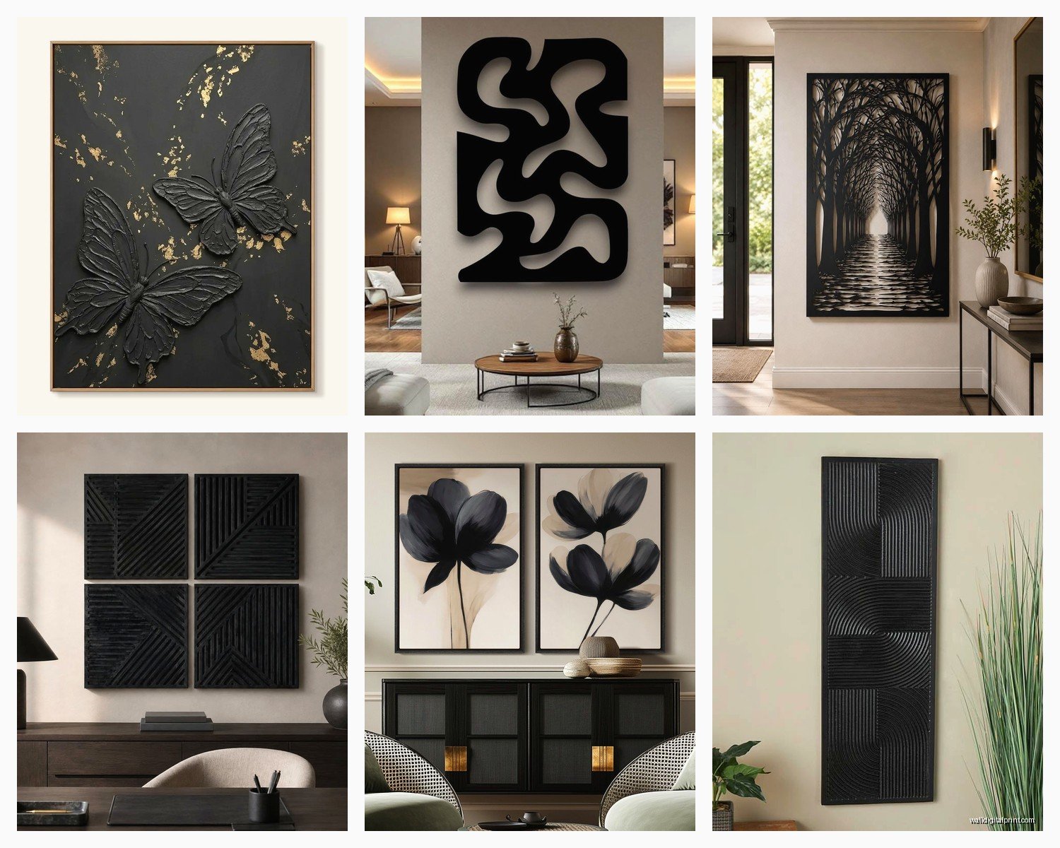
Okay so this is where things get interesting. I spent like two months researching textured black canvases because I wanted something dimensional. The key word here is MATTE. Glossy black art can work but it’s tricky because it reflects light in weird ways and you end up seeing glare instead of the actual artwork.
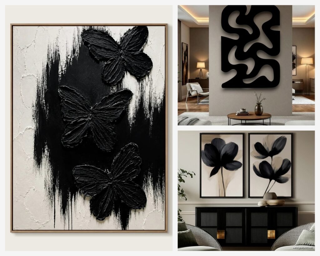
Look for pieces that have texture – like raised brushstrokes, mixed media elements, maybe some metallic accents in gold or copper. The texture catches light differently throughout the day and that’s what makes it interesting to look at. I found this piece at HomeGoods (of all places, I wasn’t even shopping for art, was there for towels) that has black paint with these subtle bronze streaks and it changes completely depending on whether it’s morning or evening light.
Line Art in Black
This is having a moment right now and honestly it’s very hit or miss. The minimalist line drawings – you know, the ones with faces or bodies made from single continuous lines? They can look really sophisticated but they can also look like you printed something from Pinterest and called it art.
If you’re going this route, size matters. Small line art prints just look unfinished. You want these either in a large format as a statement piece or in a gallery wall with like 6-9 pieces. I did a gallery wall in my hallway with all black frame line art and it works because there’s enough of them that it feels curated. One small line drawing alone just looks sad.
The Frame Situation Nobody Talks About
Oh and another thing – frames make or break black art. I’ve probably spent as much on framing as I have on actual art at this point and my cat knocked one off the wall last month so that was fun.
Black frames are the obvious choice but they’re not always the RIGHT choice. Here’s my framework (see what I did there):
- Black art with lots of texture or mixed media – use a simple black floater frame so you can see the edges of the canvas
- Black and white photography – black frame with white mat like I mentioned, or a thin gold/brass frame if you want warmth
- Line art or minimalist pieces – black frames but make them thin, like maybe half inch width max
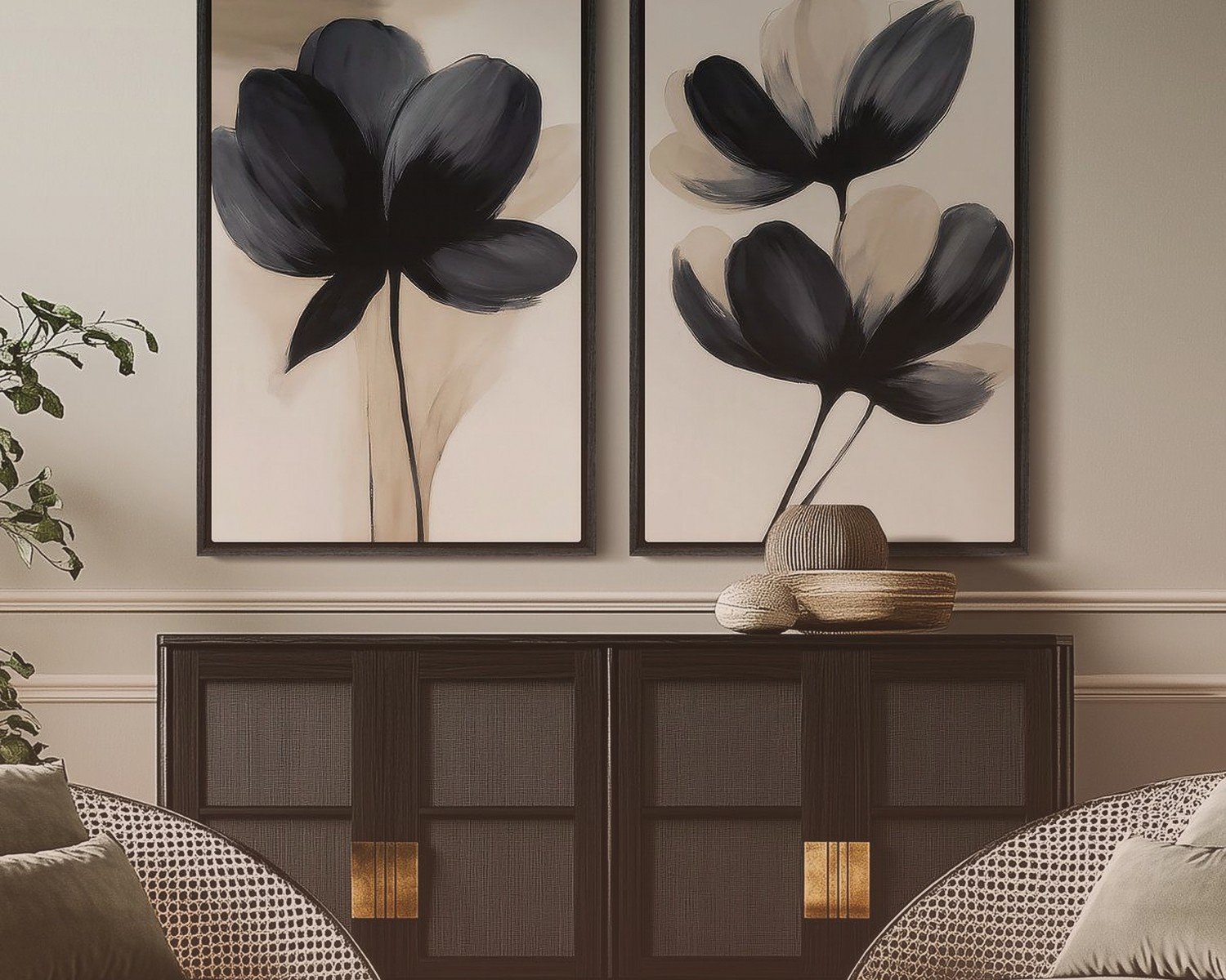
- Abstract black paintings with color accents – match the frame to the accent color or go natural wood
I made the mistake of putting a really ornate vintage gold frame around a modern black abstract piece once and it looked absolutely ridiculous. My sister still brings it up at family dinners. Sometimes simple is better, you know?
Where to Actually Buy This Stuff
Okay so funny story, I used to think you had to spend a fortune on original art to get good black wall pieces but that’s not really true anymore. Here’s where I’ve had the most success:
Etsy is genuinely great for this. Search for “textured black canvas” or “modern black abstract art” and you’ll find actual artists selling original pieces usually between $100-$400 depending on size. I’ve bought probably six pieces from Etsy and only one was disappointing (the texture looked way better in photos than in person, lesson learned about reading reviews).
Society6 and Minted have good options if you want prints rather than originals. The quality is consistent which is nice when you’re ordering online. Just make sure you’re getting the largest size you can afford – black art needs to make a statement.
West Elm and CB2 if you have more budget. Their black art selection is usually pretty curated and modern. I got this three-panel black and gold piece from West Elm that was like $400 but it’s huge and it’s the focal point of my dining room so worth it.
Thrift stores and estate sales though – this is where you can find weird vintage stuff. I found this old black velvet painting (yes really) that’s so kitschy it came back around to being cool. It’s in my home office and clients either love it or hate it, no in between.
DIY Options If You’re Crafty
Wait I forgot to mention – you can absolutely make your own black textured art and it’s easier than you’d think. I did this when I was staging a condo and didn’t have budget for art.
Get a canvas from Michael’s or wherever, use black acrylic paint in different finishes (matte, satin, glossy), and just layer it with texture. You can use a palette knife, mix in modeling paste, add gold leaf accents. The key is building up layers so there’s dimension. I watched half a season of The Crown while making three canvases and honestly they turned out better than some stuff I’ve bought.
The nice thing about DIY is you can customize the size exactly to your space. Store-bought art comes in standard sizes which don’t always work with your wall dimensions.
Placement and Styling Rules
This is where people mess up the most. You can have the most beautiful black art piece and completely ruin it with bad placement.
Height matters: Center of the artwork should be at eye level, which is usually around 57-60 inches from the floor. I see so many people hang art way too high and it just floats awkwardly near the ceiling. Unless you’re doing a gallery wall that goes vertical, keep it at eye level.
Spacing from furniture: If you’re hanging black art above a sofa or console, leave about 6-10 inches between the furniture and the bottom of the frame. Too much space and they look disconnected, too little and it feels cramped.
Scale is crucial: This is probably the biggest mistake I see. A tiny 16×20 print on a massive wall just looks lost. Your art should take up roughly 2/3 to 3/4 of the width of the furniture below it. So if your sofa is 90 inches wide, you want art that’s about 60-68 inches wide total. This might mean one large piece or a gallery wall arrangement.
Lighting Your Black Art
Okay so circling back to the lighting thing because it’s THAT important. Black art needs dedicated lighting or it disappears.
Picture lights are worth the investment. I installed them on three pieces in my apartment and the difference is insane. They don’t have to be expensive – got mine from Amazon for like $40 each. The wireless LED ones are super easy to install, just stick them on with adhesive strips.
If picture lights aren’t your thing, make sure you have either track lighting, recessed lights, or floor lamps positioned to highlight the art. Natural light is great during the day but you need artificial light for evenings unless you want your art to vanish after sunset.
Mixing Black Art with Other Pieces
You don’t have to go full black gallery wall (though I have one and I love it). Black art actually plays really well with other styles.
I have a wall in my entryway that mixes black and white photography with colorful abstract prints and some brass sculptural elements. The black pieces ground everything and make the colors look more vibrant. It’s like how wearing black clothes makes jewelry stand out more.
The trick is repeating the black throughout the arrangement. Don’t put all your black art on one side – distribute it so your eye moves around the whole wall. And use consistent frame colors even if the art styles vary. All black frames or all natural wood frames will unify different art styles.
Rooms Where Black Art Works Best
Living rooms are obvious but I’ve found black art works surprisingly well in:
- Bathrooms – especially powder rooms where you can be more dramatic
- Home offices – creates a serious, focused vibe
- Bedrooms – but only if you have good lighting and lighter bedding to balance
- Dining rooms – makes the space feel more formal and sophisticated
I’m less sold on black art in kitchens unless your kitchen is really modern with lots of white. Most kitchens have too much visual clutter for dark moody art to work.
What Doesn’t Work
Let me save you some money and mistakes. I’ve learned these the hard way:
Don’t buy black art just because it’s trendy right now. It needs to fit your actual space and aesthetic. I bought this huge black geometric piece because I saw it on Instagram and it sat in my storage unit for a year before I finally sold it on Facebook Marketplace.
Avoid super glossy or glass-covered black art in rooms with lots of windows. The glare is terrible and you can’t actually see the art, just reflections.
Don’t match your black art to black furniture directly next to it. You need contrast. If you have a black console table, hang your black art with some visual space or put lighter objects on the console to break things up.
Skip the motivational quote prints in black. They just look like office decor in the worst way. If you want text art, go for something more artistic or abstract with typography.
Maintaining and Cleaning Black Art
Real quick because nobody thinks about this until there’s dust – black shows dust like crazy. Especially matte black surfaces.
Use a microfiber cloth for dusting, no cleaning products unless it’s glass-covered. For textured canvases, a soft brush works better than a cloth. I use a clean makeup brush to get into crevices of heavily textured pieces.
If you have black art in high-humidity areas like bathrooms, check it periodically for any warping or damage. I had a print in my bathroom that started to curl at the corners after about a year and had to replace it.
The nice thing about most black art is that minor imperfections don’t show as much as they would on lighter pieces. A small scratch or scuff on a black canvas kinda just blends in whereas it would be super obvious on white.
Anyway that’s basically everything I’ve learned from living with and styling black art for the past few years. It’s not as intimidating as it seems and honestly once you get one good piece you’ll probably want more because of how much depth it adds to a room.