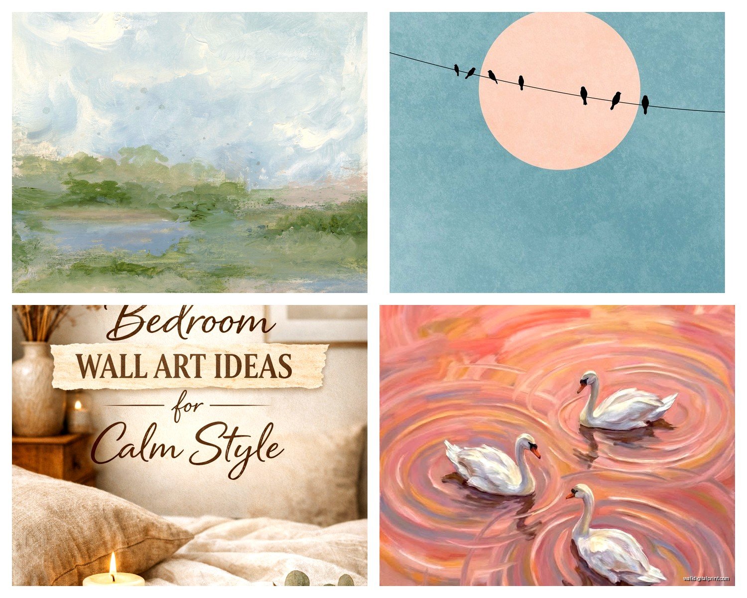
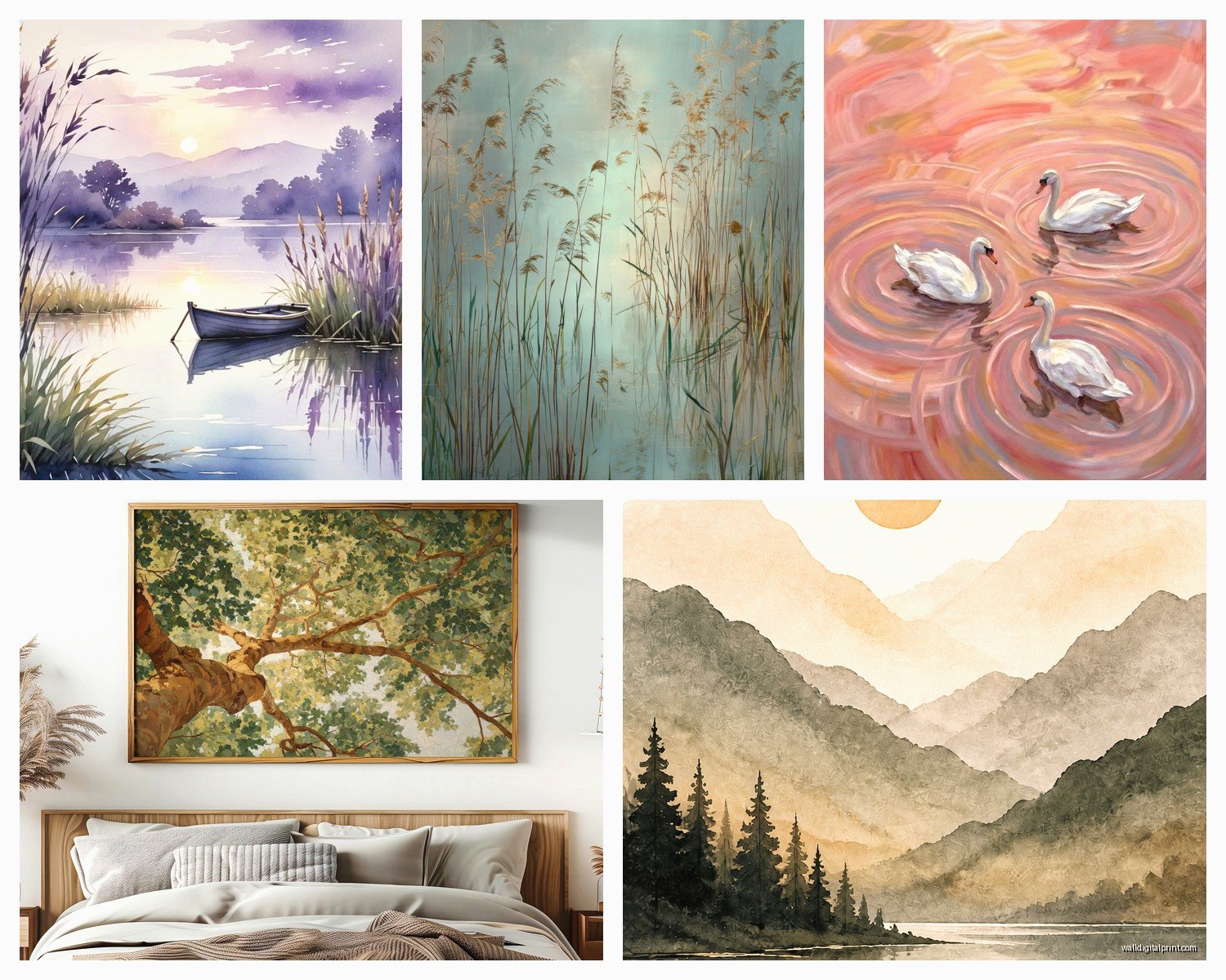
Wall Art Guide, Wall Art Tutoriels
Calming Wall Art: Peaceful Relaxing Soothing Tranquil
Sep
So I’ve been down this whole calming wall art rabbit hole for like three years now, both for my own space and for clients who are basically begging me to help them create a bedroom or living room that doesn’t feel like visual chaos, and honestly? There’s a method to this that nobody really talks about.
The Color Thing Everyone Gets Wrong
Okay so first thing – people think calming automatically means blue and gray. And like, yes, those work, but I had this client last month who put up this massive navy abstract piece thinking it would be soothing and she texted me at midnight saying she felt like the wall was “yelling” at her. The issue wasn’t the blue, it was the saturation and the contrast.
What actually matters is the tonal range. You want art where the darkest dark and the lightest light aren’t too far apart. I usually hold up my hand and squint at a piece – if the values all kinda blur together in a pleasant way, that’s your winner. Soft greens, muted terracottas, dusty pinks, warm whites… these all work if they’re not screaming at you with intensity.
I’ve got this watercolor landscape in my bedroom that’s technically orange and pink (sunset vibes) and it’s way more calming than the stark black and white photography I had before. The difference was the gentleness of the transitions between colors.
Subject Matter That Actually Soothes
Here’s what I’ve noticed works consistently:
- Horizons – ocean, fields, anything with a clear horizontal line that your eye can rest on
- Soft botanicals – not like dramatic tropical leaves, more like delicate wildflowers or eucalyptus branches
- Abstract pieces with flowing movement – think watercolor bleeds, not geometric hard edges
- Minimalist line drawings – single line faces or bodies, simple and uncomplicated
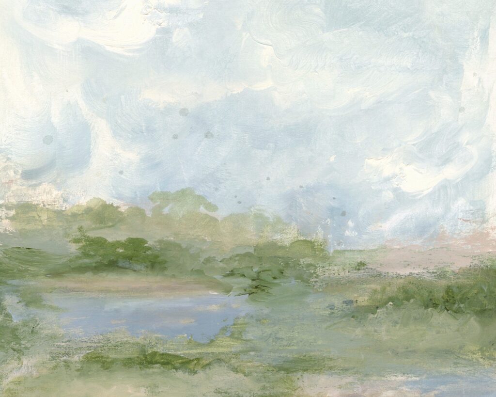
- Misty landscapes – anything with atmospheric perspective where things fade into the distance
What doesn’t work (and I learned this the hard way): cityscapes, busy patterns, anything with faces that seem to watch you, sharp geometric designs with high contrast, motivational quotes in bold fonts. That last one… I see it everywhere and it’s the opposite of calming because your brain has to READ and PROCESS language.
The Size Question Nobody Asks Right
People always ask “how big should it be” but the real question is “how much visual weight can this wall handle before my nervous system taps out?”
For a bedroom, I typically go smaller than you’d think. Like, above a queen bed, instead of the standard 40×30 inch piece, sometimes a 24×18 works better because it doesn’t dominate. You want to glance at it and feel settled, not confronted.
Living rooms can handle larger statement pieces, but here’s the thing – if you’re going big, it needs to be even MORE subdued in content. I just installed a 60×40 inch abstract in someone’s living room and it’s basically three shades of cream and taupe with the gentlest movement. Huge, but whisper-quiet visually.
Oh and another thing – multiple small pieces in a gallery wall can actually be less calming than one medium piece. Your eye has to jump around, make decisions about where to land. Unless you’re doing like three pieces in a perfect row with identical frames and similar content, skip the gallery wall for calming spaces.
Frame Choices Matter More Than You Think
This is gonna sound weird but the frame is like 40% of whether something feels peaceful. I’ve seen beautiful serene artwork completely ruined by an ornate gold frame or a chunky black frame with too much presence.
For calming art, I almost always use:
- Natural wood frames in light or medium tones – oak, maple, walnut
- Thin metal frames in brass, copper, or matte black (emphasis on THIN)
- White or cream frames with simple profiles
- No frame at all – canvas prints or mounted prints can float on the wall
The frame should disappear, basically. If someone walks in and comments on your frame before the art, that’s a problem for a calming space.
Where to Actually Find This Stuff
Okay so funny story, I spent like six months buying and returning art from different places trying to find reliable sources. Here’s what I’ve landed on:
Etsy is honestly my go-to for downloadable prints. You can get high-res files for like $5-15, print them at your local print shop or online through Printique or Nations Photo Lab, and frame them yourself. Search terms that work: “neutral abstract art print,” “minimal landscape printable,” “soft botanical watercolor.” I probably download three prints a week just to test them in different spaces.
Minted has curated calming stuff and you can filter by color which is clutch. Their framing is expensive but good quality. I wait for their sales which happen constantly.
Society6 and Redbubble let you buy from independent artists and the quality is… variable. I’ve had better luck with Society6’s premium prints. Just read reviews on the specific product.
For original work, local art fairs and small galleries are where I find the best calming pieces because you can see them in person. Photos lie about how soothing something actually is – you need to stand in front of it.
The Print vs Original Debate
Look, I curate art professionally and I’m gonna tell you something that might be controversial – for calming purposes, a $30 high-quality print can work just as well as a $500 original. What matters is the visual effect, not the provenance.
That said, original watercolors and pastels have this softness that’s hard to replicate in prints. The texture, the way light hits the paper… if you can afford an original in a calming medium, go for it. I have this small original watercolor seascape that cost me $150 and I look at it every morning and my shoulders literally drop.
Placement Secrets
This is where people mess up constantly. You can have the perfect calming piece and put it in the wrong spot and it does nothing.
Bedrooms: Across from or beside the bed, not directly above unless you’re never gonna see it while lying down (you want to see it from your pillow). I keep mine on the wall my feet point toward so it’s the first thing I see when I wake up and the last thing before sleep.
Living rooms: Not above the TV. I cannot stress this enough. You want your calming art where your eye naturally rests when you’re sitting on your couch in rest mode. Usually that’s the wall perpendicular to your seating, or behind the seating if you have an open floor plan.
Home offices: Within your peripheral vision but not directly in your sightline when you’re working. I have mine to the left of my desk so when I glance away from the screen, there it is.
Bathrooms: Yes, put calming art in bathrooms! Across from the tub is prime real estate. Just make sure it’s properly sealed or framed with glass if it’s a steamy bathroom.
The height thing – center of the artwork should be at eye level, which is usually 57-60 inches from the floor. But in a bedroom where you’re mostly sitting or lying down, I go a bit lower, like 52-55 inches.
Lighting Can Make or Break It
I had this whole thing last year where I couldn’t figure out why my calming bedroom art felt off, and turns out it was my overhead lighting. Harsh overhead lights kill the peaceful vibe of any artwork.
What works:
- Picture lights – small LED strips or dedicated picture lights cast gentle illumination
- Ambient floor lamps that wash the wall with soft light
- Natural light – but watch for glare on glass-covered pieces
- Warm-toned bulbs (2700K-3000K) not cool daylight bulbs
I installed dimmer switches in my bedroom and living room and it’s a game-changer. Same art can feel completely different at different brightness levels.
The Combination Approach
Wait I forgot to mention – sometimes the most calming setup isn’t one piece of art but art plus something else. I’ve been doing this thing where I pair a simple calming print with a floating shelf underneath that holds like three objects max. Maybe a small plant, a candle, and a smooth stone or ceramic piece.
The art doesn’t have to do all the heavy lifting. Sometimes a really minimal line drawing paired with physical calming elements creates this whole ecosystem of peace.
Also been experimenting with textile art – woven wall hangings, macramé, that sort of thing. The texture adds this softness that flat prints can’t achieve. My cat destroyed my first macramé piece by using it as a climbing wall, so now I hang them higher, but yeah, the dimensional quality is inherently soothing.
Seasonal Swapping
This might sound extra but hear me out – I keep a small rotation of calming prints and swap them seasonally. Winter gets more warm-toned misty landscapes, summer gets coastal watercolors. It’s not necessary but it keeps the space from feeling stale, and since I mostly use prints, it’s not expensive to have options.
I store the off-season ones in a flat portfolio case under my bed. Takes like ten minutes to swap them out and suddenly the room feels refreshed without any major changes.
What to Avoid (Learned Through Mistakes)
Overly trendy pieces – that line art face thing was everywhere two years ago and now people are sick of it. Go for more timeless calming imagery.
Anything that demands interaction – optical illusions, where’s waldo type detail, text that needs reading. Your brain should be able to glaze over it peacefully.
Too much symmetry – weirdly, perfect symmetry can feel rigid rather than calming. A little organic asymmetry is more restful.
High contrast – I keep saying this but it’s the number one mistake. Pure white next to pure black is activating, not calming.
Busy backgrounds – if there’s a lot happening in the background of the image, your eye never rests.
I had this phase where I thought abstract expressionism would be calming because it’s “just colors and shapes” but a Jackson Pollock type piece is visual chaos. What you want is more like a Mark Rothko – simple color fields with soft edges.
Budget Real Talk
You don’t need to spend a fortune. Here’s my budget breakdown for a calming art setup:
Minimal budget ($30-50): Download a print from Etsy, print at Costco or local shop, simple IKEA frame. Done.
Mid-range ($100-200): Quality print from Minted or Society6 with their framing, or a nice original small piece from a local artist.
Investment ($300+): Larger original work or a really high-quality framed print with museum glass and custom framing.
I’ve done all three and honestly, some of my $30 setups are just as effective as my expensive pieces. The expensive stuff feels good to own, but for pure calming function, you can absolutely do this on a tiny budget.
Testing Before Committing
Here’s what I do now before buying anything – I find an image online, display it full screen on my iPad, and tape the iPad to the wall where the art would go. Then I live with it for a few days. Sounds ridiculous but it works. You’ll know pretty quickly if something actually calms you or if it’s just pretty in theory.
For prints, I’ll sometimes order just the digital file first, get it printed at Walgreens for like $3 in a small size, and see how I feel about it before committing to a large expensive print.
The goal is art that makes you sigh in a good way when you see it. Not art that impresses guests or fits an aesthetic, but art that genuinely settles your nervous system. You’ll know it when you feel it, and it might not be what you expected at all.