Wall Art Guide, Wall Art Tutoriels
Black and White Nursery Wall Art: Monochrome Baby Room Decor
Oct
So I’ve been working on nursery designs for like three years now and the black and white thing is honestly genius if you do it right. My friend just texted me panicking about her baby’s room looking “too stark” and I’m like no no no, you’re doing it wrong.
Why This Actually Works Better Than You Think
Okay first thing – babies see high contrast way better than pastels. Like their vision is fuzzy for months and black and white shapes are literally easier for them to focus on. I had this whole phase where I thought everyone was just being trendy but then I read the actual research and was like oh… this makes sense. Plus it grows with them which means you’re not repainting when they turn three and suddenly hate the elephant theme you committed to.
The trick is mixing geometric with organic shapes. If you go all geometric it feels like an office. All organic and soft shapes, it’s too busy somehow? I learned this the hard way with my sister’s nursery where we did all these flowing abstract pieces and she was like “Sophia I feel anxious in here” and I had to start over.
What to Actually Buy (I’ve Tested Most of This)
Prints vs Canvas vs Decals
Framed prints are gonna be your most flexible option. You can swap them out, move them around, and honestly they look more intentional than decals. I usually do a mix of 8×10 and 11×14 sizes because all matching sizes looks weirdly formal for a baby room.
Canvas prints are fine but they collect dust like crazy and you can’t really clean them without ruining the texture. My cat knocked one down once and the corner got dented and there’s literally no fixing that. Stick with glass front frames – wipe them down, done.
Wall decals seemed so convenient to me at first. Applied like 50 of them across different projects and here’s the thing… they peel. Not right away but after six months with a humidifier running (which you need for a baby) they start lifting at the edges. The vinyl ones hold up better than paper but still. If you’re renting though, decals make more sense because they don’t leave marks.
The Actual Pieces That Work
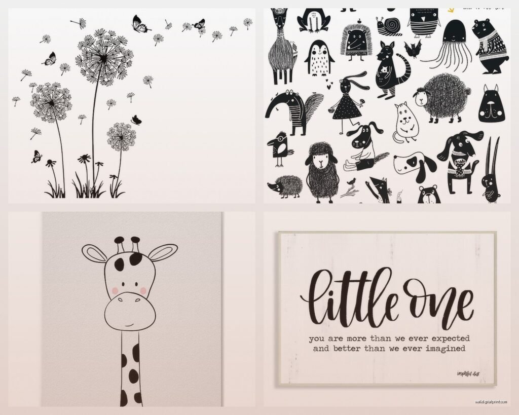
Animal silhouettes but make them simple. Not like cartoon animals, just clean line drawings. I found this set on Etsy with a giraffe, elephant, and lion that were literally just outlines and paired them with some geometric prints. The shop was called something like ModernMiniBaby or MiniBabyModern… I’d have to check my orders. Cost me like forty bucks for digital downloads and I printed them at a local print shop for another thirty.
Abstract shapes are your friend. Circles, triangles, mountains, waves. There’s this one artist – I wanna say her name is Coco something – who does these minimalist mountain prints that I’ve used in probably ten nurseries. They read as mountains but they’re really just triangles and it doesn’t feel babyish as the kid gets older.
Alphabet and number prints but only if they’re actually cool looking. Not the ones that look like a kindergarten classroom poster. More like the ones where the letters are made of geometric shapes or have interesting negative space. I saw someone do the first letter of the baby’s name as this huge 16×20 print and it looked so good.
Oh and another thing – moon phases. I know everyone does moon phases but there’s a reason. They’re interesting to look at, scientifically accurate which I weirdly appreciate, and they span horizontally which helps fill wall space above a changing table or dresser.
How to Arrange Them Without Losing Your Mind
This is where people mess up. They buy all these great prints and then just randomly stick them on the wall and wonder why it looks chaotic.
Gallery wall rule I use: cut out paper templates the same size as your frames and tape them to the wall first. Move them around until it feels right. I know this sounds tedious but I’ve patched so many nail holes from people who just started hammering and hoping.
For a standard nursery wall (like 8-10 feet wide), I usually do:
- One larger piece as an anchor – 16×20 or 11×14
- Four to six smaller pieces around it – 8×10 or 5×7
- Keep the spacing between frames consistent – I do 2-3 inches
- The whole arrangement should fit within an imaginary rectangle
Or forget the gallery wall entirely and do one big statement piece. Sometimes three large prints in a horizontal row looks cleaner. I did this over a crib once with three 16×20 animal prints and it was so much easier than fussing with a gallery arrangement.
The Height Thing Everyone Gets Wrong
Hang art at your eye level, not at the baby’s eye level. I see people putting frames like three feet off the ground thinking the baby needs to see them but the baby is lying down most of the time anyway. Plus you’re the one looking at this room for hours during middle of the night feedings. Make it pleasant for you.
Exception: if you’re doing a reading nook area or somewhere the toddler will actually be standing and looking, then yeah, lower it a bit.
DIY Options That Don’t Look DIY
Okay so funny story – my client canceled last month and I spent like two hours making custom prints on Canva because I was bored. It’s stupidly easy. They have templates specifically for nursery art and you can customize colors, add names, whatever.
What actually works for DIY:
Black and white photos of nature – branches, leaves, closeups of flowers. Print them large format and they look expensive. I took photos in my backyard, converted them to black and white, upped the contrast, and printed them at Costco for like eight bucks each. Framed them in simple black frames and people thought they were from West Elm.
Hand lettering if you’re into that. Quote prints are hit or miss but if you pick something simple like “Hello World” or “Dream Big” and you have decent handwriting, you can scan it and print it. Or trace it. I’m not above tracing.
Scandinavian-style line art. Literally just clean lines making shapes. You can draw these yourself or find free SVG files online. I’ve used vector graphics from free sites, cleaned them up in Illustrator (but you could use Inkscape which is free), and printed them.
What to Avoid Because I’ve Seen It Go Wrong
Too much text. One or two word prints are fine but full paragraphs on the wall make the room feel cluttered. Someone once did this whole “Children Learn What They Live” poem across their nursery wall and it was just… a lot. To read. While exhausted. At 3am.
All geometric with no softness. You need something organic in there – a plant print, an animal, something with curves. Otherwise yeah it does look like an office.
Mixing too many art styles. If you’re doing minimalist line drawings, don’t also add realistic animal portraits and then throw in some abstract paint splatters. Pick a vibe. Two styles max.
Really thin frames or cheap frames that aren’t actually square. I ordered frames from Amazon once that were so warped the glass didn’t sit flat and catching the light wrong drove me insane. IKEA frames are honestly solid for the price – the FISKBO and RIBBA lines work great.
The Practical Stuff Nobody Tells You
Lighting Changes Everything
Black and white art looks completely different depending on your light source. Warm bulbs make white look cream and can muddy the contrast. I always recommend daylight LED bulbs (5000K-6500K) for nurseries anyway because it helps with visibility during diaper changes but it also makes black and white art pop properly.
If your nursery gets a lot of natural light, make sure you’re using UV-protective glass in your frames or the prints will fade. Learned this when a print I’d hung facing a west window turned straight up gray after like eight months.
Securing Frames Properly
This is gonna sound paranoid but use proper wall anchors rated for the weight. Babies eventually become toddlers who pull on things. I use two mounting points per frame when possible, not just one centered hook. And nothing goes directly over the crib where it could fall – keep at least a foot of clearance.
Command strips work for lightweight frames (under 3 pounds) and are great for renters. The picture hanging strips, not the regular ones. Follow the instructions exactly – press for 30 seconds, wait an hour before hanging. People skip that waiting part and then wonder why their frame falls.
Where to Actually Source This Stuff
Etsy for digital downloads. Pay like 5-15 bucks per print, download the file, print it yourself or upload to a print service. Way cheaper than buying pre-printed. Search terms that work: “modern nursery printable,” “monochrome baby art,” “minimalist animal print.”
Minted has beautiful designs but pricey. Wait for their sales – they do 15-20% off pretty regularly. Their frames are actually really nice quality though if you don’t wanna deal with framing yourself.
Society6 and Redbubble let you buy from independent artists. The print quality is decent, not amazing. I use them for less prominent pieces or when I need something specific.
Juniper Print Shop – I’ve ordered from them probably fifteen times. Simple designs, good quality, not stupid expensive. They do sales around holidays.
Print shops like FedEx Office or local print shops will print your digital files. Cost varies but usually 10-20 bucks for an 11×14. The paper quality matters – ask for heavyweight matte photo paper or cardstock, not regular printer paper.
Color Accents (Because All Black and White Gets Boring)
Wait I forgot to mention – you probably want like one accent color. Not in the wall art necessarily but in the room. Black and white art with maybe a gray rug and then one color in the textiles keeps it from feeling cold.
I usually suggest:
- Warm woods in the furniture
- One colored throw blanket or pillow
- Natural fiber baskets for storage
- Maybe one plant if you’re into that
The black and white art stays timeless but you can swap out that accent color as trends change or as the kid develops preferences. Right now everyone wants sage green or terracotta but in two years who knows.
Mixing Textures Helps
If all your art is flat prints in frames, add a woven wall hanging or a macrame piece. Or a small shelf with a few objects. Breaking up the flatness makes the space feel more dimensional. I did a nursery last year with black and white prints, a jute wall hanging, and some wooden bead garland and it felt way more interesting than just frames alone.
Budget Breakdown for Different Approaches
Budget Option (under $100): Digital downloads from Etsy ($30-40 for 5-6 prints), print at FedEx ($50-60), IKEA frames ($30-40). You’re looking at roughly $110-140 total. Okay so slightly over but close enough.
Mid-Range (around $200-300): Mix of Etsy digital downloads and pre-printed art from places like Minted or Juniper Print Shop. Better frame quality from Target or Amazon Basics. Maybe one larger custom piece.
Higher End (over $500): Original art from independent artists, custom framing from a frame shop, maybe one commissioned piece with the baby’s name. I’ve done nurseries where just the art was over a thousand dollars but that’s excessive unless you’re really into it.
The thing is, babies don’t care about your budget. They’re not gonna appreciate the custom letterpress print versus the Etsy download. So honestly the budget option looks just as good if you choose well and frame it properly.
Seasonal Updates and Growing With Them
One reason I love this approach – you can swap prints easily. Maybe you start with very baby-focused art like animals and simple shapes. When they’re two or three, you can add some alphabet or number prints. By the time they’re five, you can shift to more sophisticated geometric art or even let them pick some pieces.
The frames stay, you just switch what’s inside them. Way easier than repainting or redecorating entirely.
I’ve also done removable prints where we print on thinner paper and use poster putty to stick them up. Makes swapping even easier but looks less polished. Good for renters or people who get bored easily.
This is getting long but basically – keep it simple, high contrast, mix geometric with organic shapes, frame properly, and don’t overthink it. The baby’s gonna spit up on everything anyway so don’t stress too much about making it perfect. Start with like three prints and see how you feel before going all in on a massive gallery wall.